
Most people pick bedroom paint colors the same way they choose a shirt — quickly, by eye, based on what looks nice in the store sample. But color is not purely aesthetic. Research in environmental psychology shows that the hues surrounding you during sleep affect cortisol levels and heart rate. Color also determines how quickly your nervous system downshifts from the day. The stakes are higher than they appear.
I have spent more than a decade designing bedrooms with wellness at their core, and color is almost always where the conversation starts. It is one of the cheapest changes you can make — but also one of the most impactful. A color that agitates the nervous system subtly will undermine even the best mattress. A color that calms it can make an ordinary room feel like a genuine retreat.
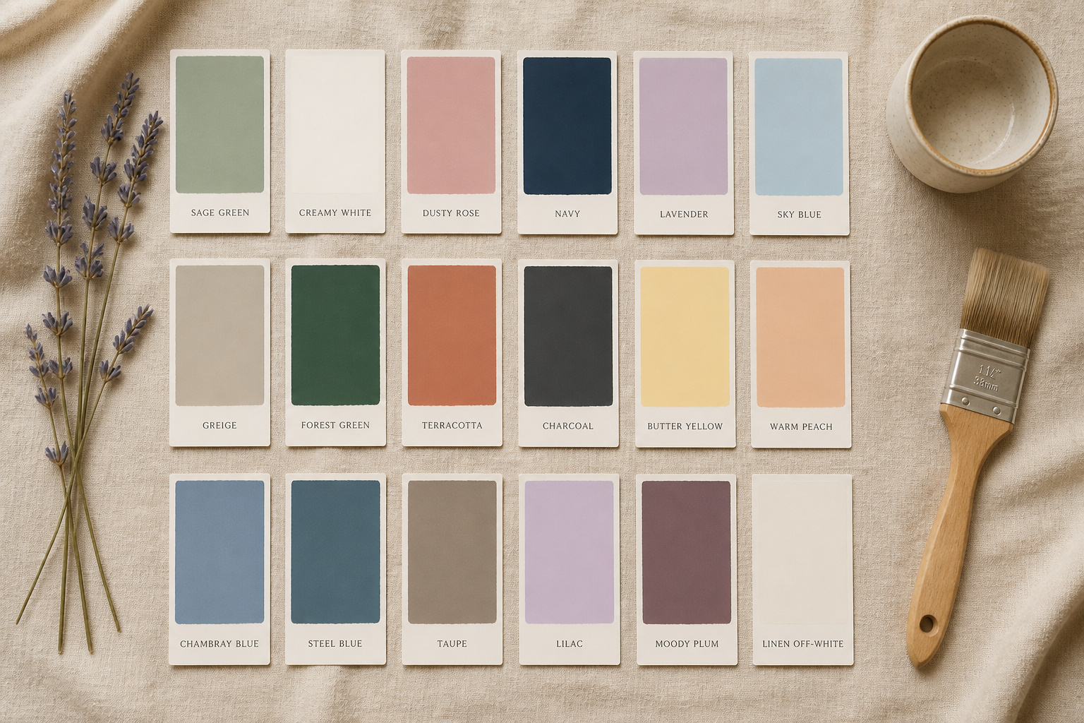
These 18 bedroom paint colors are chosen with rest in mind. Each has a specific reason to be here — research backing, sensory quality, or simply the fact that it shows up in the bedrooms of people who sleep deeply and wake restored. For every color I have included real brand names, finishes, and pairing guidance. Theory without specifics is not much use when you are standing at the paint display.
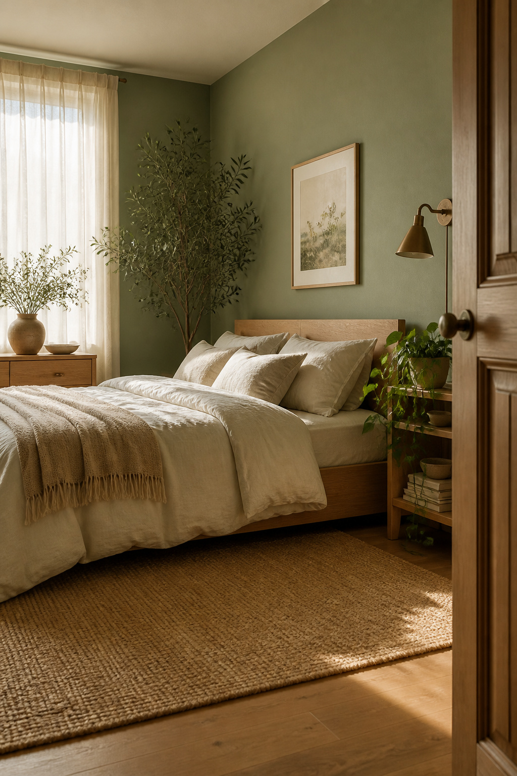
1. Soft Sage Green: The Bedroom Paint Color Backed by Stress Research
Sage green has moved beyond trend status. It is now one of the most consistently recommended hues in wellness design, and the research helps explain why.
Why Sage Signals Calm to the Nervous System
Color psychology research links muted greens consistently to lower cortisol responses. Green is the hue most associated with nature. Biophilic theory holds that even the visual cue of natural tones — without actual plants or outdoor access — reduces physiological stress markers.
Best Sage Shades and Finishes
The key with sage is saturation: too bright and it reads as lime; too grey and it becomes dingy. Benjamin Moore Lichen has just enough yellow-green to read organic without feeling too warm. Farrow & Ball Mizzle works beautifully in north-facing rooms. Sherwin-Williams Retreat sits in the same muted, grey-sage territory. For finish, eggshell is the sweet spot — enough sheen to reflect light gently without clinical coldness.
Pairing Sage With Natural Textiles
Sage walls read best surrounded by earthy organic materials. Natural linen bedding in ivory or oatmeal, warm-toned wood furniture, and jute rugs create a room that feels genuinely restorative. Avoid introducing cooler tones — grey, white, or metal — which disrupt the warm biophilic thread.
2. Warm Creamy White: The Bedroom Wall Color That Never Overwhelms
The most common mistake with white bedrooms is choosing a white that is too cool. True white — assessed under harsh fluorescent store light — often reads sterile or slightly blue once it hits bedroom walls in incandescent light. Warm creamy white is the correction most designers reach for.
Cold White Versus Warm White
Look for whites with yellow, pink, or beige undertones rather than blue or grey ones. The easiest test: hold the paint chip against a piece of warm natural linen. If the paint looks colder than the linen, it will likely feel clinical in the room.
Top Creamy White Paints for Bedrooms
Benjamin Moore White Dove (OC-17) is the standard for creamy whites. Its soft yellow-grey undertone shifts beautifully across light conditions. Sherwin-Williams Alabaster (SW 7008) is slightly warmer and suits rooms with cooler light. For something creamier still, Farrow & Ball Pointing sits closer to linen than white. For inspiration on making the most of a white bedroom aesthetic, textural layering is the key to keeping it warm rather than stark.
Keeping Cream From Feeling Flat
Plain cream walls need texture to feel interesting. Knitted throws, ribbed cushion covers, a chunky rug, limewashed furniture — the visual interest comes from surfaces rather than the wall. That restraint is what makes the room feel like a sanctuary rather than a blank space.
3. Dusty Rose Blush: A Soft Bedroom Paint Idea for Warm, Restful Evenings
Blush has a complicated reputation. Its overexposure made people cautious. But a dusty, desaturated rose applied thoughtfully is one of the genuinely comfortable hues you can wake up inside.
The Psychology of Blush
Blush occupies an interesting position in color psychology — welcoming and intimate, but without the stimulating intensity of deeper reds. Desaturated pinks have a mildly quieting quality that suits the bedroom well. The key is avoiding bright, saturated versions, which read as energizing rather than restful.
Choosing a Dusty Rose That Reads Grown-Up
Saturation is everything. The blush shades that veer into nursery territory are bright, warm, and candy-adjacent. Go for a rose that has been greyed down. Farrow & Ball Peignoir is the benchmark — barely pink in some lights, shifting between blush and warm grey through the day. Behr Dusty Miller and Sherwin-Williams Antique White offer accessible options in the same desaturated territory.
Pairing Blush With Earthy Neutrals
Rattan headboards, linen bedding in ivory, natural wood furniture, and earthy orange-toned accents all ground blush walls without sweetening them. Avoid pairing with bright white, which amplifies the pink. Cream, taupe, and warm terracotta work far better.
4. Navy Blue: The Bedroom Paint Color That Creates a Cocooning Effect
Here is the counterintuitive truth about bedroom paint colors: going dark often feels more restful than going pale. Navy blue applied all four walls creates a genuinely sheltering effect — contained, secure, and quiet in a way pale walls cannot replicate.
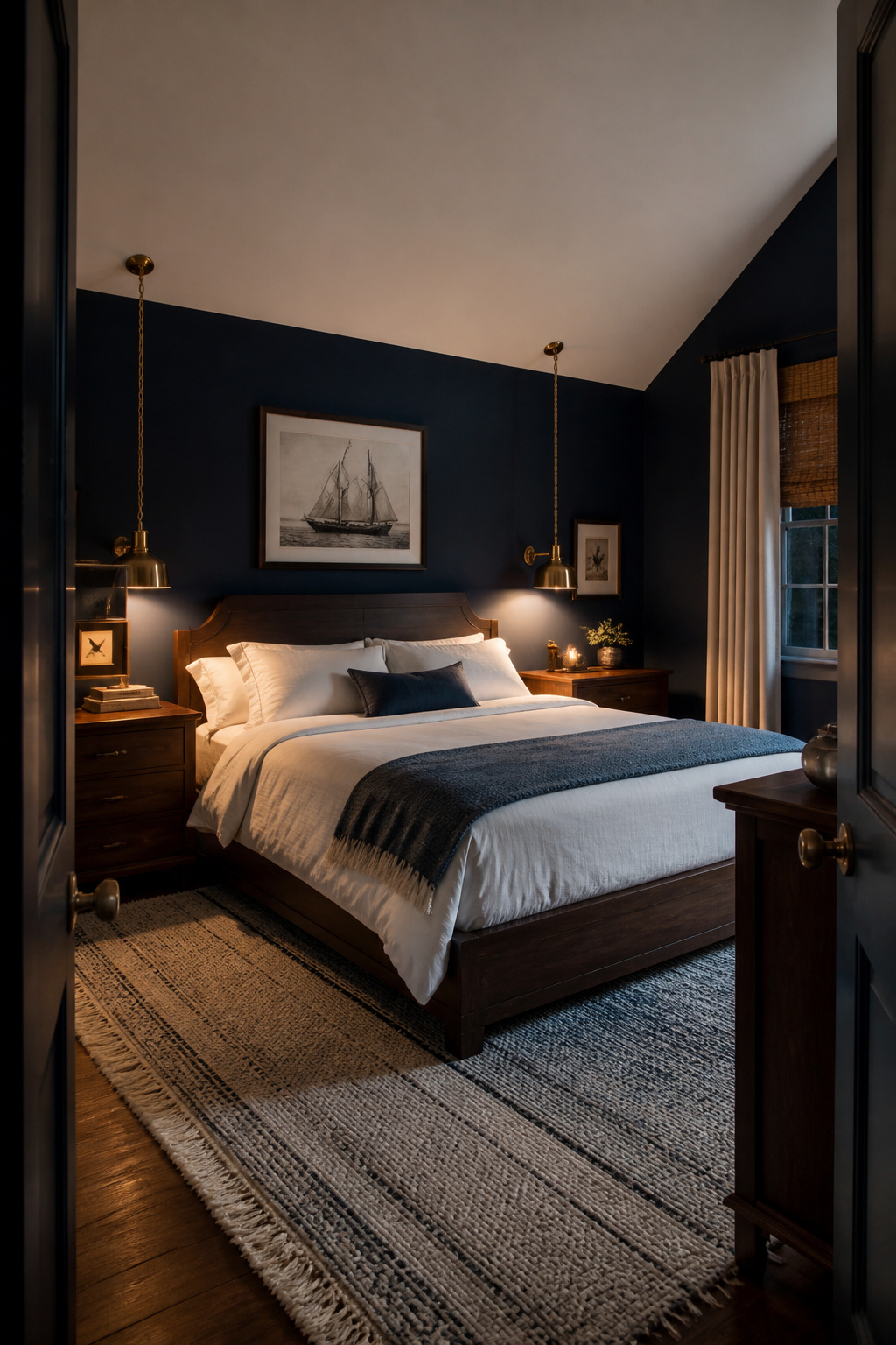
Why Dark Colors Can Feel More Restful
Research on sleep environments suggests low-light conditions — both actual and perceived — support melatonin production. Dark walls absorb light and reduce ambient brightness, signaling to the body that it is time to wind down. Psychologically, dark rooms feel private, contained, and secure — which is what a good sleep environment should be.
Best Navy Bedroom Paints
Farrow & Ball Hague Blue has a slight teal undertone that prevents flatness — widely considered one of the finest deep blues available. Benjamin Moore Hale Navy is a more muted, grey-navy that reads consistently across different light sources. For dark bedroom inspiration, the contrast with warm brass fixtures is consistently the winning formula.
Balancing Navy With Light Bedding and Warm Accents
White bedding is non-negotiable — it provides the contrast that makes the room feel layered rather than oppressive. Brass or gold hardware lifts the palette. Natural wood tones break up the intensity. Keep the floor light — a cream or oatmeal rug prevents the room going too moody.
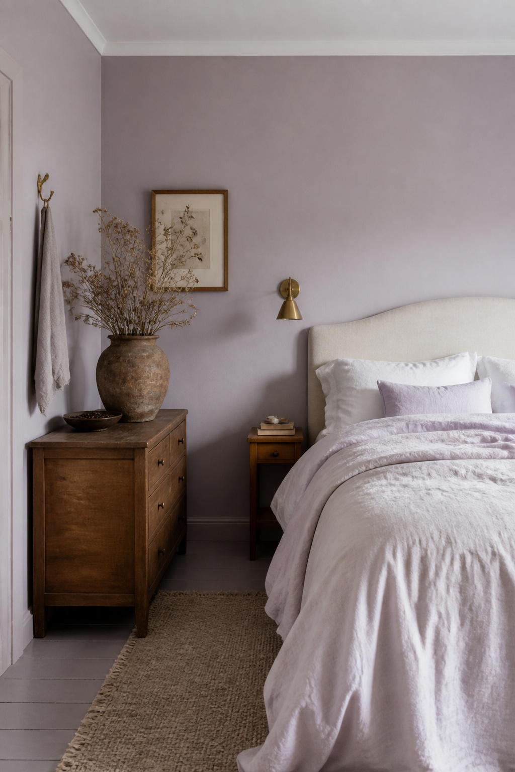
5. Soft Lavender: A Calming Bedroom Color That Promotes Deeper Sleep
Lavender is, in some ways, the most scientifically supported of the bedroom paint colors on this list. The scent of lavender has been studied for its relaxing effects on the nervous system. The color itself also carries a calm association that most people respond to intuitively.
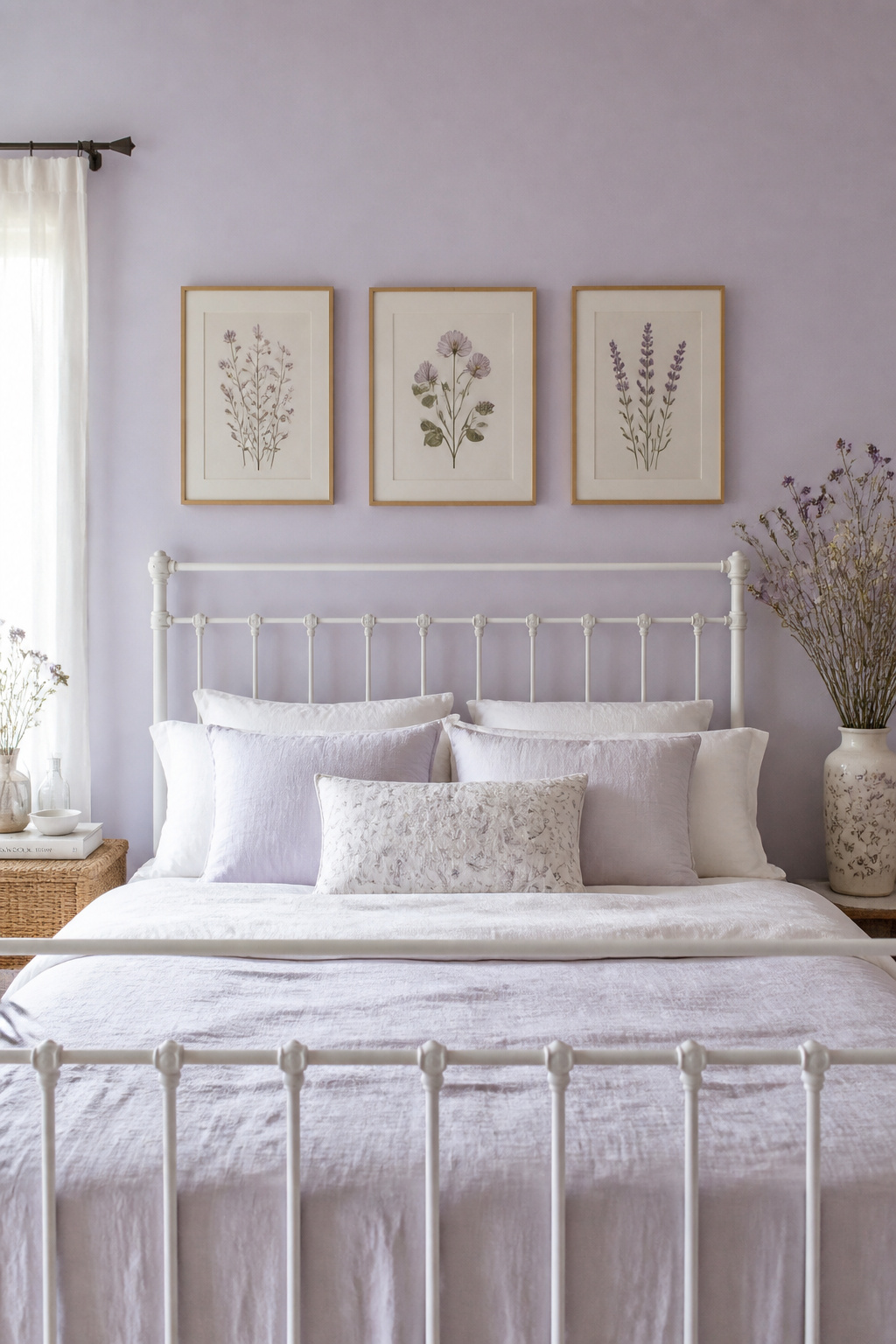
How Lavender Affects Relaxation
Cool-toned, desaturated purples sit on the edge of blue in the color spectrum, sharing some of the same calming associations. Some color psychology studies found that viewing cool lavender tones reduces heart rate slightly — a modest but meaningful shift in a bedroom environment.
Warm Versus Cool Lavender
Cool lavenders (more blue) work well in warm climates or rooms with afternoon sun. Warm lavenders (with a slight pink or red undertone) suit cooler light conditions. Benjamin Moore Poetic License is a warm, muted lavender that avoids artificial brightness. Sherwin-Williams Heliotrope runs cooler and suits south or west-facing rooms. Both avoid the synthetic purple quality that makes some lavender paint colors feel childlike.
Styling Lavender as an Adult Bedroom Color
Avoid matching purple accessories — let the wall do the color work and keep everything else in warm, natural, earthy territory. Aged linen, natural wood, and simple ceramics keep the palette sophisticated. This is one bedroom color where less visual noise is genuinely more.
6. Pale Sky Blue: Light Bedroom Paint Colors for Airy, Spacious Calm
A Travelodge UK study of 2,000 homeowners found that people in blue bedrooms averaged nearly eight hours of sleep — more than any other color. Sky blue specifically appears to trigger a relaxation response rooted in deep comfort with clear open environments.
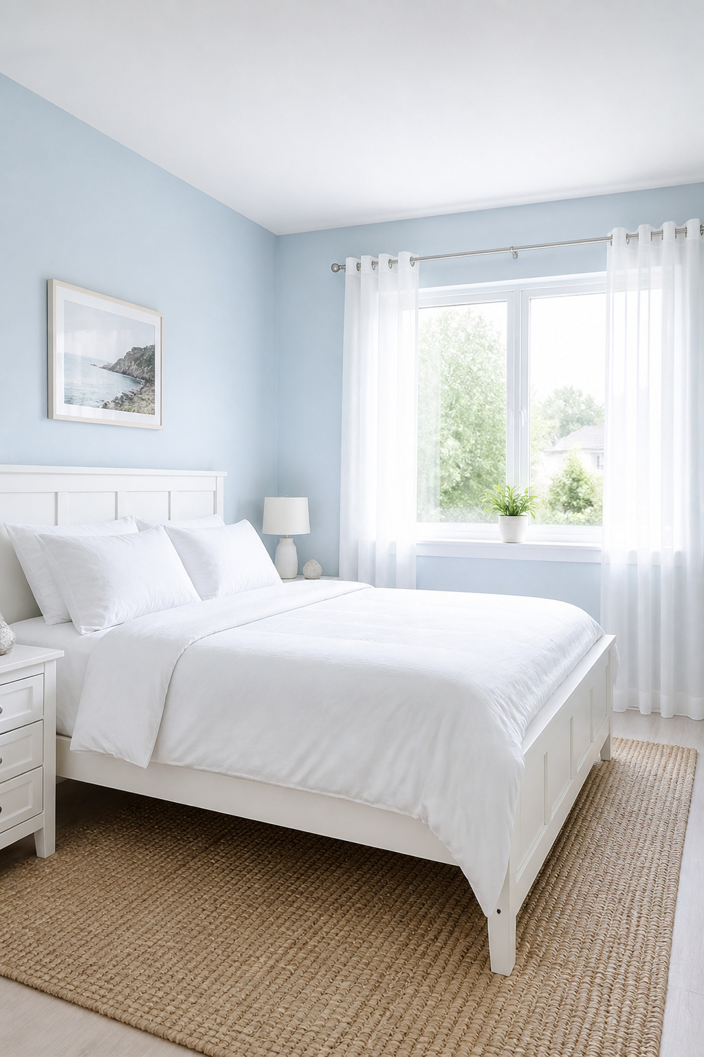
Why Blue Ranks as the Most Restful Color for Bedrooms
Blue’s restfulness connects to sky, water, and open space — environments associated with safety and calm in evolutionary terms. The critical variable is saturation: highly saturated blues feel energizing. The pale, slightly greyed sky blues are where the sleep benefit is strongest.
Finding the Right Pale Blue
Avoid shades with too much cool grey or pure white, which read as clinical in artificial light. Farrow & Ball Skylight has just enough warmth. Benjamin Moore Iceberg is clean without coldness. For rooms with generous natural light, Benjamin Moore Buxton Blue offers more visual presence while staying firmly restful.
Using Sky Blue in North-Facing Rooms
North-facing bedrooms receive cool indirect light, which can flatten cool blues. In these spaces, look for blues with slightly more yellow: Sherwin-Williams Watery has a subtle aqua warmth that keeps the color alive in low-light conditions throughout the day.
7. Warm Greige: Bedroom Paint Ideas for a Versatile, Grounded Space
Pure grey without warmth tends to feel cold in bedrooms — particularly under artificial evening lighting. Greige (grey-beige) solves this. It has the visual sophistication of grey with enough warmth to feel cocooning rather than clinical, making it one of the most consistently successful bedroom paint ideas for any style.
Why Greige Outperforms Grey With Warm Furnishings
Grey is a cool color. When it meets warm wood furniture or golden lighting, the contrast can feel jarring — the room looks cold even when lit warmly. Greige absorbs warmth from its surroundings rather than resisting it. In a bedroom with oak furniture and warm-toned textiles, it reads as a quietly warm neutral; in a cooler-styled room, it pulls toward sophisticated grey.
The Best Greige Paints
Sherwin-Williams Accessible Beige (SW 7036) has a warm but not excessively sandy quality that works across many light conditions. Farrow & Ball Elephant’s Breath has a distinctly grey-greige character suited to contemporary bedrooms. Benjamin Moore Revere Pewter remains technically excellent — particularly in bedrooms where you want the grey quality to read first and the beige to emerge only as warmth in the evening light.
8. Deep Forest Green: A Bedroom Color for a Nature-Immersed Retreat
If sage green is the accessible entry to biophilic bedroom color, deep forest green is the full commitment. It brings the immersive quality of old-growth canopies into the bedroom in a way that most people find immediately, almost instinctively, calming.
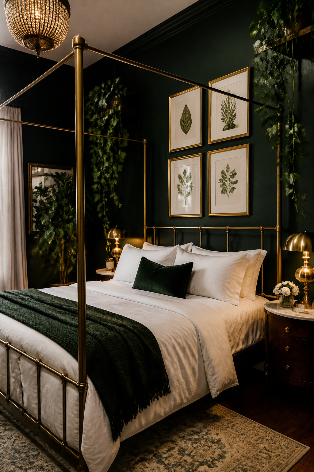
The Biophilic Case for Deep Green
Biophilic design holds that humans have an innate need to connect with nature — and that designed environments can satisfy this even without literal green space. Research on nature-immersive settings suggests they reduce blood pressure and promote parasympathetic nervous system activity, the rest-and-digest state that supports quality sleep.
Specific Forest Green Paints Worth Choosing
For green bedroom ideas with real depth, Farrow & Ball Calke Green has a muted, heritage quality that avoids commercial brightness. Benjamin Moore Hunter Green is deeper and slightly more blue. Sherwin-Williams Jasper is a warm forest green with enough yellow to stay lively in limited light. All three work best with warm brass or gold accents that prevent the green reading too cool.
Lighting Deep Green Walls Properly
The biggest mistake with forest green bedrooms is under-lighting. Dark walls absorb light, so the room needs more — specifically warm light. Swap cool daylight bulbs for warm white (2700K–3000K) and layer multiple sources: bedside lamps, wall sconces, a floor lamp. The combination of deep green and warm layered light creates an evening atmosphere that is genuinely beautiful.
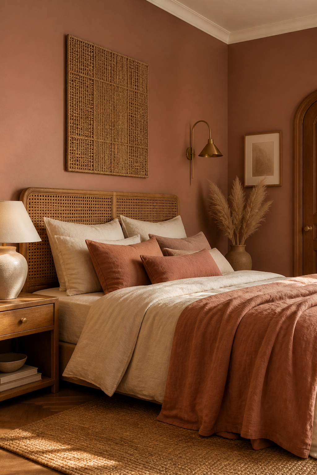
9. Soft Terracotta: Earthy Bedroom Paint Colors for Warmth and Grounding
Terracotta has settled from trend into the mainstream, joining ochre, rust, and sandy beige as one of the natural earth tones people return to when they want their bedroom to feel grounded. It is warm, honest, and unfussy.
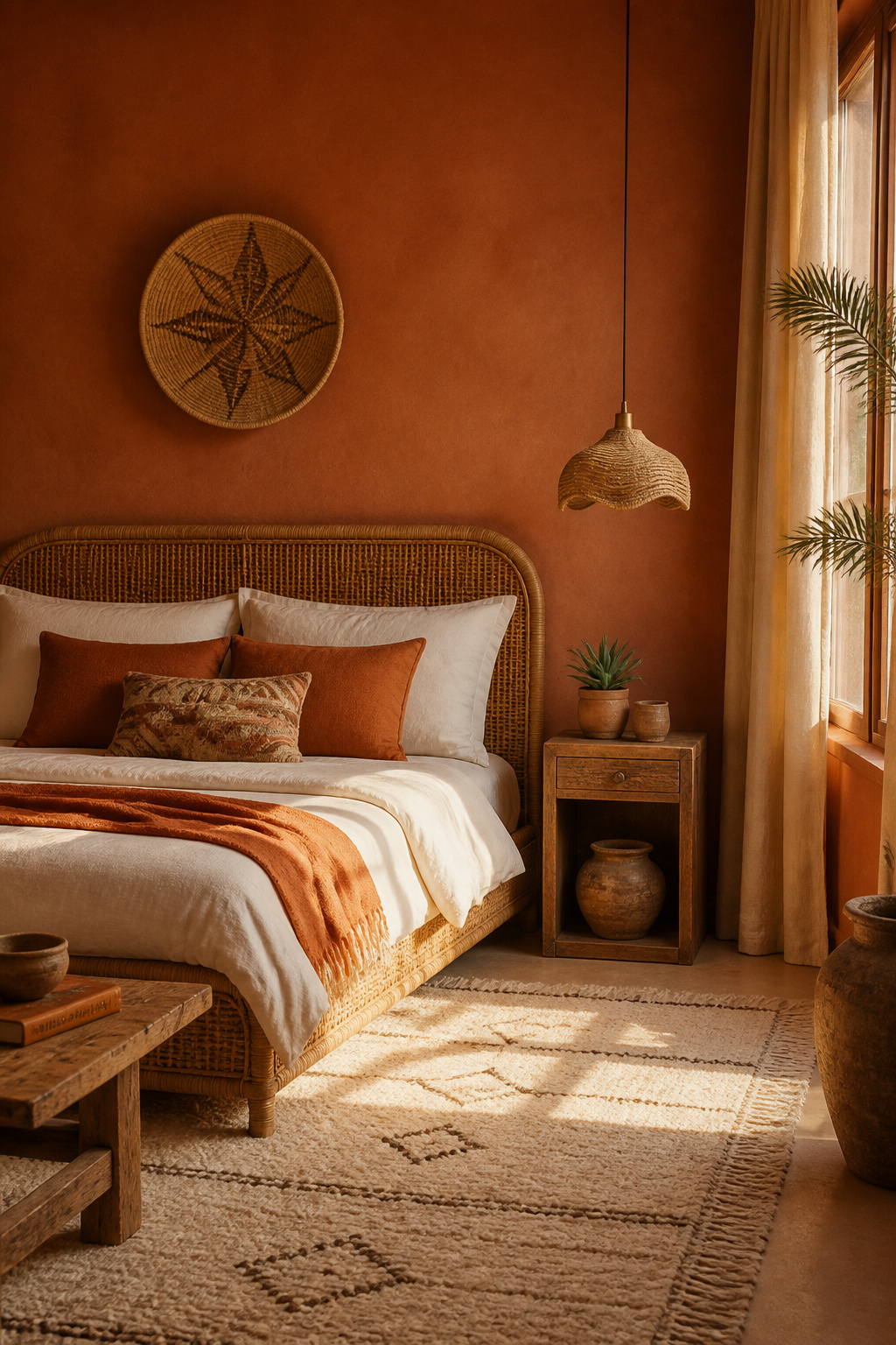
Why Terracotta Works Best in West-Facing Rooms
West-facing rooms receive warm, golden light in the afternoon and early evening — which terracotta walls absorb and amplify beautifully. The result is a bedroom that glows in the hours most people use it for winding down. In north or east-facing rooms, test samples at multiple times of day — the color can read flatter in cool indirect light.
Finding a Terracotta That Reads Clay Rather Than Orange
Look for terracottas with a dusty, clay-like character. Backdrop Baked has the opacity and red-earth tone of actual fired clay. Portola Paints Roman Clay applied as a textured finish gives the most authentic terracotta effect and adds a tactile dimension that flat emulsion cannot match.
Pairing Terracotta With Natural Materials
White cotton or linen bedding provides the breathing space terracotta walls need. Rattan and natural wood furniture keep the earthy palette consistent. Cream-glazed ceramics pick up the warm undertones without matching too closely. Terracotta is an earthen color and reads its best when surrounding materials share that same honest, unfinished quality.
10. Charcoal: Bold Bedroom Paint Colors for a Sophisticated Sleep Cave
Charcoal is darker and more neutral than navy — sleek rather than rich, serious rather than maritime. In the bedroom, it creates something close to a true sleep environment: a room with very low ambient brightness that encourages the body to begin winding down earlier in the evening.
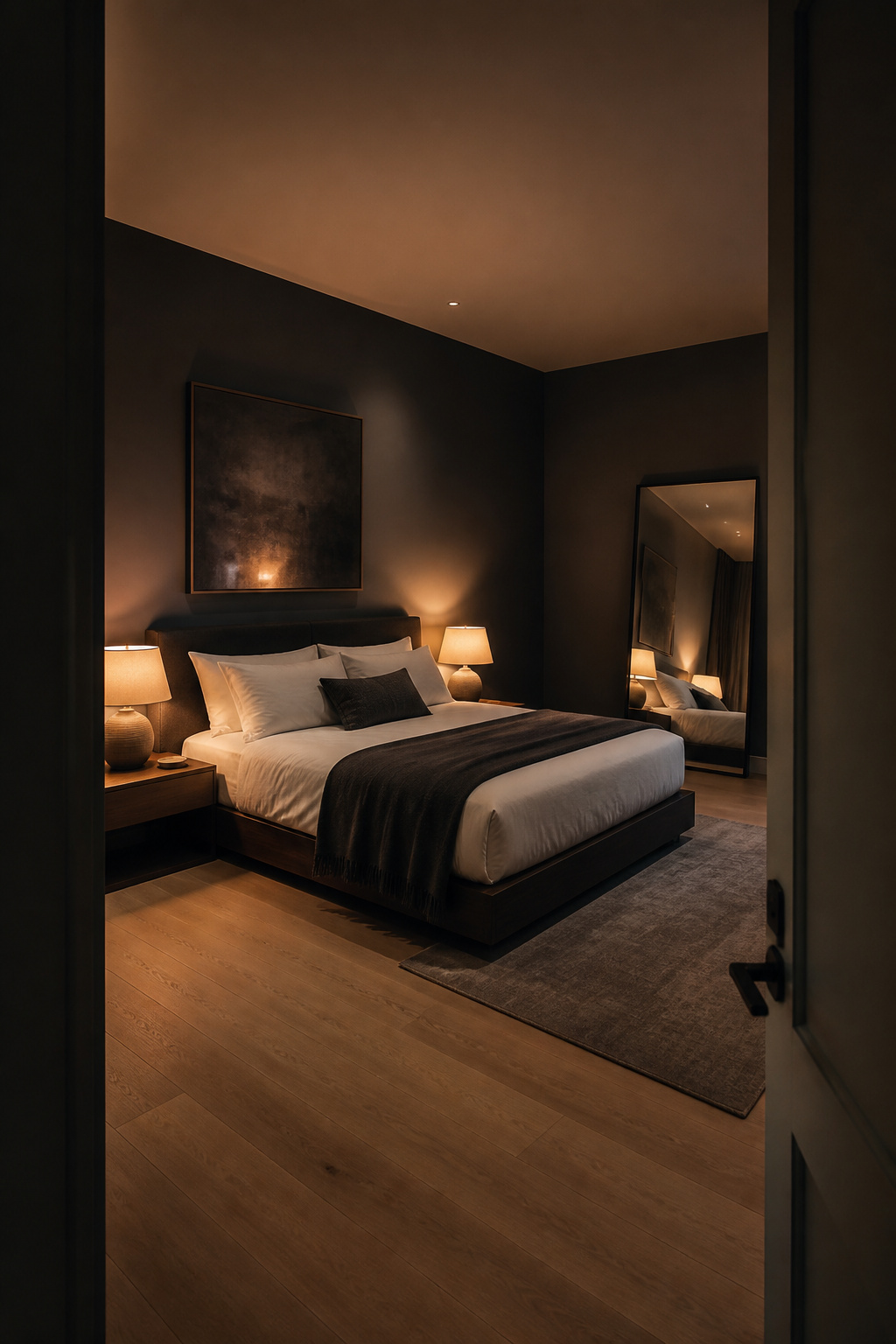
The Science Behind Dark Rooms
Research on light and melatonin is clear: the darker the room during sleep hours, the more reliably the body produces the hormone that regulates sleep cycles. Dark paint colors meaningfully reduce the amount of ambient light bouncing around a room. In practice, charcoal walls feel quieter and more contained than pale ones, supporting the psychological winding-down that precedes sleep.
Best Charcoal Paints for Bedrooms
Benjamin Moore Iron Mountain has a slight blue-grey undertone that keeps it from reading brown or muddy — it is a true dark grey with real depth. Farrow & Ball Railings is cooler and slightly more black, suited to contemporary and industrial-leaning bedrooms. Sherwin-Williams Peppercorn sits in the middle: enough depth to create the cave effect without feeling overpowering.
Preventing a Charcoal Bedroom From Feeling Claustrophobic
White bedding is non-negotiable. Beyond that, generous warm lighting is essential — the amber contrast of incandescent-equivalent bulbs against charcoal walls is genuinely beautiful. Mirrors help too: a large mirror bounces both light and perceived space into dark corners without disrupting the overall mood.
11. Butter Yellow: Cheerful Bedroom Paint Colors for Morning Energy
Yellow is the most complicated color to use in a bedroom. It can genuinely energize and lift mood — useful in rooms that serve as both sleep space and morning preparation area. But the wrong yellow creates stimulation at exactly the wrong time. The solution is to think in terms of butter, not sunshine.
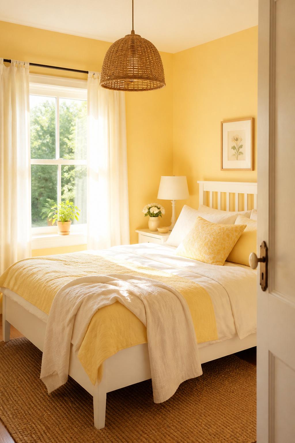
Getting Yellow Right in a Bedroom
Color psychology has identified a connection between high-intensity yellows and anxiety — but the operative word is intensity. Pale, greyed, butter yellows fall well below the saturation threshold where this becomes a concern. The rule: if the yellow reads like a crayon, it is too much. If it reads like morning light on a white wall, you are in the right range.
The Best Butter Yellow Paints
Sherwin-Williams Butter Up is almost universally praised — it walks the line between golden and white with just enough yellow to register without announcing itself. Benjamin Moore Pale Moon is even more restrained, closer to warm white with a yellow suggestion. Both work best with white trim — specifically a clean, cool white that creates a crisp separation and prevents the room from feeling candy-colored.
12. Warm Peach Blush: Inviting Bedroom Paint Ideas for a Golden-Hour Glow
Peach is one of the most overlooked bedroom paint colors — sitting between blush and terracotta in the warmth spectrum. At its best it does something lovely: it makes artificial light look flattering, casting a warm golden hue across the room that reads like candlelight even when it is just a bedside lamp.
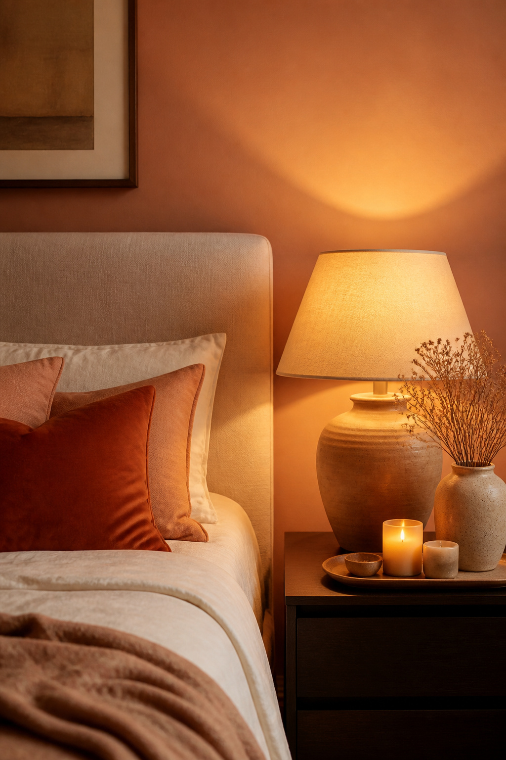
Why Warm-Toned Walls Flatter in the Evening
Warm-toned wall colors — peach, terracotta, dusty rose — reflect a warm color cast onto surfaces in the room, including people. In a peach bedroom with evening lamp light, the effect approaches candlelight. That is why so many wellness-focused bedrooms favour warm earth tones over cool blues and greys.
Selecting a Peach That Holds Under Artificial Light
The biggest risk with peach is it reads differently under different light sources — appealing in daylight, potentially salmon-pink under cool artificial light. Test samples under your actual bedside bulbs at night. Clare Fresh Kicks holds its color well across light types. Benjamin Moore Peach Parfait sits slightly more muted, which helps it avoid the salmon problem. Both pair beautifully with warm wood furniture and aged brass hardware.
13. Chambray Blue: Sophisticated Bedroom Paint Colors With Depth and Calm
Chambray blue sits between the paleness of sky blue and the intensity of navy — substantive enough to feel intentional, light enough to breathe. For bedrooms that want the calm of blue with real visual presence, chambray is consistently the right answer.
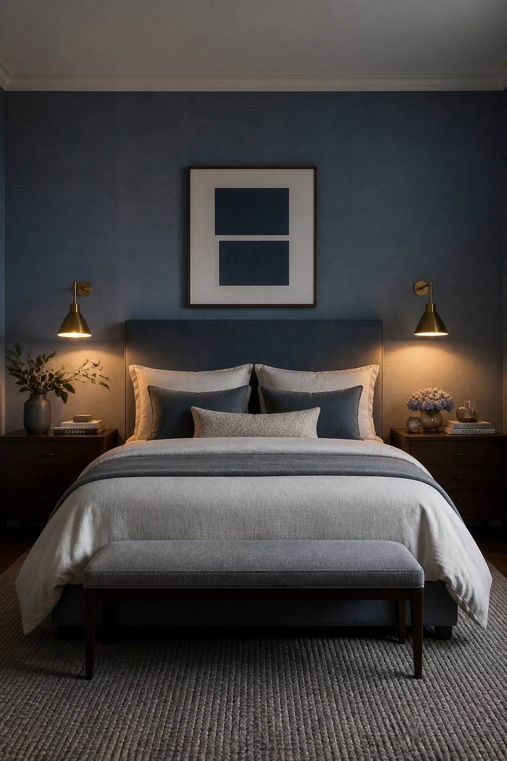
Finding the Right Chambray
Benjamin Moore Newburyport Blue has a coastal, weathered quality that reads as sophisticated rather than nautical. Sherwin-Williams Waterfall sits in the same range, slightly more muted. Farrow & Ball Parma Gray leans toward faded denim rather than fresh blue, working beautifully in rooms that receive warm afternoon light. All three suit full-wrap applications — all four walls — which creates the most calming effect.
Full-Wrap Versus Accent Wall
Full-wrap chambray surrounds rather than punctuates, creating consistent calm in every direction. An accent wall behind the bed frames the sleeping space and makes the headboard wall feel deliberate. For a serene blue bedroom that feels genuinely calming rather than decorative, the full-wrap approach is worth committing to.
14. Steel Blue: A Gender-Neutral Bedroom Color With Timeless Appeal
Steel blue is the composed professional of this list — not as obviously calming as sky blue, not as dramatic as navy, not as warm as chambray. But it has staying power. But it has a reliable, composed quality that suits an enormous range of bedroom styles. Couples gravitate toward it precisely because it reads as neither specifically masculine nor feminine.
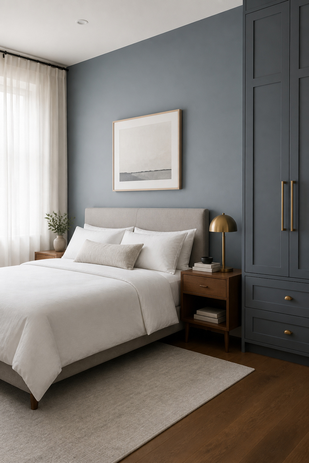
Why Steel Blue Works in Shared Bedrooms
Most colors carry gender associations from cultural conditioning. Steel blue sidesteps these by sitting in a register that is neither deliberately soft nor deliberately bold. It has the composed neutrality of slate with enough color to feel intentional — particularly effective in shared spaces where one strong aesthetic direction would feel exclusionary.
Best Steel Blue Paints and Undertones
Sherwin-Williams In the Navy sits in cool steel territory that reads more as a sophisticated mid-blue than its name implies. Benjamin Moore Cadet has a slight grey undertone that pushes it toward steel without losing its blue character. Farrow & Ball Pigeon has a complex, slightly green-influenced steel quality that works beautifully with warm wood tones and aged brass — also the ideal styling approach for all three options.
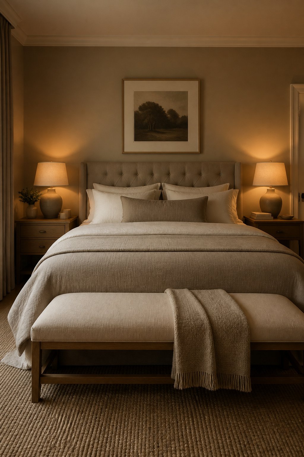
15. Warm Taupe: The Bedroom Paint Color That Goes With Everything
Taupe is the chameleon of bedroom paint colors. It shifts between beige and grey depending on the light and surrounding materials, and it rarely looks wrong with wood, white, blue, green, or almost anything else. This adaptability makes it valuable when you want a bedroom that can evolve without requiring a repaint.
Understanding Taupe Undertones
Not all taupes are equal. The ones that read as muddy tend to have too much brown without enough grey to clean them up. Look for taupes with a clear grey-beige balance. Benjamin Moore Revere Pewter (HC-172) has enough grey to feel sophisticated and enough warmth to feel cosy. Sherwin-Williams Agreeable Gray (SW 7029) is lighter and more consistently warm, particularly useful in rooms with limited natural light.
Taupe Across Seasons
The seasonal advantage of taupe is underrated. Pale blues feel slightly cold in winter; whites can feel stark; bright tones sometimes feel off-season. Taupe adapts naturally — reading as cosy and grounding in winter, neutral and fresh in summer. For a bedroom meant to feel consistently restful year-round, it is one of the most reliable choices. Farrow & Ball Elephant’s Breath, with its slightly cooler grey-beige character, suits contemporary bedrooms particularly well.
16. Lilac: Delicate Bedroom Paint Colors for a Restorative, Dreamy Space
Lilac gets dismissed as childlike, which is a shame. When handled with the right materials, it creates one of the most genuinely restorative bedroom atmospheres on this list — dreamy and soft, but grounded enough to avoid feeling precious.
Sophisticated Lilac Versus Baby Lilac
Baby lilac is bright, cool, and better suited to a nursery. Sophisticated lilac is desaturated, slightly warm, with either a grey or a mauve undertone. Farrow & Ball Calluna sits firmly in this second category — it reads as a dusty, heathery lilac that shifts between purple and pink depending on light. Benjamin Moore Sweet Lilac is similar: soft, greyed-down, and versatile.
Styling Lilac as an Adult Color
The key is restraint. Do not add purple accessories or lavender accents — let the wall do the color work and keep everything else in warm, natural, earthy territory. Warm wood furniture grounds lilac walls in a way that nothing else does as effectively. Cream linen bedding, a natural jute rug, and simple ceramics complete the picture without sweetening it.
17. Moody Plum: Deep Bedroom Paint Colors for a Luxurious Night-Time Atmosphere
Plum is the least intuitive color on this list — and arguably the most rewarding when executed well. It occupies the territory that navy and charcoal claim, but brings a warmth neither achieves. In a bedroom lit with warm light, plum walls have a quality close to velvet: deep, rich, and genuinely beautiful.
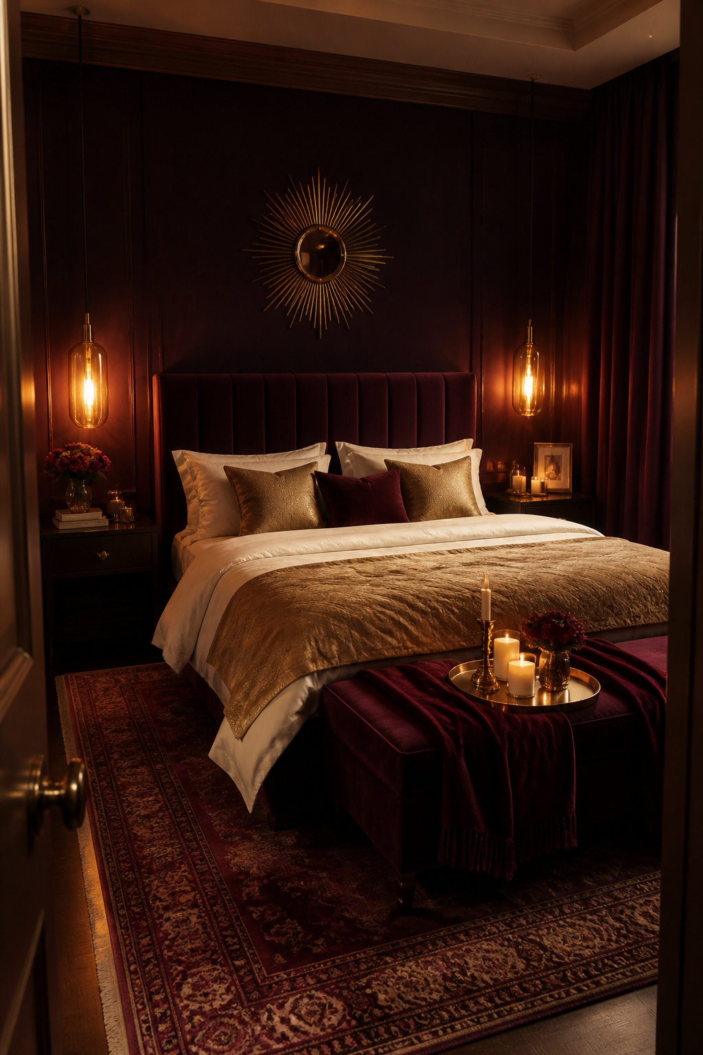
When to Choose Plum Over Navy or Charcoal
Navy is cooler and more structured; charcoal is more neutral. Plum brings warmth that neither achieves — particularly effective in bedrooms with warm-toned furnishings like walnut, gold, and amber-colored textiles. It is most effective in bedrooms used primarily in the evening, where warm lighting can do justice to the depth of the color.
Best Plum Bedroom Paints
Farrow & Ball Pelt is the benchmark — dark enough to feel genuinely moody without tipping into purple-black. Benjamin Moore Eggplant is slightly warmer and deeper. For a softer entry point, Sherwin-Williams Plum Brown sits between red and purple in a way that reads more aubergine, making it more accessible. Eggshell finish is best: matte can look chalky on deep walls, while eggshell gives a gentle sheen that catches warm light beautifully.
Preventing Plum From Feeling Heavy
Layered warm lighting is non-negotiable — avoid cool overhead lighting entirely. Rely on bedside lamps, floor lamps, and wall sconces all on warm-white bulbs. White bedding provides the light contrast that makes dark walls readable. Keep one surface in the room — the ceiling, trim, or floor — genuinely pale to give the eye somewhere to rest.
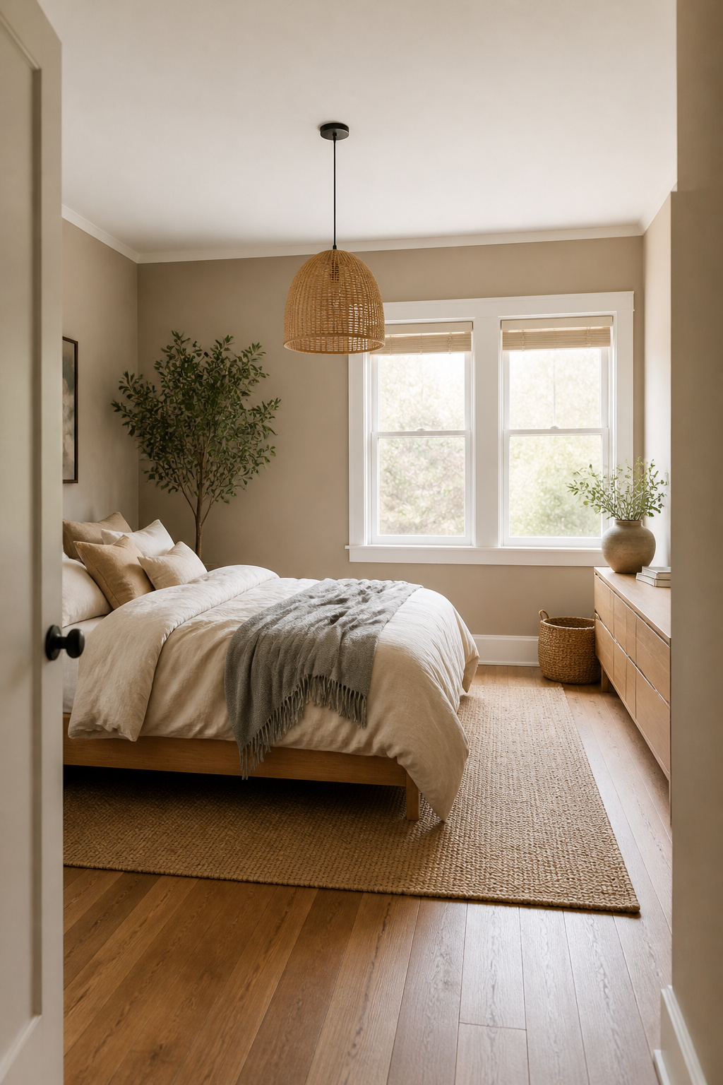
18. Linen Off-White: Timeless Bedroom Paint Ideas for a Clean, Restful Base
Linen off-white has never gone out of fashion as a bedroom wall color — it does its job quietly, competently, and without getting in the way of anything else. It is the color equivalent of a really good mattress — you do not think about it, but everything feels better because of it.
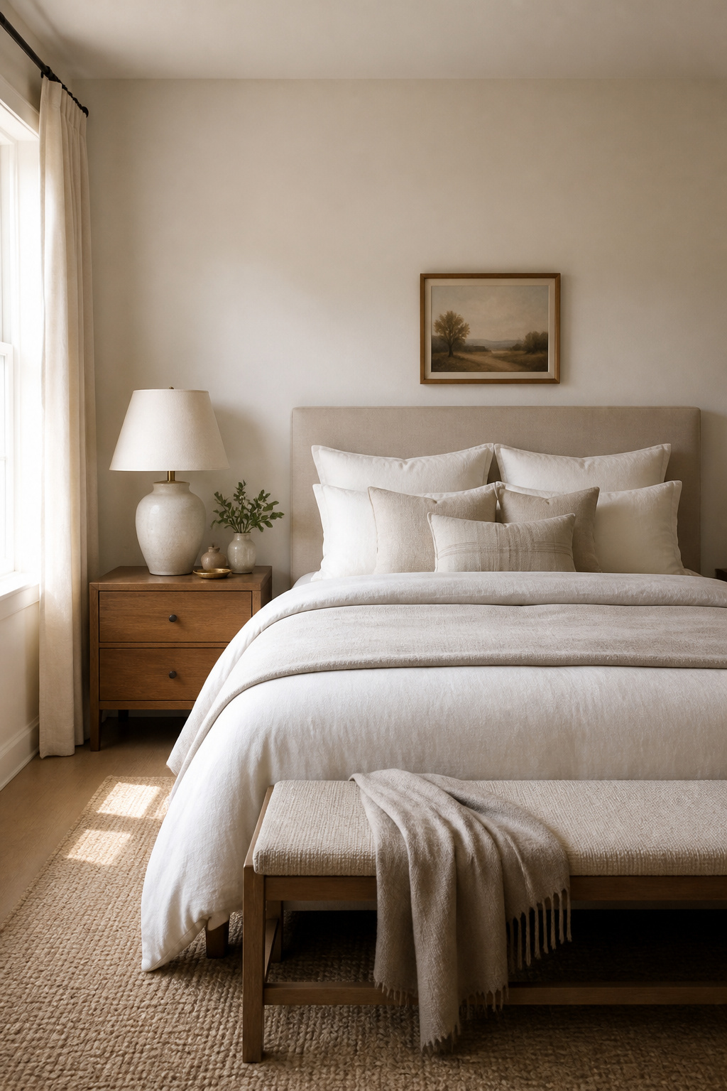
Why Off-White Beats Pure White in Most Bedrooms
Pure white bedrooms look spectacular in photographs but feel relentlessly bright in person. The high reflectance value of true white bounces light aggressively — including at night, when streetlamp or lamp light can become disruptive. Off-white absorbs slightly more light, creating gentler brightness. It also ages better: off-white shows far less of the yellowing that affects true white paint over time.
The Best Linen and Off-White Paints
Benjamin Moore White Dove, already mentioned as a creamy white, also functions in the off-white category — pale enough to read as white in most lights, warm enough to avoid clinical brightness. Farrow & Ball Pointing is slightly more ivory, closer to linen, creating a beautifully antique effect. For a cozy bedroom built around an off-white base, the warmth comes from layered textures: linen bedding, warm wood furniture, pottery in earthy tones, and plants with interesting leaf shapes.
How to Choose the Right Bedroom Paint Color for Your Space
The right bedroom paint color is not the most beautiful one in the photograph — it is the one that works with your room’s conditions and your own patterns of rest. With so many bedroom paint colors to consider, here is how to narrow it down.
Test Samples in Your Room’s Actual Light
Buy proper sample pots and paint patches at least A3 size on multiple walls. View them at different times: morning, midday, late afternoon, and under your actual evening lighting. A color that looks perfect on a north-facing wall may look different on the east-facing wall of the same room. Test on both.
Match Finish to the Bedroom’s Needs
For most bedroom walls, eggshell is right: subtle sheen to reflect light gently, durable enough to clean if needed. Matte finishes hide surface imperfections well — useful in older homes — but can look chalky in deep colors. Avoid satin finishes in bedrooms; they read too commercial and shiny for a restful environment. Also consider the ceiling: painting it the same wall color diluted with white creates a cocooning effect that plain white ceilings cannot match.
Live With Samples Before Committing
Put samples up on a Friday and forget about them for a week. Notice how the room feels Saturday morning, how it looks after work Tuesday, what it does under Thursday evening lamp light. Your gut response after seven days of normal living tells you more than any deliberate evaluation. And if you are choosing colors for adjacent rooms, check how they read from one space to the other — for reference on how paint colors work across connected living spaces, the principle is the same: a thread of color continuity makes both rooms feel more deliberate and more calm.