
Paint is the single most powerful, most affordable tool in any living room transformation. I’ve spent years working with clients who renovate furniture, swap out textiles, and rearrange layouts. Then, somewhat reluctantly, they agree to change the wall color. Without exception, the paint change makes the biggest difference. It shifts how the room breathes, how quickly you relax, and how much you genuinely want to be there.
Color psychology is not abstract theory. Research shows that the tones surrounding you affect cortisol levels, heart rate, and perceived spatial comfort. In other words, the right living room paint is a health decision as much as an aesthetic one. The 15 colors below aren’t chosen because they photograph well. Each is paired with a specific mood, a specific room type, and the exact paint shades that reliably deliver on the promise.
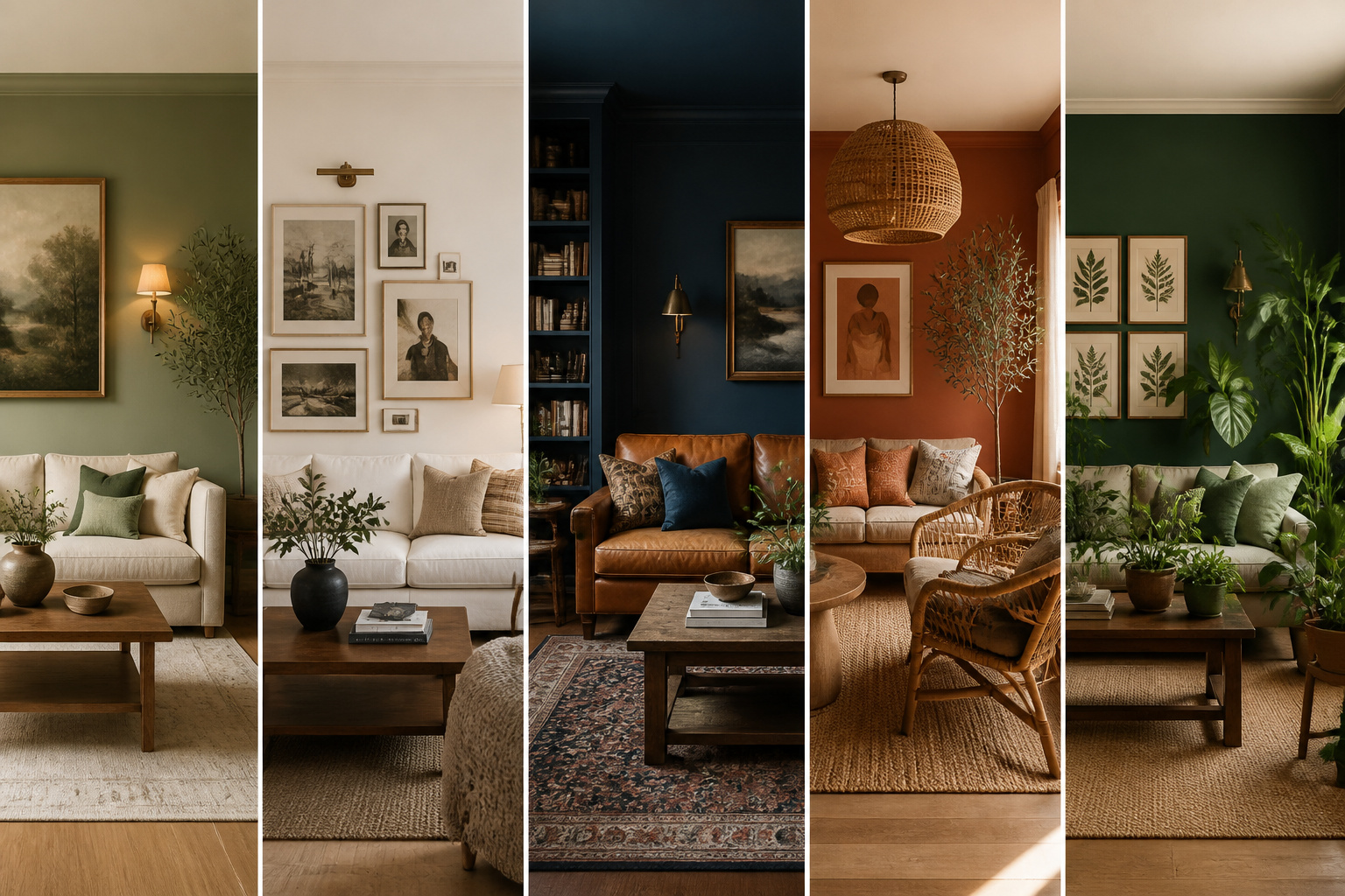
1. Soft Sage Green for a Calming, Restorative Living Room
Sage green has a quiet superpower. It sits in the middle of the visible light spectrum, requiring less muscular effort from your eyes than any other color. Environmental psychologists have found that green tones reduce cortisol more reliably than almost any other hue — and in a living room where you come to decompress, that matters.
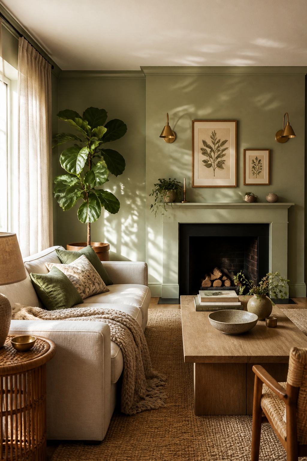
The key to sage green’s success is its undertone. It contains significant grey and brown content, preventing it from reading as vivid or energizing. This makes it a color that works even when you’re unsure about going green — it sits comfortably alongside neutrals, wood tones, and almost any textile palette you already own. Farrow & Ball Mizzle (No. 84) is a complex, slightly khaki sage with depth in lower light. Sherwin-Williams Evergreen Fog (SW 9130) was their Color of the Year and costs around $70–75 per gallon. Benjamin Moore Saybrook Sage (HC-114) is the warm-undertone option at around $55–65 per gallon.
Finish and Pairing
For the living room, eggshell (2–5% sheen) gives sage its best quality. It’s washable without the slight plasticity of satin. Also, it won’t show daily marks the way flat can. Pair sage with warm woods, oatmeal linen, terracotta accents, and matte brass hardware. The combination triggers every biophilic instinct you have without requiring a single plant.
Pro Tips
Test your sample on the largest wall first. Live with it over a full weekend — morning, afternoon, and evening. Sage undertones shift dramatically depending on light source. What looks calm at noon can read greenish-yellow under evening lamps. The variation is what makes sage so interesting. But you want to know what you’re choosing before you commit to four walls.
2. Living Room Paint in Warm White: Building an Airy Foundation
Warm white is not a compromise. It’s the choice made by designers who understand that walls should recede and let everything else come forward — art, furniture, plants, people. The right warm white creates a sense of openness that no other color delivers at the same scale.
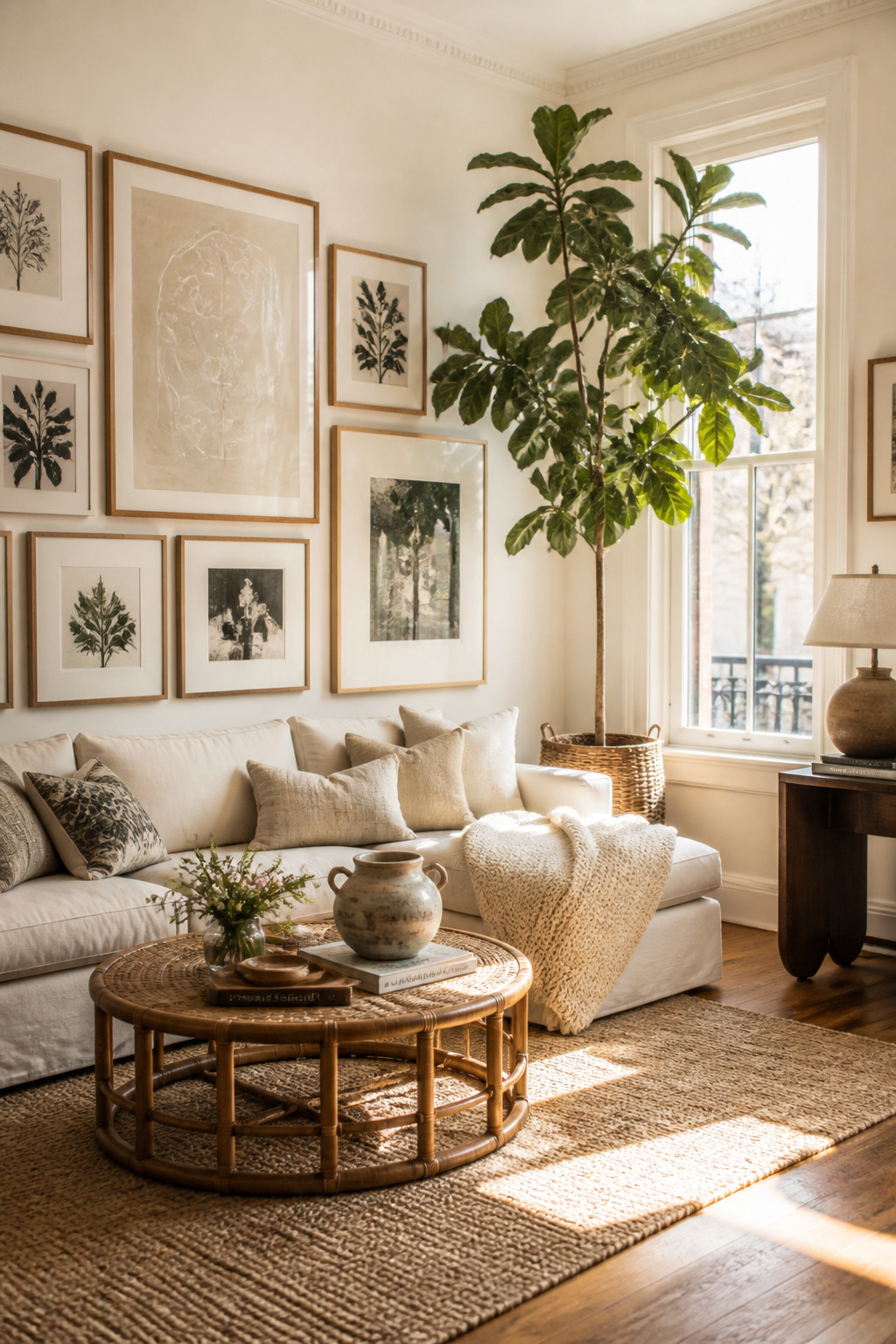
Cool whites contain blue undertones and optical brighteners. They read clean in the store and clinical on your walls. Warm whites contain yellow, cream, or faintly pink pigments. They make the room feel inviting rather than sterile. Benjamin Moore White Dove (OC-17) is the most-used warm white in professional interior design at around $55–65 per gallon. It works in virtually any light. Sherwin-Williams Alabaster (SW 7008) won their Color of the Year in 2016. It’s around $70–75 per gallon and has barely left the bestseller list since. Farrow & Ball Wimborne White (No. 239) is a creamy white with the chalky depth that Farrow & Ball’s pigments reliably produce.
Getting the Undertone Right
Test warm white samples against your sofa and flooring, not just the wall. The biggest mistake is choosing a warm white in the store, then finding it clashes with yellow tones in your wood floor or fights the cool grey of your sofa. The right warm white disappears into the background. If you see a clash when you hold the sample next to your main furniture, you’ll see it every day on the wall.
When Warm White Works Best
Warm white excels as a wall color when the room has real personality — art, interesting furniture, beautiful plants, or architectural detail. Also, it’s the right choice when you change textiles frequently. It works as a backdrop for virtually any palette you’ll ever own.
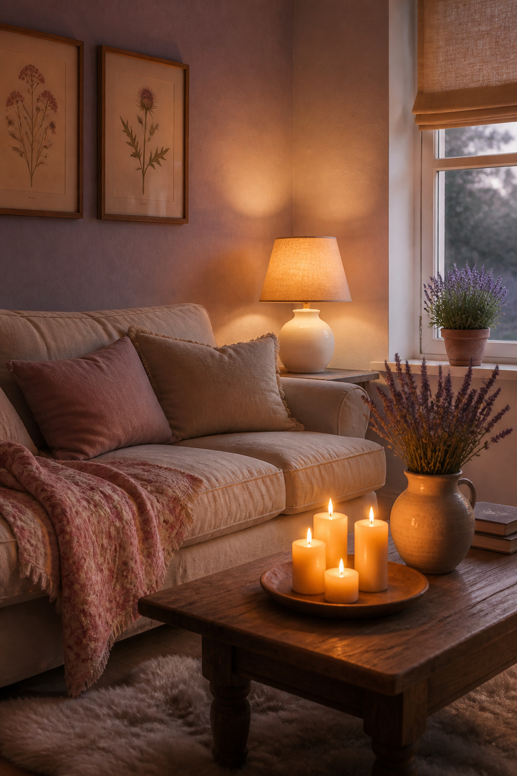
3. Deep Navy Blue as a Grounding, Dramatic Statement Wall
Navy sits at the cool, stable end of the blue spectrum. Psychologically, it reads as grounding rather than stimulating — associated with trust, depth, and security. For a living room that feels anxious or chaotic, navy is remarkably effective.
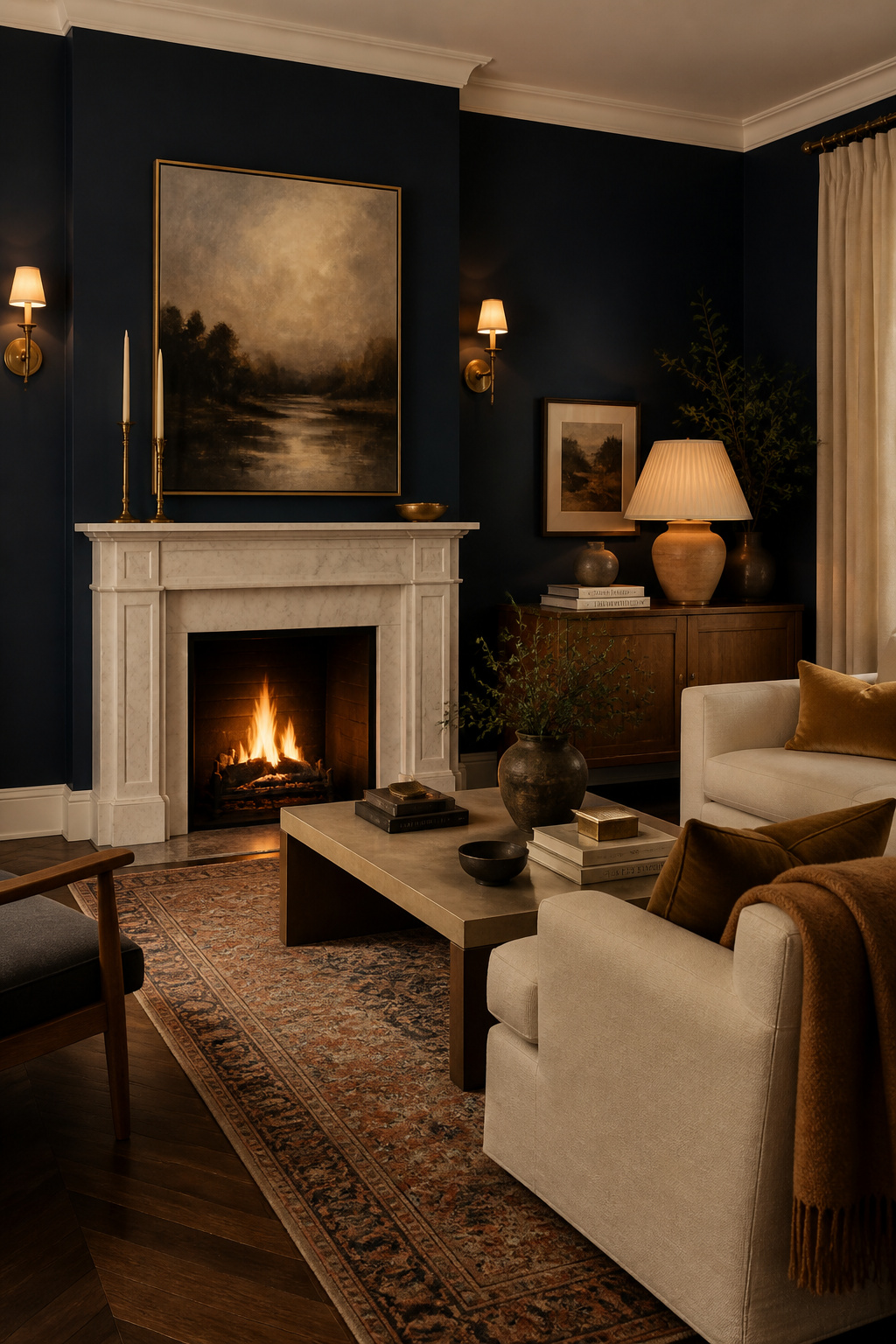
Farrow & Ball Hague Blue (No. 30) is a rich, slightly green-tinged navy. It’s one of the most photographed dark paint shades in design publications and has extraordinary visual depth. Benjamin Moore Hale Navy (HC-154) is a cleaner, slightly brighter navy and one of their bestselling Heritage Colors at around $55–65 per gallon. Sherwin-Williams Naval (SW 6244) was their 2018 Color of the Year — a pure, deep navy with minimal green or purple cast, and a modern classic.
One Wall vs All Four
As an approach, navy on a single chimney breast or fireplace wall creates drama without the cave effect. Full-room navy works in rooms with 9-foot or higher ceilings and generous natural light. In standard 8-foot rooms, start with one wall. Live with it for a season before extending.
Lighting for Dark Paint
Because navy absorbs light significantly, plan your lighting before you paint. Use at least three light sources — a floor lamp, a table lamp, and overhead — so the room has warmth and dimension at evening. Dark living room paint rewards good lighting design far more than pale colors do.
4. Warm Terracotta for an Earthy, Grounded Atmosphere
Terracotta takes its name from the Italian for ‘baked earth.’ That etymology tells you exactly what it does to a room. It connects you to natural materials, ancient craft traditions, and the warmth of sun-baked clay. In a world that feels increasingly digital and abstract, a living room painted in terracotta feels like coming home to something real.
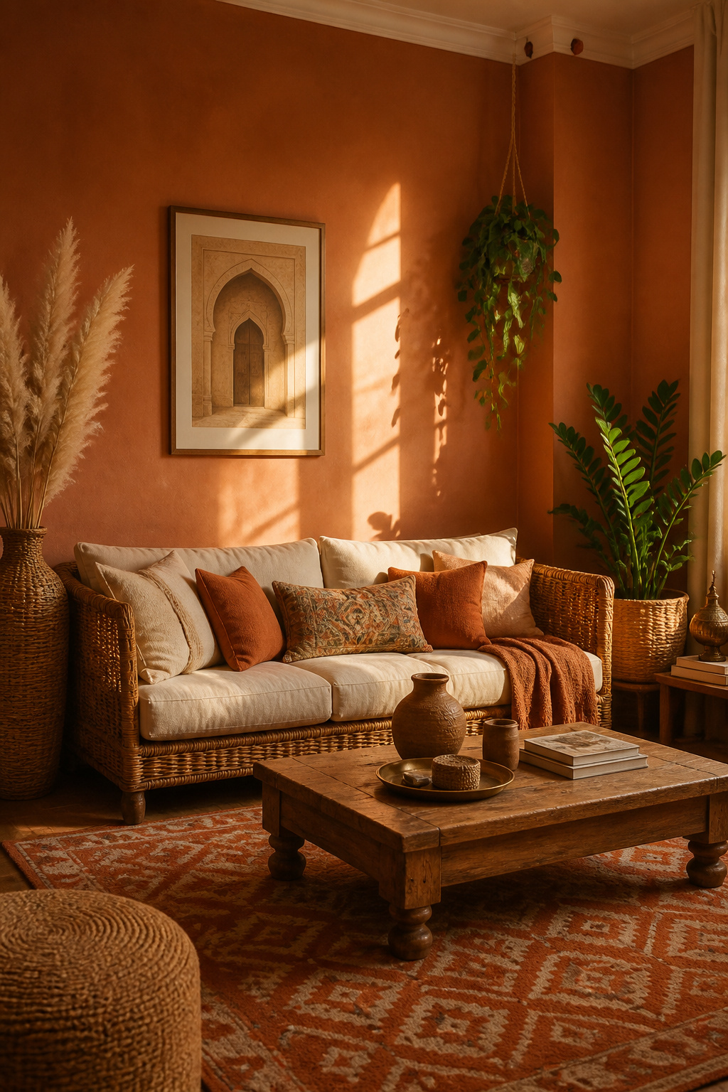
Biophilic design research supports earthy clay tones as reliable stress-reducers. They mimic natural environments — clay soil, desert rock, autumn leaves — that humans are evolutionarily primed to find safe and sheltering. Farrow & Ball Red Earth (No. 64) is a true, warm terracotta with orange-red depth. Clare Terra (approximately $49 per gallon) is a muted, dusty version popular for its sophistication. Benjamin Moore Yuma (2167-30) sits between peachy and clay — warm and versatile without the full intensity of a deeper shade.
Getting Undertones Right
Orange-leaning terracotta energizes. Pink-leaning terracotta softens. Brown-leaning terracotta grounds. For a living room, the brown-to-pink range is most calming. Look for shades described as ‘dusty’ or ‘muted’ rather than ‘vivid’ if you want comfort over drama. Also, avoid bright white trim with terracotta — it creates harsh contrast that disrupts the warmth you’re building. Cream or warm ivory trim feels far more integrated. For earthy, organic living room inspiration, rustic living room decor ideas cover the full natural material palette in detail.
Styling Terracotta Walls
Rattan, undyed linen, vintage ceramics, copper or brass hardware, natural jute rugs, and botanical prints all belong alongside terracotta walls. Anything handmade or tactile sits naturally here.
5. Classic Greige: Living Room Paint Colors That Stand the Test of Time
Greige — the paint world’s name for a grey-beige blend — has quietly dominated professional interior design for over a decade. It balances cool and warm undertones simultaneously. That makes it one of the most forgiving living room paint colors across different architectural styles, furniture palettes, and lighting conditions.
Benjamin Moore Pale Oak (OC-20) is a warm, light greige with barely-there pink undertones. At around $55–65 per gallon, it works in virtually any light. Sherwin-Williams Accessible Beige (SW 7036) is their bestselling greige at around $70–75 per gallon. It pairs with almost any flooring, which is why contractors love it. Farrow & Ball Elephant’s Breath (No. 229) is more complex — a grey-brown with cool lavender-grey undertones that reads sophisticated in formal and contemporary rooms alike.
Avoiding Muddy Greige
The muddy greige failure happens when competing undertones fight each other in your specific room light. A shade that looks clear in the store can look tired on your walls. Testing in your actual room is not optional with greige — it’s the most undertone-sensitive paint family you can choose.
Why Greige Outperforms Pure Grey
Greige outperforms pure grey in rooms with warm wood floors because the beige content harmonizes naturally with warm oak or walnut. Pure grey can feel clinical beside those tones. Also, greige is more forgiving when your furniture mixes warm and cool colors — which describes most real-world living rooms.
6. Dusty Blue for a Serene, Coastal-Inspired Calm
Research published in Color Research & Application found that blue-green and soft blue environments measurably reduced heart rate and self-reported anxiety. Dusty blue delivers this benefit in its most liveable form. It has enough grey content to stay quiet rather than vivid, calm rather than energetic.
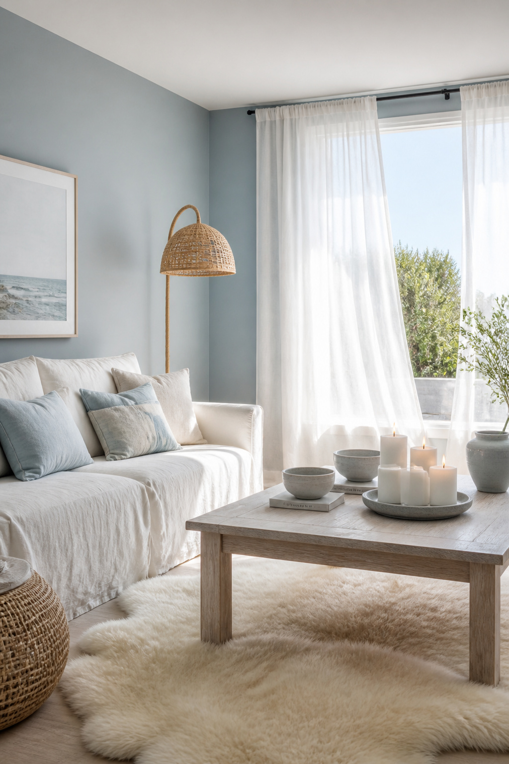
Sherwin-Williams Misty (SW 6232) is pale and grey-tinted — light and airy without reading ice-cold. Benjamin Moore Buxton Blue (HC-149) is a Heritage Color with a slightly deeper, green-hinted quality. Farrow & Ball Borrowed Light (No. 235) is arguably the most famous dusty blue in interior design. It appears almost white in bright rooms and distinctly, beautifully blue in shade. Farrow & Ball Skylight (No. 205) is a slightly deeper relative with excellent depth.
Why Dusty Blue Differs from Other Blues
Dusty blue gets its quality from significant grey content. That grey tempers the saturation, so the color feels quiet rather than corporate or energetic. Unlike slate blue or turquoise, dusty blue as a living room paint choice sits in a sweet spot between color and neutral. It works particularly well in smaller spaces where managing spatial volume is as important as color choice.
Pairing for Living Rooms
Natural linen, whitewashed oak, rattan, white or cream upholstery, and sand-toned textiles all work beautifully here. Also, use warm-toned bulbs (2700K) rather than daylight bulbs. Cool bulbs push dusty blue into institutional territory in the evenings, and that’s the opposite of what you want.
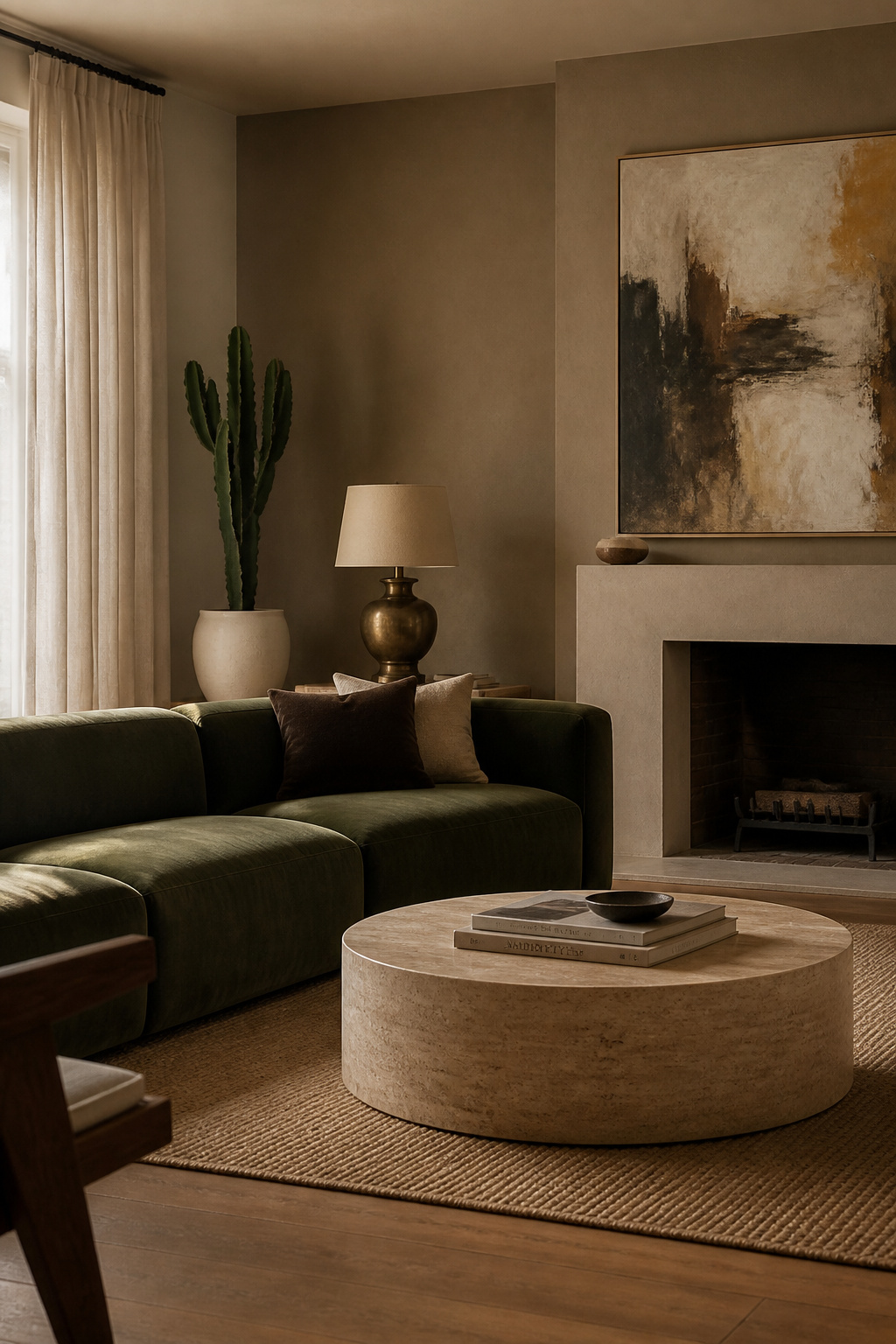
7. Moody Charcoal: A Bold Living Room Paint Choice That Feels Cozy
Most people fear dark living room paint. They worry about the space feeling small, gloomy, or hard to sell. But in practice, charcoal walls do something genuinely unexpected. They make large, cold rooms feel human-scale and intimate. They wrap the space around you rather than retreating away from you.
Farrow & Ball Railings (No. 31) is a dark, blue-tinted charcoal — one of the most photographed dark paint shades in design publications. Benjamin Moore Black Panther (2125-10) is a near-black charcoal with warm brown undertones. It reads less cold than pure black and more grounding. Sherwin-Williams Peppercorn (SW 7674) is a medium-dark charcoal with blue-grey undertones — a more accessible starting point if near-black feels like too much.
Finish Matters More in Dark Paint
With charcoal, finish is the detail most people overlook. Eggshell gives rich depth without excessive shine. Flat creates a sophisticated, velvety appearance — like the inside of a jewellery box — but shows marks more readily. Avoid satin or semi-gloss, which push a distracting sheen on dark walls and make the color look lighter than intended.
Warming Up Charcoal
Brass sconces, cognac leather, warm-toned wool throws, and aged bronze hardware prevent charcoal from reading cold. Also, white trim and ceiling create clean architectural contrast that stops the room from feeling monolithic. The key to charcoal walls is excellent lighting design. Plan for at least three separate light sources so the room has warmth and dimension at evening. If you want to see how warm paint tones can contrast this approach, these warm paint colors for living room walls offer a useful comparison.
8. Forest Green for a Biophilic, Nature-Connected Living Space
Biophilic design studies from the University of Exeter found that connecting living environments to natural elements reduced stress markers and improved focus. Forest green does this more directly than almost any other color. It takes the color of the canopy and puts it on your walls.
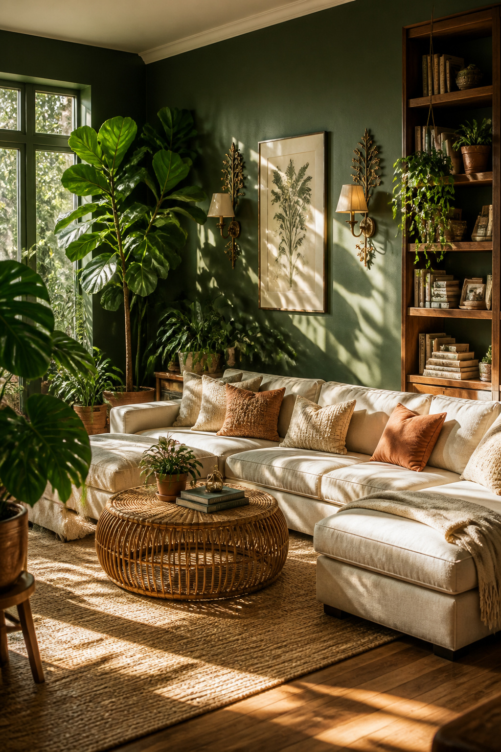
Farrow & Ball Calke Green (No. 80) is a mid-tone, slightly dusty forest green. It’s more sophisticated and less vivid than standard green paints, shifting between olive and forest depending on the light. Benjamin Moore Forest Green (2047-10) is a deeper, true forest tone with brown undertones — rich and grounding. Sherwin-Williams Hunt Club (SW 6468) is a traditional, earthy forest green — slightly more yellow-toned and warm in character.
Room Size and Light Conditions
Mid-tone forest green works in rooms from roughly 200–600 square feet. Very deep, near-black green works best in larger spaces or rooms with generous natural light. For north-facing rooms, choose blue-undertone greens like Calke Green to avoid the yellow-green shift that can occur in cool, indirect light. Always test in your room’s actual conditions.
The Botanical Styling Advantage
Large-leaf tropical plants amplify the biophilic impact significantly. A Monstera, fiddle-leaf fig, or tree fern in a terracotta pot against a forest green wall creates a living, breathing environment. Research shows it genuinely lowers the body’s stress response within minutes of entering the space. You’re not just painting the room. You’re building a sanctuary.
9. Earthy Mushroom Tones: Living Room Wall Colors With Quiet Depth
Mushroom tones sit precisely between warm grey and light brown. They have the neutrality of grey without the coldness, and the warmth of beige without reading dated. Interior designers shifted from grey to mushroom neutrals around 2021. Grey alone often feels clinical in residential settings. Mushroom, simply, works better.
Farrow & Ball Elephant’s Breath (No. 229) is the gold standard mushroom tone — a complex grey-brown that reads sophisticated in any room. Clare Chaise (approximately $49 per gallon) is a warm, contemporary greige-mushroom that photographs beautifully and has built a strong following. Benjamin Moore Pale Smoke (2116-60) sits at the lighter, slightly lavender-tinted edge of mushroom — more airy and good for smaller rooms. If you’re exploring the warm neutral family further, this guide to beige living room ideas covers related tones in depth.
Identifying True Mushroom
Hold your sample next to a warm white. True mushroom should look distinctly earthy by comparison. Also, hold it next to cool grey — a proper mushroom will read warmer. If the two look nearly identical, you’re looking at greige, which behaves differently in warm artificial light.
The Layering Strategy
The real appeal of mushroom is how well it receives layering. Velvet cushions in forest green or deep teal, linen throws in oatmeal, sisal rugs, and oak or walnut furniture all sit naturally against mushroom walls. Unlike bolder colors, mushroom stays neutral enough to evolve with your taste. So it won’t need repainting every time your style shifts.
10. Warm Butter Yellow to Brighten a North-Facing Living Room
Yellow is the color most associated with serotonin stimulation in color psychology research. Yellow-toned environments correlate with elevated mood, optimism, and social energy. But most yellow wall colors are too saturated to live with comfortably. Butter yellow is the exception — muted, creamy, and functional almost as a warm white with clear, visible character.
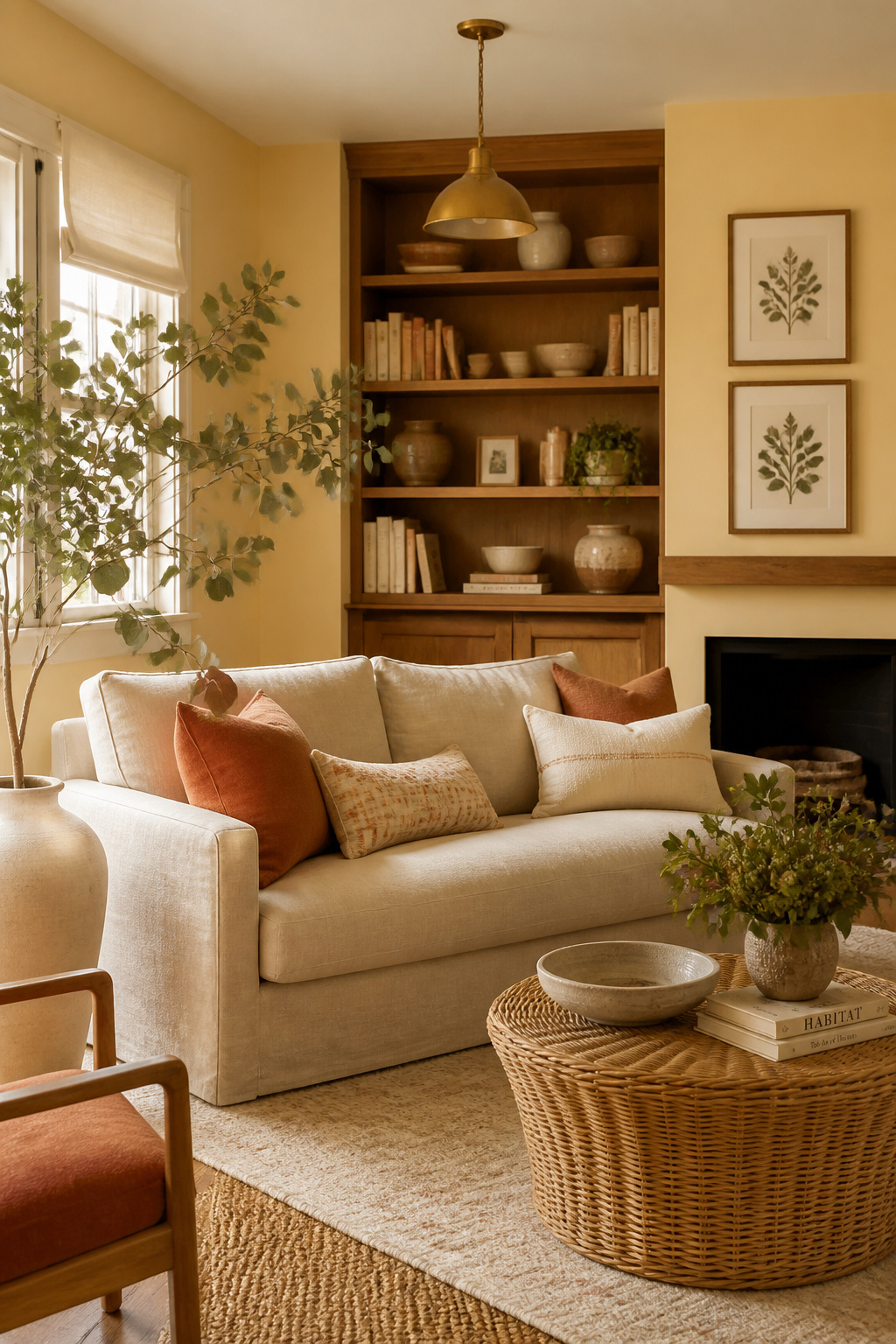
North-facing rooms receive only indirect daylight. The cool, grey-blue quality of northern light makes neutral and cool paint choices feel flat and cold. Warm living room paint in the butter yellow family effectively adds the impression of sunlight the room doesn’t naturally receive. Benjamin Moore Pale Straw (2020-60) is a whisper-soft butter yellow — it reads almost white in bright light but warmly yellow in lower light. Farrow & Ball Hay (No. 37) is a warmer, more obviously golden straw tone. Sherwin-Williams Butter Up (SW 6681) delivers medium-intensity warmth without entering lemon territory. For practical advice on building a warm palette, this guide to living room styling covers warm natural material pairings in detail.
The Yellow Amplification Problem
Yellow amplifies considerably on a large surface. If the sample looks slightly beige on the paint card, it will read as a perfect warm creamy yellow on four walls. That’s the rule of thumb: choose the softest, most muted version you’re considering. The paint will deliver warmth at scale without overwhelming the room.
Best Pairings
Natural rattan, cream trim, warm oak furniture, botanical greens, and soft terracotta accents all work well with butter yellow. Avoid bright white furniture or cool-toned grey upholstery — the contrast creates tension rather than the harmonious warmth you’re building.
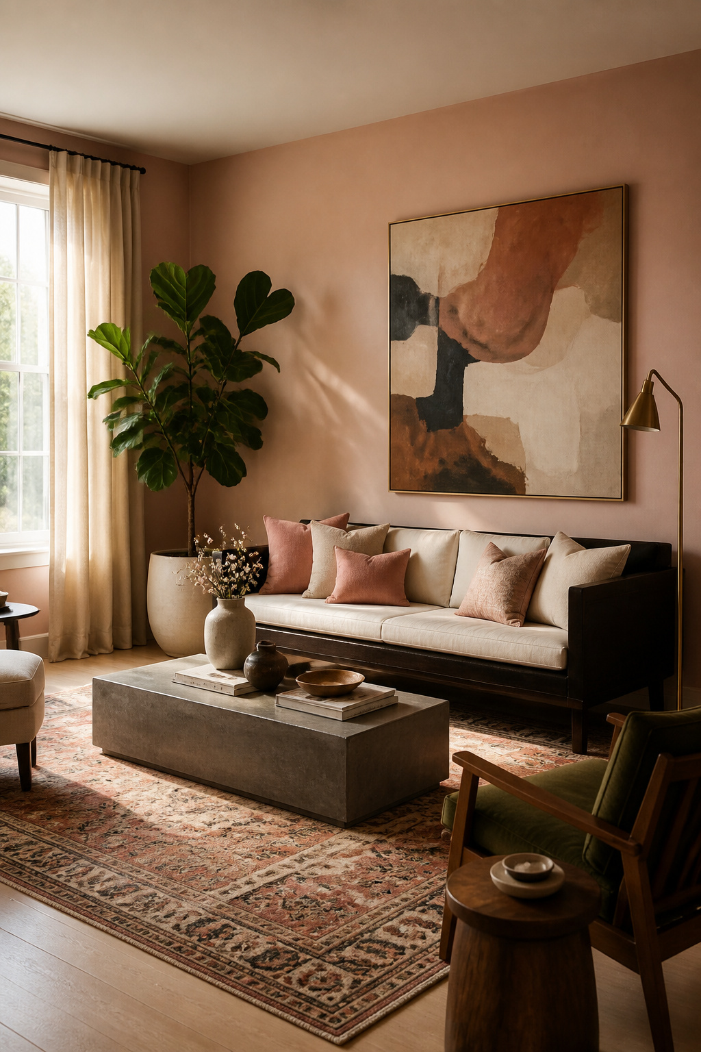
11. Soft Blush Pink for a Gentle, Welcoming Living Room
Sophisticated blush pink reads as a warm neutral — not a pink room. That distinction is entirely a matter of saturation. The key is choosing a shade where the color has been pulled back enough that pink reads as warmth rather than hue.
Farrow & Ball Pink Ground (No. 202) is a pale, sophisticated blush — warm without being sweet. It works in both traditional and contemporary rooms. Benjamin Moore Pale Blush (2173-70) reads as a pinkish off-white in most lights — a barely-there option for those who want warmth without the commitment. Clare Prickly Pear (approximately $49 per gallon) is slightly deeper and more clearly pink — better for rooms where you want the living room paint color to register more definitively.
Styling Blush Neutrally
The difference between sophisticated blush and nursery pink is the contrasting elements. Dark or natural wood floors and furniture balance blush’s softness effectively. Raw concrete accents — a coffee table, a lamp base — add industrial counterweight. Also, deep jewel-toned cushions in teal, navy, or forest green prevent the space from reading too gentle. A large vintage rug shifts the room into curated, collected territory.
The 60/30/10 Rule for Blush Walls
Use blush as the 60% (walls), then bring in 30% of a contrasting neutral — a dark walnut, a cool charcoal, a raw linen — that’s distinctly different in undertone. The remaining 10% is your accent color. That contrast is what reads ‘intentional adult living room.’ Without the grounding 30%, blush walls become the whole story.
12. Soft Lavender: Living Room Paint That Promotes Rest and Calm
Lavender the color borrows its calming associations from lavender the plant, which has genuine clinical evidence for anxiety reduction. In color psychology, that association transfers — the color cue alone triggers a relaxation response in many people, making it one of the more psychologically active colors to put on a living room wall.
The key to sophisticated lavender is high grey content. Pure saturated purple reads decorative and childish. A grey-washed lavender reads as a complex neutral that happens to carry a faint violet quality. Sherwin-Williams Positive Vibes (SW 9108) is a muted, cool lavender-grey — elegant and barely-there. Farrow & Ball Brassica (No. 271) is deeper and more dusty — a botanical purple that works in larger rooms and creates genuine drama. Benjamin Moore Violet Mist (2071-60) is light and airy, soft enough to read almost as a pale grey with pink-purple notes. It’s an accessible entry point into lavender for any living room.
Pairing to Keep Lavender Sophisticated
Natural wood, warm cream textiles, matte brass hardware, and raw linen work well alongside lavender. Avoid chrome, cool grey furniture, or stark white upholstery. These push lavender too cool and make it look more purple than intended. Instead, lean toward warm, organic materials that ground the color’s delicate quality.
The Ceiling Trick
If lavender feels too much of a commitment on all four walls, try it on the ceiling only. A pale lavender ceiling above white or cream walls creates a hazy, dreamy quality — like late afternoon light — without the full psychological impact of full-room lavender. It’s also a practical way to test the color’s effect before committing to the walls.
13. Crisp Off-White for a Timeless, Versatile Living Room Backdrop
Pure brilliant white — the default in most standard paint ranges — contains optical brighteners that reflect blue light and create a cold, clinical quality. Off-white is the professional alternative. It contains small amounts of cream, yellow, or faintly pink pigment that soften the brightness and make the room feel genuinely inviting.
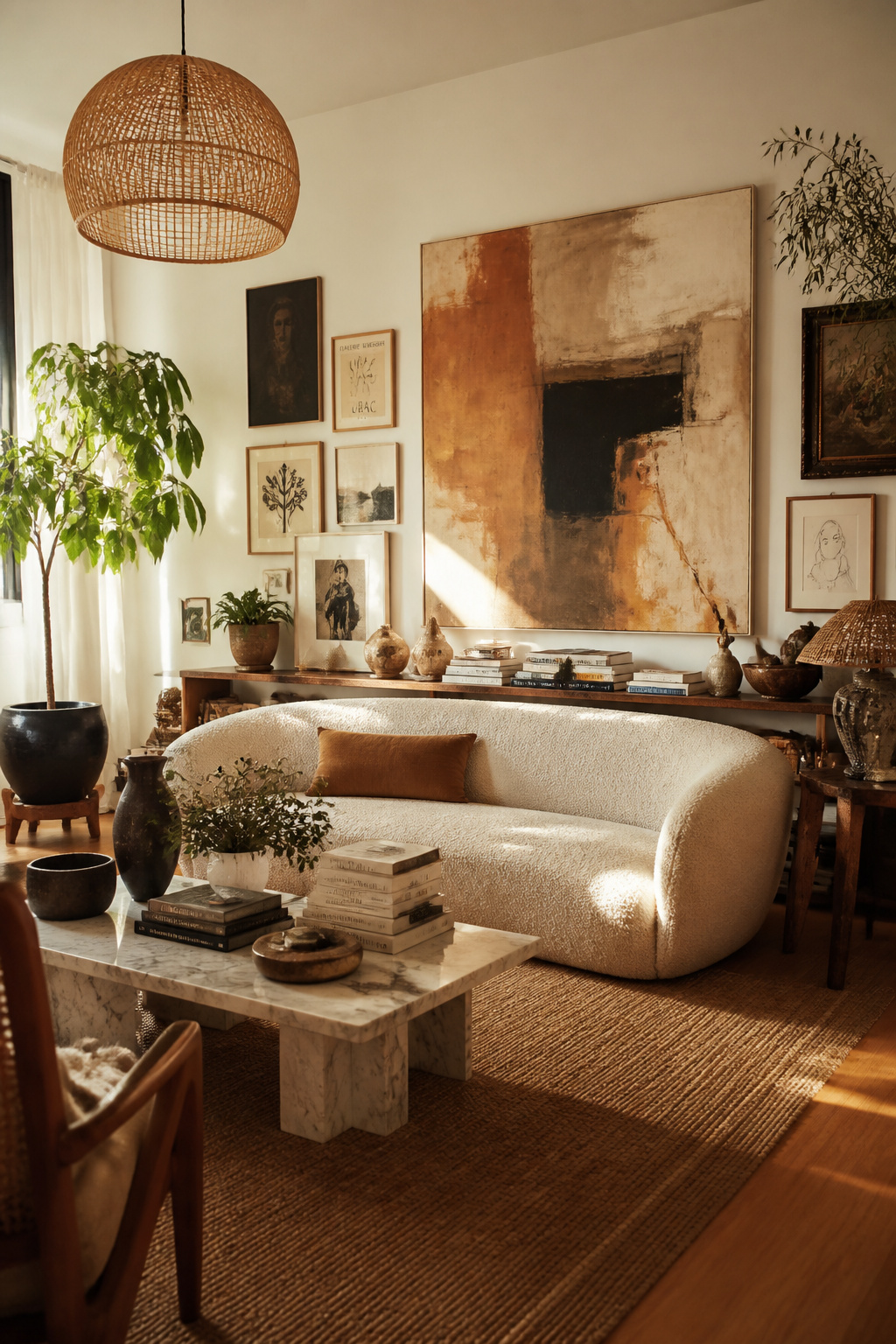
Benjamin Moore Chantilly Lace (OC-65) sits between pure white and warm white — clean and crisp without blue-tone coldness. It’s one of the most popular whites in contemporary interiors. Farrow & Ball All White (No. 2005) is warm in undertone but not creamy, avoiding the yellow cast that some off-whites develop. Sherwin-Williams Extra White (SW 7006) is a clean, cooler-leaning white without optical brightener coldness, well-suited to contemporary rooms that need a fresh, clear quality.
The Printer Paper Test
Hold your off-white sample next to plain printer paper. If the sample looks definitively creamy or warm by comparison, it has enough warmth to work as a living room wall color. If the two look nearly identical, you’re buying brilliant white with a premium label. You want a visible, clear difference.
When Off-White Excels
Off-white excels as a backdrop for art collections, books, and textile-forward rooms. It keeps the eye moving to objects rather than walls. Also, consider how it interacts with your flooring — this living room flooring guide covers how wall color and floor tone work together in different light conditions.
14. Rich Burgundy: A Living Room Paint Color for Cozy Intimacy
Burgundy and deep wine tones create visual weight. They advance toward the viewer rather than recede. This makes large, high-ceilinged living rooms feel more human-scale and intimate. If your living room feels too cavernous, burgundy on the walls is often more effective than adding more furniture.
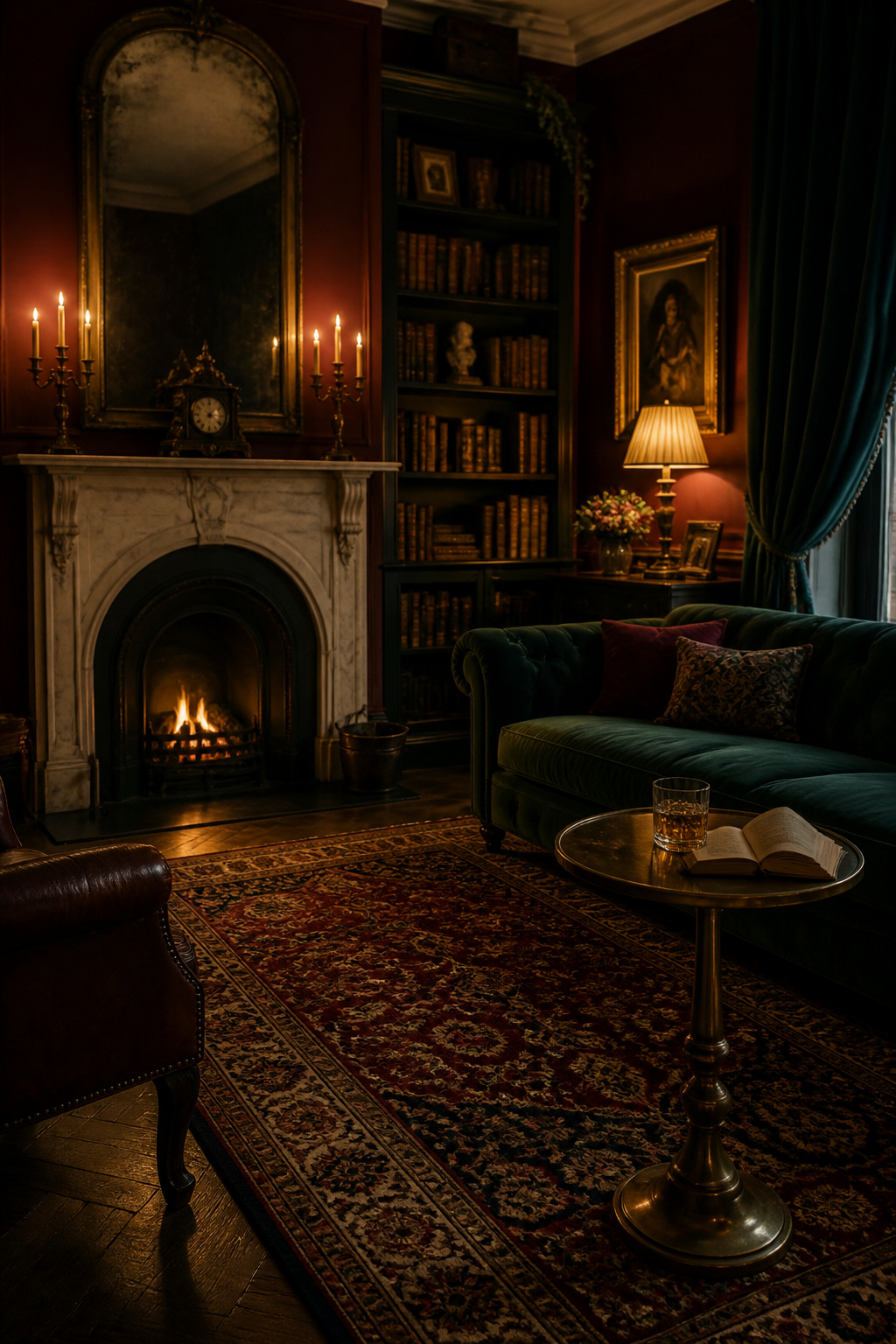
Farrow & Ball Preference Red (No. 297) is a rich, complex burgundy-red with brown undertones — more sophisticated than pure red, earthy and muted rather than vivid. Benjamin Moore Cabernet (2006-10) is a classic, jewel-toned burgundy — deep and lush without leaning purple. Sherwin-Williams Merlot (SW 6281) sits in warm burgundy-red territory with deep brown depth, a reliable choice for rooms that need warmth and weight.
Where Burgundy Works Best
Burgundy works particularly well in formal or evening-use living rooms — entertainment spaces, dining-adjacent rooms, and spaces you use primarily after dark. For formal living room design principles that pair naturally with rich, deep living room paint colors, the formal living room guide covers architectural and material considerations in detail.
Getting the Most From Burgundy
Metallic pairings make or break burgundy. Aged brass, antique gold, and bronze echo the warmth without clashing. Chrome creates a jarring cold-warm collision that undermines everything you’re building. Dark wood furniture complements burgundy naturally. For a more contemporary space, one chimney breast or alcove wall in burgundy — with the remaining walls in warm off-white — creates intimacy without full saturation.
15. Pale Blue-Grey for a Scandinavian-Inspired Living Room
Hygge — the Danish concept of coziness and contentment — is closely associated with neutral, muted interiors. Pale blue-grey is a key color in that palette. It evokes winter light diffused through linen curtains and the quality of a grey-sky morning where everything inside feels warmer by contrast.
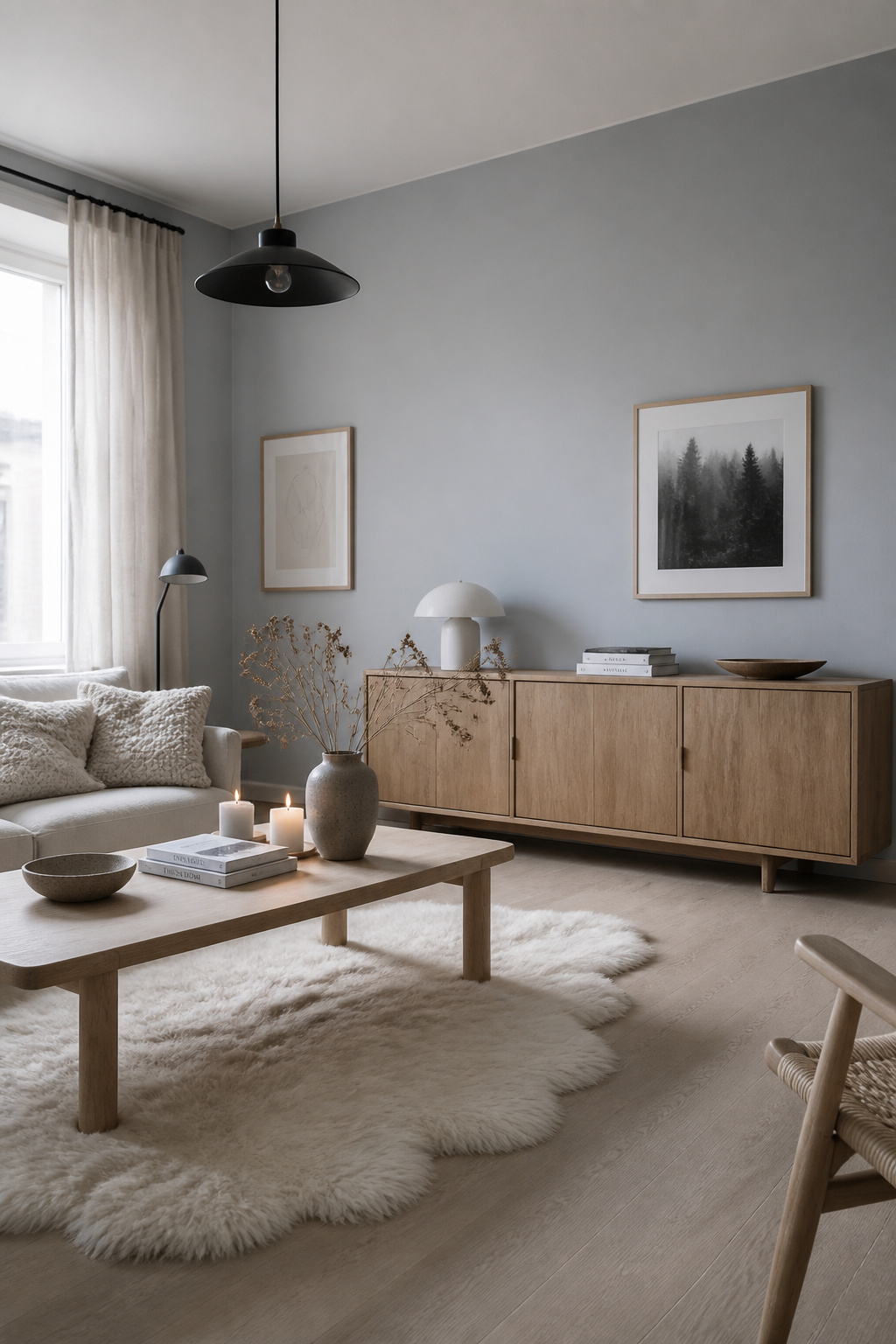
Pale blue-grey sits between cool and warm in a way that avoids the coldness of pure grey and the energy of saturated blue. Farrow & Ball Skylight (No. 205) is a cool, subtle shade that shifts noticeably between warm and cool depending on the hour of day. Benjamin Moore Sea Salt (2137-60) is lighter and slightly green-tinted — airy and coastal-adjacent. Sherwin-Williams Iceberg (SW 6476) is a clean pale blue with greyed undertones — fresh without starkness.
The Hygge Principle in Practice
Scandinavian color philosophy favours restraint and coherence. Pale blue-grey walls work best when the entire room stays within the same cool-neutral palette. Warm terracotta or earthy orange accents create a clash that undermines the calm. Stay within natural, organic materials: pale oak, sheepskin, knitted wool in oatmeal and white, undyed linen, simple black iron fixtures.
Light Sensitivity
Pale blue-grey performs best in rooms with good natural light. In a darker north-facing room, warm the scheme with organic textures and amber-toned bulbs (2700K rather than daylight 5000K). For smaller rooms where pale blue-grey creates useful spatial illusion, these small living room ideas cover how to pair a pale living room paint color with minimal furniture to maximum effect.
How to Choose the Right Living Room Paint Color for Your Space
Choosing living room paint comes down to three questions most people skip when they’re standing in the paint aisle.
First: how do you actually use this room? A living room for loud family gatherings needs different paint psychology than one you primarily use for quiet reading. Energizing colors — warm yellow, terracotta, confident greige — serve the first. Calming colors — sage, dusty blue, soft lavender — serve the second. Most living rooms do both at different times. So the safest approach is to anchor the room in a calming neutral and introduce energy through lighting and textiles rather than paint.
Second: what light do you have, and when? North-facing rooms need warmth — butter yellow, terracotta, greige, or warm white. South-facing rooms handle cool tones beautifully because direct sunlight warms the space regardless of the wall color. East-facing rooms are warm in the morning and cool in the afternoon. Blush and sage serve both halves of the day well.
Third: what are you keeping? Your flooring, your largest sofa, and your main rug are unlikely to change when you paint. Test samples against all three before committing. A living room paint color that fights your oak floors, your grey sofa, or your patterned rug will not improve with time.
If you genuinely can’t decide between two shades, buy sample pots of both. Paint 30×30cm patches on three different walls. Photograph them at 8am, 12pm, and 8pm. One will consistently look right in your room’s light. Trust that observation over the sample card and over the brand’s recommendation. Your room is the only one that counts.