Most people believe green kitchen cabinets are a risky trend. Home improvement forums warn against them. But green has appeared on cabinetry in nearly every generation since homes had kitchens worth decorating. I’ve spent 12 years restoring kitchens from the 1890s through the 1970s. Green is not a gamble. It’s a homecoming.
These 18 green kitchen cabinets ideas cover everything from pale mint to deep forest. Each shade has genuine design roots. I’ll walk you through hardware pairings, finish decisions, and shade choices — the specifics that separate a kitchen that looks considered from one that just looks painted.
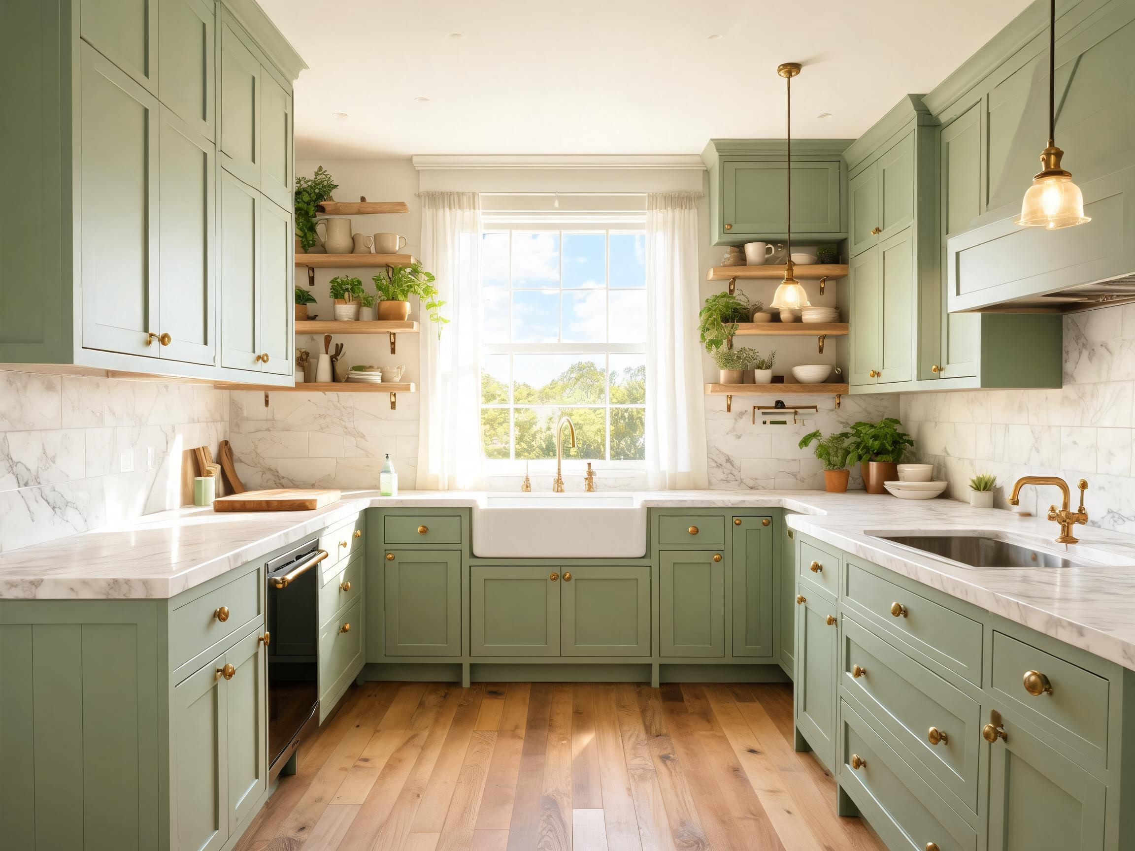
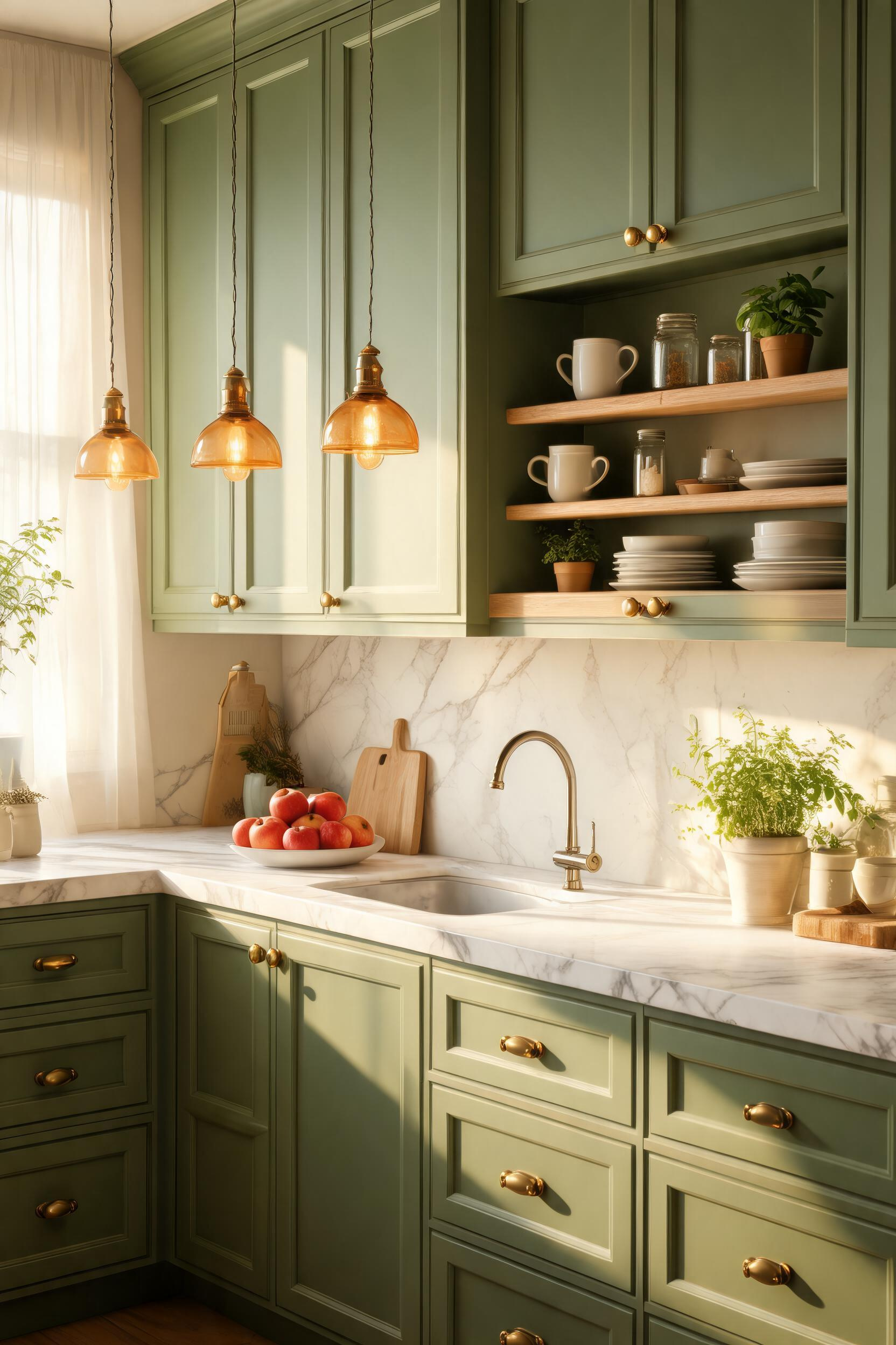
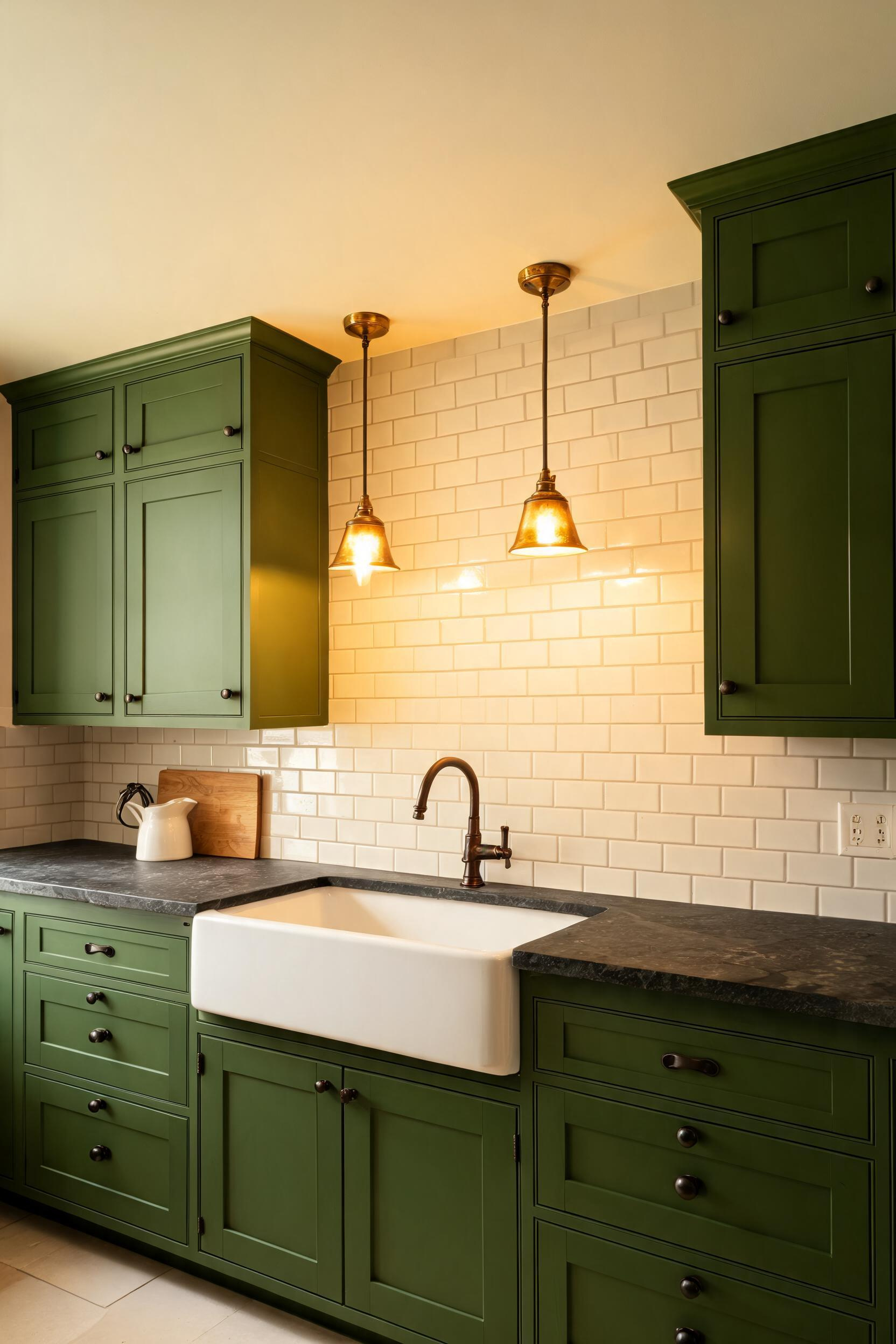
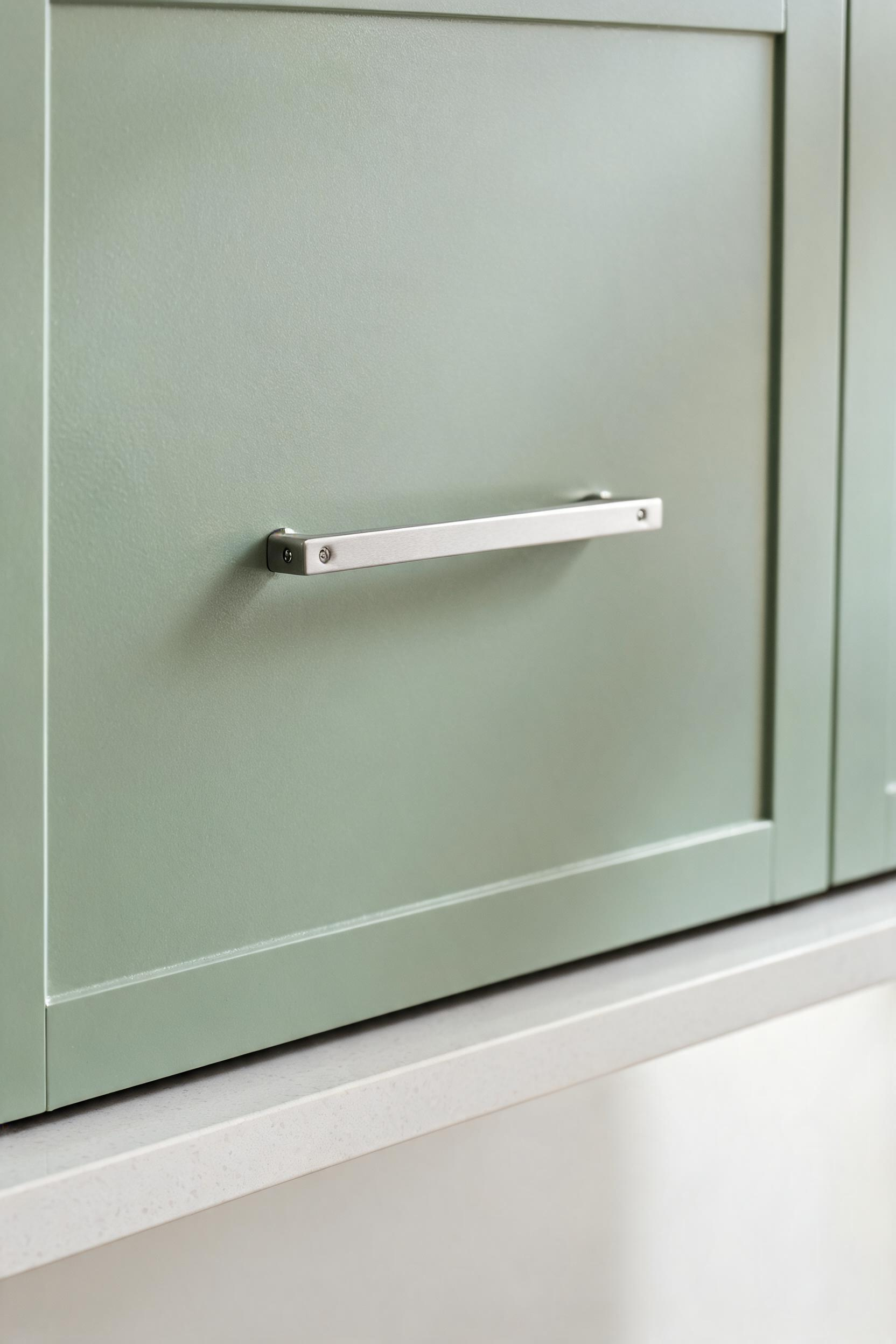
1. Sage Green Cabinets With Warm Brass Hardware
Sage green and warm brass is the pairing I recommend most when someone asks where to start with green kitchen cabinets. It works because sage sits in a rare middle territory. It’s warm enough to feel cozy, cool enough to feel fresh. Brass mirrors those same contradictions.
Why This Pairing Works Across Decades
Sage green reads differently depending on your kitchen light. In morning sun it can look almost yellow-green. Under cool overhead lighting it leans more grey-green. Unlacquered brass adjusts with it, shifting tone as it ages. That aging process improves the pairing rather than fighting it.
Choosing the Right Sage
Benjamin Moore Pale Sage (HC-110) runs warm and slightly grey. Farrow & Ball Mizzle (No. 266) runs cooler and more mineral. Sherwin-Williams Rosemary (SW 6187) sits in the middle. Test any sage sample across a full day of light. The color shifts more than most people expect.
Pro Tip: Mix Flat and Satin Finishes
Paint cabinet boxes in flat finish and doors in satin. The flat base feels more solid and less plasticky. Satin doors clean without showing every fingerprint.
2. Forest Green Lower Cabinets Paired With White Uppers
Forest green on lower cabinets with white uppers is the most structurally sensible two-tone kitchen. Dark-lower-light-upper mimics the way we see nature — dark earth below, bright sky above. Our eyes find it immediately comfortable.
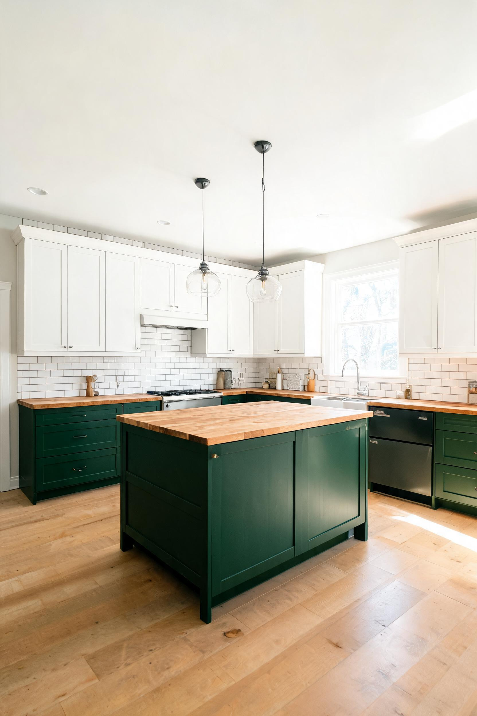
The Two-Tone Logic: Weight and Proportion
Forest green has real visual weight. Used on all cabinets, it can feel heavy. Used only on the lowers, it grounds the kitchen without closing it in. In kitchens under 200 square feet, this genuinely changes how spacious the room feels. For context on what an all-white palette achieves instead, these timeless white kitchen ideas are worth comparing.
Best Forest Greens for Lower Cabinets
Behr Salamander (N410-7), Benjamin Moore Forest Green (2047-10), and Valspar Sage Leaf (5006-2B) are all reliable choices. I prefer paints with LRV values above 12 for lower cabinets that face into the room rather than windows. Darker LRV values in shadow zones can read almost black under certain conditions.
Countertops That Bridge Both Colors
Butcher block is the most forgiving countertop when you have forest green below and white above. Warm-toned quartz like Caesarstone Windmill also works. Avoid cool grey quartz, which makes forest green appear muted and lifeless.
3. Hunter Green Kitchen Cabinets for a Timeless Shaker Look
Hunter green kitchen cabinets have appeared in American homes since at least the late Victorian period. Green was standard in kitchen and utility spaces long before the white-kitchen obsession of the 20th century took over. That history is part of why hunter green feels settled rather than novel.
Why Hunter Green and Shaker Doors Work Together
Shaker doors have a flat recessed panel and clean rail lines. Hunter green settles into those recesses and creates shadow definition that reads beautifully at any scale. Ornate cabinet doors with carved details can look busy in deep greens. Shaker’s restraint lets the color do the work.
Hardware: Oil-Rubbed Bronze vs Matte Black
Oil-rubbed bronze warms hunter green and gives it period-authentic quality. Matte black is sharper and more contemporary — it makes hunter green feel slightly more urban without losing depth. Both work. Match your hardware metal family across your faucet, light fixtures, and cabinet pulls for cohesion.
All Cabinets vs Accent Only
All-hunter-green kitchens work in larger rooms with strong natural light. In smaller kitchens, limit hunter green to the island or lower cabinets. Dark cabinets above dark hardwood floors can collapse a space visually. Lighter countertops and a pale backsplash provide essential breathing room.
4. Mint Cabinets That Bring 1950s Retro Charm Into Today
Mint green is the cabinet color that makes me most nostalgic. It carries the entire postwar American optimism — the gleaming, modern-but-friendly kitchen of 1953. In the right setting, mint green cabinets feel both vintage and completely fresh.
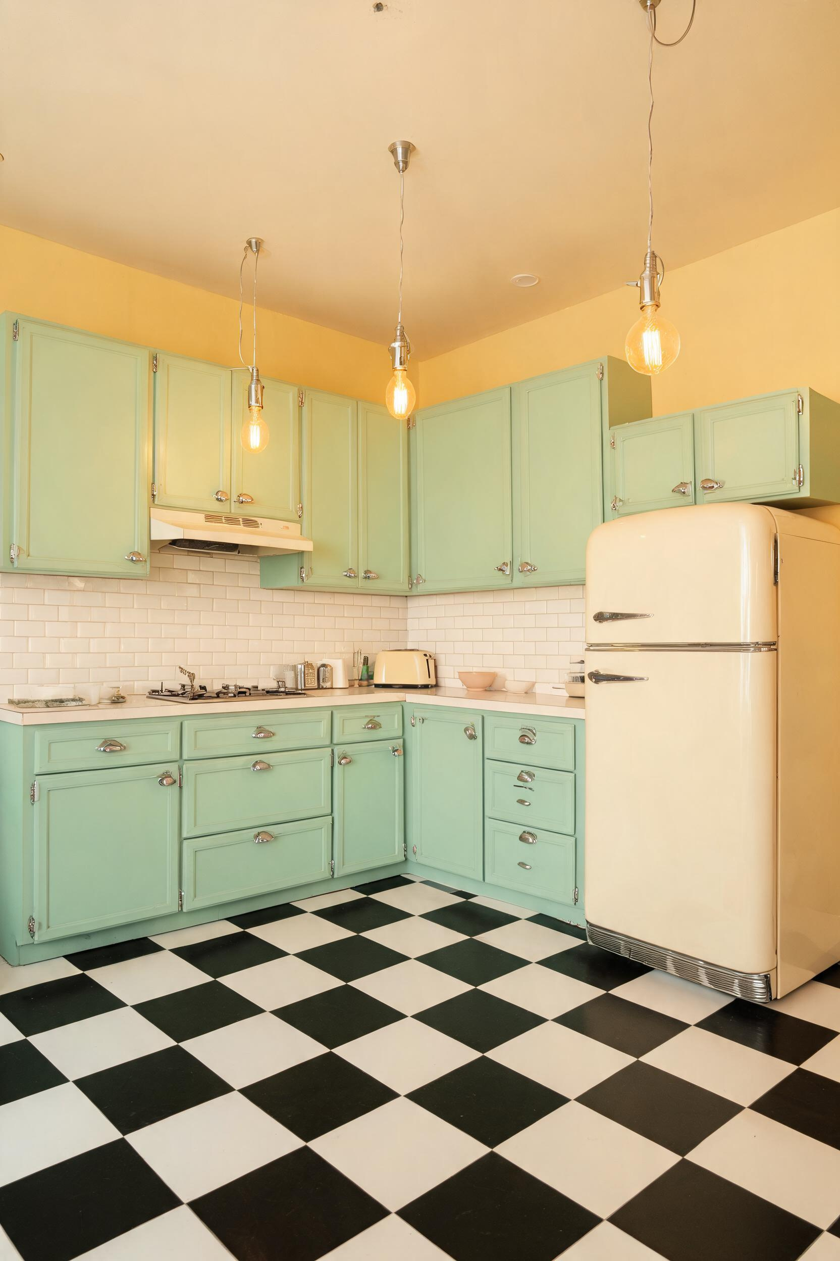
The History of Mint in Postwar Kitchens
American appliance manufacturers between 1945 and 1965 — GE, Frigidaire, Hotpoint — produced appliances in soft greens they called Turquoise, Sea Foam, and Jade. Cabinet makers matched them. That palette was a deliberate marketing decision. The kitchens survive in original condition across the Midwest. They are genuinely beautiful, not just nostalgic.
Sourcing Vintage-Style Mint Hardware
Chrome cup pulls and bin pulls in the 1950s style are available from Rejuvenation, House of Antique Hardware, and D. Lawless Hardware. Prices run from $4 to $22 per piece. Original chrome pulls found at estate sales are invariably better quality than modern reproductions.
Matching Retro Appliances
Big Chill and Smeg both make refrigerators and ranges in mint and sea-foam tones. Big Chill’s Mint colorway runs $3,299 for the Pro Refrigerator. For flooring, 12-inch black and white ceramic checkerboard tile costs $2–$5 per square foot and is still made in both porcelain and encaustic cement.
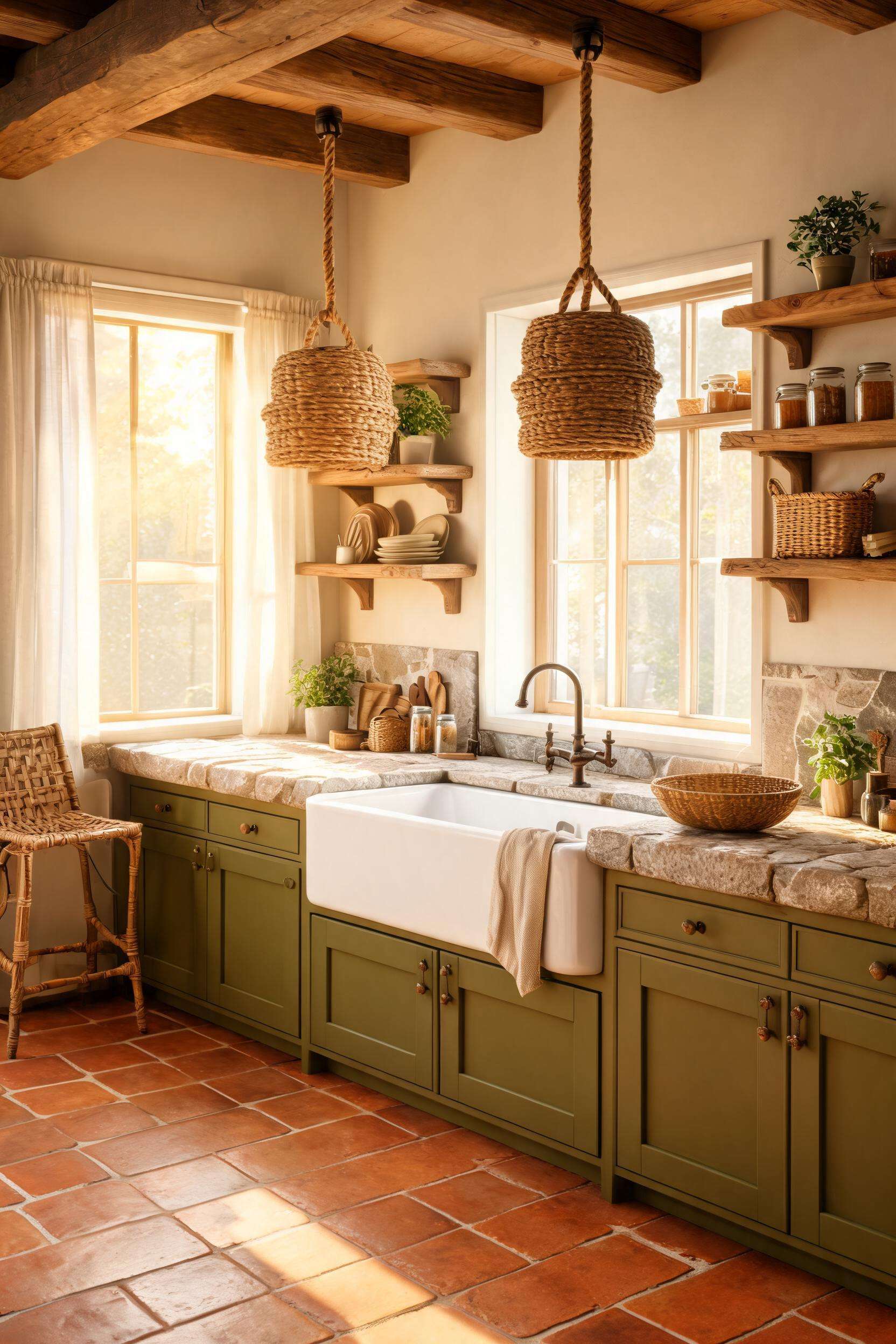
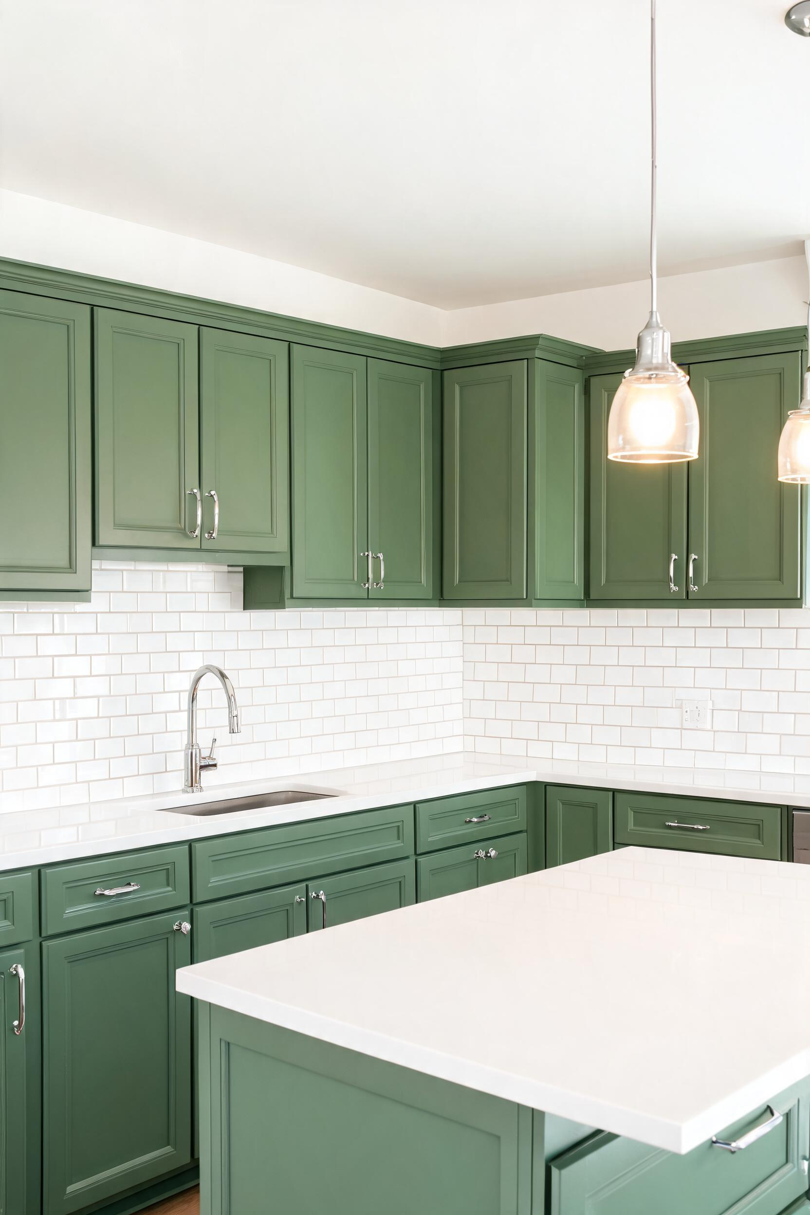
5. Olive Green Kitchen Cabinets in Earthy Farmhouse Settings
Olive green kitchen cabinets occupy a category harder to define than sage or hunter. Olive sits between green and brown. That means it pairs naturally with nearly every earthy material in a farmhouse kitchen — wood, stone, terracotta, linen — without needing a separate neutral to bridge the gap.
Olive vs Sage: What Makes Each Distinct
Both are muted greens, but their undertones differ. Sage leans grey or blue-green. Olive leans yellow-brown or khaki. Sage reads clean beside white tile. Olive reads warm and slightly aged beside stone or wood. Match the green undertone to your dominant material’s undertone.
Pairing With Natural Stone and Wood
Olive green cabinets beside soapstone countertops look genuinely spectacular. The dark grey of soapstone and the yellow-brown of olive share an earthy mineral quality. For open shelving, medium-tone oak at its natural tone is ideal. Very light woods read as unfinished beside olive; very dark ones fight for visual weight.
Reliable Paint Options Under $60 Per Gallon
Sherwin-Williams Basil (SW 6194) at $42–$50/gallon mixes into their Emerald cabinet enamel for excellent durability. Benjamin Moore Dried Thyme (CSP-810) at $55–$65/gallon works beautifully in their Advance alkyd formula. Both hold up in high-traffic kitchens without constant touch-ups.
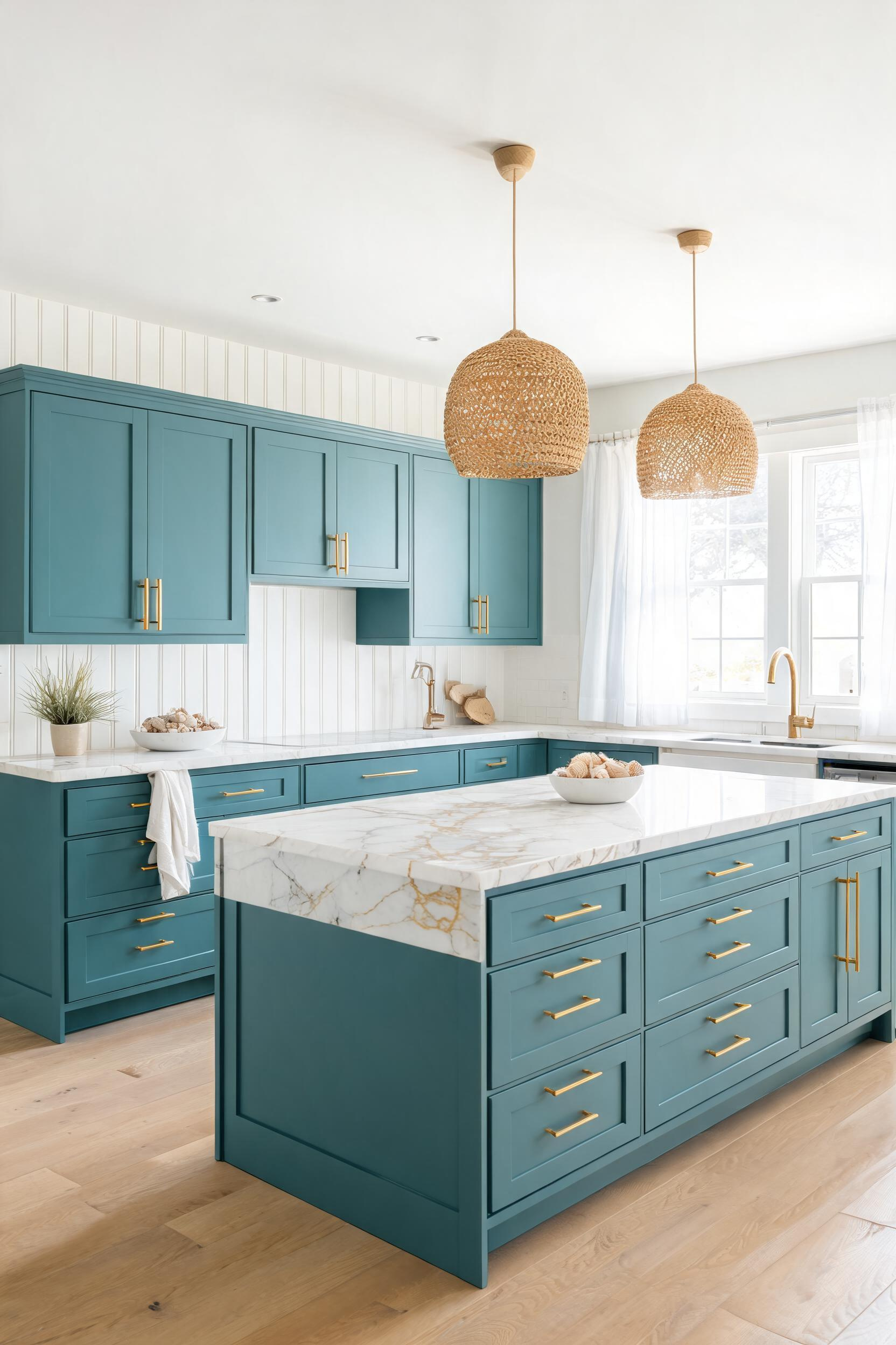
6. Emerald Green Island Cabinets as a Kitchen Focal Point
An emerald green kitchen island is one of the most effective single investments in a neutral kitchen. It gives the room a focal point, a jewel-tone shot of personality, and — because it’s contained to the island — none of the risk that comes with painting every cabinet a saturated color.
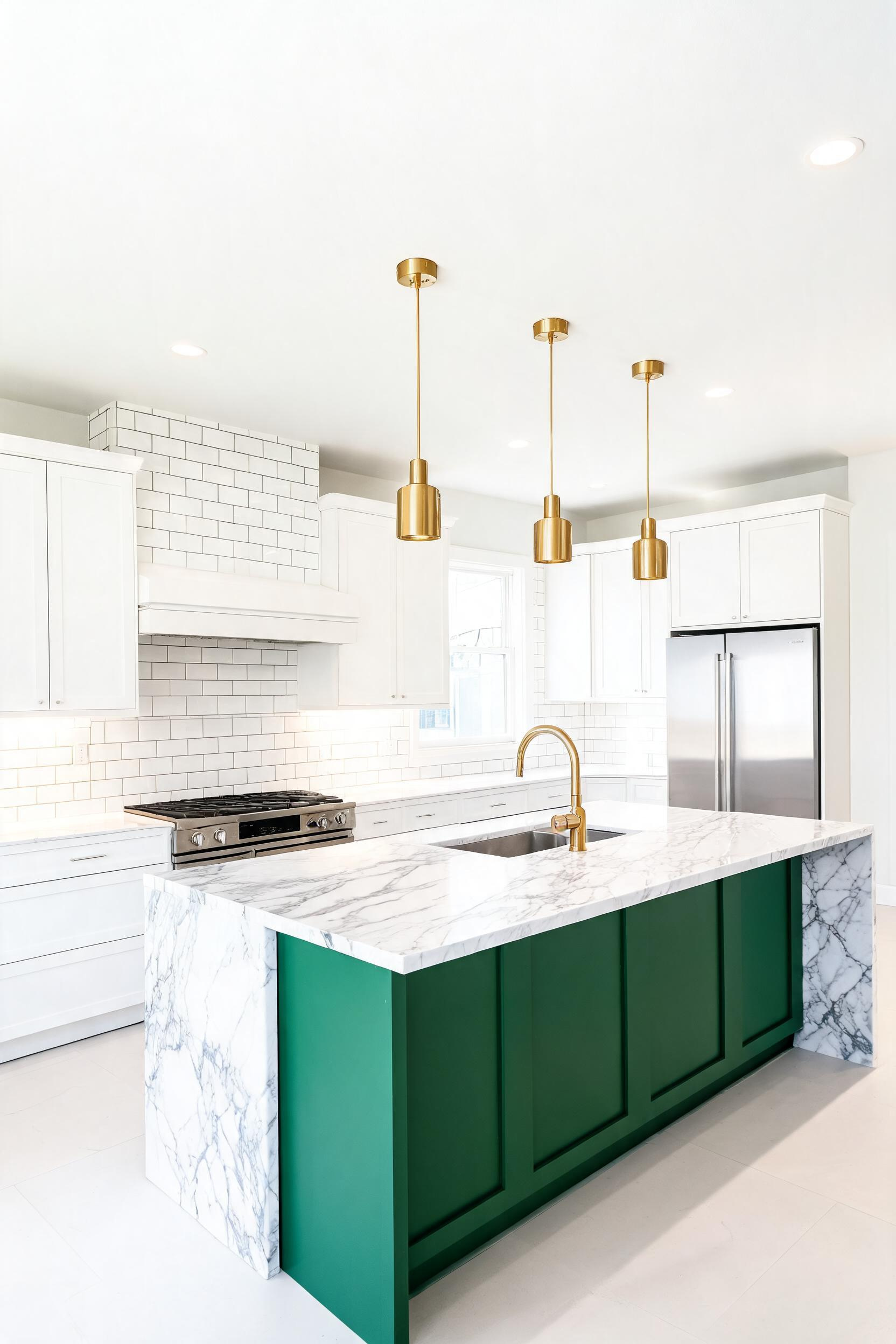
Why Emerald Works Best as an Island Accent
Emerald is saturated and visually loud. On all cabinets, it overwhelms. On an island, it acts like a statement piece of furniture — chosen deliberately and appreciated from every seat. It also lets you keep perimeter cabinets in white or cream, which prevents the space from darkening. Before committing to an island treatment, these kitchen island cabinet options cover the structural choices that come before the color decision.
Countertop Materials That Complement Jewel Tones
White Carrara marble on an emerald island looks stunning. The white-with-grey-veining plays against the deep green with beautiful tension. Calacatta Gold quartz at $55–$85/sq ft installed is a more budget-friendly alternative. Black soapstone gives a more dramatic result that works in larger kitchens.
Lighting the Island to Make Emerald Pop
Pendant lights in aged or unlacquered brass work above emerald islands. The warm metal catches the green’s depth without competing with it. Aim for pendants between 20 and 28 inches wide on islands over 6 feet long. Use LED bulbs at 2700K to keep the emerald looking rich rather than harsh.
7. Painted Green Cabinets: Picking the Right Finish for Every Style
Picking a finish type is as consequential as picking the color itself. The wrong finish can make even a beautiful green look cheap, plasticky, or impossible to maintain. This is the section I wish someone had written for me before my first kitchen repaint.
Matte vs Eggshell vs Satin
Matte absorbs light and makes greens look deeper and more sophisticated. But it marks easily and is harder to wipe clean. Eggshell has a slight sheen and is the best all-purpose finish for cabinet doors using latex paint. Satin is the most durable option for doors and drawer fronts. For cabinet interiors, semi-gloss is the practical choice.
How to Prep Cabinets Before Painting Green
Degreasing is non-negotiable. Kitchen cabinets accumulate cooking oil residue that paint won’t bond to properly. TSP or Krud Kutter removes it reliably. After cleaning, sand lightly with 220-grit, then apply a bonding primer before your green topcoats. If you’re updating existing cabinets rather than replacing them, these strategies for modernizing kitchen cabinets sustainably cover the prep mistakes that ruin most DIY cabinet repaints.
Best Cabinet Paints for Durability
Benjamin Moore Advance (alkyd formula, $60–$75/gallon) levels beautifully and hardens over 30 days into a surface that takes real abuse. Sherwin-Williams Emerald Urethane Trim Enamel is comparable and more widely available. Regal Select is a step below in hardness but more forgiving on application technique — useful for a first cabinet-painting project.
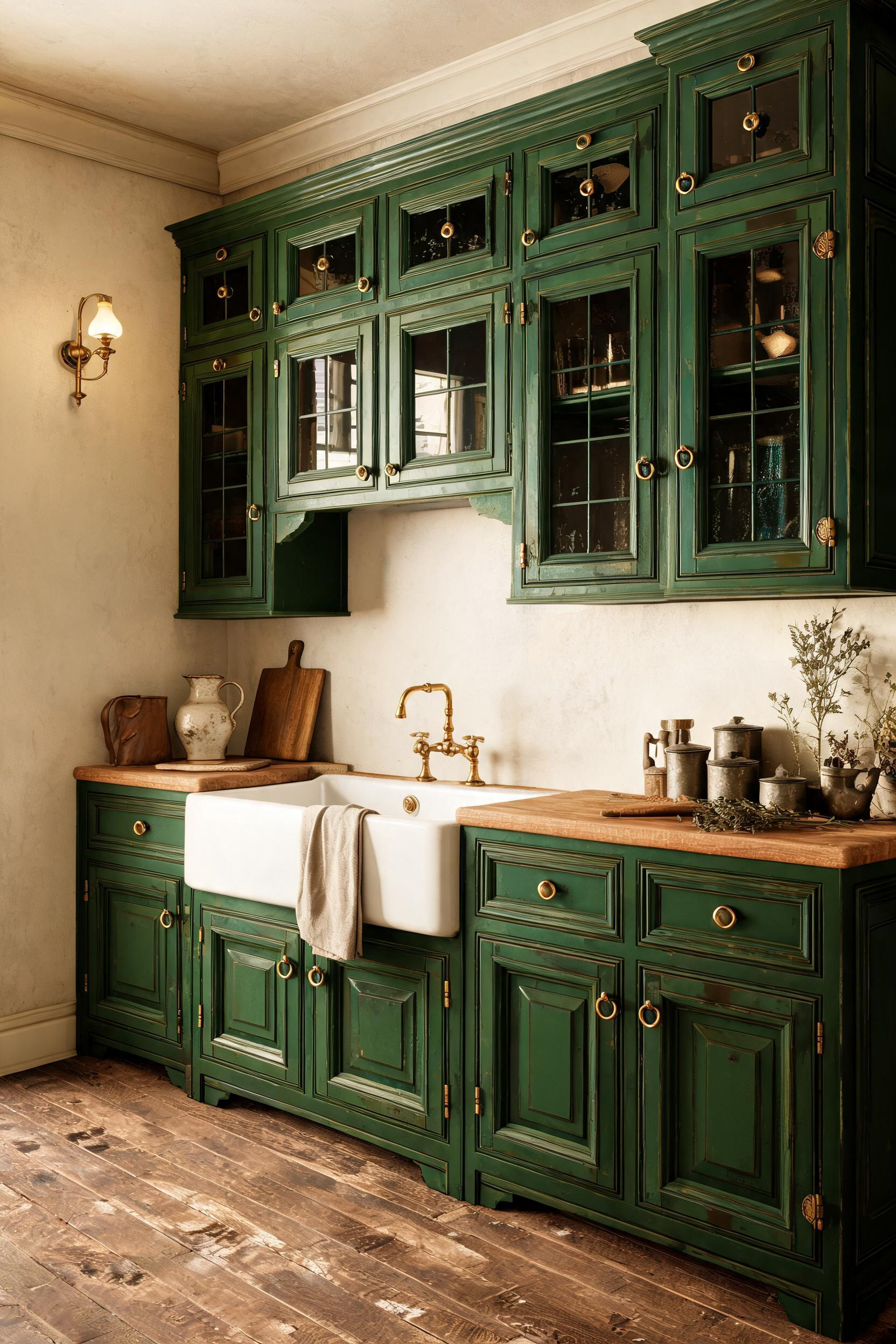
8. Sage Green Cabinets Beside White Marble Countertops
Sage green cabinets and white marble countertops look like a photo from 1957 and a photo from today simultaneously. That’s rare. The pairing achieves timelessness because both materials have genuine history — sage in 18th-century European painted furniture, marble in kitchens of every era.
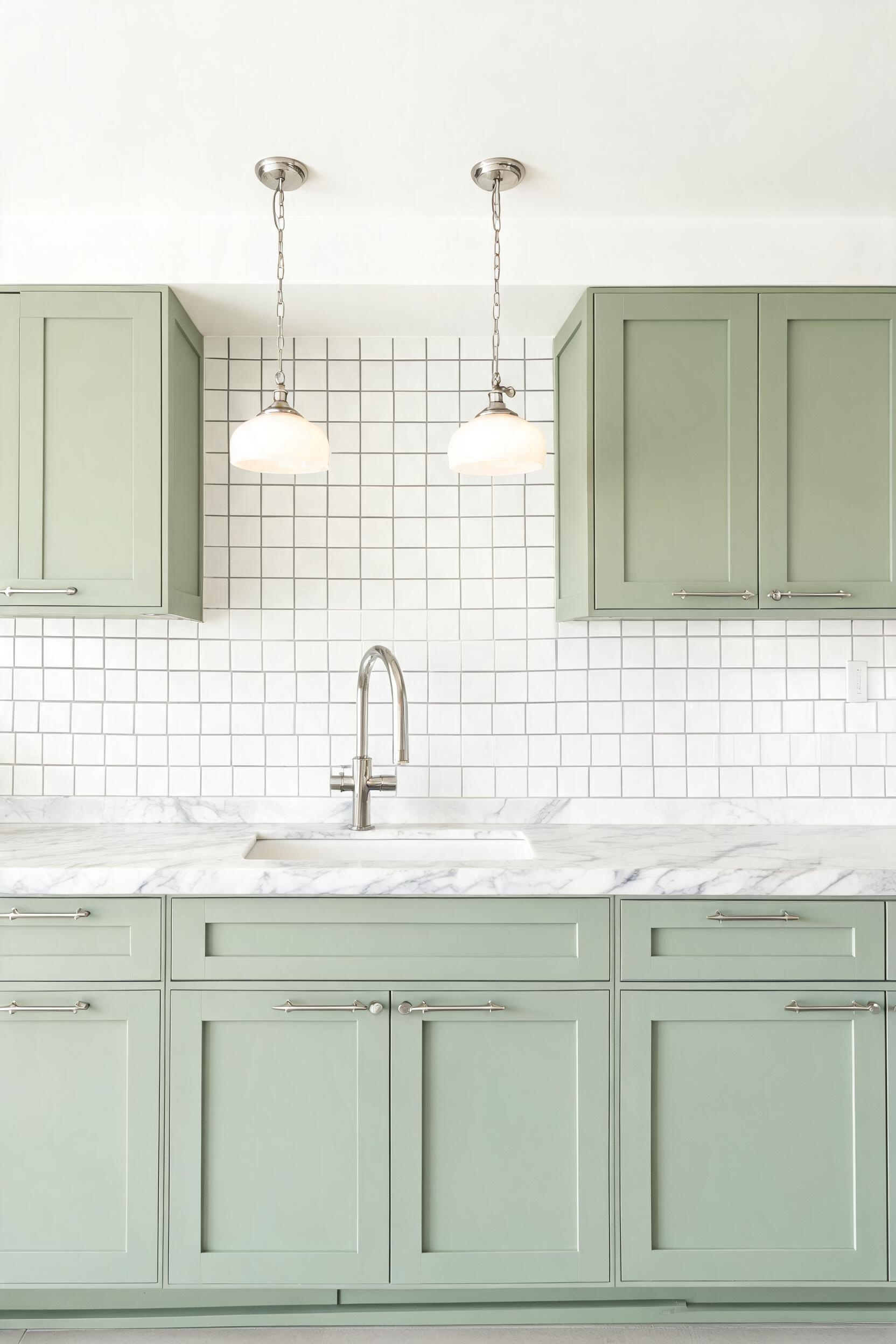
Why Warm-Veined Marble Softens Sage Green
Cool white stone with blue-grey veining can make sage appear tired. But Calacatta Borghini with gold and cream veining, or Danby marble with its warm ivory base, gives sage a backdrop that makes the color appear richer. The warmth in the stone echoes the warmth in the green’s undertones.
Marble Alternatives for Less
Caesarstone Calacatta Nuvo ($55–$75/sq ft installed) has warm-cream veining without the maintenance burden. MSI Calacatta Miel Quartz at $45–$65/sq ft has stronger gold tones. For budget-conscious kitchens, Wilsonart’s Fantasy Brown laminate at $25–$40/sq ft installed photographs well and outlasts natural stone in durability. For more countertop pairings beyond marble, these kitchen countertop ideas cover quartz, butcher block, concrete, and beyond.
Backsplash Choices When the Countertop Has Movement
Marble has built-in visual movement. So the backsplash can afford to be simple. White 3×6 subway tile in a standard horizontal stack is the most versatile choice. Zellige tile in off-white adds handmade character without busy patterning. Avoid large-format patterned tile when the countertop already has prominent veining.
9. Dark Green Kitchen Cabinets for Drama Without Overwhelm
Dark green kitchen cabinets get avoided by cautious decorators. Deep colors feel like a commitment. But I’ve installed dark green cabinets in five kitchens over the past decade. Not one client regretted it when they got the surrounding details right.
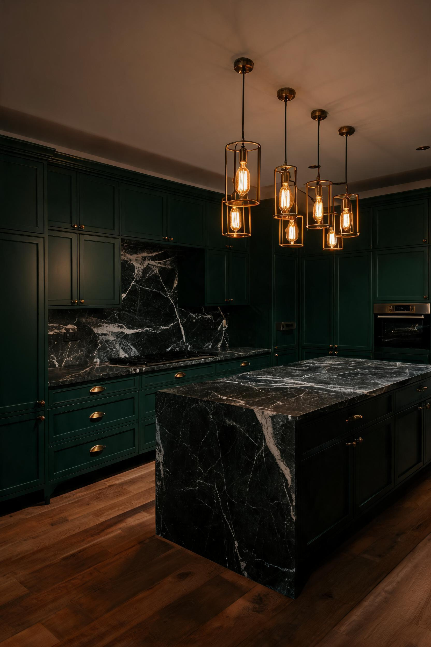
Which Dark Greens Work in Smaller Kitchens
Farrow & Ball Studio Green (No. 93) at LRV 4 is genuinely very dark. It needs significant natural light to remain readable. Farrow & Ball Calke Green (No. 80) at LRV 9 is more forgiving. Benjamin Moore Tarrytown Green (HC-134) at LRV 10 sits in the same workable range. For kitchens under 150 square feet, stick to colors with LRV above 8 unless you have excellent daylighting.
Lighting Strategies for Deep-Toned Cabinets
Under-cabinet LED strips at 3000K are non-negotiable in a dark-green kitchen. They illuminate the countertop work surface and make the cabinets look intentional rather than gloomy. Overhead fixtures at 2700K keep the mood warm. Recessed lights spaced at 24-inch intervals or less prevent harsh shadows on deep-toned doors.
All Surfaces vs Contrast Only
Full dark-green kitchens work in rooms with high ceilings and strong light sources. In rooms without those qualities, use dark green on the island only, or on lower cabinets only. Keep uppers in a light cream or white that reflects light back into the room.
10. Green and Natural Wood Cabinet Combinations
Green and wood share an obvious outdoor reference — forest, garden, meadow. That shared language makes them feel coherent together even before you’ve thought about formal color theory. This is the combination I return to most often when a client wants warmth and personality without committing to a single saturated color.
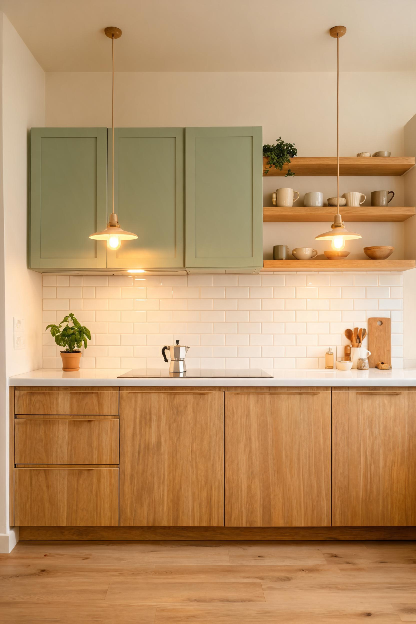
Choosing the Right Wood Tone
Light woods — birch, pine, ash — can look washed out beside green unless they have a warm finish. Medium woods — oak, cherry, mid-tone walnut — are the sweet spot. Dark woods create a moody richness that works in dramatic kitchens. As a general rule, the deeper the green, the lighter the wood should be to maintain balance.
Upper Green, Lower Wood — or Vice Versa?
Most designers default to green uppers and wood lowers, following the nature logic of sky above, earth below. But green lowers and wood uppers is also worth considering in small kitchens. The lighter wood upper reflects more light. The green lower adds color without making the room feel enclosed.
Open Shelving in Wood Beside Green Cabinets
One or two sections of open wood shelving integrated into an otherwise green-cabinet kitchen adds breathing room. Keep shelf wood matched to any wood cabinets or flooring. Floating shelves in 2-inch thick walnut or oak, sealed in a clear matte finish, look proportional beside shaker-profile green cabinet doors.
11. Surprise the Eye: Green-Painted Cabinet Interiors
Interior cabinet painting is one of the most underused techniques in home decoration. The outside of the cabinet stays any color. The inside becomes a small, private scene of color that reveals itself when a door opens. It’s warm, clever, and costs under $100 in paint for most kitchens.
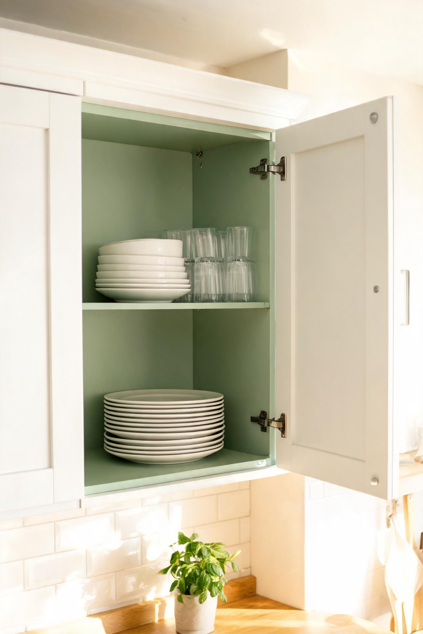
The Interior-Only Technique for the Cautious Decorator
Paint all cabinet interiors in a sage or hunter green before rehanging the doors. The effect is a private pop of color visible only when someone reaches for a bowl or glass. If you love it — and most people do — you can take the color to the exterior doors in a future project.
Which Greens Look Best Inside Cabinets
Deep greens — hunter, forest, dark sage — read better inside cabinets than pale ones. Cabinet interiors are in shadow, and pale colors can look dingy in low light. Benjamin Moore Salamander, Sherwin-Williams Jasper, and Farrow & Ball Calke Green all perform well. A high-gloss finish inside the cabinet body reflects interior light back and makes the space look cleaner.
Pairing Exterior and Interior Colors
If your exterior cabinets are white, almost any green interior works. White exterior, hunter green interior, brass knobs — this is the simplest and most reliable combination. If your exterior is a natural wood, choose a green with matching undertones: warm wood pairs with olive or warm sage; cool-toned wood pairs with blue-sage or mint.
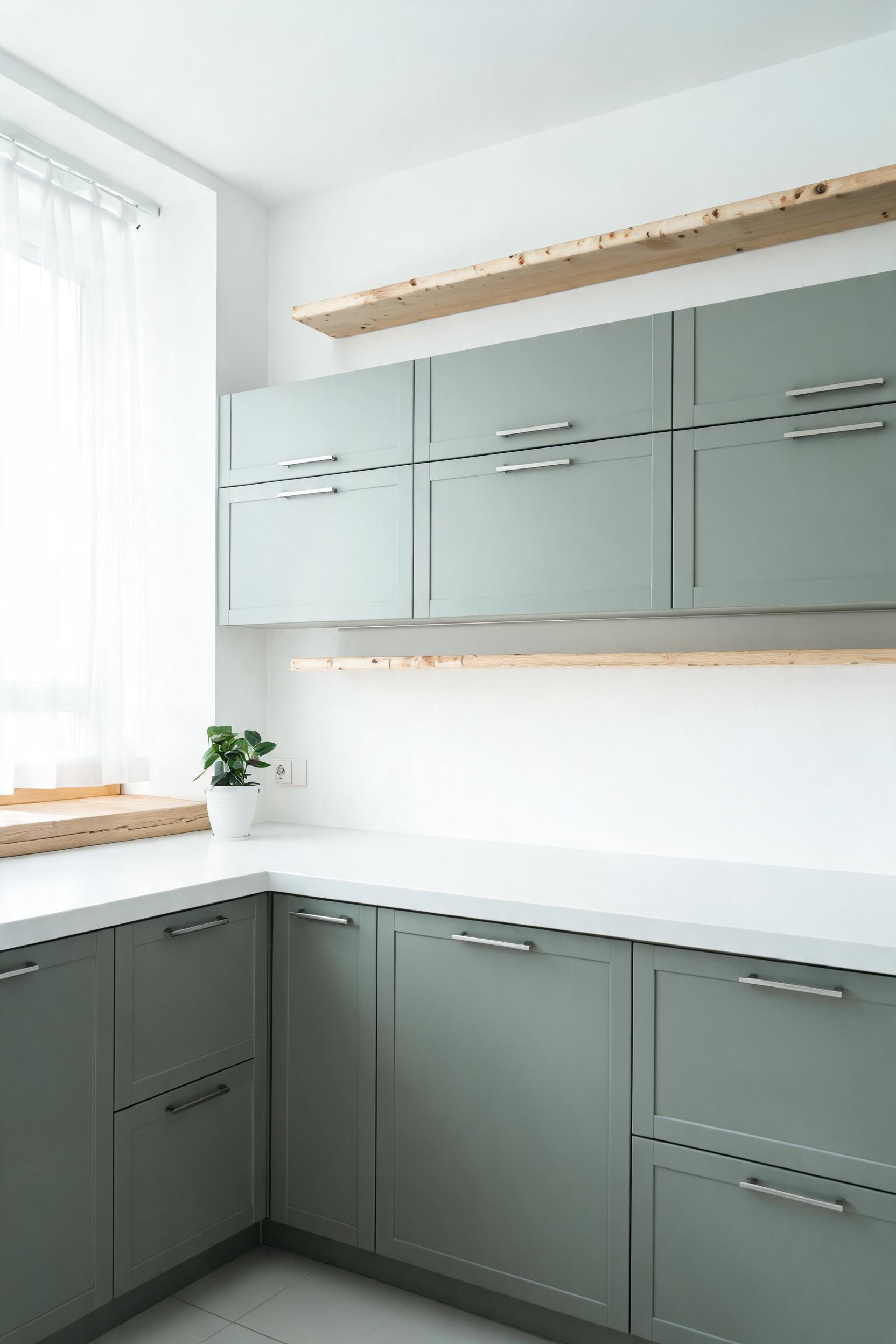
12. Muted Sage Green Kitchen Cabinets in a Nordic-Inspired Space
Scandinavian kitchen design has a genuine affinity for muted, earthy greens that most American decorating coverage overlooks. The Swedes and Danes have used these tones — pale sage, dusty sage, grey-green — in kitchens and farmhouses for centuries. Muted sage green kitchen cabinets in a Nordic setting draw on that deep tradition.
The Scandinavian Affinity for Muted Greens
Traditional Scandinavian farmhouses used earth-pigment paints in warm ochres and earthy greens on furniture and cabinetry. The Gustaviansk green, a grey-sage pigment used on painted furniture in the 18th and 19th centuries, is a direct ancestor of the Nordic sage kitchens popular today. That historical precedent is why they feel settled rather than trendy.
Pairing Sage With Light Woods and White Walls
In a Nordic kitchen, light birch, ash, or beech appears in open shelving, flooring, or on countertop butcher-block sections. These pale woods share the grey-green’s cool, quiet quality. White walls prevent the room from reading too muted. Avoid warm-cream or yellow-toned walls beside Nordic sage green — the warmth conflicts with the palette’s mineral quality.
Hardware That Does Not Compete
Thin bar pulls in brushed nickel or satin stainless are the standard in Scandinavian-influenced kitchens. They do their job without visual commentary. Recessed edge pulls — no visible hardware at all — are also appropriate for very flat-front, handleless Nordic cabinet designs. Avoid ornate or decorative pulls; they belong in a different design language.
13. Limewash Green Cabinets for Layered Vintage Texture
Limewash on green cabinet paint produces a result that looks like it came from a Tuscan farmhouse or a French country cottage. The finish is layered, lived-in, completely individual. Each cabinet door looks slightly different from the next — and that irregularity is the point.
What Limewash Is and How It Ages
Limewash is made from slaked lime mixed with pigment and water. It’s absorbed into porous surfaces rather than sitting on top of them. So it doesn’t peel or crack the way standard paint does. Instead, it softens over time, developing a patina that looks increasingly beautiful. On cabinets — a smooth, non-porous surface — limewash needs either a cabinet-grade formula or a preparatory treatment. Portola Paints makes a reliable cabinet-specific option.
Applying Limewash to Flat-Front Cabinets
Flat-front or shaker doors work best. Raised panel profiles can make limewash look uneven in the recesses. Apply a base coat in your chosen green, let it dry fully, then apply limewash in a lighter tone using a wide brush with irregular strokes. The goal is visible brushwork and slight transparency. Portola Paints’ Roman Clay ($85 per gallon) is a genuine and well-regarded lime-based option.
Styles It Suits Best
Limewash green cabinets feel at home in farmhouse, cottage, Tuscan, and French country kitchens. They look wrong in ultra-modern settings — the handmade quality conflicts with machine precision. In a kitchen with stone floors, rough plaster walls, or wood-beam ceilings, they are exactly right.
14. Green Kitchen Cabinets With Matte Black Hardware
Matte black hardware has genuinely elevated the look of green kitchen cabinets over the last eight years. It makes green look sharper, more deliberate, and more current — without erasing any of the color’s warmth. This is also the most budget-accessible hardware upgrade available.
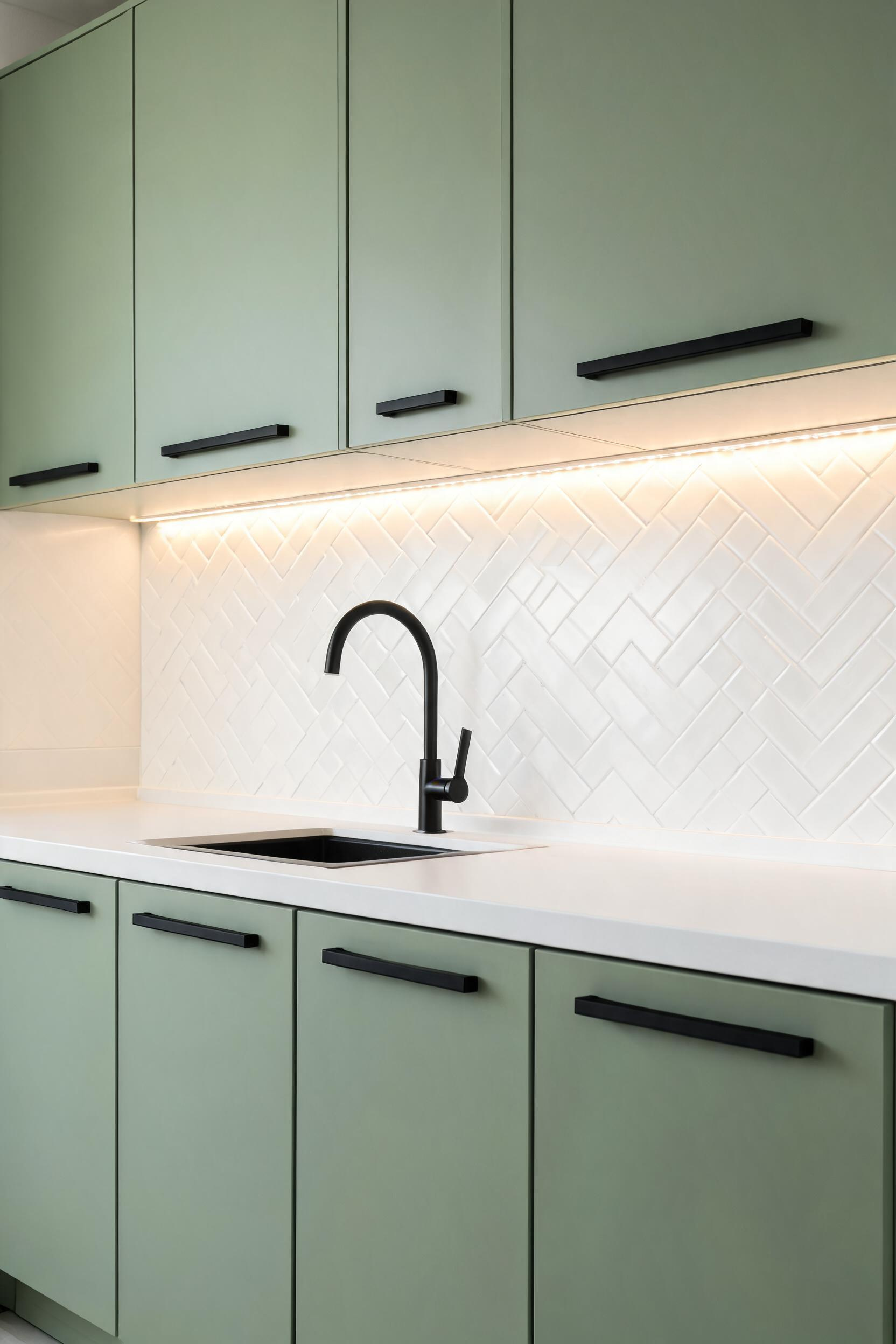
Why Matte Black Works With Green
Matte black doesn’t reflect light. So it doesn’t fight with the cabinet color for visual dominance. Brass reflects warmth back into the room; chrome reflects coolness. Matte black anchors the cabinet door and lets the green be the thing you notice. This is particularly useful with complex greens — dark sage, olive, or forest — where reflective hardware can muddy the color.
Pulls vs Knobs for Different Door Profiles
Bar pulls suit flat-front and shaker profiles equally well. They’re the most functional option for larger doors and drawers. Knobs suit smaller upper cabinet doors better — a pull would be proportionally oversized. Using knobs on uppers and bar pulls on lowers is standard practice. It adds visual refinement at no extra cost.
Preventing a Cold Overall Palette
If your green has cool undertones — blue-sage or blue-green — matte black hardware can push the palette toward starkness. The fix is warm lighting: pendant fixtures in aged brass, under-cabinet LEDs at 2700K, and any warm natural material on the countertop or floor. Butcher block countertops are particularly effective at warming a cool-green-and-black kitchen.
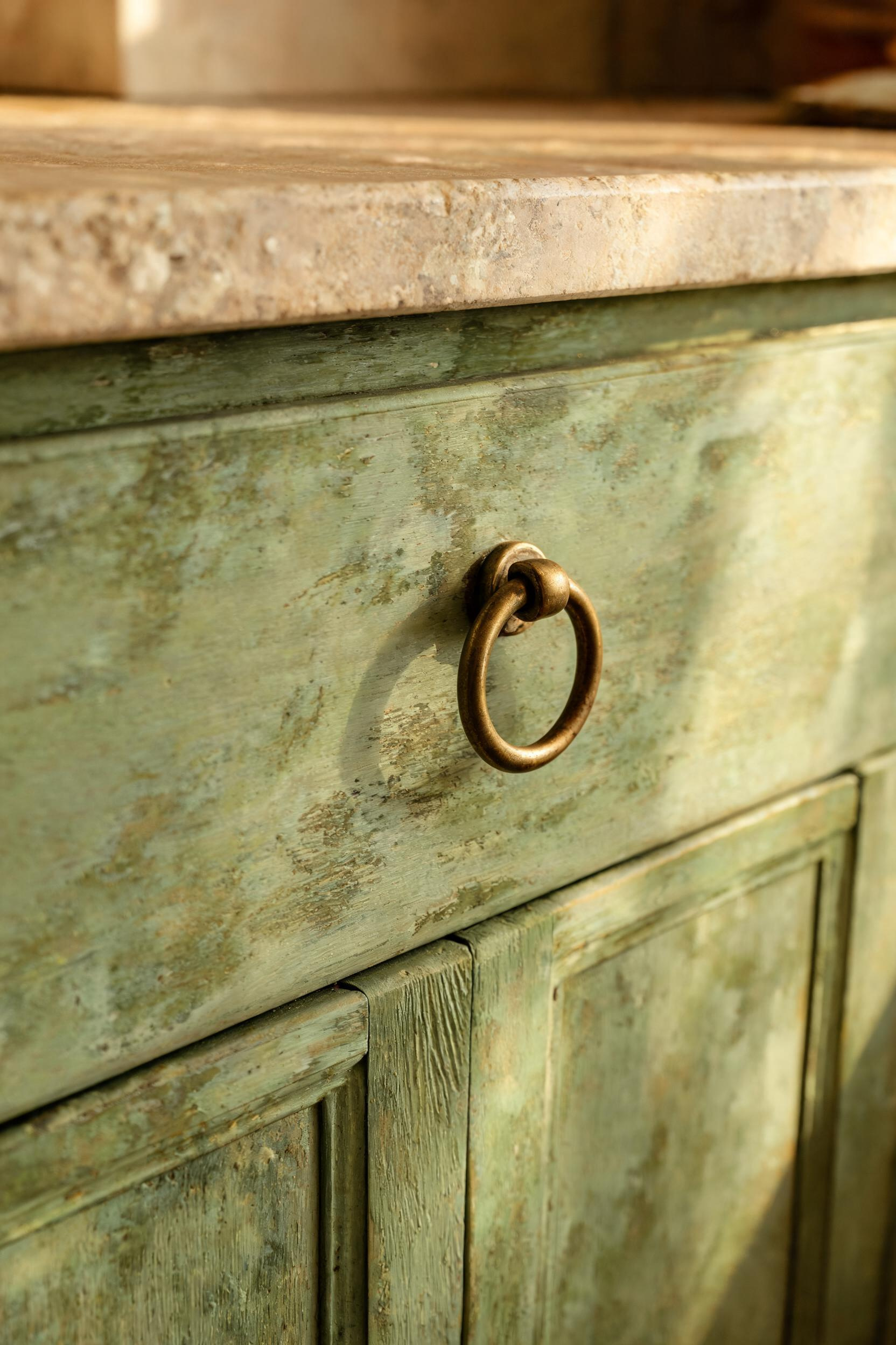
15. Glazed or Distressed Green Cabinets for Heirloom Character
Glazed and distressed finishes are among the most misunderstood techniques in cabinet painting. Done badly, they produce an orange-peel texture or fake-looking distress marks. Done well, the result looks like furniture that has genuinely lived through several generations.
The Glazing Technique
Cabinet glazing involves applying a translucent, tinted medium over a fully dried base coat. You then wipe away most of it while leaving residue in recesses and edges. On green cabinet paint, a dark brown or raw umber glaze adds depth that reads as age. The glaze catches light differently from the flat surfaces — exactly as old paint does naturally.
DIY Distressing vs Professional Aging
Lightly sand edges, corners, and areas around hardware holes — places where real furniture shows wear. Five to eight distress points per cabinet door is enough. Any more looks theatrical rather than authentic. Professional aging using heat guns, burnishing, and tinted glazes in combination produces a more convincing result, but runs $800–$1,500 for a standard kitchen.
How to Apply Dark Glaze Over Green Base
Use Valspar Antiquing Glaze ($18/quart) or General Finishes Gel Stain in Java ($28/quart) over a fully cured base coat. Apply with a chip brush, let sit for 30–60 seconds, then wipe back with a clean lint-free cloth. Leave residue in recesses and along edges. Work door by door — the glaze sets quickly in warm weather. Seal with a satin polyurethane topcoat.
16. Teal Kitchen Cabinets: When Green Meets Blue
Teal sits at the boundary of green and blue. That in-between quality is both its appeal and its challenge. In some lights it reads clearly green. In others it shifts toward blue. That responsiveness to light is what makes teal kitchen cabinets feel alive in a way that more decided colors sometimes don’t.
How Teal Differs From Sage and Hunter Green
Sage and hunter green have clear green identity even in shifting light. Teal does not. In morning north light it can appear almost turquoise. Under evening incandescent light it becomes a rich sea-green. Test a large sample board across a full weekend of light before committing. The transformation from midday to evening is more dramatic than with any other green family.
Choosing Teal for Coastal or Bohemian Kitchens
Teal belongs most naturally in coastal and bohemian kitchens. Its blue component references water and sky directly. In a coastal kitchen, pair it with natural materials — rattan, linen, driftwood tones — and white or cream walls. The backsplash options for teal cabinets are wide. For inspiration on what works beyond standard subway tile, these kitchen backsplash ideas cover a useful range of patterned, textured, and material options.
Hardware and Backsplash for Teal
Brushed gold or aged brass grounds teal beautifully. The warm metal prevents the blue component from making the room feel cold. Matte black is the least ideal pairing for teal — it can make the blue-green look flat. For backsplash, white subway tile and white hexagonal mosaic are the most forgiving; patterned Moroccan tile in cream and terracotta also works in bohemian teal kitchens.
17. Green Kitchen Cabinets Paired With Classic Subway Tile
Subway tile works with every shade of green kitchen cabinets. This is not a default born of a lack of imagination. It’s a fact born of design reality. Green reads as a complex color — it shifts warm or cool, light or dark, depending on the room. A patterned or complex backsplash adds another variable. Subway tile steps back and lets the cabinet color lead.
Why Subway Tile Is the Most Forgiving Choice
The standard 3×6 horizontal arrangement does nothing to compete with the cabinet color. It gives green a clean backdrop and frees you to put decorative energy into hardware, countertops, and lighting instead. Also, subway tile is available in at least 40 white and off-white tones — you can calibrate warmth precisely to your specific green shade.
Grout Color Changes the Entire Look
White grout with white subway tile creates a smooth, nearly seamless backsplash. Grey grout (Laticrete Platinum or Mapei Warm Gray) defines the grid lines and adds an industrial quality that suits green cabinets particularly well. Black grout is bold and sharp — it suits dark green and hunter green, but can look heavy beside pale sage. Cream grout softens the overall palette and is the most forgiving choice in kitchens mixing warm and cool tones.
Where Subway Tile Layout and Direction Matter
Standard horizontal stack is appropriate in almost any setting. Vertical stack adds height, which suits kitchens with low ceilings. Herringbone adds craftsmanship quality and pairs well with shaker cabinets. Offset brick pattern suits period or farmhouse kitchens. Avoid diagonal layouts beside green cabinets — the visual restlessness competes with the cabinet color rather than supporting it.
18. Choosing the Right Green: A Shade Guide From Sprout to Forest
After 12 years of working with green on cabinets and furniture, the most common question is the most fundamental: how do I know which green is right for my kitchen? The answer is never “trust your gut.” The gut in a paint store under fluorescent lighting is a completely unreliable instrument.
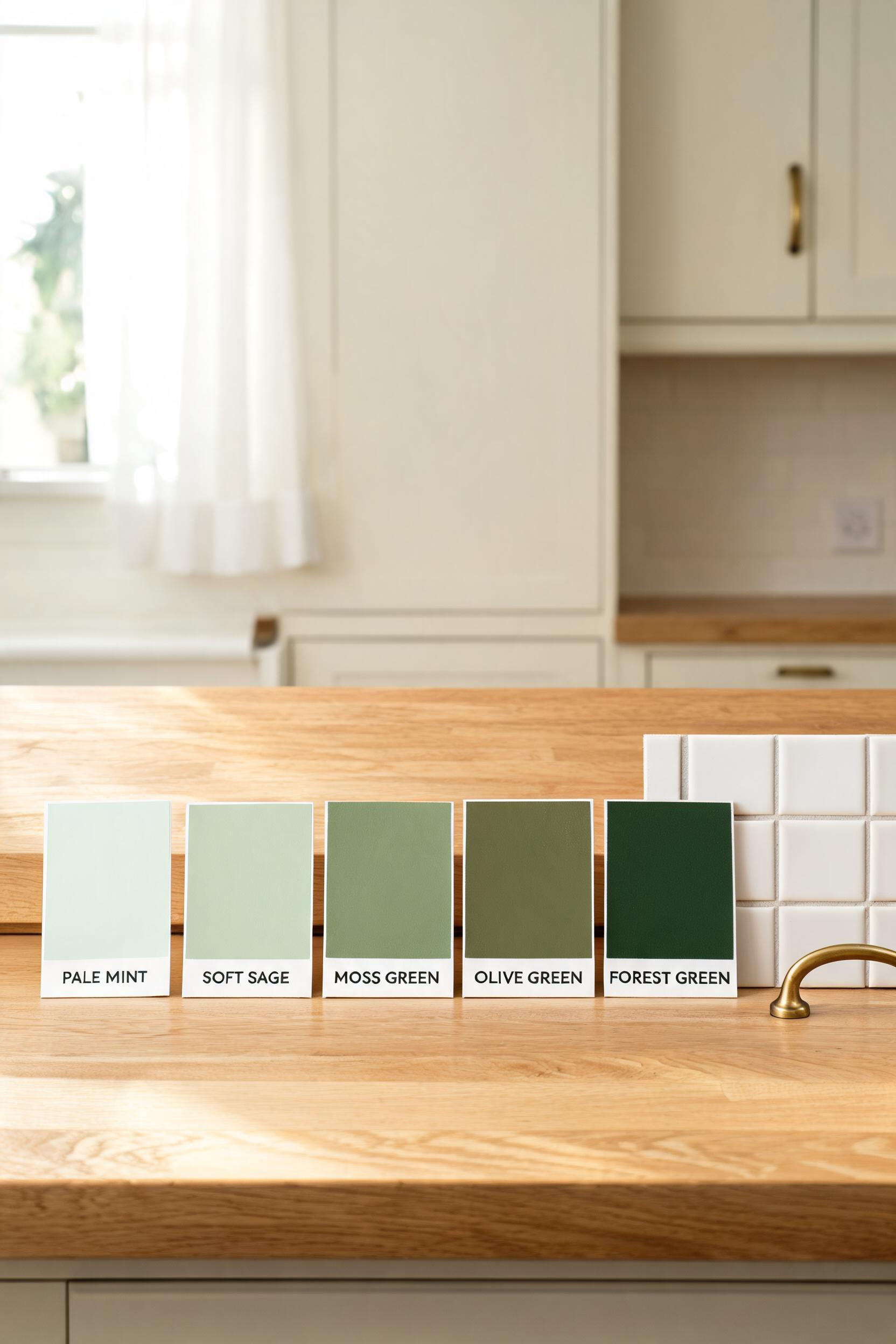
The Light-Reflectance Value (LRV) and Why It Matters
LRV is a number between 0 and 100 that tells you how much light a paint color reflects. Pale mint greens have LRV values in the 60s. Medium sages sit in the 30–50 range. Hunter and forest greens drop to 10–20. The deepest dark greens fall below 10. In a kitchen with one small north-facing window, a cabinet color below LRV 15 may read as almost black by 4pm. In a kitchen with south-facing skylights, even LRV 8 can remain rich and readable all day.
Testing Green Samples in Your Specific Kitchen
Buy 12×12 or larger sample boards — never small chips. Paint them in two coats and move them around the kitchen over three days: morning light, midday, afternoon, and under overhead fixtures at night. Tape them to cabinet doors, not walls, since cabinet doors face the room at a different angle. The color that remains your favourite across all four lighting conditions is the right one.
The Five Green Families and Which Rooms They Suit
Mint-family greens (LRV 50–70) suit small kitchens, north-facing rooms, and retro or cottage styles. Sage-family greens (LRV 25–50) are the most versatile and work in contemporary, Scandinavian, farmhouse, and transitional kitchens. Olive-family greens (LRV 15–30) suit farmhouse and rustic settings with warm-toned materials. Hunter-family greens (LRV 8–20) suit larger, well-lit, traditional kitchens. Forest-family greens (LRV below 8) suit statement applications — islands, lower cabinets only, or bold all-in choices in kitchens with exceptional natural light.
Which Green Kitchen Cabinet Shade Is Right for Your Home
Start with your existing floor and countertop. Those are the things you are least likely to change, and they determine which green family will work.
If your floor is warm-toned — oak, pine, terracotta, warm grey tile — choose a green with brown or yellow undertones. Olive, warm sage, and limewash finishes all fit. If your floor is cool-toned — pale grey tile, cool white stone, blue-grey hardwood — choose a green with blue or grey undertones. Cool sage, muted blue-sage, and dusty mint are the right family.
Your countertop works the same way. White Carrara marble and cool grey quartz pair with cooler greens. Warm-veined Calacatta, butcher block, and soapstone pair with warmer greens. Hold a green paint chip beside your actual countertop edge in your actual kitchen light. Trust what you see there, not what looked good in the store or online.
Matching Green to Your Existing Surfaces
A 10×12 kitchen with medium-toned hardwood and white quartz is the ideal canvas for any sage-family green. A galley kitchen with dark tile floors and brown granite needs a lighter green — LRV above 30 — or the room becomes too dark. A large open-plan kitchen with 12-foot ceilings can handle deep forest green on all perimeter cabinets without feeling enclosed.
How to Start With a Single Cabinet Before Committing
Remove one cabinet door. Paint it in your chosen green and finish. Let it cure for a full week. Rehang it and live with it for two more weeks. If you still love it, paint the rest. If it bothers you every time you walk into the kitchen, you’ve saved a significant amount of time and money for under $40. The single-door test is the most useful insurance policy in home improvement. Green kitchen cabinets reward patience — give the test door its full two weeks before you decide anything.