
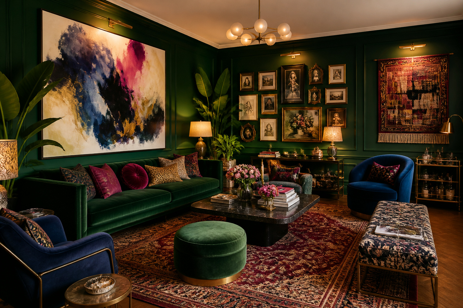
We promise this: the right living room wall art doesn’t just fill a gap above the sofa. It rewires how the entire room feels. After studying the work of bold interior designers who refuse to play it safe, we landed on 16 ideas. Each one consistently turns forgettable walls into the most talked-about part of any home. These aren’t disposable trends you’ll swap out next season. Instead, they’re statement-making choices that grow more personal and more confident the longer they live on your walls.
Sofia Chen-Martinez has spent 11 years making maximalist living rooms sing. The most common mistake she sees? Treating living room wall art as an afterthought — something to hang once the sofa is settled and the cushions are chosen. “Art doesn’t complete a room,” she says. “It starts one. Choose your walls first, and let everything else follow.” If you’re ready to finally commit, here are 16 ideas worth committing to.
1. Oversized Abstract Canvas: Living Room Wall Art That Anchors the Room
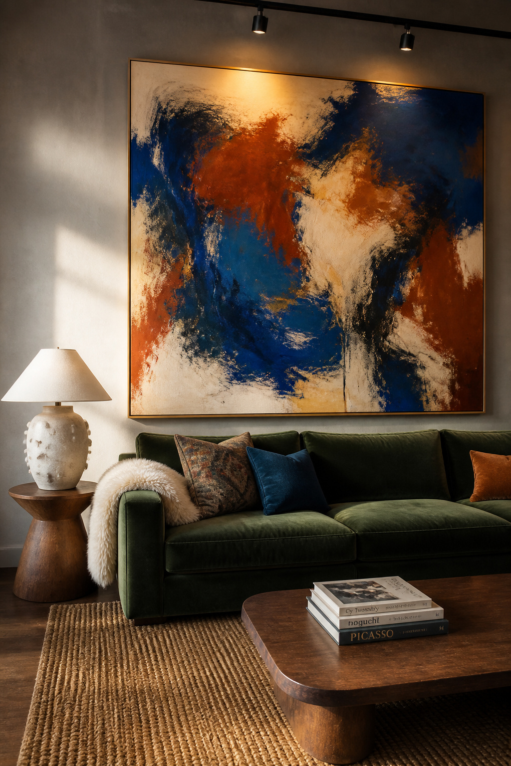
There’s a reason oversized abstract canvases appear in the living rooms of people who know exactly what they’re doing. A single canvas measuring four feet wide or more makes a clear, bold visual decision. The rest of the room has to rise to meet it. For Sofia, this is the first piece she recommends to any client standing in front of an empty wall wondering where to begin.
Choosing the Right Scale
The general rule is to fill roughly two-thirds to three-quarters of the wall width above your main seating. So a seven-foot sofa calls for a canvas between 54 and 63 inches wide. Go smaller and the piece floats. Go larger and it becomes architectural, which is also a valid choice — just a different one.
What to Look For in Abstract Art
Look for canvases with at least three distinct tonal values — light, mid, and dark. That range ensures the piece reads clearly from across the room. Also, choose something with a clear dominant color that already appears somewhere in the space. A cushion, a rug, a throw — one shared tone connects the art to its surroundings without making the connection feel engineered. Prices range from around $200 for quality prints on canvas to well over $2,000 for original works, but the scale matters more than the price tag.
Leaning vs. Hanging
If commitment feels daunting, lean the canvas against the wall on a low console or shelf. It reads as deliberate and relaxed at the same time, and it’s forgiving if you want to swap it out later.
2. Gallery Wall With Mismatched Frames for a Collected, Not Curated Feel
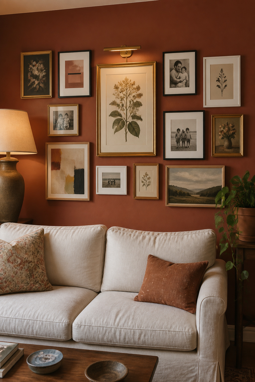
A gallery wall done well is one of the most personal things a living room can have. Done badly, it looks like a pile-up. The difference almost always comes down to the frames. The mistake most people make is buying a matching set — all identical black, all the same width, all the same finish. The result is tidy but lifeless. Instead, mix frames deliberately: combine antique gilt with simple black metal, wide matted frames with frameless prints, wooden frames in two or three different tones. The mismatched look reads as collected over time, which is exactly what you want.
Frame Mix Strategy
Stick to a maximum of three or four frame styles. More than that and the wall stops reading as collected and starts reading as chaotic. Also, keep the mat colors consistent — all white or all cream — even when the frames vary. That single thread of consistency pulls the whole display together.
Spacing and Layout Planning
Cut paper templates to the size of each frame and tape them to the wall. Live with the arrangement for a day before putting in a single nail. Most galleries that feel right end up with 2 to 3 inches between frames. That gap keeps pieces reading as a group. But it’s also far enough to give each one breathing room. For the full breakdown on building a room that carries a display like this, see 16 Secrets to a Maximalist Living Room: The Art of Layering.
Starting the Arrangement
Begin with the largest piece first, slightly off-centre. Then build outward from there. Most galleries look best when the visual weight distributes roughly evenly. Balance a large dark print on one side with two or three smaller pieces on the other.
3. Jewel-Toned Art Prints in a Salon-Style Floor-to-Ceiling Arrangement
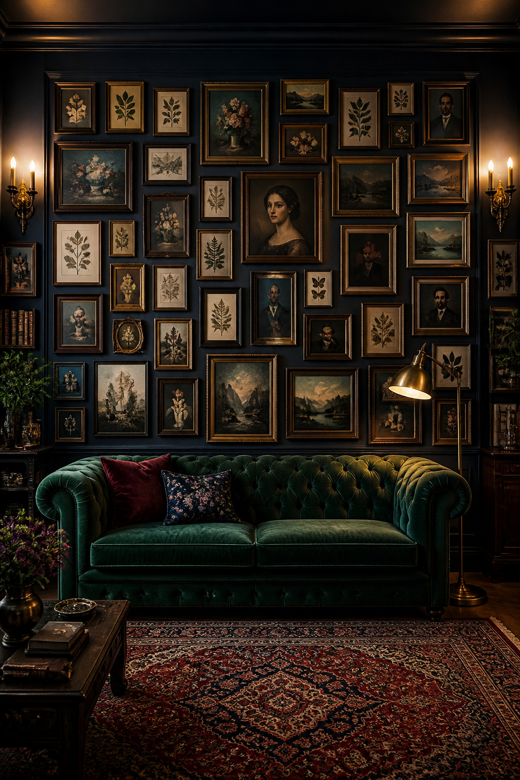
Salon-style hanging — art stacked from floor to near ceiling in a dense arrangement — looks intimidating until you see it in person. Then it looks like the only honest way to treat a wall. The key is color. Pick prints that share at least one dominant jewel tone: deep emerald, sapphire blue, garnet, or amethyst. That shared palette is what holds a dense salon arrangement together.
What Makes Salon Hanging Work
The density is the point. Don’t leave too much wall between frames. Salon displays work because the art crowds together. That density creates a sense of abundance which would overwhelm in a smaller display but reads as glorious at full scale. Mix the subjects freely: landscapes beside portraits beside abstracts. Tonal unity does the cohesion work.
Colour Anchoring the Display
Choose one jewel tone that appears in at least a third of the prints. Every other color should either complement it or be neutral enough to disappear. Deep emerald is one of the most forgiving anchor tones because it reads as sophisticated against almost any wall color.
Print Sources and Sizes
For salon displays, variety in size is important. Mix large prints (20×24 inches and above) with medium (11×14) and small (5×7) pieces to create visual rhythm. Good sources for affordable jewel-toned prints include Society6, Etsy, and museum print shops. All three carry quality reproductions that work well at larger scales.
4. Living Room Wall Art in Vintage Maps and Antique Cartography
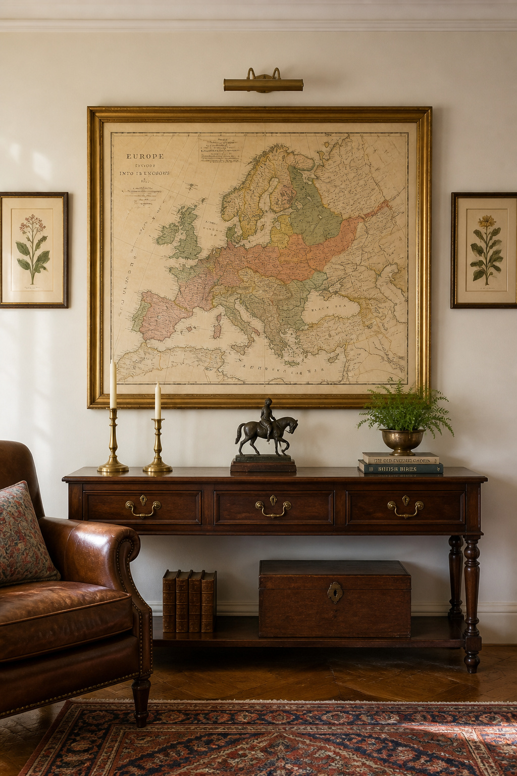
Vintage maps are one of the most underused ideas in living room wall art. They bring authority, history, and visual interest at once. And they work across almost every decorating style, from Victorian maximalism to clean contemporary rooms. A large antique map of a city you’ve visited, or simply a beautiful piece of cartography, can anchor an entire wall on its own.
Why Maps Work as Art
A map tells a story at every scale. Up close, you read the place names and the topographic detail. From across the room, it reads as graphic art — bold lines against a coloured field. That double-read quality is rare in decorative prints. It’s why maps hold attention in a way purely decorative art sometimes doesn’t.
Sourcing Authentic Vintage Maps
Old House, Barry Lawrence Ruderman Antique Maps, and David Rumsey’s shop are reliable sources for authentic vintage prints starting around $150. For less expensive options, high-quality reproductions are available from Etsy sellers and museum gift shops — often printed on archival paper for under $50. The reproduction route is completely valid. At that size on a wall, nobody can tell the difference unless told.
Framing and Placement
Vintage maps look best in simple gilt or dark wood frames with wide cream mats. Avoid modern black frames — the contrast reads as too sharp against the aged colors of most cartographic art. Hang living room wall art like this at eye level, with the center of the piece at roughly 57 to 60 inches from the floor.
5. Woven Textile Wall Hangings for Layered Tactile Depth
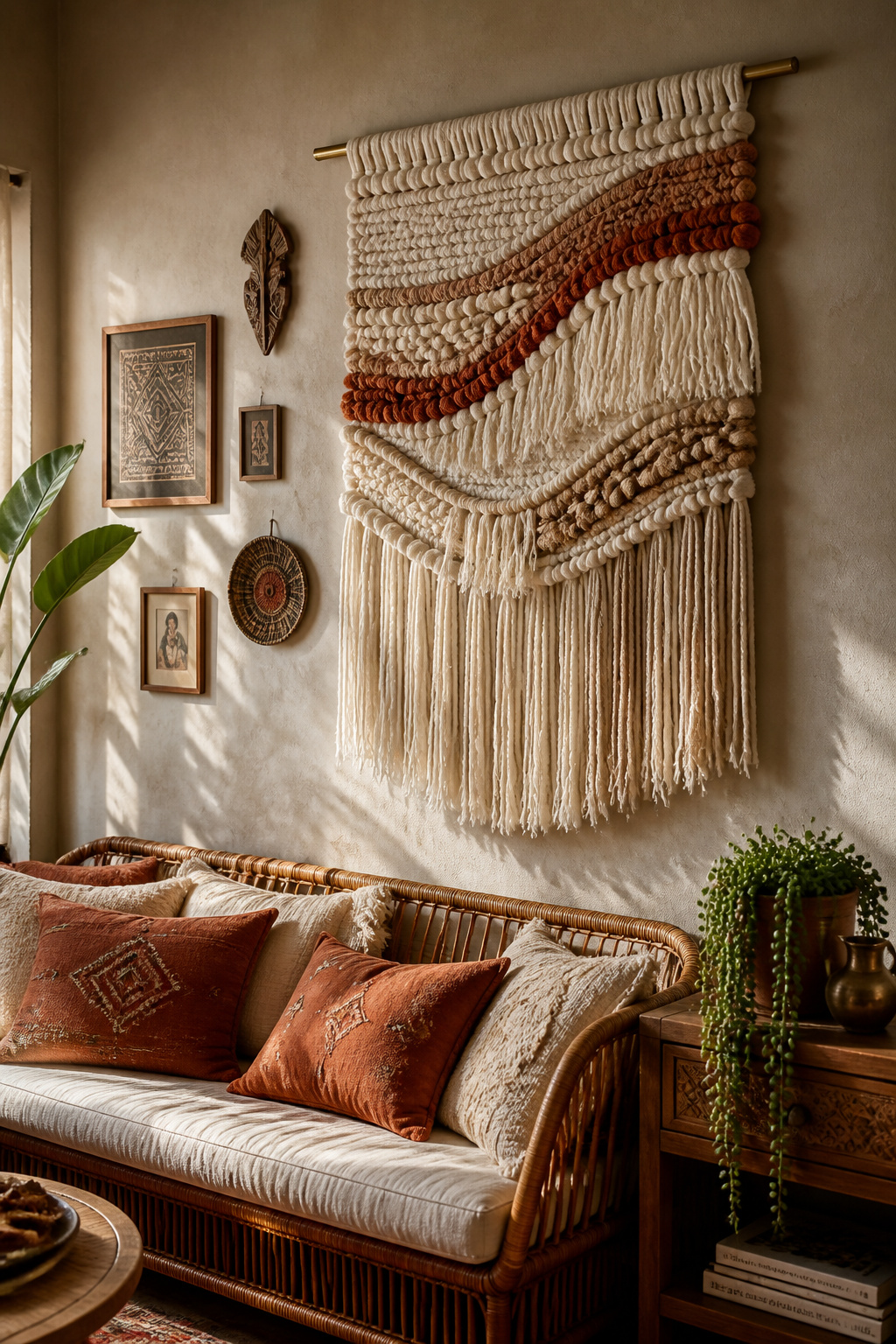
Texture is one of the most underestimated tools in living room wall art. A woven textile hanging adds something a framed print never can: physical depth. The fibers catch light differently at different times of day. The piece looks slightly different from morning to evening — which keeps a wall feeling alive rather than static.
Why Texture Changes Everything
When every piece on a wall is flat, the eye stops finding things to do. A woven textile gives visual variety that no amount of framing can replicate. It also softens sound, which makes it a particularly good choice in rooms with hard floors or high ceilings. For layering textiles and found objects into a cohesive living room, Living Room Styling: Curate Your Home with Vintage Finds is worth reading alongside these ideas.
The same principle of layered texture carries through to covered outdoor spaces too. 24 Living Room Wall Ideas to Finally Connect Your Home to the Outdoors explores exactly how.
Hanging Methods That Won’t Damage Walls
Most woven hangings come with a wooden or metal dowel built in. For heavier pieces (anything over about two pounds), use two picture hooks rated for 20 pounds each, spaced to match the dowel width. For lighter pieces, a single 5-pound Command strip is enough. It comes down without damage when you’re ready to move things around.
Sizing and Placement
A woven hanging that’s too small looks like a craft project. Go large: a piece at least 24 inches wide works for a standard living room wall, and 36 to 48 inches is better. Hang it so the fringe base falls at roughly chair-rail height or slightly below. That gives the piece room to breathe without crowding the furniture.
6. Black-and-White Photography Grid for Graphic, High-Contrast Impact
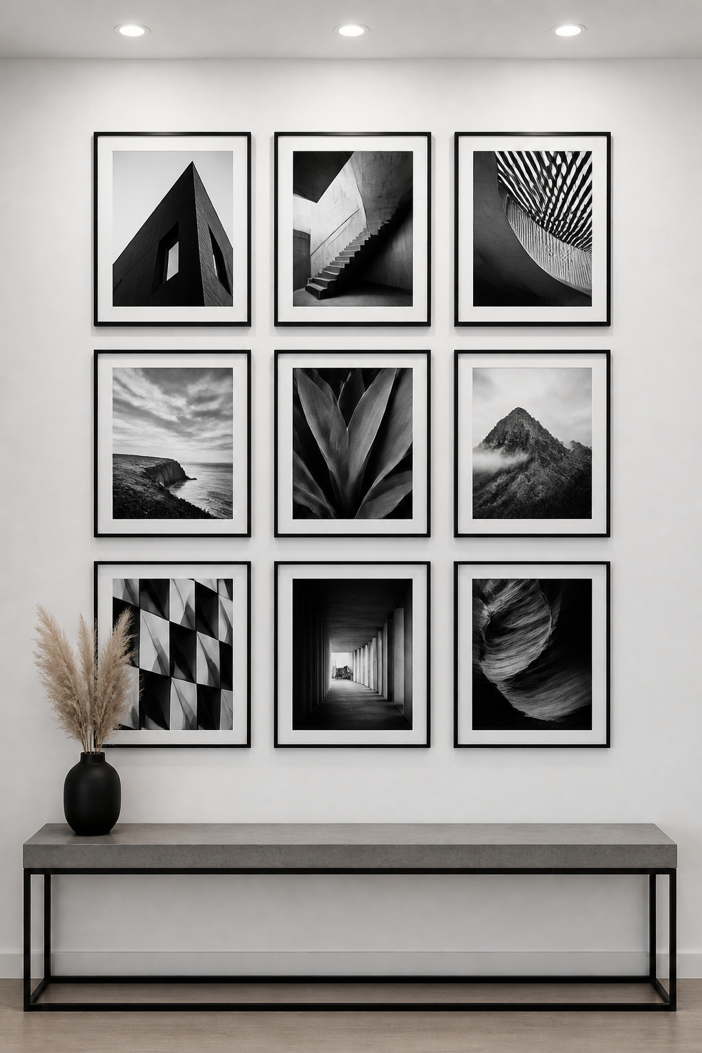
A photography grid is the most graphic option on this list. Done right, it has the precision of graphic design and the intimacy of personal history. The key is commitment. A grid of nine prints — all the same size, all black-and-white, all in matching frames — hung in a tight 3×3 arrangement. The repetition creates impact. The uniformity makes the images — not the frames — the point.
Building a Cohesive Photo Grid
Don’t mix personal photos with stock or editorial images unless you’re very deliberate about it. Either go full personal — family, travel, moments — or go full editorial. Mixing the two without intention creates a dissonance that reads as unresolved.
Printing and Frame Choices
For a clean result, print everything at the same size. Nations Photo Lab and Artifact Uprising both produce consistent quality on archival paper. Frame everything in the same profile — thin black or dark gunmetal reads as the sharpest choice for this type of display.
Making It Personal vs. Editorial
If the images are your own photographs, use a consistent processing style. All high-contrast black-and-white, or all with the same Lightroom preset applied. The visual consistency is what elevates a collection of personal snapshots into something that reads as intentional and considered.
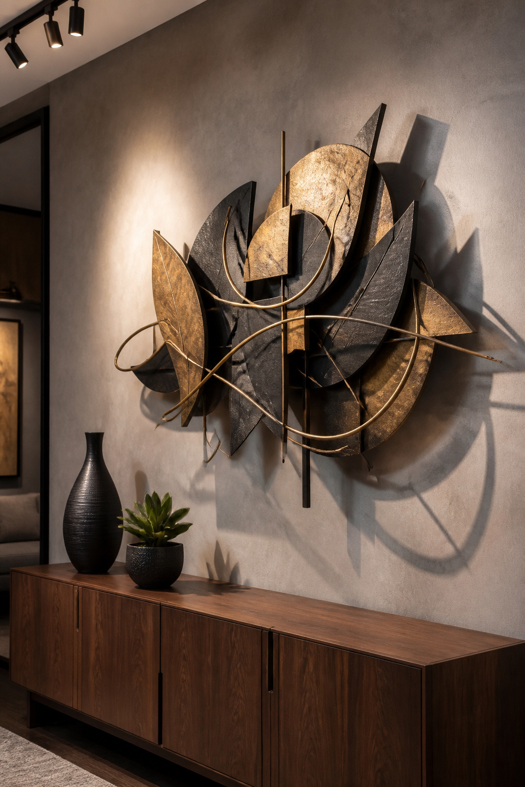
7. Sculptural Metal Living Room Wall Art for Three-Dimensional Drama
Metal wall art is the option that surprises people in person. In photos, it looks like interesting decoration. On a wall, it creates shadows that shift as the light moves through the day. The piece feels different at 9am than it does at sunset. That quality is something no flat print or canvas can match.
Materials and Finishes
Brass and copper read as warm and maximalist. Blackened iron reads as industrial and dramatic. Brushed steel reads as cooler and more contemporary. For most living rooms, a combination of two finishes — brass with iron, for example — creates more visual interest than a single uniform metal. Quality metal wall art from independent Etsy makers typically runs $150 to $600 for pieces in the 24-to-48-inch range.
Scale Considerations for Metal Pieces
Metal has visual weight even when physically lightweight. A piece 36 inches wide can read like a much larger work. Start with something that would seem almost too big when you’re ordering it, and it will likely look exactly right on the wall.
Mixing Metal With Other Wall Elements
Metal works well as a single statement piece, but it also works in combination. A large sculptural piece flanked by two smaller framed prints reads as considered and layered. A medium metal work hung above a low console with a mirror leaning against it does the same. The shadow play from the metal shifts the whole composition.
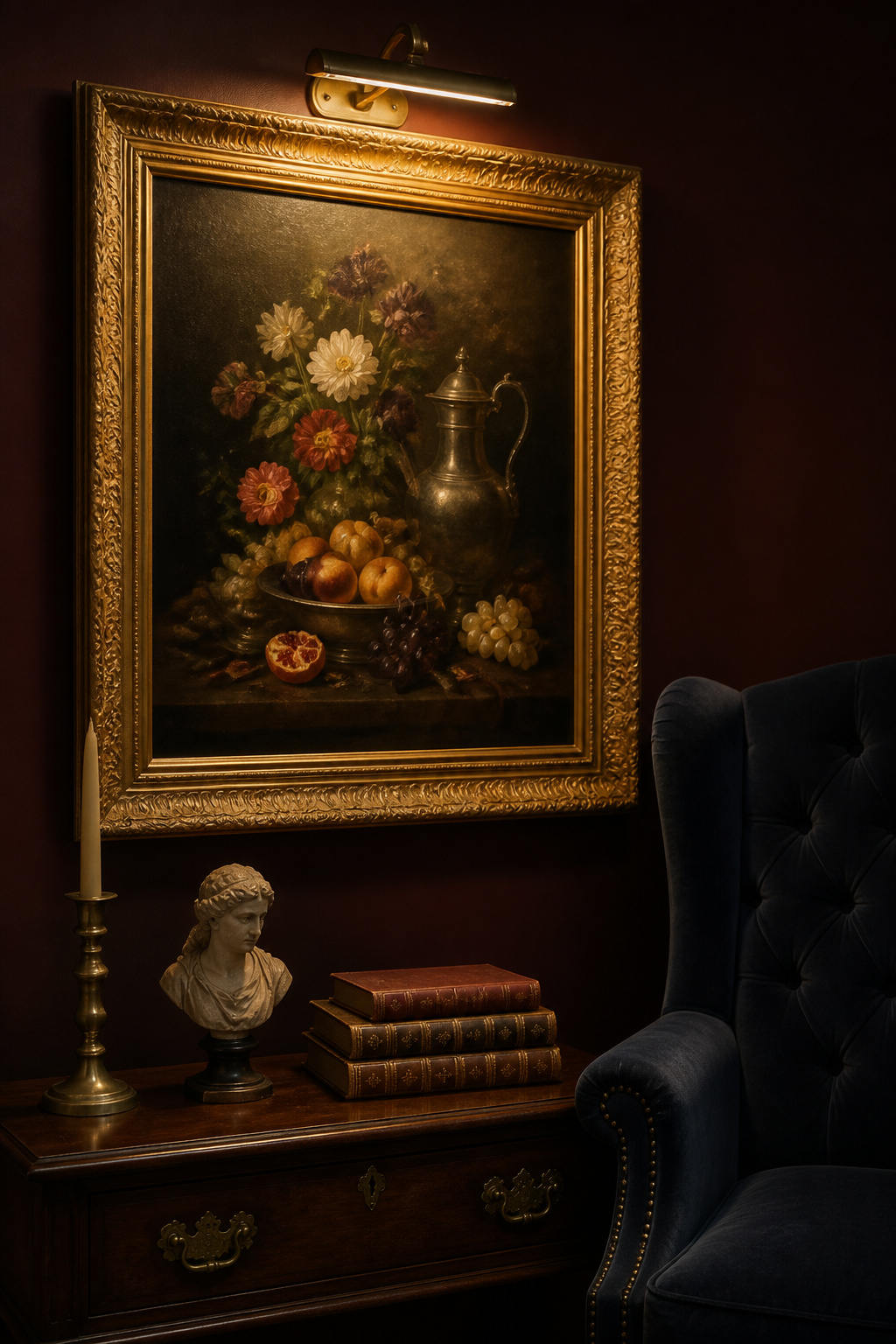
8. Oil Painting Reproductions in Gilded and Ornate Frames
There is nothing timid about an oil painting reproduction in a gilded frame. This is wall art that announces itself — that says the person who hung it has opinions and isn’t apologetic about them. Quality reproductions of Old Master paintings, Impressionist works, or 19th-century portraiture, professionally printed on textured canvas and stretched over proper frames, can look genuinely remarkable. And the frames matter as much as the image.
Reproduction vs. Original: The Real Difference
For most people, the difference between a well-made reproduction and an original painting is academic in a living room context. What matters is texture, color accuracy, and framing quality. Museums don’t use low-quality reproductions for their gift shops, and neither should you. Services like Canvaspop, Printed.com, or specialist fine-art printers produce textured canvas prints at quality that rewards close inspection. For ideas on how rooms like The Ultimate Formal Living Room Design Guide handle this kind of statement wall, the framing approach transfers directly.
Choosing the Right Frame
A reproduction oil painting needs a frame that matches its ambition. Look for ornate carved profiles in gold or antique gilt — not the thin modern frames that suit photography grids. The frame width should be at least 3 inches on all sides for pieces 24 inches or smaller, and wider still for anything larger.
Placement for Maximum Drama
Hang the painting so the bottom of the frame sits at roughly 60 to 65 inches from the floor. That’s slightly higher than standard, but the ornate frame carries the piece upward visually. A brass picture light mounted to the frame top adds authenticity. The painting looks as though it belongs in a room collected over generations.
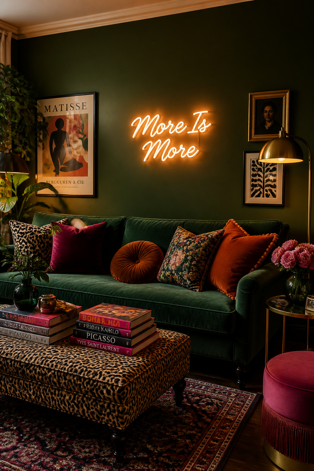
9. Bold Typography and Neon Lettering as a Personal Manifesto
Typography art divides people, which is exactly why it belongs on this list. A single word — or a phrase, a line of poetry, a house rule — rendered large and hung on a wall makes a room feel authored. Not decorated. Neon signs take this further, adding light, color, and a slight edge of the unexpected that makes even a traditional room feel alive. The key is choosing something you actually believe, not a generic “gather” or “live, laugh, love” sentiment borrowed from nobody in particular.
Choosing the Right Words
Short phrases work best: three to five words maximum. Longer quotes read as literary rather than graphic, and they lose the visual punch that makes typography art worth doing. Also, think about who else will see this room. A phrase that feels genuinely bold is the right choice. Something borrowed from a lifestyle brand is always a little hollow.
Typography Art vs. Neon Signs
Typography art — a letterpress print, a screen-print, a statement print in a good frame — is the quieter option. It reads as graphic and intentional without demanding attention. Neon is the option for people who want the wall to do the most talking. Both are valid, and both function as strong wall displays. The decision comes down to how much energy you want the piece to hold.
Scale and Color
For typography, scale up: a statement that fills 70 to 80 percent of the wall width hits differently from one that’s centered on a 12×12-inch print. For neon, match the glow color to something already in the room. That connection keeps the sign from reading as an isolated novelty.
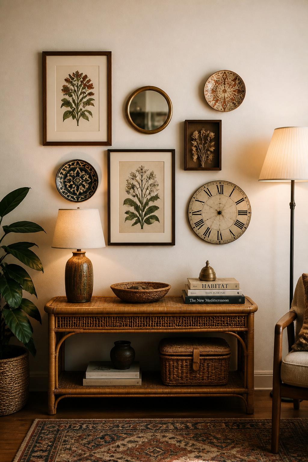
10. Art for Your Living Room: Mixed Media Gallery Walls That Tell a Story
Mixed media gallery walls go further than traditional gallery displays because they don’t limit themselves to flat prints and photographs. A well-assembled mixed media wall might include framed art, a mounted clock, a decorative plate, driftwood, and a small mirror. All of it composes into a single coherent arrangement. The result is a wall that looks assembled by someone who has genuinely lived a life — not someone who ordered a gallery wall kit.
What Counts as Mixed Media
Anything that can mount safely on a wall is a candidate. Small baskets, decorative plates, woven wall panels, mounted antlers, vintage keys, brass letters — all of these can join a wall composition. Each object just needs to hold its own visually when sized and placed with intention. The only rule: each object needs to hold its own visually, whether through shape, texture, or color.
Anchoring the Arrangement
In a mixed media display, start with the largest piece — a framed print or a mirror — and treat it as the anchor. Build the remaining objects around it. Keep approximately half of the wall within the arrangement as breathing space between pieces. Tighter arrangements read as collections; looser ones read as casual and free.
Connecting the Pieces Visually
Color does the connecting work in a mixed media display. If three objects share a warm brass or terracotta note — a frame finish, a ceramic glaze, a dried flower tone — the arrangement reads as intentional. It doesn’t matter how different the objects are in type. One shared color thread is usually enough.
11. Architectural Prints and Technical Drawings as Graphic Wall Displays
Architectural prints — cross-sections of buildings, engineering drawings, old house plans, botanical diagrams — occupy a space between wall art and graphic design. Intricate enough to reward close reading, dramatic enough to anchor a wall at distance, and neutral enough in subject to work in almost any room. For living rooms where the owners want something visually substantial but not emotionally loud, architectural prints are exactly right.
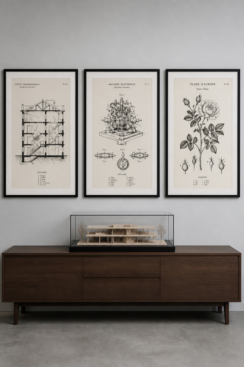
Where to Find Architectural Prints
The David Rumsey Map Collection and the New York Public Library Digital Collections both offer free high-resolution downloads of architectural drawings and engineering diagrams. Print them at large scale for a fraction of the cost of commercial prints. For vintage botanical diagrams, the Biodiversity Heritage Library is another free source with genuinely beautiful material. For rooms with a relaxed, traditional feel, this connects to ideas in 20 Enduring Rustic Living Room Decor Ideas: A Guide to Authentic Charm.
Framing for a Graphic Effect
Architectural prints look sharpest in simple thin-profile frames with wide white or cream mats. The mat is doing a lot of work here. It creates the clean border that makes each print read as a considered piece rather than a page torn from a book. Aim for a mat that’s at least 3 inches on all sides.
Room Pairings That Work
Architectural prints suit contemporary and transitional rooms particularly well, but they also work in traditional and maximalist spaces when framed with the right material. In a room with a lot of wood tones and warm textiles, opt for frames in a warm walnut rather than black. In a cooler, more minimal room, black metal or dark charcoal frames read cleanest.
12. Statement Mirror Groupings as Reflective Wall Art
Mirrors as living room wall art deserve more credit than they usually get. A single mirror over a fireplace is conventional enough to be invisible. But a grouping of three to five mirrors in different shapes and frame styles, arranged as a deliberate display, functions as art. A single mirror never does that. The arrangement creates visual interest, amplifies light, and adds depth to the wall without adding visual weight. It’s also one of the more practical options on this list, since mirrors make rooms feel larger.
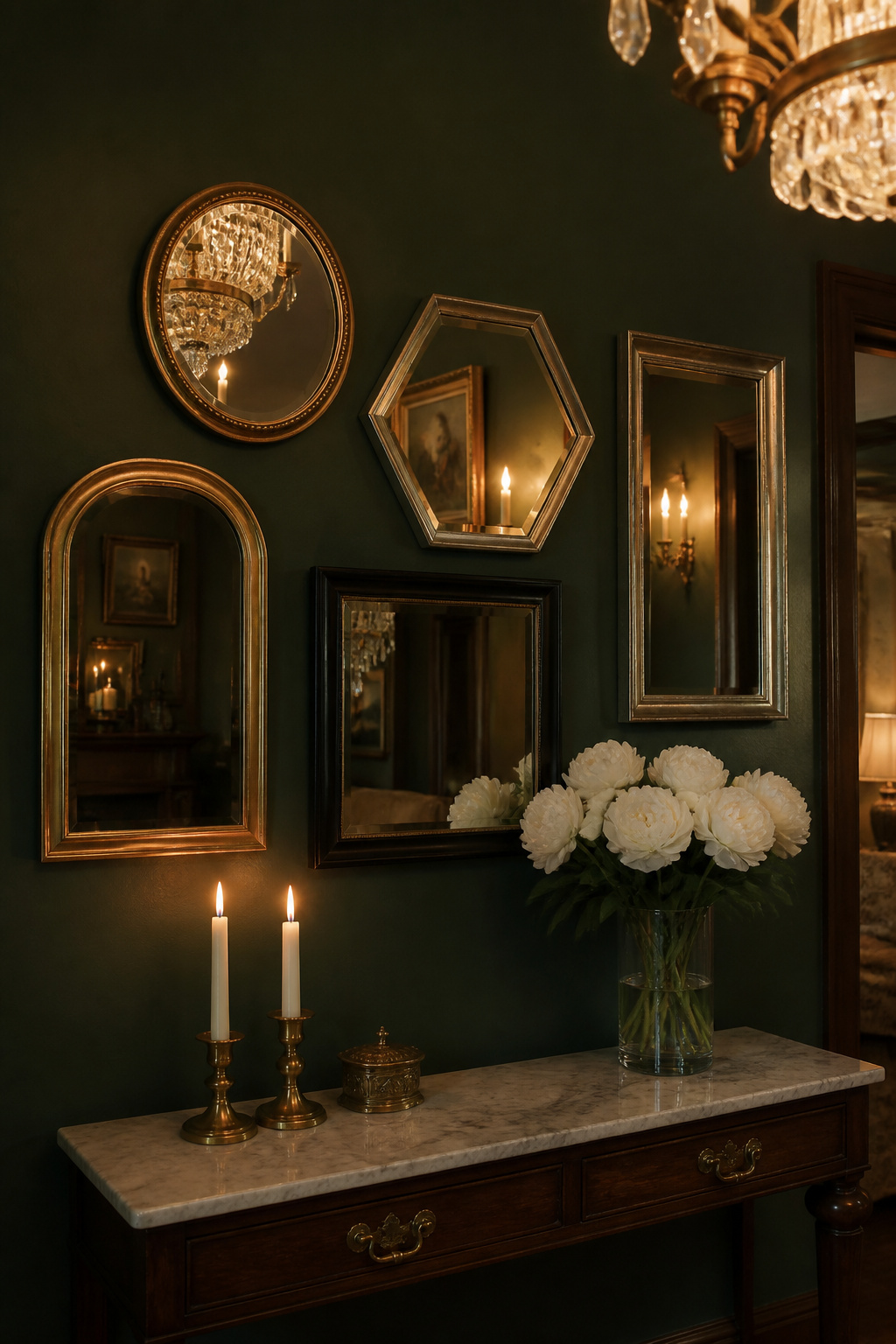
Why Mirrors Function as Art
A grouping of mirrors does what a gallery wall of prints does — with one addition. It shifts with the light, with the time of day, and with the activity in the room. Unlike static prints, mirrors include the room itself in the composition. That quality makes them particularly good in rooms that change throughout the day — a living room that shifts from morning to evening use.
Grouping Strategy
Odd numbers work better than even numbers for mirror groupings — three or five reads as more dynamic than two or four. Also, vary the shapes significantly. Mixing a round mirror with an arch and a rectangle creates more interest than three rounds together, even at different sizes.
Frame Styles and Finishes
For a traditional or maximalist room, antique gold frames are a reliable choice. For a more eclectic look, mix two or three finishes — aged silver, blackened iron, and raw wood, for example. Keep at least two of the frames in the same finish family so the grouping has a visual anchor point. For rooms with a dark color backdrop, 18 Black Living Room Ideas for a Modern Gothic Sanctuary shows how mirrors work in dramatic contexts.
13. Living Room Wall Decor With Dried Botanicals and Pressed Flower Shadow Boxes
Pressed flower shadow boxes and dried botanical arrangements bring the outside in — but in a form that’s permanent and intentional rather than accidentally decorative. A well-made shadow box with pressed botanicals can look like a museum piece. A dried pampas arrangement in a simple frame looks like a still life. Neither requires flowers to be replaced or maintained, which makes them practical in a way fresh floral arrangements never are.
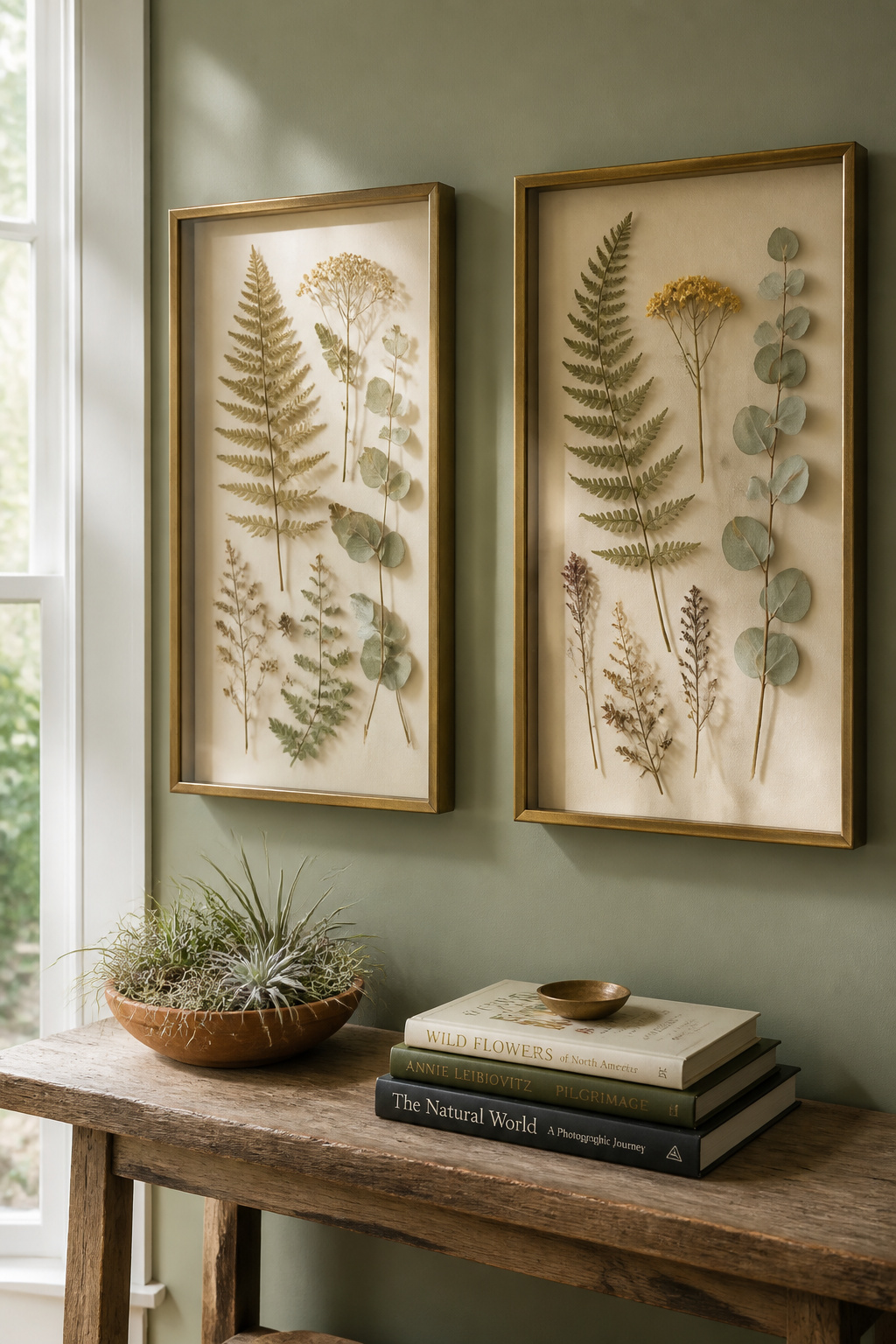
Why Botanicals Work on Walls
Plants bring a quality of life to a space that manufactured objects rarely replicate. Pressed and dried botanicals carry that same association — the sense that something from the natural world is present — without the maintenance requirement. They also photograph beautifully, which matters in living rooms that double as entertaining spaces.
DIY vs. Ready-Made Options
Pressing your own flowers is straightforward: lay them between sheets of absorbent paper, weight them with books, and leave for two to three weeks. The result is material that costs almost nothing and is completely personal. Ready-made options from Etsy makers run $40 to $150 for framed pressed arrangements. That quality is hard to match with DIY at that size.
Styling Shadow Boxes
Use a neutral backing in the shadow box — cream, linen, or natural kraft paper — so the botanical forms read clearly. Mount the plants with a small amount of archival-quality adhesive (PVA glue works well) rather than pins, which can damage the pressed material over time. For larger compositions, build in layers: a backdrop of larger leaves, then medium-scale flowers and stems, then small accent botanicals in front.
14. Painted Accent Wall and Mural Panels as the Art Itself
A mural panel is the largest possible commitment in living room wall art — and also the most rewarding when it works. A painted accent wall that tells a story, renders a landscape, or creates an abstract composition becomes the room’s defining element. Everything else in the space ends up in conversation with it. It’s also completely unique. Nobody else has your mural.
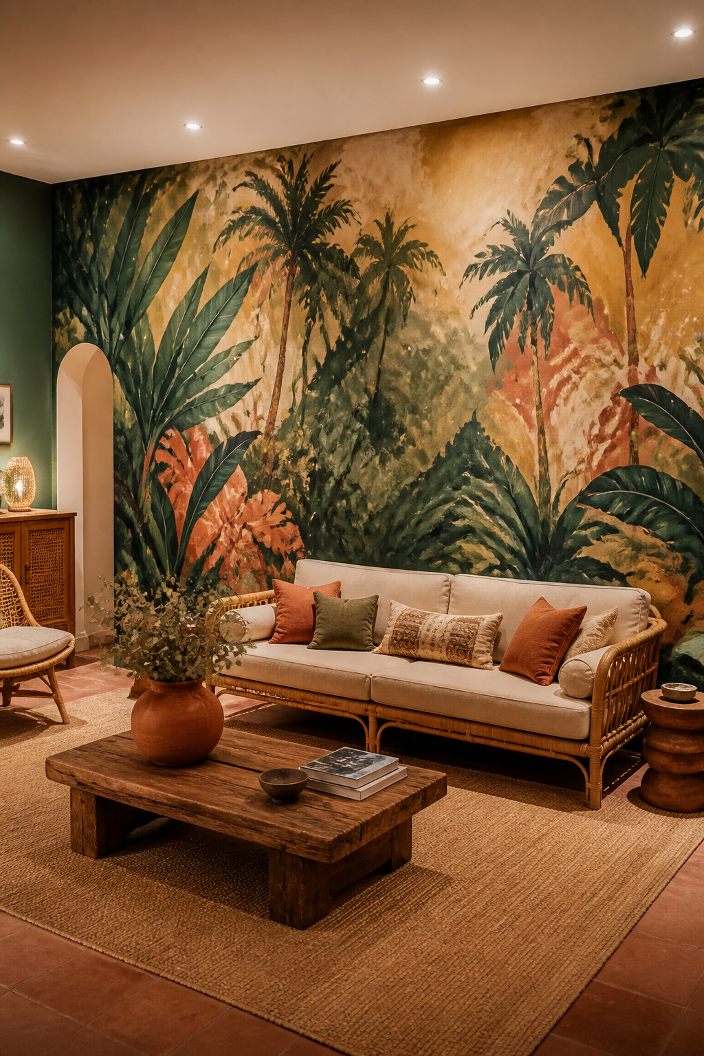
Choosing a Mural Style
Abstract murals are the most versatile option: they translate across different room styles and are less likely to feel dated than representational scenes. Botanical murals — stylized leaves, branches, tropical forms — hold up particularly well over time and work in rooms from maximalist to relatively minimal. Geometric or color-field murals offer the boldest graphic impact.
Hiring a Muralist vs. DIY
A professional muralist typically charges $15 to $50 per square foot for a standard living room wall, with the total depending on complexity and location. For a 9×12-foot wall, expect $1,600 to $5,400. DIY mural panels from Mural Source, Photowall, or Murals Your Way cost $300 to $800 for a full wall and require no painting skill.
Colour and Composition
The mural should share at least two color tones with the rest of the room. A completely different palette from the furniture reads as a collision rather than a decision. Brief the muralist or choose a panel with the room’s existing color range in mind.
15. Macramé and Fiber Art for Bohemian Maximalist Drama
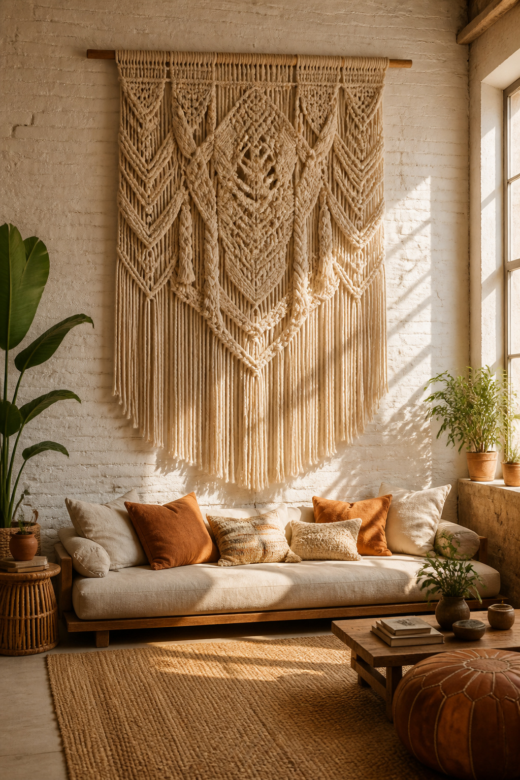
Large-scale fiber art is the option for people who want their living room wall art to stop conversations. A macramé piece measuring four feet wide and five feet tall is genuinely impressive in person. The complexity of the knotwork, the texture of the fiber, the fringe that shifts with air currents — these qualities exist only in the physical object. It’s tactile in a way that no flat art can be.
Scale Is Everything
Small macramé pieces rarely work as living room wall art. They read as craft projects rather than design decisions. Go large: anything under 24 inches wide belongs in a bedroom or bathroom. For a living room, start at 30 inches wide and consider going up to 48 or 60 inches for rooms with high ceilings or wide walls.
Natural vs. Dyed Fiber Looks
Natural undyed cotton or jute reads as calm and organic — it pairs well with warm earthy rooms and doesn’t compete with colorful furnishings. Dyed fiber art in terracotta, sage, or indigo has more visual energy. It pairs well with rooms that have a muted palette needing warm punctuation. Both work as living room wall art, but the choice should be made based on what the room is already asking for.
Layering Fiber Art With Other Pieces
A large fiber hanging works as a solo statement, but it also layers well with smaller framed pieces hung alongside it. A woven hanging flanked by two small botanical prints reads as a deliberate composition. The textile provides texture; the prints provide the graphic element. The combination reads as more sophisticated than either piece would on its own.
16. Vintage Poster Collection in a Consistent Color Story
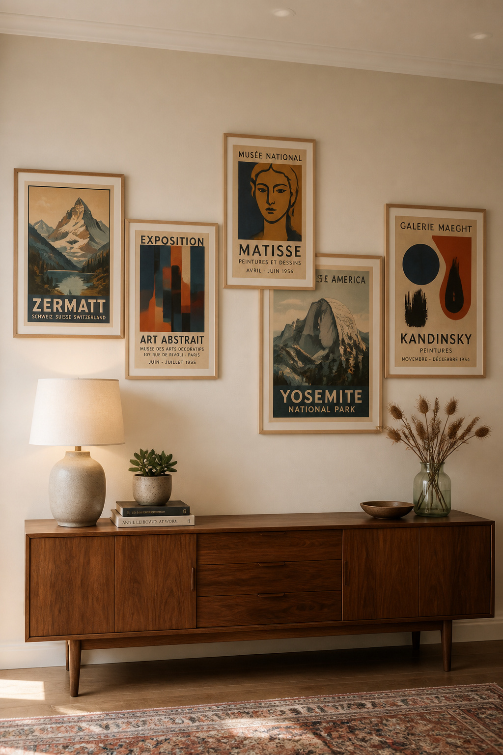
Vintage posters — travel lithographs, mid-century product ads, film posters, art exhibition announcements — are some of the most graphically refined objects you can hang. The printing techniques of the 1920s through 1960s produced color work that digital printing hasn’t matched. When posters share a consistent color story, the display reads as designed rather than found — even though each piece is original.
Building a Cohesive Collection
Color is the organizing principle for a poster collection. Decide on two or three dominant hues before you start sourcing, and only buy pieces that fit that palette. This approach transforms a random accumulation into a display that looks assembled as a set — even if it took years to gather. For a complementary approach to building a distinctive, collected room, the principles behind curating by color and era run through every display style on this list.
Sourcing Vintage Posters
Serious vintage poster dealers include International Poster Gallery in Boston and La Belle Epoque in New York, with authentic originals starting around $200. For more accessible options, eBay’s vintage poster category, Retrographik, and AllPosters.com carry reproduction prints in a range of sizes. Reproduction quality varies significantly — always request a paper sample before ordering a large print.
Display Strategies
For five or more posters, a horizontal row with consistent spacing reads cleanest. For three, a slight stagger in height adds informality. For two, hang them symmetrically: identical frames, identical heights, identical gap from a central point.
Finding Your Living Room Wall Art Style: From First Print to Full Gallery
The honest truth about living room wall art is that most people overthink the beginning and under-think the follow-through. They spend weeks deciding on the first piece, hang it tentatively, and then stop. A single piece on a bare wall rarely looks like a decision — it looks like a placeholder. The rooms that make the strongest impression are the ones where someone committed. To a gallery wall that actually covers the wall. To a textile hanging that’s genuinely large. To a mural that takes up the whole surface.
Start With One Piece That Scares You (a Little)
The first piece of living room wall art you hang should be slightly more than you think you’re ready for. Not overwhelming, but not safe either. An oversized canvas when you’ve only hung small prints. A salon-style arrangement when you’ve only hung single pieces. A sculptural metal work when you’ve only used photographs. That first stretch, that first decision that feels a little bold, is always the one that unlocks the rest.
Building Your Collection Over Time
The best art walls aren’t assembled in a single afternoon. They accumulate: a piece from a market, a poster from a city you visited, a print you loved in a gallery and finally ordered a copy of. Give yourself permission to leave walls partially done for a while. A room actively being built has a quality finished rooms sometimes lose — the sense that someone is still paying attention, still finding things.
The goal with living room wall art isn’t to fill every square inch of wall. It’s to make the art already there feel so right that the blank spaces look intentional too.