
There is a persistent myth in interior design: beige is what you choose when you can’t commit to a real colour. I’ve heard this from clients. I’ve read it in design columns. And I’ve watched it lead people to overcomplicate rooms that needed nothing more than a considered neutral. Beige living room decoration is not the safe choice. Done well, it is the considered one. Beige has an undertone, a temperature, a character. It can read as golden sand, warm oatmeal, grey-touched clay, or pale straw depending on the light. That responsiveness is its strength. Because beige reflects and adapts, it rewards layering. Texture, light temperature, organic materials, tonal variation — these transform a beige room from flat to deeply satisfying. The 15 ideas below come from years working with neutral palettes in rooms that needed to feel like sanctuaries. None of them require a bold colour. All of them work.
1. Layer Beige Textures with Boucle, Linen, and Chunky Knits
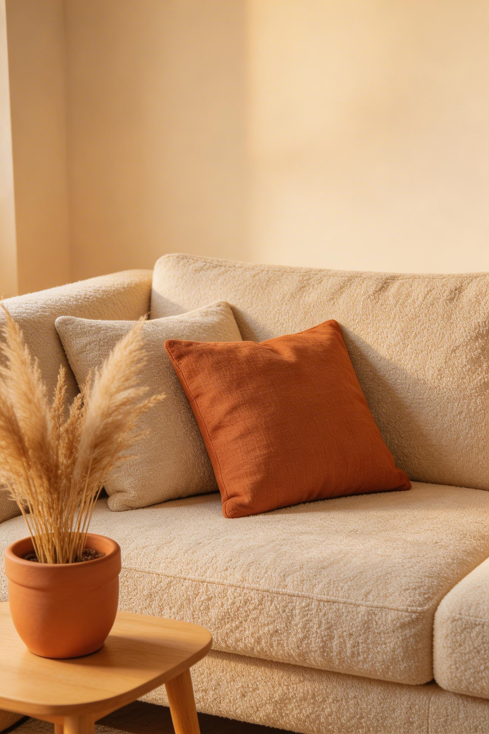
Most beige living rooms feel flat not because of the colour but because of the finish. When walls, sofa, cushions, and rug are all the same smooth plane, the eye has nothing to engage with. Texture is what separates a considered beige living room decoration from a room that simply hasn’t been finished yet.
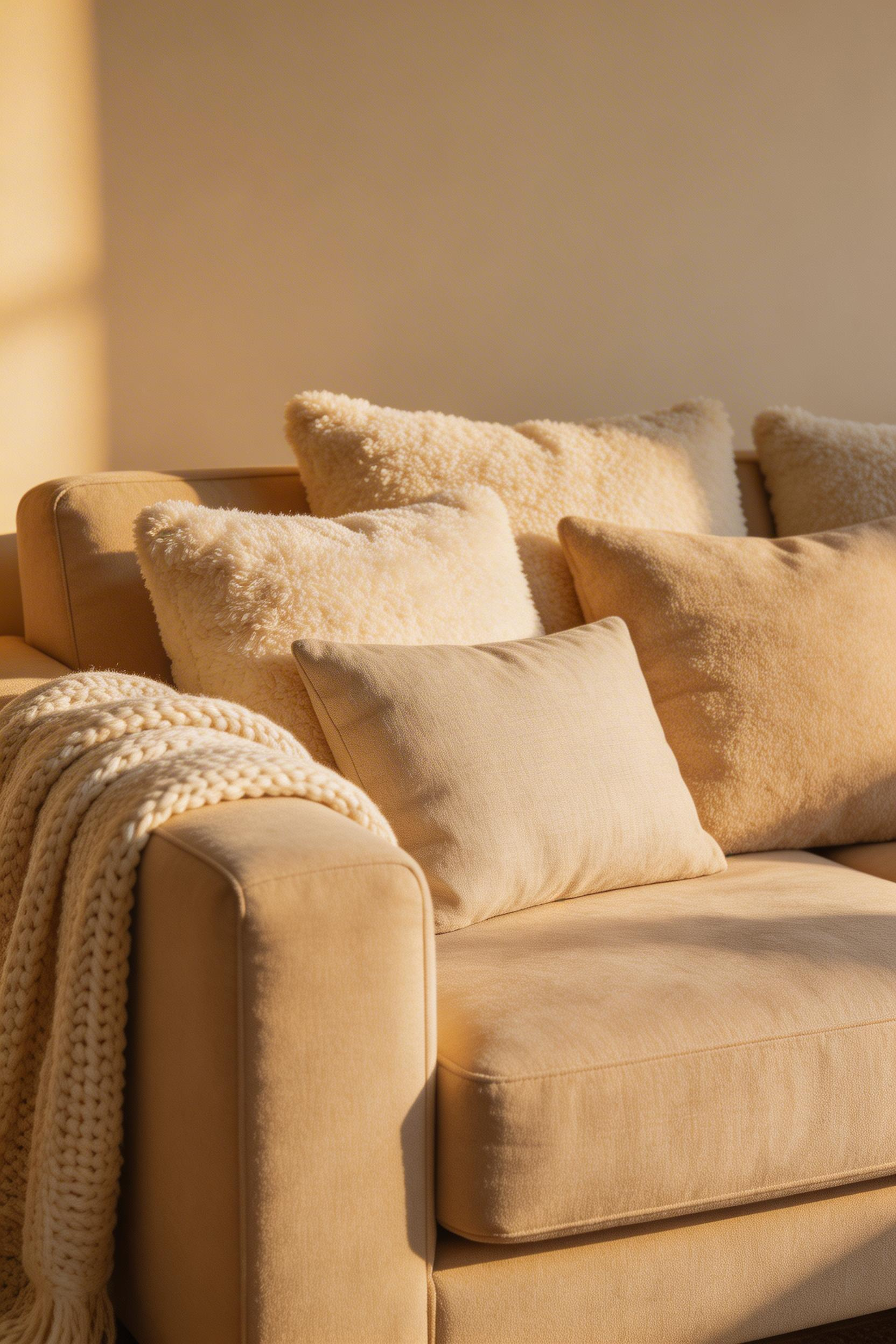
The rule that works consistently is the rule of three fabrics. Choose a smooth base layer, a mid-weight tactile layer, and a chunky accent. In practice: two or three linen cushion covers (50x50cm) as your base. Then one or two boucle cushions in the same tonal range. Finally, a single chunky knit throw draped off one armrest — not folded, not arranged symmetrically, but dropped there as if you actually use it.
Why Varying Heights Matters
The detail most people miss is height variation. A uniform row of cushions reads as styled rather than inhabited. Pair a 60x60cm boucle cushion with a 50x50cm linen behind it. The 10cm height difference creates visual rhythm that a matched set never achieves. Research from environmental psychology backs this up. Textured environments reduce psychological stress more effectively than flat-finish spaces. The texture gives the brain low-level sensory engagement that quiets mental chatter.
Budget options are reasonable here. H&M Home stonewashed linen covers run about £13 each. West Elm’s Chunky Mélange throw is £79 and large enough to drape properly. For boucle, the Anthropologie Textured Boucle Cushion at £38 has the right muted ivory tone. It avoids the orange-yellow cast that cheaper boucle often carries. But honestly, charity shops regularly turn up genuine linen and wool pieces. In a beige room, a found object with a little age reads better than a matched set from one brand.
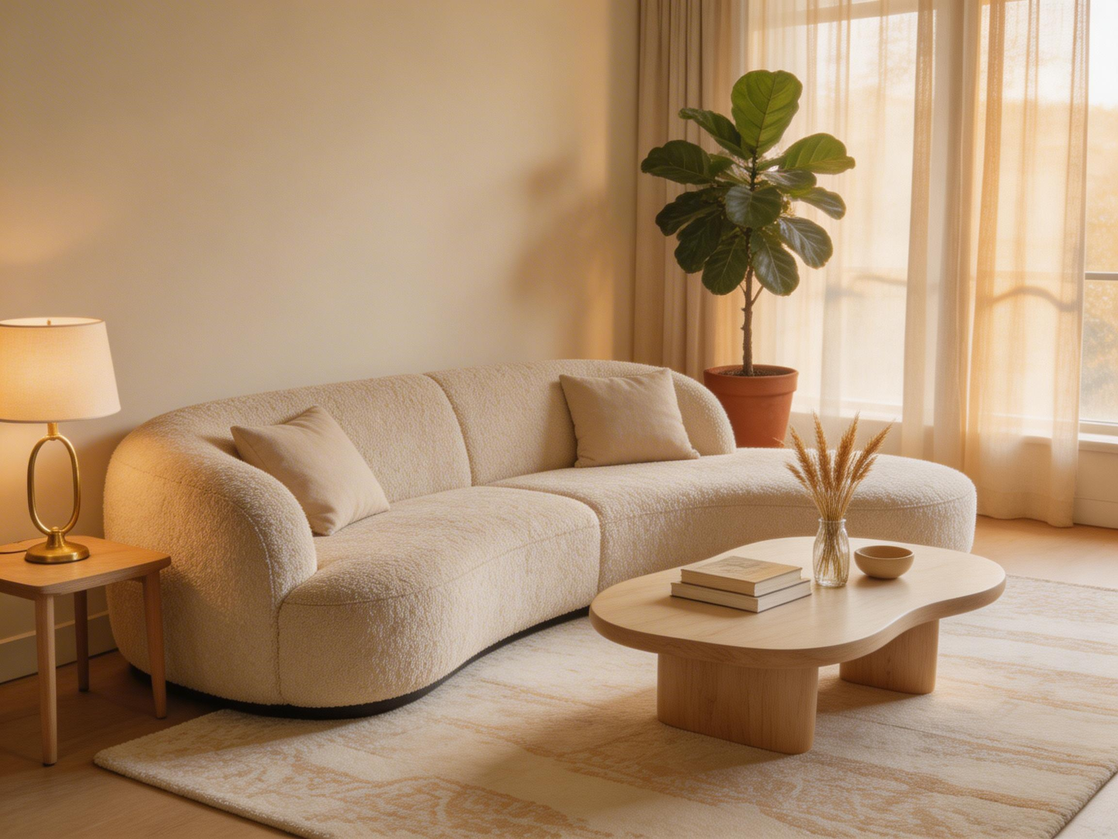
2. Anchor the Room with a Warm-Toned Wood Coffee Table
A coffee table in a beige living room does more structural work than it appears to. Without a warm-toned wood piece at the room’s centre, a beige scheme can drift toward looking unfinished. All soft edges and no visual anchor. The grain and colour of wood in honey, white oak, or walnut tones provides what paint and upholstery cannot: organic warmth and visual weight.
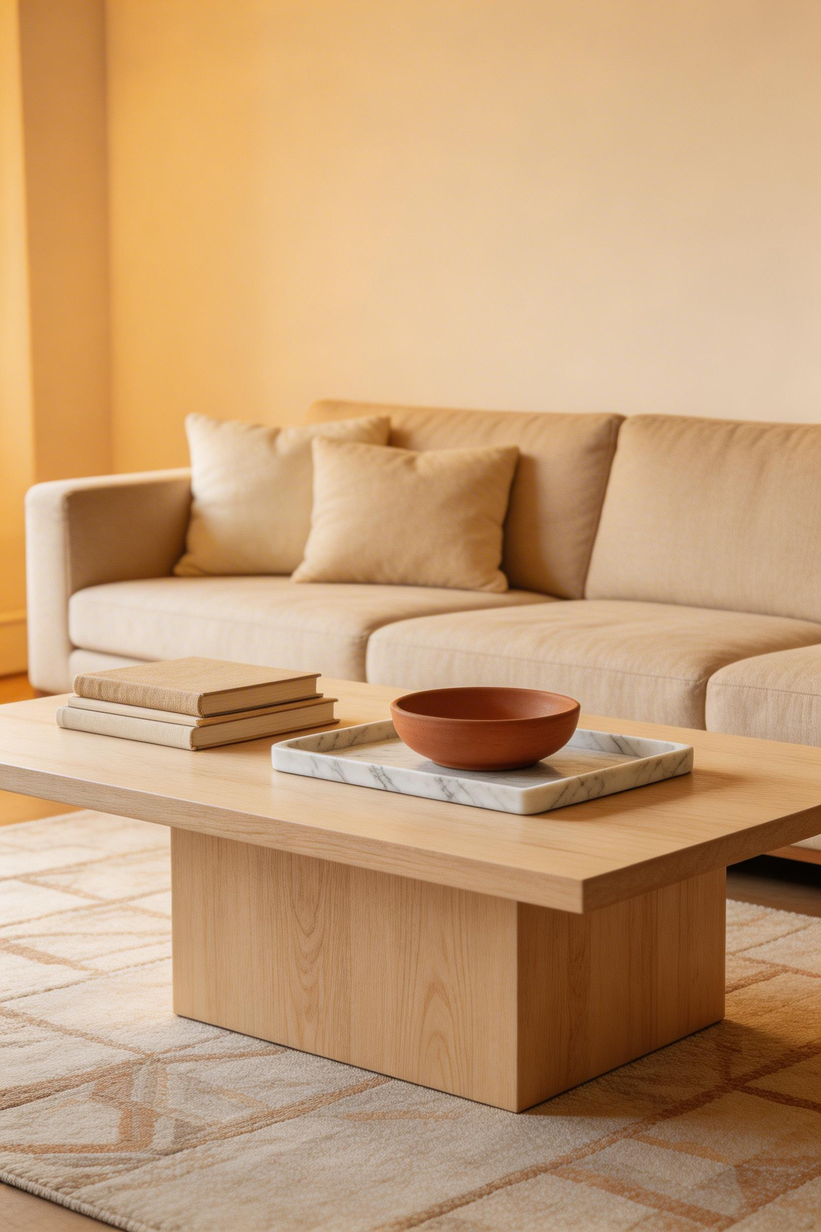
The wood tone should either match your floor closely or contrast clearly. Mid-tones that almost match the floor read as errors rather than decisions. If your living room flooring is a pale ash or blond wood, go darker with walnut or American oak. If the floor is a rich mahogany, a lighter white oak on the table creates intentional contrast rather than confusion.
Getting the Proportions Right
Standard coffee table height sits between 40-45cm. The table should sit 3-5cm below the sofa seat cushion for visual proportion. For a 220cm sofa, a 120-140cm length table creates balance. In smaller rooms, round tables at 80-100cm diameter often work better. They avoid the visual dominance of a long rectangular piece.
The MADE.com Huxley White Oak Coffee Table (£349, 120x60cm) is a reliable mid-range option. It has a clean line that suits contemporary beige schemes. The John Lewis Calia Walnut (£499) has genuine deep grain and a storage shelf — practically useful and visually grounded. For vintage coffee table pieces, solid reclaimed timber from smaller makers on Etsy runs £300-600. These often have the kind of natural marking that new furniture cannot replicate. Leave 30-40% of the surface empty after styling. A table crowded to the edges looks anxious rather than curated.
3. Introduce Brass and Bronze Accents for Low-Key Glamour
Warm metals are the punctuation marks of beige living room decoration. On their own, lamp bases, picture frame edges, cabinet handles, and candlestick holders are small objects. But scattered across a neutral room in consistent brass or bronze tones, they give the eye specific points to land. A room where the eye has somewhere to go reads as designed rather than merely decorated.
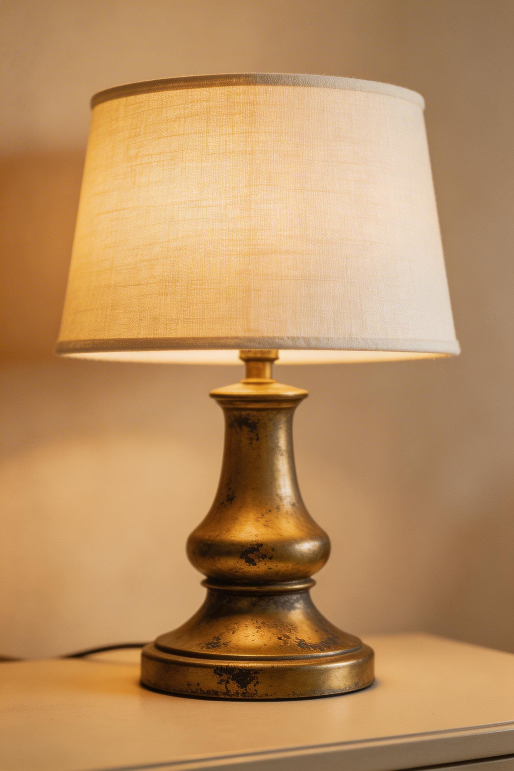
Antique brass suits warm beige better than polished brass. Polished brass can read as yellow against sand tones. The distinction matters. Polished brass reflects coolly. Unlacquered or lightly tarnished antique brass absorbs light more softly and reads as warm rather than shiny. Bronze, with its slightly cooler grey-brown tone, pairs especially well with taupe-leaning beige and greige.
The Repetition Rule
The key discipline here is repetition: repeat the metal in at least three locations. One brass lamp surrounded by silver hardware looks like a mistake. Three brass elements — a lamp base, a set of picture frames, and a pair of cabinet handles — look like a decision. Pooky’s brass lamp bases (from £85) are genuinely good and understated. IKEA’s ENHET brass-effect handles at £8 for four are a practical starting point for extending the metal accent consistently.
Also: unlacquered brass needs occasional maintenance, but the job is simple. Half a lemon and a little salt removes tarnish without stripping the patina. It’s a five-minute task. The result looks far better than the sealed, uniform finish of lacquered pieces.
4. Layer a Large Patterned Beige Rug to Define the Space
The most common rug mistake in a beige living room decoration is scale. A rug that only fits under the coffee table fragments the room rather than grounding it. The front legs of all major seating pieces should sit on the rug. When you get the size right, a rug defines the seating area, adds texture, and introduces pattern without introducing colour.
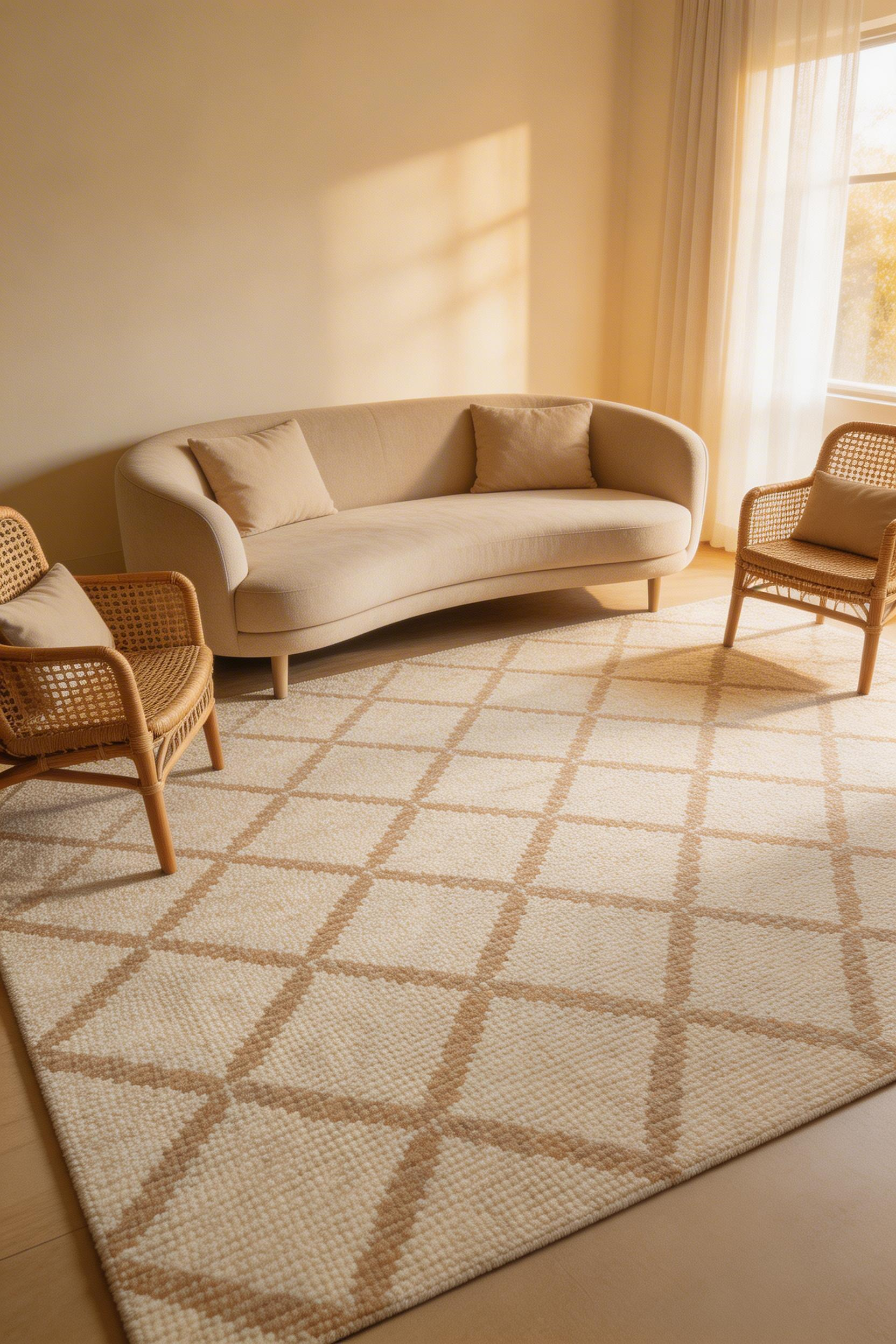
Tonal rugs — those using two or three shades within the same colour family — are the right tool here. A beige-on-cream geometric, an ivory-on-oatmeal abstract weave, or a sand-on-wheat Berber-style pattern all create visual complexity. But they stay entirely within the neutral range. The eye reads the pattern variation as richness rather than colour. That is exactly what a beige living room needs.
Sizing and Layering
For a medium-sized living room, 240x340cm is the minimum to ground the space properly. The Wayfair Moroccan Berber-style rug (200x290cm, £189) is a practical entry point. Its cream-on-oatmeal diamond pattern suits both traditional and contemporary beige rooms. The John Lewis Aisha Abstract (200x300cm, £279, 100% wool) is better quality. It will hold its texture under heavy furniture for years rather than months.
Always use a non-slip underlay the same size as the rug. The 3mm of padding prevents the rug from moving. It also lifts the edges slightly, improving the drape. A rug without a pad always reads as cheaper than it is. For living room flooring in wood or tile, choose a flatweave or low-pile rug. High-pile rugs shift on smooth surfaces even with a pad underneath.
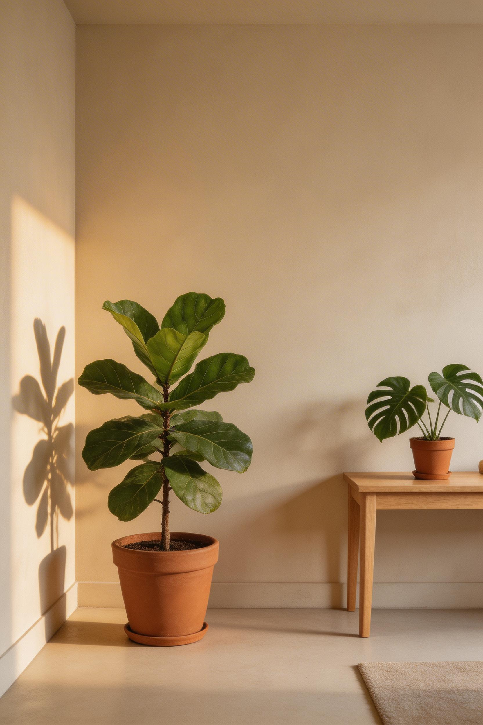
5. Add Living Green Plants for a Natural Colour Counterpoint
In beige living room decoration, green is the only accent colour that feels entirely inevitable. It doesn’t interrupt the neutral palette — it completes it. Warm beige and plant green sit in adjacent contrast on the colour wheel. Green provides the precise temperature counterpoint that warm beige lacks. The result is a room that feels balanced rather than monotone.
The University of Exeter’s 2014 research found that adding plants to a space increased reported well-being by 47% among participants. That finding has been replicated consistently. It aligns with what biophilic design has always argued. The human nervous system responds to living plants in ways that no synthetic material can replicate. In a beige room, where the palette is already calm, plants add the one element that moves and breathes.
Building a Plant Arrangement
The three-tier arrangement is more effective than a single floor plant. A fiddle leaf fig or rubber plant at floor level (100-120cm) as the anchor. A pothos or snake plant at surface level on a console or shelf. A trailing string of pearls in a hanging planter as the top tier. Together, these create sculptural layering that reads as a design decision.
Terracotta pots and seagrass baskets extend the beige palette rather than interrupting it. The unglazed terracotta tone sits mid-way between beige and rust, making it a natural container choice. Patch Plants and Bloombox Club both deliver fiddle leaf figs in the 100-120cm range for £45-70. IKEA’s terracotta pot sets in three sizes run £18-35. Seal the inside before planting to protect any shelf or living room flooring underneath. Also, always use a slightly oversized saucer under floor plants to prevent moisture damage.
6. Mix Beige Paint Finishes Across Walls, Trim, and Ceilings
This is the step most beige living room decorations skip. It is also the one that most reliably separates a flat room from a layered one. Using a single paint colour in three different finishes creates architectural depth without a second colour. Matte on walls, eggshell on woodwork, and a slightly lighter version on the ceiling.
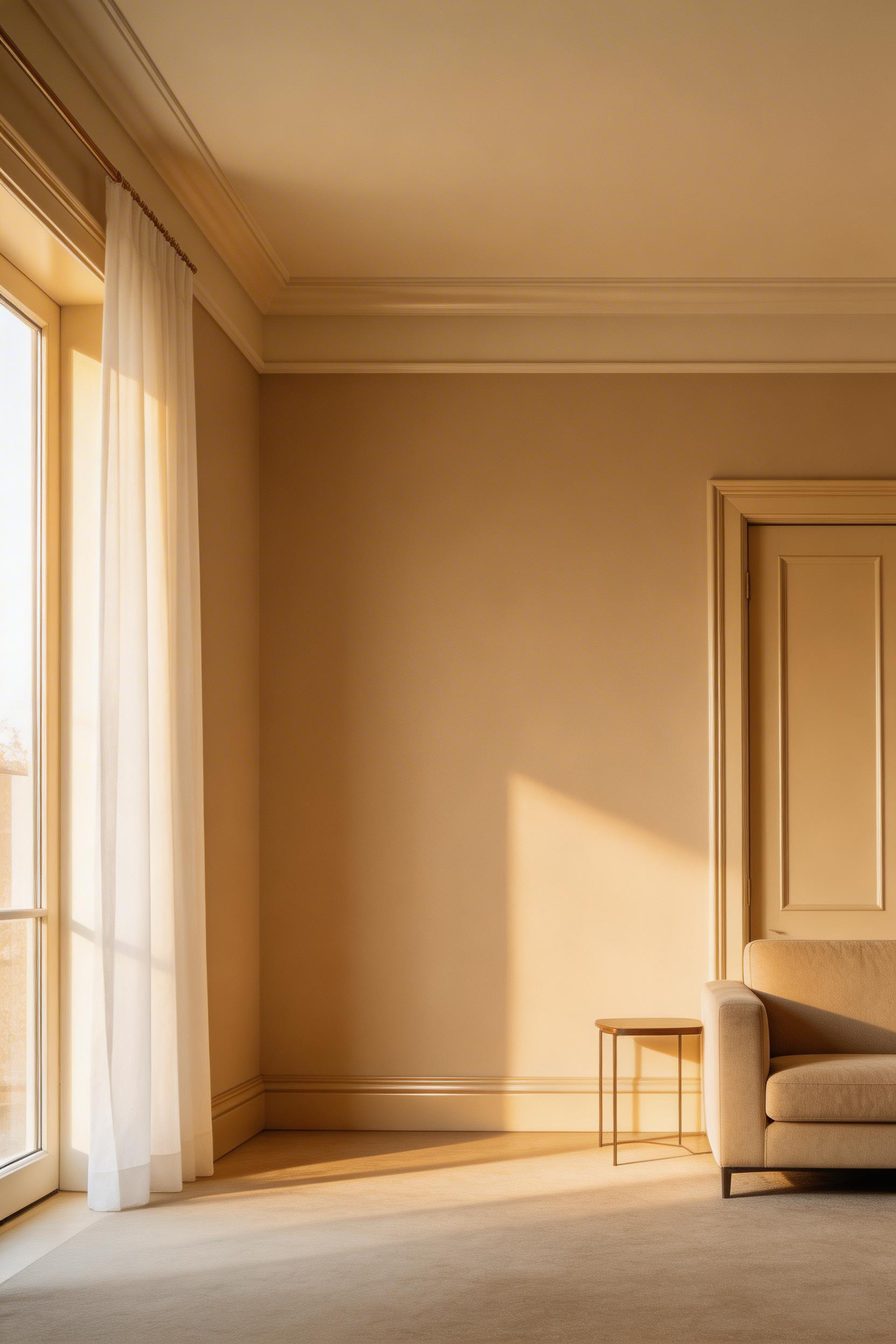
The technique is sometimes called ‘drenching’. It involves painting everything — including ceiling and trim — in tones within the same colour family. The finish hierarchy matters, however. Flat/matte on walls absorbs light and hides imperfections. Eggshell or satin on woodwork is more durable and cleans easily. A 10-15% lighter version on the ceiling avoids the oppressive quality of a coloured ceiling that’s too deep.
Choosing the Right Beige
Farrow & Ball’s ‘String’ (No.8) is a warm yellow-beige in their range since the 1980s. It remains one of their most consistent living room sellers. Their ‘Jitney’ (No.293) is slightly greyer and suits rooms with cooler light. Little Greene’s ‘Aged Ivory’ is creamier and less overtly yellow. It suits rooms with warm wood floors particularly well. For a budget option, Dulux ‘Natural Hessian’ has genuine warmth and is available in all required finishes. The ceiling version should always be the lightest point. ‘Dimity’ from Farrow & Ball works well. Alternatively, a 20% dilution of your wall colour mixed by any paint shop achieves the same effect.
Also: paint the ceiling before the walls. This sequence saves time and eliminates ceiling drips on freshly painted walls. Cut in against the dry ceiling as your second step. The half-hour it saves is worth more than the instruction seems to suggest.
7. Bring In Travertine or Limestone Stone Accents
Travertine is the natural stone that most closely echoes the beige palette. Its characteristic cream, ivory, and warm tan tones come from natural pitting and veining formed by thermal spring deposits. These make it inherently compatible with beige living room decoration. More importantly, travertine adds something that paint and fabric cannot. It is geological texture — a material formed over thousands of years that carries that history visibly in its surface.
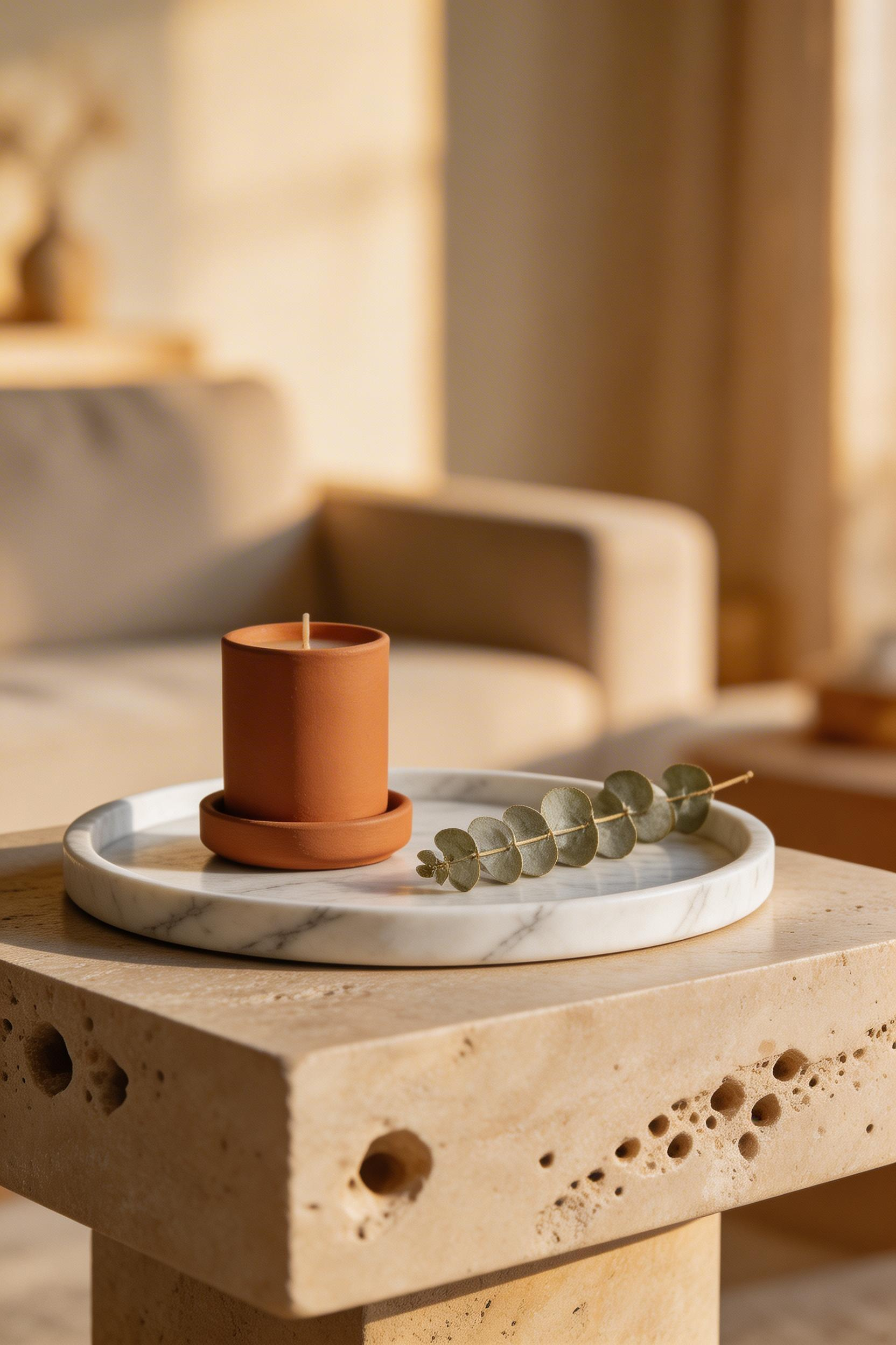
The argument for stone in a beige room comes down to natural variation. Within a single piece of travertine, the shifts from pale cream to warm tan, the organic pitting, the subtle veining — these provide more visual complexity than any paint finish or textile pattern. Also, stone never dates. A travertine side table bought now will look as appropriate in 20 years. That cannot be said for most decorating choices.
Where to Start with Stone
Full travertine living room flooring runs £40-95/sqm for honed, filled tiles. That is a significant investment. For beige living room decoration on a more measured budget, start with objects. CB2’s Travertine Side Table (£299) has a 20cm round top on a geometric metal frame. It is small enough to sit beside an armchair without commanding the room. Rockett St George’s Natural Travertine Tray (£55, 30x20cm) adds organic texture to a coffee table. H&M Home’s Travertine Candle Holder Set (£29.99) is the lowest-commitment entry point.
For any travertine objects used as surfaces, seal with a penetrating sealer annually. Avoid lemon or vinegar-based cleaners, which etch the stone. Buy unfilled travertine where possible for decorative use. The visible voids are what make the material distinctive. In a beige room, that organic patterning reads as intentional texture rather than a manufacturing flaw.
8. Use Terracotta and Clay Tones as Warm Accent Colours
Terracotta is beige’s closest relative on the colour wheel. Its warm orange-red base shares the same yellow-undertone as warm beige. That means it creates harmony rather than contrast when introduced as an accent. It is the safest and most effective accent colour for a beige living room decoration scheme — warmer and more grounded than blush, more personal than sage, more cohesive than rust.
The terracotta trend has been sustained since approximately 2018. That is unusually long for an interior colour movement. Terracotta genuinely solves a problem. It provides warmth and personality without the aggression of orange or the tartness of red. So it is compatible with neutral base palettes in a way that most colours are not.
Getting the Proportion Right
The proportion guide for terracotta in a beige room matters: terracotta accents should make up no more than 15-20% of the visual field. Distribute across three or more objects rather than one large piece. Two stonewashed linen cushion covers in terracotta (H&M Home, £17.99 each) among four oatmeal boucle cushions is a good start. Add a set of three clay ceramic bowls on the coffee table (Zara Home, £29.99). Finish with a terracotta-glazed plant pot. That is enough. More than this and the room starts to read as Spanish bistro rather than calm living space.
The most effective terracotta accent, though, is often the unplanned one. A handmade ceramic mug left on the coffee table, a terracotta-coloured book spine facing outward in the gallery wall — these read as personality rather than styling. Because that is what they are. Natural clay tones include raw sienna, burnt sienna, ochre, and terracotta proper. Mixing two or three of these across your objects creates more depth than a single matched set.
9. Choose a Curved Sofa as the Room’s Central Statement
A curved sofa does in form what a bold colour would do in a conventional room: it provides visual drama. In beige living room decoration, where the palette is deliberately restrained, the silhouette of the sofa becomes the primary design statement. A curved or arc sofa in oatmeal, sand, or warm ivory commands the room without a single contrasting colour.
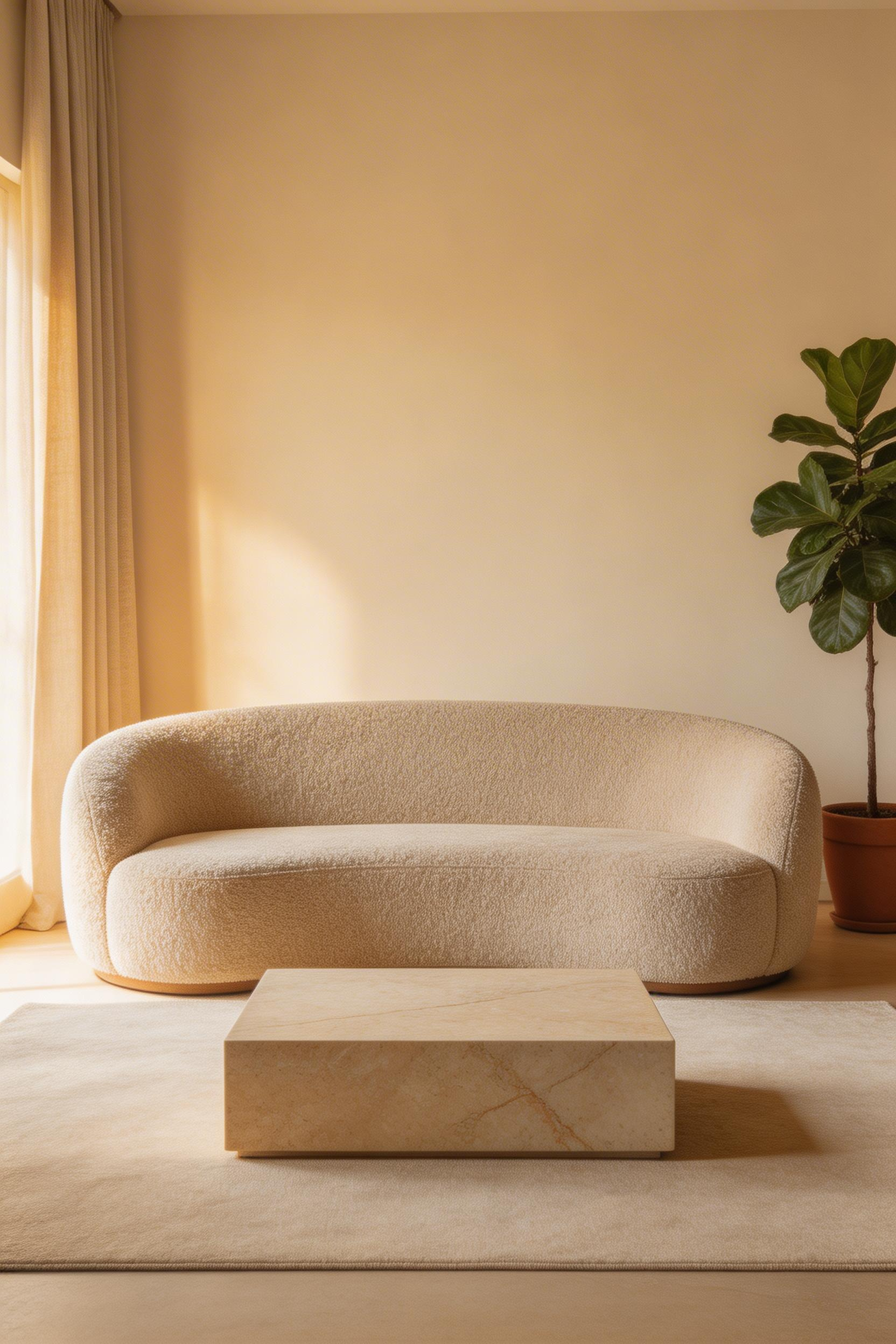
The curve trend has been sustained since 2021. It was driven by a widespread reaction against hard-edged minimalism. But beyond trend, there is a practical reason curved sofas work in beige living rooms. The organic shape adds visual softness that flat-front sofas lack. In a room without colour contrast, the curve is what the eye follows around the piece. This is also worth considering for formal living room arrangements. The choice between a curved and a straight sofa significantly affects how formal or relaxed the space reads.
Buying Considerations
Standard curved sofa length runs 220-260cm for a gentle curve. Full-arc designs reach 280-340cm and need room to breathe. A 60-80cm walkable clearance on the open side is essential. Sofa.com’s Lilou Curved Sofa in Natural Boucle (£2,195, 220cm) has a generous 100cm seat depth. The boucle surface handles both texture and colour in a beige scheme. John Lewis’s Otley Large 3-Seater in Sand Weave (£2,499) has a 10-year frame guarantee. That matters more than most buying guides acknowledge. For budget options, MADE.com’s Ola Chaise End in Oat Boucle at £1,799 adds chaise functionality for larger rooms.
Seat depth is the most overlooked specification before purchase. 90-100cm is comfortable for most adults. Anything under 85cm starts to feel like perching rather than sitting. If buying in a showroom, sit on the sofa for 10 minutes. The body will tell you quickly whether the depth is right.
10. Style Natural Linen Drapes from Ceiling to Floor
Hanging curtains from ceiling height is one of the most reliable optical illusions in interior design. It adds perceived ceiling height without touching the architecture. It also makes windows appear larger. In a beige living room decoration context, it creates a continuous vertical flow of neutral tone from ceiling to floor. The whole room reads as taller and more considered.
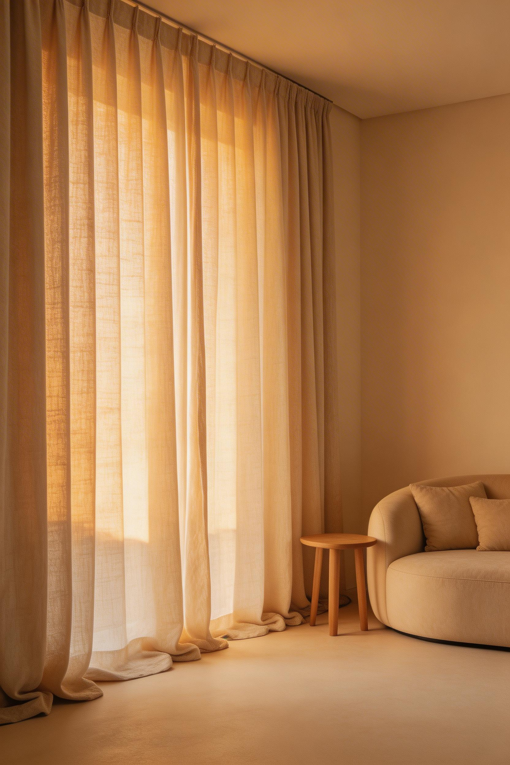
Undyed or raw linen ranges from pale oat to mid-wheat. There is natural variation between rolls from the same batch. This variation — often seen as an inconsistency — is actually a feature in beige living room decoration. The slight tonal shift within the fabric creates the same layered quality as using multiple shades of beige. But within a single material.
Getting the Drop and Width Right
Curtain drop for a standard 2.4m ceiling: 260-270cm for a clean floor break. A 5cm puddle reads as more formal. Ten centimetres or more of pooled fabric is theatrical and adds warmth. The IKEA ANNAKAJSA sheer linen curtains (145x250cm, £40 per pair) are an honest value option. They will need a curtain extension tape for a clean floor drop in standard rooms. The White Company Heritage Linen Curtains (£120 per panel, 140x228cm) are pre-washed for a relaxed drape.
Width is as important as drop. Eyelet curtains need 1.5-2x the window width per panel for adequate fullness. Buying curtains that are too narrow is the most common sizing mistake. Thin curtains look poor even in premium linen. Steam curtains for 20 minutes after hanging rather than ironing them. The steam relaxes the fibres into soft natural folds. That slightly lived-in quality is precisely what makes linen drapes work in a beige room.
11. Incorporate Wicker, Rattan, and Cane for Natural Depth
Rattan, cane, and wicker share a defining quality in beige living room decoration: the light-and-shadow effect of their woven structure. As light moves through a room across the day, a rattan armchair or cane-front cabinet creates shifting micro-patterns on the surrounding surfaces. This is visual complexity achieved through natural material rather than colour or pattern. And it is entirely within the beige family.
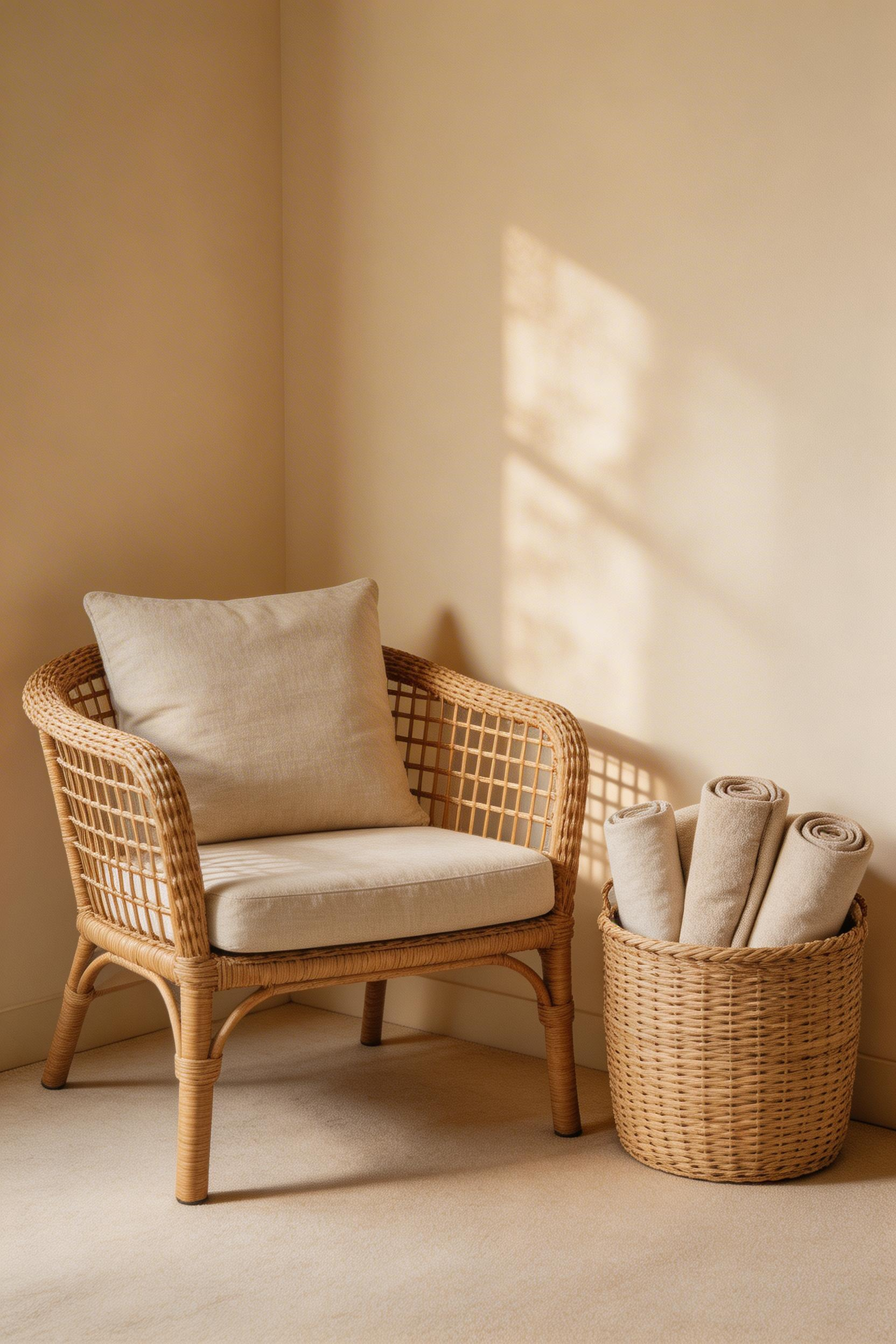
Genuine rattan is naturally beige-toned, ranging from pale honey to mid-wheat depending on age and finishing. This material-level compatibility is why rattan has appeared in interior design across decades. From 1930s conservatory furniture through 1970s naturalism to the back-to-nature interiors of the 2020s. The H&M Home Rattan Armchair at £179 is a solid entry point with a slatted back that creates strong shadow lines. The Habitat Cane Cabinet with Glass Door (£349) combines rattan with oak. It extends living room styling by adding storage function and organic texture in a single piece.
The Best Rattan Buy for a Beige Room
The most efficient rattan purchase in a beige living room is a storage basket, not a chair. A 40-50cm wicker basket filled with rolled linen throws beside the sofa gives texture, storage, and sculptural organic form for under £50. Rockett St George’s Rattan Floor Basket (£45) is a good option. The Habitat Cane Cabinet at £349 is the step up — a functional piece that also serves as a texture element. For rustic living room decor approaches, rattan integrates naturally with earthy palettes and warm woods. Woven natural materials appear consistently in that aesthetic alongside linen and stone.
12. Create a Tonal Beige Gallery Wall with Neutral Artwork
A gallery wall is one of the strongest focal points available to a beige living room decoration. The usual concern — that it will look too low-contrast and bland — misunderstands how the tonal approach works. The human eye reads variation between ivory, warm white, tan, sepia, and ochre as richness. Not monotony. The visual complexity comes from variation within the beige palette, not from contrast outside it.
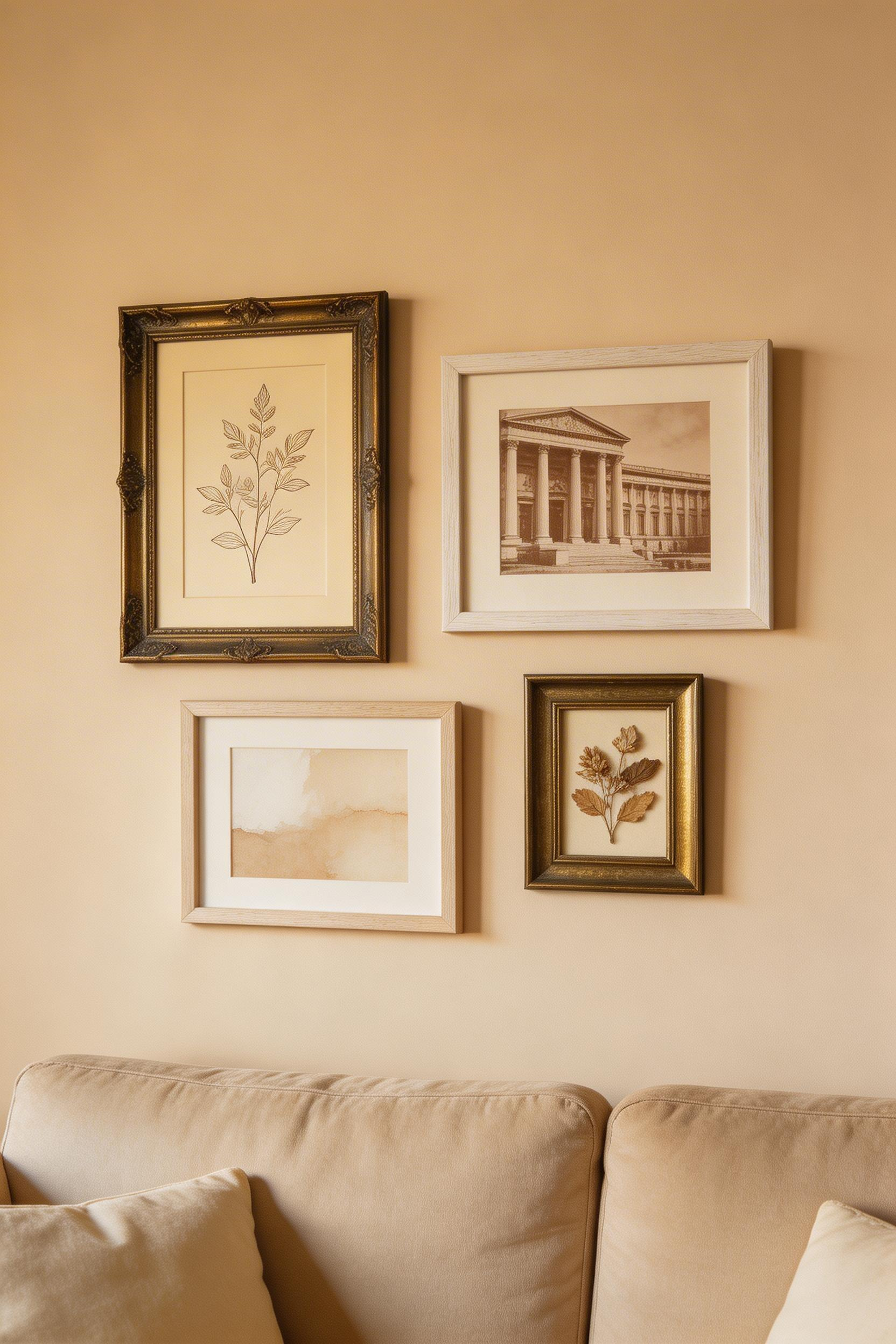
The gallery wall format that suits beige rooms most naturally uses mixed frame materials within a warm neutral range. Antique brass, bleached wood, natural linen-covered frames, and raw wood each add variation. But all stay within warm neutral territory. Art types that work: botanical line drawings, sepia or black-and-white photography, abstract washes in cream and warm ochre, pressed dried plants, vintage maps in earth tones. Desenio’s Botanical Study Prints (set of 3, A3, £39 unframed) come in cream-background, warm-ochre-illustration versions that sit well against most beige walls.
Hanging and Arrangement
The centre of the arrangement should sit at approximately 145-155cm from the floor. That is average eye level. For a gallery wall above a sofa, the bottom of the arrangement should sit 20-25cm above the sofa back. Closer looks cramped. Further creates disconnection.
Arrange the entire layout on the floor first. Photograph it. Live with the photo for a day, then begin hanging. The rearrangement you make between floor layout and final wall version is almost always worth the extra time. Patching multiple nail holes in freshly painted beige plaster is a genuinely tedious task.
13. Layer Ambient Lighting with Warm-Bulb Table and Floor Lamps
Light temperature is the most overlooked variable in beige living room decoration. A room painted in the most considered warm beige, furnished with perfect neutral textiles, can read as cold and grey under the wrong bulbs. Conversely, a simple beige room under well-chosen 2700K lighting becomes golden, enveloping, and genuinely calming.
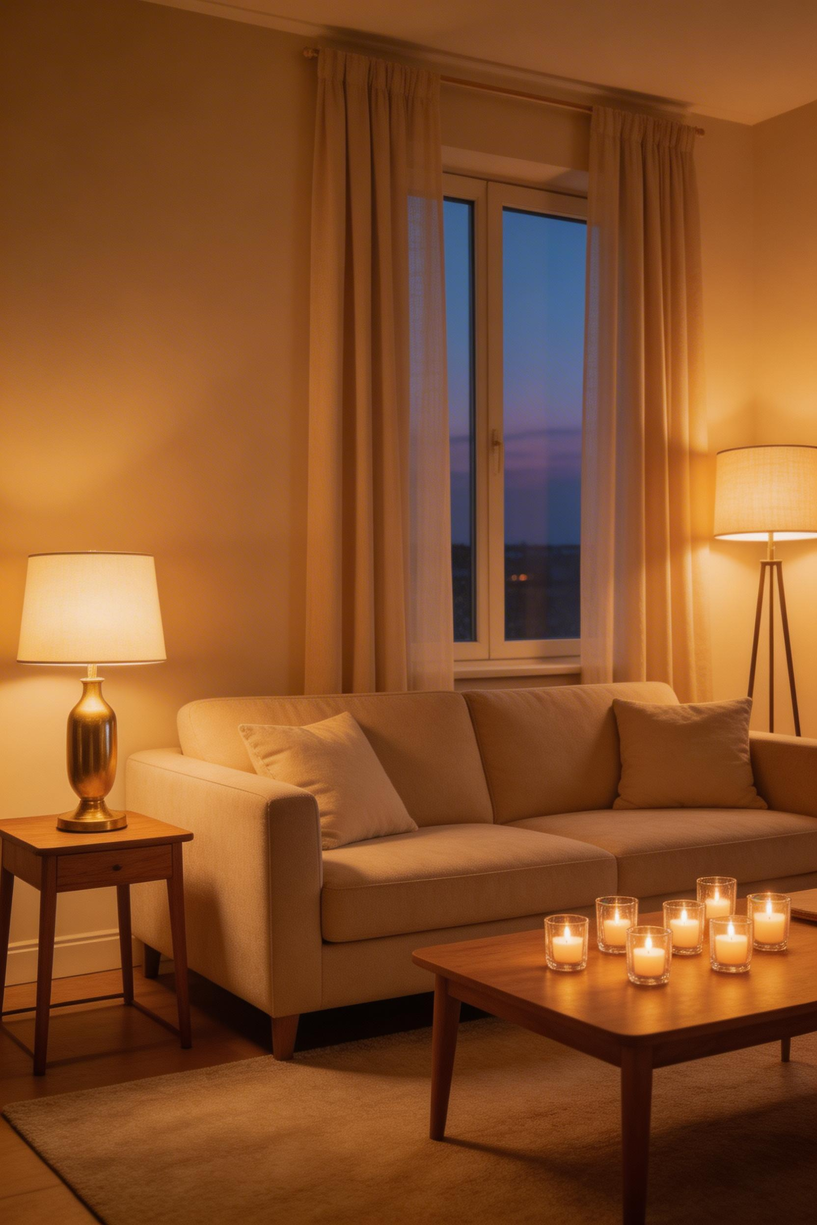
The science is direct. Warm-coloured surfaces like beige, cream, and terracotta reflect warm light warmly. Under 4000K LEDs — the standard in many households — beige walls appear grey despite their warm paint colour. Under 2700K bulbs, the same walls glow. A research paper from the Lighting Research Center found that warm-coloured rooms under 2700-3000K lighting were rated 28% more ‘comfortable’ and ‘relaxing’ than under cool white light.
Layering the Sources
Layered lighting means three or more sources at different heights. Overhead ambient (a ceiling light on a dimmer). Mid-height task (a floor lamp beside a reading chair). Low accent (a table lamp on a side table or console). The Pooky Linen Shade Table Lamp with Brass Base (£95 base, £45 shade) is a reliable choice. The linen shade transmits 2700K light as amber rather than pure yellow. IKEA’s RANARP Floor Lamp (£45) with an off-white shade and a warm filament bulb is an honest budget option. Philips Hue White Ambiance bulbs (£64.99 for three) allow the full range from 2200K candlelight to 6500K daylight. The ability to shift to near-candlelight warmth on winter evenings fundamentally changes the experience of a beige living room.
Replace every living room bulb with 2700K equivalents before doing anything else. It costs £30-50 total. It is the cheapest beige living room decoration upgrade available.
14. Introduce Cream and Warm White for Tonal Variation
Beige is not a single colour. It is a family of approximately 15-25 named shades across major paint brands. Pale ivory and warm cream at the lighter end. Mid-tone wheat, oatmeal, and sand in the middle. Deeper taupe and greige at the other end. Using tones from across this range in a single room creates visual depth. No single shade, however carefully chosen, can provide that alone.
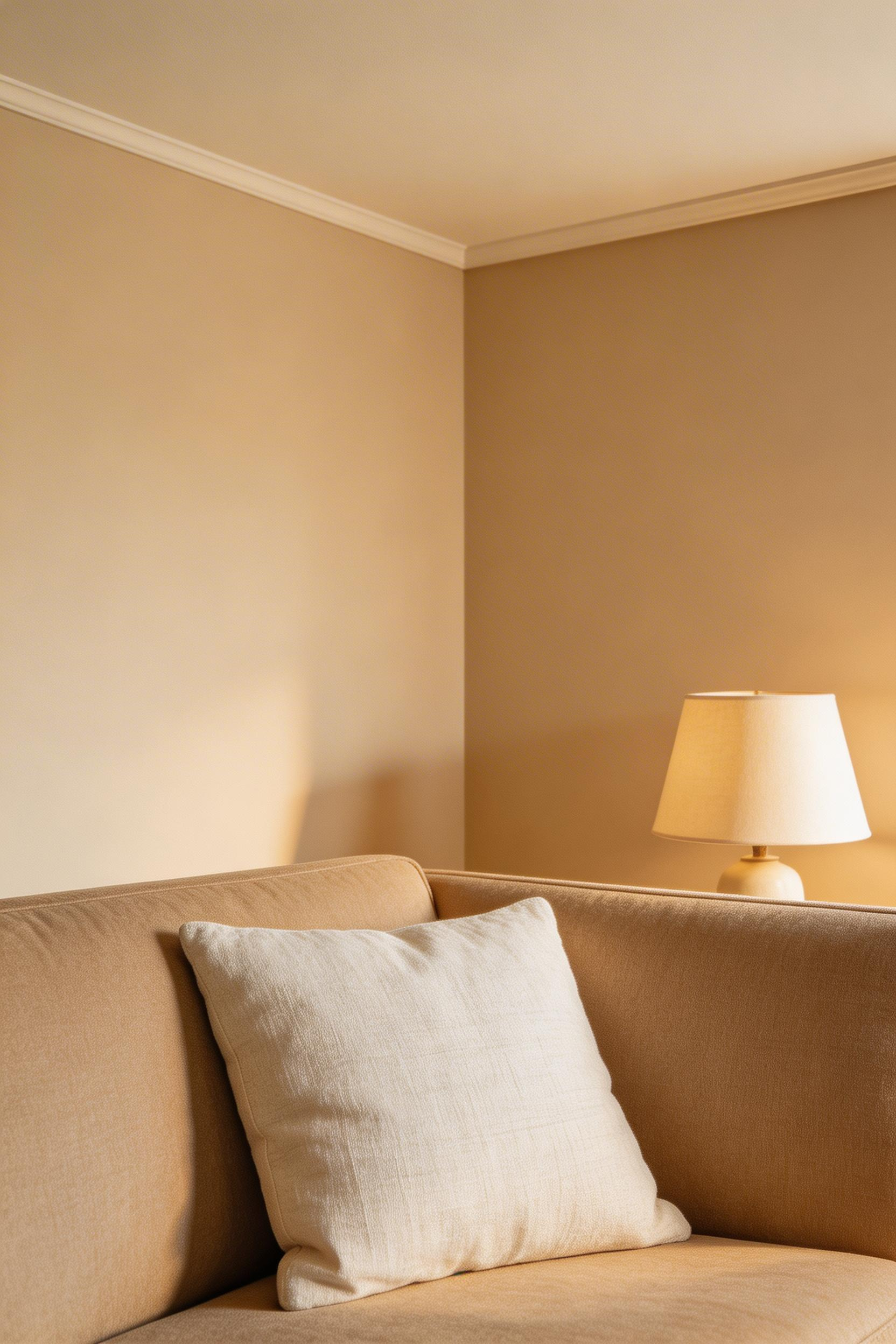
The important distinction in beige living room decoration is between warm white and cool white. Pure white — Dulux ‘Pure Brilliant White’, Farrow & Ball ‘All White’ — reads clinical and cold against warm beige. It creates an unwanted contrast that chills the whole palette. Off-white options maintain warmth. Farrow & Ball’s ‘Dimity’ (a pale cream with a faint pink undertone) works well as a ceiling colour over beige walls. Little Greene’s ‘Architect’s White’ is clean but warm. It works as a trim colour without cold contrast.
A Simple Test
The fastest way to check whether a white is warm enough: hold a sheet of pure white paper next to the paint chip. If the paint looks warm and the paper looks cold by comparison, the paint is warm enough. If they look similar in tone, the white is too cool. This test takes 30 seconds and saves a tin of paint. Dulux’s 2024 Colour of the Year was ‘Sweet Embrace’, a warm off-white. It was the second consecutive year their trend colour was in the warm neutral family. That reflects sustained consumer preference rather than a short-lived trend.
For smaller beige living rooms, a cream ceiling and off-white trim create lightness and freshness. The lightening effect is real without the palette disruption that pure white creates.
15. Style the Coffee Table with Organic Objects and Books
Coffee table styling in a beige living room decoration scheme requires the same discipline as the rest of the room. Stay within the natural, organic, warm neutral palette. Let texture and form do the work. The most common mistake is either leaving the table empty or over-filling it with matched objects from a single homeware brand. The first makes the room feel uninhabited. The second makes it look like a shop window display.
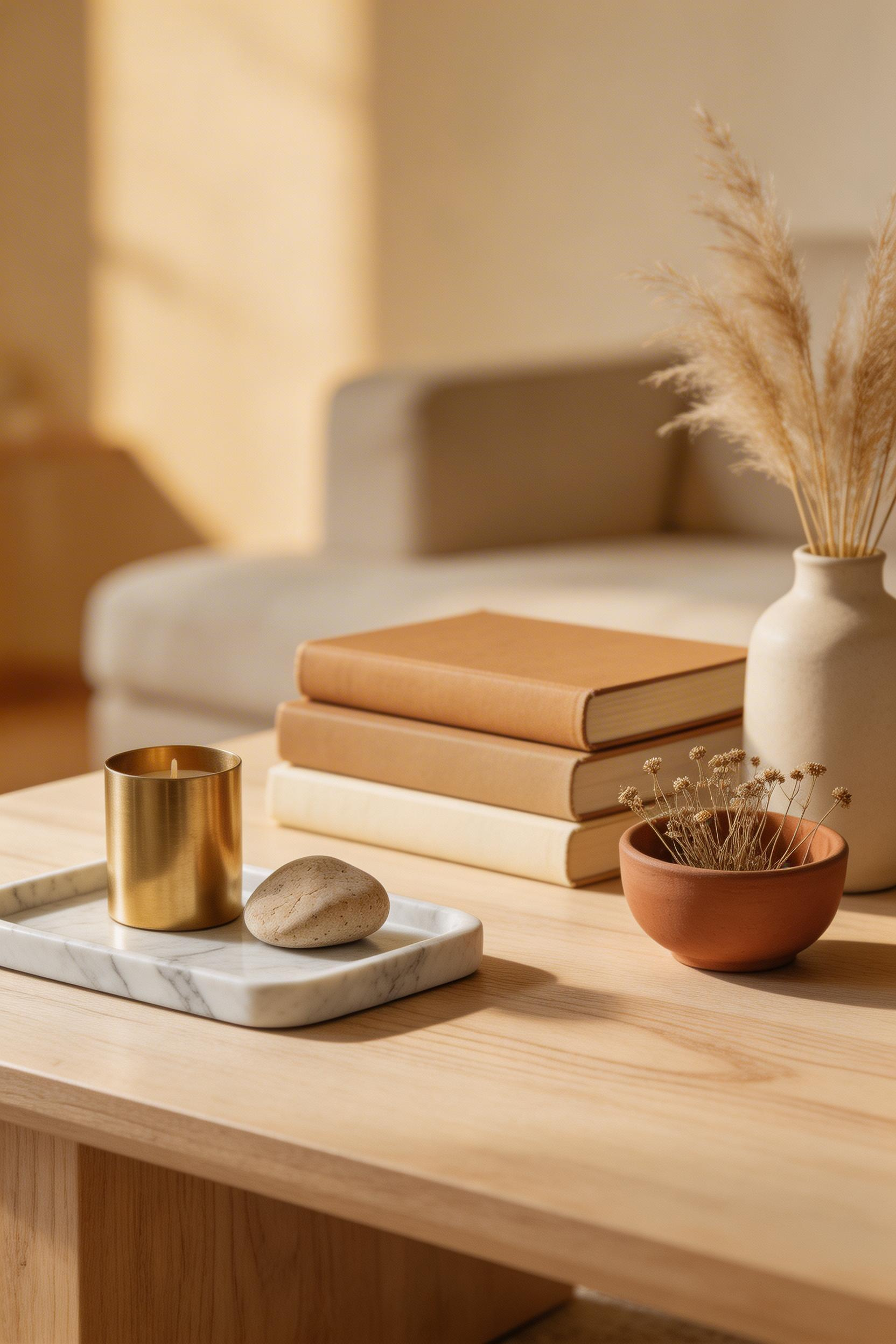
The standard formula: a tray as the base layer (marble, travertine, or plain wood — never plastic or chrome in a beige room). Then 2-3 books stacked horizontally with spines showing. An organic object with height (a ceramic vase, a stone sculpture, a dried botanical arrangement). And one element of visual lightness (a taper candle, a small plant). The tray groups the objects so they read as a collection rather than clutter. It also protects the table surface.
Objects Worth Finding
For a beige living room, the coffee table objects should follow the same material logic as the rest of the room. Natural stone, aged wood, terracotta, brass, unbleached linen-wrapped books. Assouline art books consistently have cream or tan spines. They are beautiful objects in their own right. The Menu IGNUS Taper Candle Holders in Brass (set of 2, £58) repeat the metal accent theme. Ivory or unbleached beeswax candles sit correctly within the palette. H&M Home’s marble tray (£29.99) is a reliable everyday object.
For vintage coffee table finds, a well-patinated wooden bowl or stone vessel from a market will always read better than a matched set from a homeware chain. The difference between a room that looks designed and one that looks bought is often exactly this. It is whether the objects on the table have individual character or group anonymity. A good source for this approach is the vintage coffee table guide, which covers how to source and evaluate vintage wooden and stone pieces for living room use.
Finding Your Beige Living Room Decoration Starting Point
Beige living room decoration works because it asks something different of the designer. Instead of using colour to create interest, it asks you to work with texture, light, form, and tonal variation. That demands more considered decision-making than choosing a bold wall colour. But the result — when the layers are right — is a room that genuinely rests the nervous system, photographs beautifully in any light, and ages well as tastes shift.
The most effective starting sequence is not from the walls outward but from the floor up. Get the living room flooring right first — the wood tone, the rug scale, the material of the floor itself. Every decision above it becomes easier from there. The sofa choice (curved or straight, deep or standard, boucle or linen) sets the room’s character. Lighting temperature comes next, because it governs how every other element reads. Texture layers — curtains, cushions, wicker, throws — build on that foundation. Metals and stone are the finishing punctuation.
The specific recommendation, if you are beginning from scratch: start with the 2700K bulb replacement, a rug in a correct size, and one quality plant in a terracotta pot. These three things — warm light, a grounded room anchor, and a living counterpoint in green — will tell you more about what your beige room needs next than any mood board can.