When exploring small living room ideas, common wisdom suggests that limited square footage inherently demands diminutive furniture. Homeowners often scale down decor to match a limited footprint. As a result, rooms fill with petite armchairs and postage-stamp rugs. However, this instinct triggers the “Dollhouse Effect.” Rather than maximizing space, this approach creates a cramped, artificial environment that lacks genuine comfort. For the discerning homeowner, true luxury is found in mastering architectural scale rather than simply buying smaller items.
Technically, this design failure stems from severe visual fragmentation. When the eye stops at many small items, the room feels cluttered and disjointed. Moreover, an over-reliance on “leggy” furniture creates an unanchored, unstable sensation. Without a grounded focal point, the design loses necessary visual weight. In fact, the room begins to mimic a fragile diorama rather than a functional, human-centric home.
Therefore, successful design requires prioritizing “presence” over mere physical size. This guide reveals why substantial pieces often make small rooms feel significantly larger. We will explore the psychological shift from Victorian clutter to modern spatial volume. Finally, you will learn to master “ruthless editing” to create a cohesive, grounded living experience.
The Myth: Small Rooms Require Small Furniture
In the world of interior design, the rule that small rooms require small furniture is pervasive. Yet, modern designers are debunking this myth. Filling a compact space with petite pieces creates what experts call the “Dollhouse Effect.” Consequently, the eye jumps from object to object, never finding a place to rest. This visual noise increases cognitive load, making the room feel cluttered. In contrast, a substantial piece creates a singular focal point, effectively reducing mental friction.
Crucially, you must understand the difference between size and architectural scale. For example, low-profile furniture often gets lost in rooms with high ceilings. Therefore, utilizing vertical real estate with taller items bridges the gap between human height and the room’s volume. This draws the eye upward, celebrating the space’s structure rather than just its footprint.
We can also look to Gestalt psychology for guidance. Essentially, the human mind craves stability. Thus, a large sofa acts as an anchor, utilizing the “Principle of Closure” to define zones without walls. While tiny furniture often feels temporary, substantial pieces offer primal psychological comfort. Ultimately, think of your living room as a gallery. Instead of hanging dozens of tiny photos, command the space with one large, breathtaking canvas.
The Reality: Architectural Scale and Visual Continuity
True spatial expansion requires engineering, not just decoration. Successful design manipulates how the brain perceives physical boundaries. A common error involves filling compact rooms with petite furniture. This creates a cluttered, “dollhouse” effect. Instead, architects apply “selective monumentalism.” By anchoring the space with one oversized element, like a floor-to-ceiling bookshelf, you reset the room’s scale. Therefore, the brain registers volume rather than constriction, a hallmark of modern living room decoration in luxury homes.
Furthermore, visual continuity depends on an uninterrupted floor plane. In fact, any visual break acts as a full stop for the eye. We utilize “leggy” furniture to keep the flooring visible underneath. Simultaneously, adopting a “low horizon” profile expands the vertical void above. As a result, the ceiling feels significantly higher, reducing any sense of confinement.
Finally, you must address the room’s perimeter. Distinct, high-contrast trim creates a rigid frame that boxes you in. Alternatively, painting doors and molding the exact color of the walls dissolves these outlines. This monochromatic approach removes visual friction. Ultimately, the eye glides over corners, making the architectural limits feel nonexistent.
Phase 1: The Architectural Envelope (Foundation)
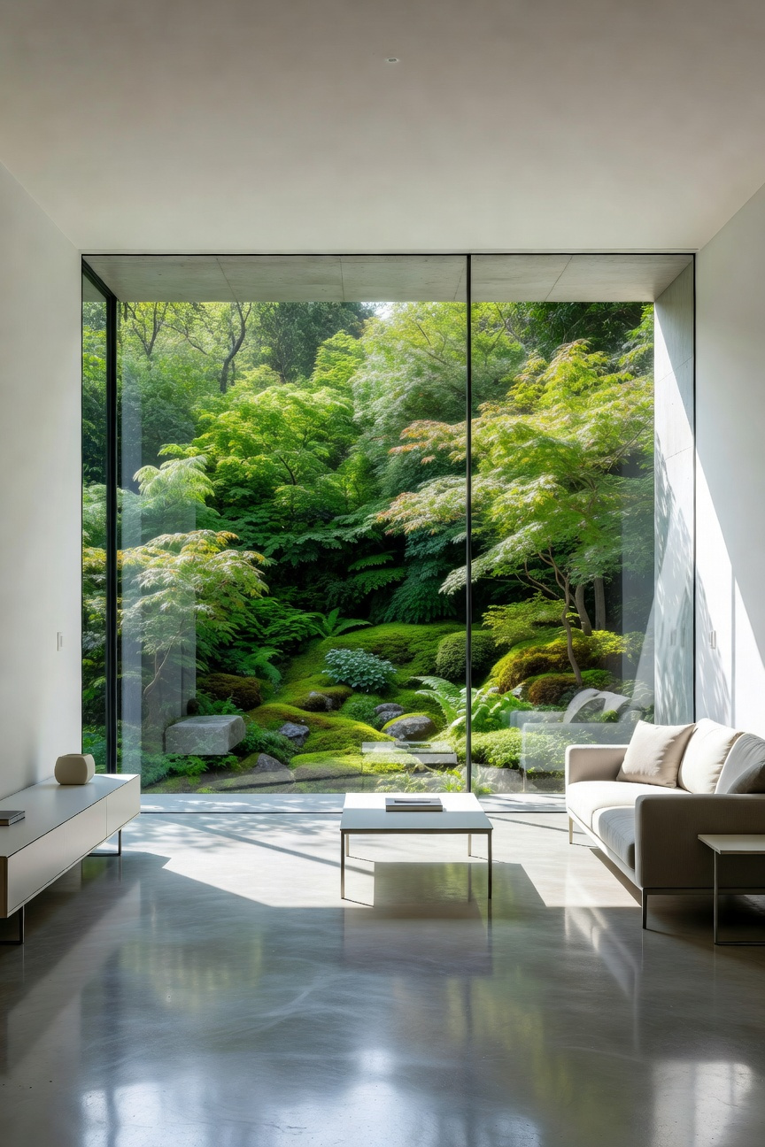
In this foundational phase, the architectural envelope acts as a high-performance shell rather than a simple box. This shell dictates the room’s psychological and physical limits. First, we must address the “transparent” envelope through the concept of *shakkei*, or “borrowed scenery.” This approach transforms windows into structural expansions. By aligning sightlines with the view rather than the wall, the exterior becomes a living canvas. Furthermore, incorporating corner glazing dissolves visual “dead corners,” pushing the room’s boundary outward.
Next, apply a subtractive method to the “opaque” envelope. Rather than adding furniture that consumes navigable volume, carve into the wall cavity. Historically, this mimics Haussmannian niches, where storage recessed into the architecture. Therefore, utilizing deeper wall studs allows for flush shelving without encroaching on the floor plane. In short, the storage becomes part of the structure.
Simultaneously, we must consider bio-acoustics. Because small spaces often suffer from “acoustic glare,” standard materials create stress. Instead, utilizing porous assemblies like cork or lime plaster creates a “soft envelope.” These materials dampen sound and prevent thermal drafts, allowing for edge-to-edge habitability. Finally, manipulate the vertical dimension. Applying a high-gloss finish to the ceiling mirrors the floor below. Ultimately, this simple optical trick doubles the perceived volume, turning a small footprint into a sophisticated urban home.
1. Obliterate the Corners: Perimeter Lighting to Dissolve Boundaries
In small industrial spaces, shadows define the limits. Therefore, to expand a room, you must effectively erase its corners. This concept relies on “Ambient Luminescence,” a philosophy pioneered by lighting legend Richard Kelly. This technique mimics the boundless, uninterrupted light of a snowy morning. By bathing walls in this uniform glow, the room’s edges seem to evaporate.
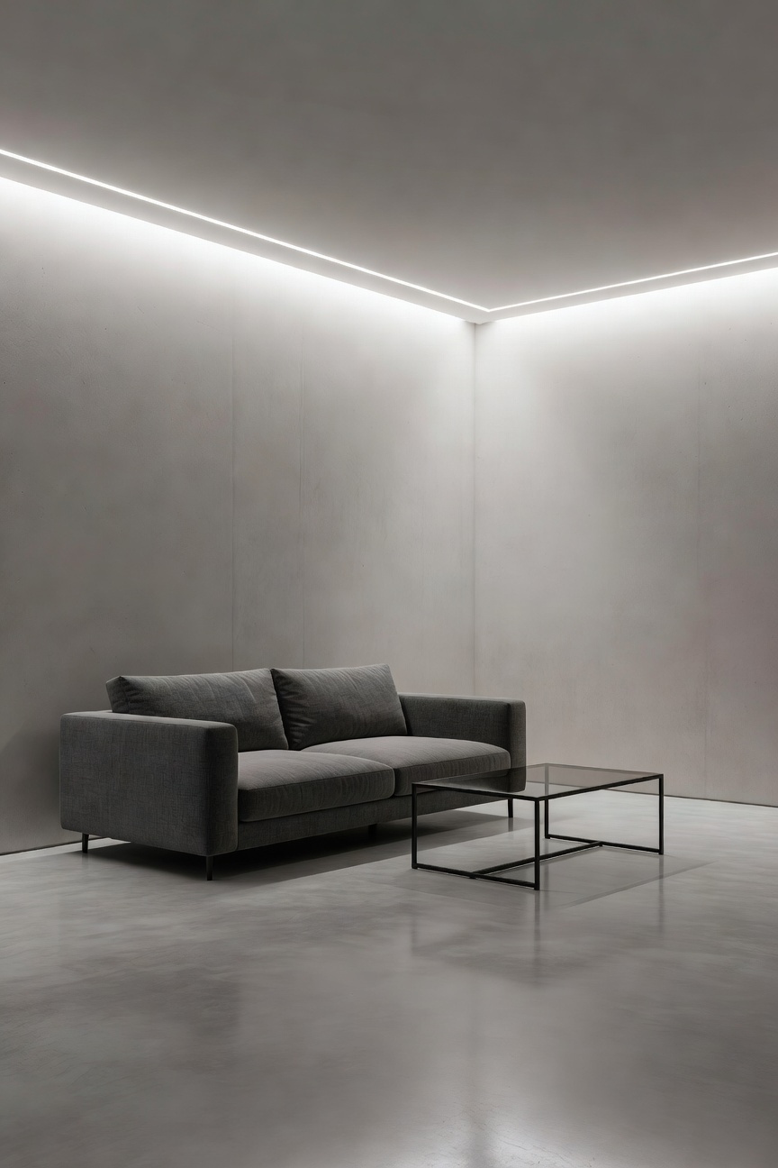
Implementation requires a specific technique called “wall washing.” Unlike wall grazing, which highlights texture through sharp contrast, washing creates a shadow-less surface. Consequently, this flattens the wall and pushes it visually away from the viewer. Shadows in corners act as anchors for the brain to measure dimensions. Thus, eliminating them blurs the “visual envelope,” making the ceiling feel like it is floating.
Psychological research supports this method through “far-side localization.” When light sits on the absolute perimeter, the brain perceives the distance as greater. To achieve this, avoid central pendant lights that cast dark wedges into upper corners. Instead, utilize hidden LED strips within “shadow gaps” or architectural coves. Moreover, apply matte paint to walls to prevent reflective hotspots from breaking the illusion. Ultimately, the light should appear to bleed from the architecture itself, not a bulb.
2. Continuous Planes: Using Large-Format Flooring to Reduce Visual Noise
The human brain processes spatial boundaries through visual cues. Distinct grid lines on a floor act as “speed bumps” for the eye. In neuroscience, these frequent interruptions trigger “saccadic flow,” forcing the brain to constantly categorize segments. This visual friction highlights the room’s limited square footage. To counter this, industrial design principles favor the creation of a “Continuous Plane.”
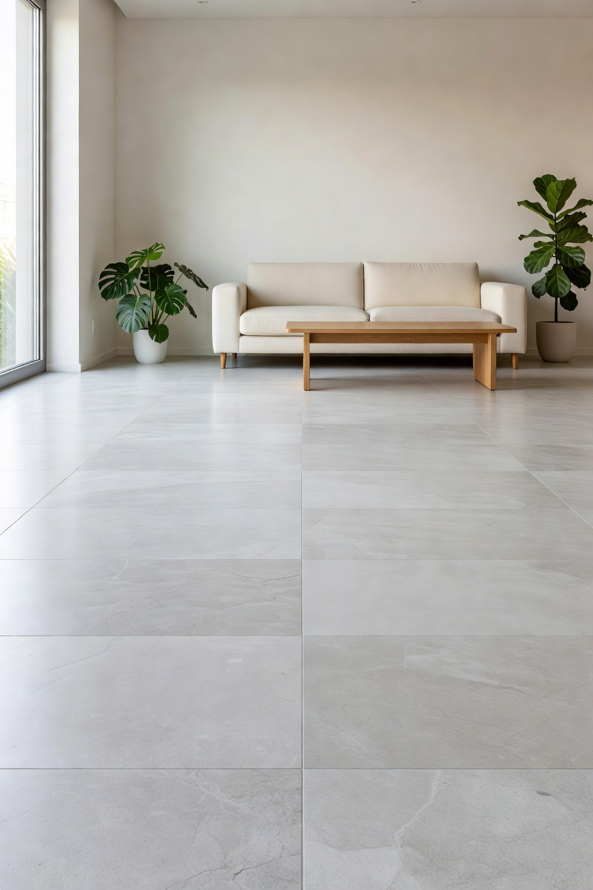
By utilizing large-format flooring, you effectively reduce visual noise. Technically, this illusion relies on “rectified” tiles. These materials feature mechanically cut edges that allow for near-perfect 90-degree angles. Therefore, grout lines can be minimized to a mere 1/16th of an inch. Furthermore, essentially disappearing seams are achieved by matching the grout color to the tile. Ultimately, the floor ceases to be a grid and becomes a monolith.
Surprisingly, this approach leverages the “Scale Paradox.” Placing oversized slabs in a compact room challenges expected proportions. Thus, the space feels grand rather than efficient. Additionally, uninterrupted surfaces maximize “specular reflection.” Instead of scattering light into muddy diffusion, a continuous plane bounces natural light deep into shadow zones. Ideally, the floor should function like a “bleed” in graphic design. It suggests the surface continues infinitely, making the walls feel like they are floating.
3. The Vertical Imperative: Drawing the Eye Upward with Raw Vertical Lines
Cognitive psychologists refer to this phenomenon as the Vertical-Horizontal Illusion. Humans naturally overestimate vertical length by up to 20% compared to horizontal width. Utilizing verticality cures “floor-plan claustrophobia” in compact industrial spaces. By prioritizing the vertical dimension, the brain perceives expansive volume rather than limited square footage.
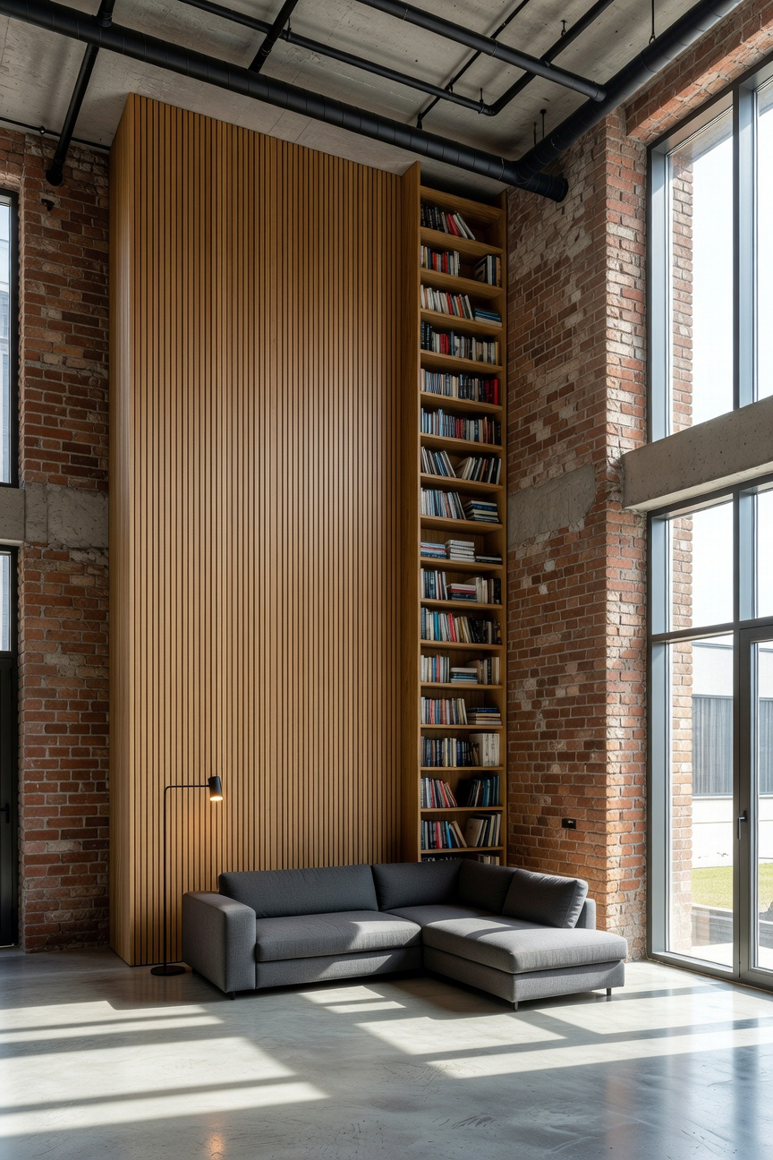
However, painting simple stripes is rarely sufficient. Instead, modern industrial design relies on physical texture to create visual rhythm. Designers often utilize fluted wall panels or tambour cladding to generate depth. These elements introduce a critical “shadow gap” between slats. Therefore, the eye is forced to climb the wall step-by-step, effectively treating the texture as a visual ladder.
Furthermore, this technique borrows from the historical concept of the “uninterrupted plumb line.” In practice, this often manifests as ceiling-mounted curtains. By hanging drapes from the absolute highest point, you create a sense of staged grandeur. Thus, the narrative shifts from living in a small box to inhabiting a tall gallery.
Finally, lighting plays a pivotal role in this vertical journey. “Grazing light” placed at the floor level illuminates these textures from below. As a result, walls appear to stretch infinitely upward, effectively mimicking a cathedral-like atmosphere.
4. Dark vs. Light: Why ‘Industrial Charcoal’ Recedes Deeper Than ‘Basic White’
Homeowners conventionally view “Basic White” as a safety net for small living spaces. Yet, this approach often highlights the very boundaries you wish to hide. Specifically, bright white illuminates every corner, seam, and baseboard. Consequently, your brain instantly maps the room’s exact dimensions, leaving you feeling “boxed in.”
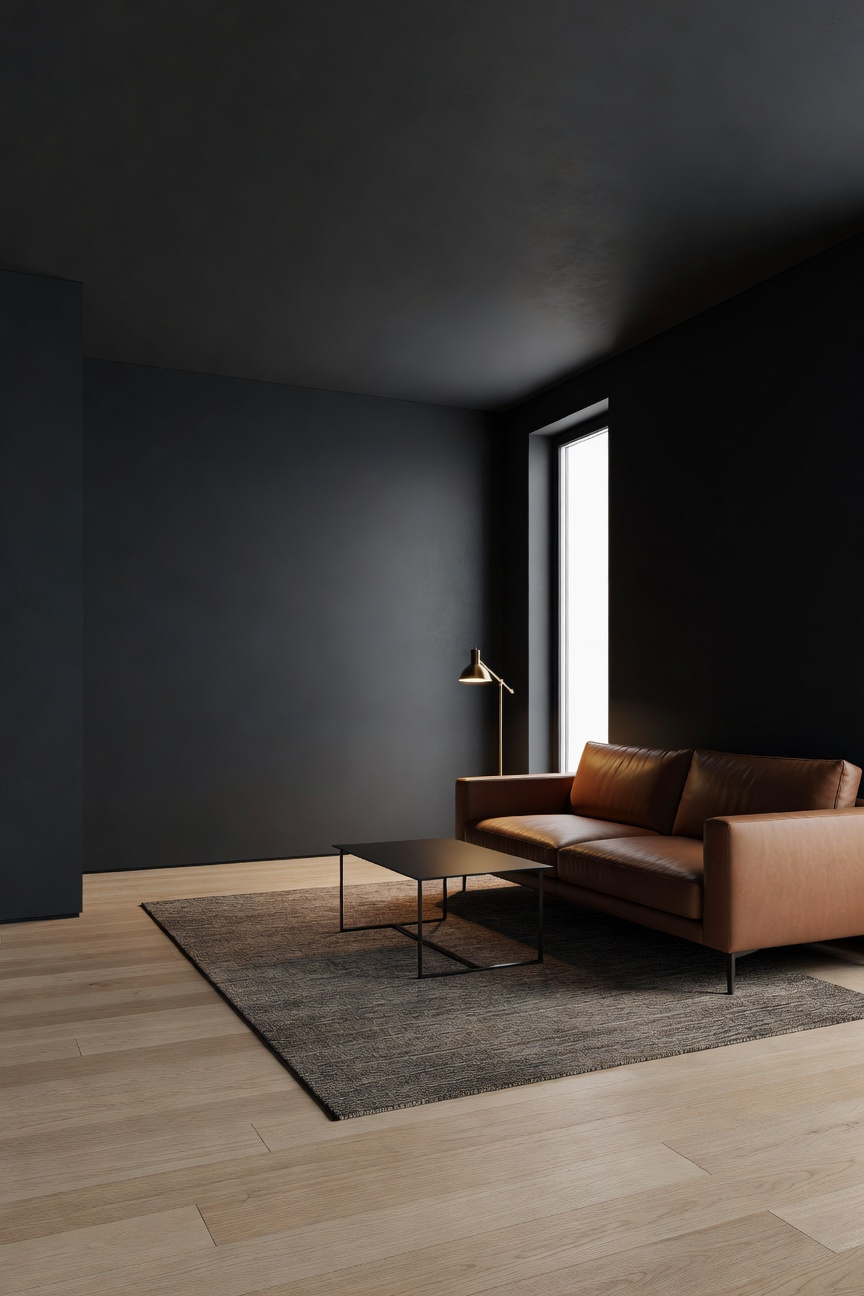
In contrast, “Industrial Charcoal” utilizes the “nocturne effect” to deceive the eye. Because dark, matte charcoal creates low light reflectance, it effectively swallows shadows. Therefore, the visual line between a dark corner and a flat wall disappears. As a result, the room feels like a limitless void rather than a restrictive square. This approach is reminiscent of the depth achieved in black living room ideas, where moody tones create a modern gothic sanctuary.
Furthermore, this hue leverages “atmospheric perspective,” a technique borrowed from landscape painting. Cool, blue-gray undertones naturally recede, mimicking the depth of a distant horizon. Conversely, white walls in north-facing or low-light rooms often turn a muddy gray. Unfortunately, this creates a dingy barrier that feels like it is physically pushing inward.
To maximize this illusion, you must select a “Dead Flat” or ultra-matte finish. This eliminates surface reflections that betray the wall’s proximity to the viewer. Ultimately, this approach creates a sophisticated “jewel box” effect. Against a deep backdrop, furniture and brass accents pop with clarity, establishing a layered, expansive depth.
Phase 2: Structural Zoning and Furnishing (Intermediate)
Intermediate design treats a small living room as a volumetric landscape. Therefore, furniture acts as architecture, and empty space becomes a functional tool. Specifically, we apply the Japanese principle of *Ma*, or “gap.” Rather than filling every corner, we intentionally leave negative space to reduce visual friction. For instance, floating a sofa four inches from the wall creates a “sun gate.” Consequently, this gap allows light to circulate, signaling depth to the brain.
Next, consider furniture as micro-architecture. Mid-century designers like Joe Colombo championed this “furniture-as-building” approach. Instead of erecting walls, use open shelving to create permeable boundaries. However, you must respect the 60/40 rule. Crucially, 60% of the floor should remain visible to ensure uninterrupted flow. If furniture blocks more than 40%, the room’s pathway psychology fails.
Furthermore, verticality dictates mood through “prospect and refuge” theory. For example, a low-hanging pendant light creates a psychological ceiling over a chair. This establishes a cozy “refuge” within the larger space. Finally, rely on material intelligence for zoning. Transitioning from hard wood to a soft rug triggers “architectural compression.” Thus, your nervous system registers a new “room” without requiring a single physical divider.
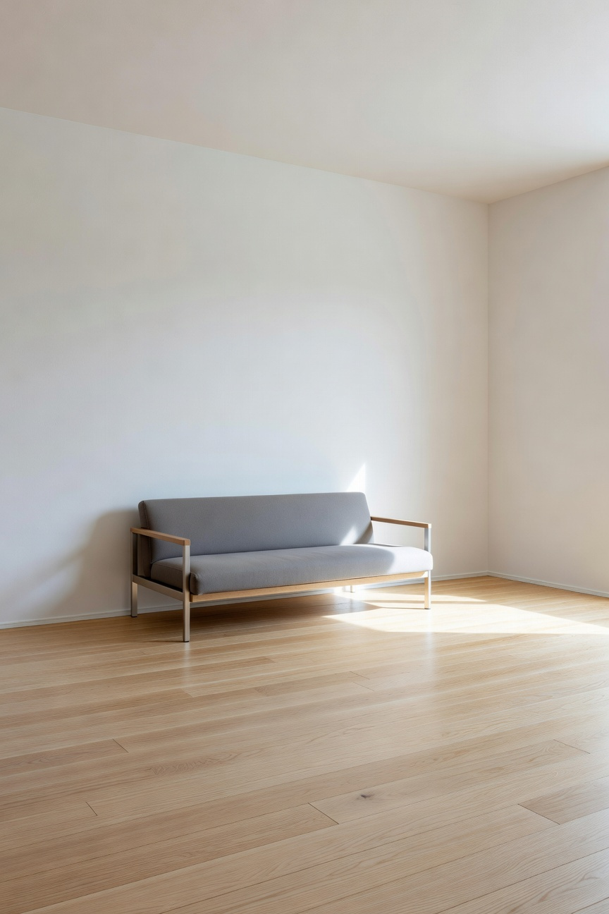
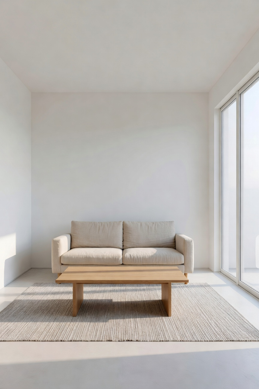
5. The Floating Theory: Exposing Floor Space with Cantilevered & Leggy Designs
The human brain calculates a room’s volume by tracing the floor until it hits the baseboards. Furniture sitting flush against the ground acts as a secondary wall. This phenomenon, known as visual occlusion, cuts off the viewer’s perception of the floor’s true boundary. To assume control, employ the “Floating Theory” to reveal the unbroken floor line. Select pieces with tapered legs or cantilevered designs. Thus, the eye travels underneath the object, tricking the subconscious into registering the room’s full square footage.
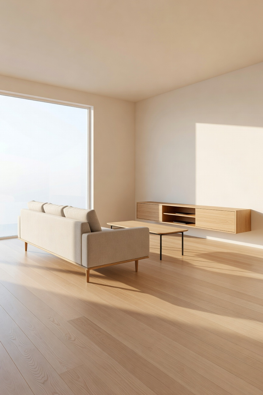
Historically, this approach draws from the Modernist movement, which rejected heavy, earth-bound Victorian silhouettes. Instead, architects favored structural elements that expressed weightlessness. Today, the most impactful application is the wall-mounted cantilever. By bolting a console directly to wall studs, you eliminate bulky bases entirely. Furthermore, this gap allows light to circulate, preventing the formation of shadow-filled “dead zones.” Ultimately, the room feels structurally lighter and more dynamic.
However, caution is necessary to avoid “leg fatigue.” If every piece features spindly legs, the space may feel chaotic and unstable. Therefore, designers often suggest a “rule of three” or a 60/40 balance to maintain composure. For example, pair a leggy, floating sofa with a solid, grounded coffee table. In doing so, you create a curated gallery feel rather than a cluttered collection of furniture.
6. Transparent Division: Using Crittall-Style Glass or Open Metal Shelving as Walls
Originally designed for factories in 1884, Crittall-style partitions maximize natural sunlight. These steel-framed walls have become essential tools for modern small urban homes. They facilitate “broken-plan” living by defining zones without reducing perceived square footage. Specifically, the signature black grid acts as a picture frame, curating the view. Furthermore, authentic hot-rolled steel offers the slenderest sightlines, minimizing visual interruption.
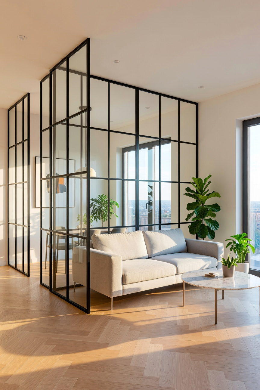
However, total transparency isn’t always desirable for intimacy. Therefore, architects often utilize reeded glass to create “polite privacy.” The vertical ribs blur silhouettes while still allowing full light transmission. In fact, this texture adds a kinetic sensory element as light refracts.
Alternatively, open metal shelving offers a functional form of division. Unlike solid bookcases, wireframe units possess near-zero visual weight. This allows the eye to pass through, maintaining necessary airiness. Yet, managing clutter is critical to avoid increasing stress through “visual noise.” Ideally, arrange items using triangular grouping to create vignettes rather than storage piles. Ultimately, transparent division balances necessary connectivity with essential seclusion.
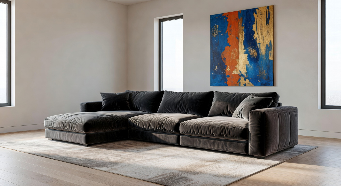
7. The ‘One Hero’ Rule: Anchoring the Room with a Single Oversized Sectional
In compact industrial spaces, intuition often dictates using multiple small furniture pieces. However, designers call this fragmented approach the “Zoo Effect.” Consequently, the eye constantly jumps between objects, creating visual chaos. Instead, the “One Hero” rule offers a sophisticated alternative. Specifically, anchor the room with a single, oversized sectional to simplify the visual narrative.
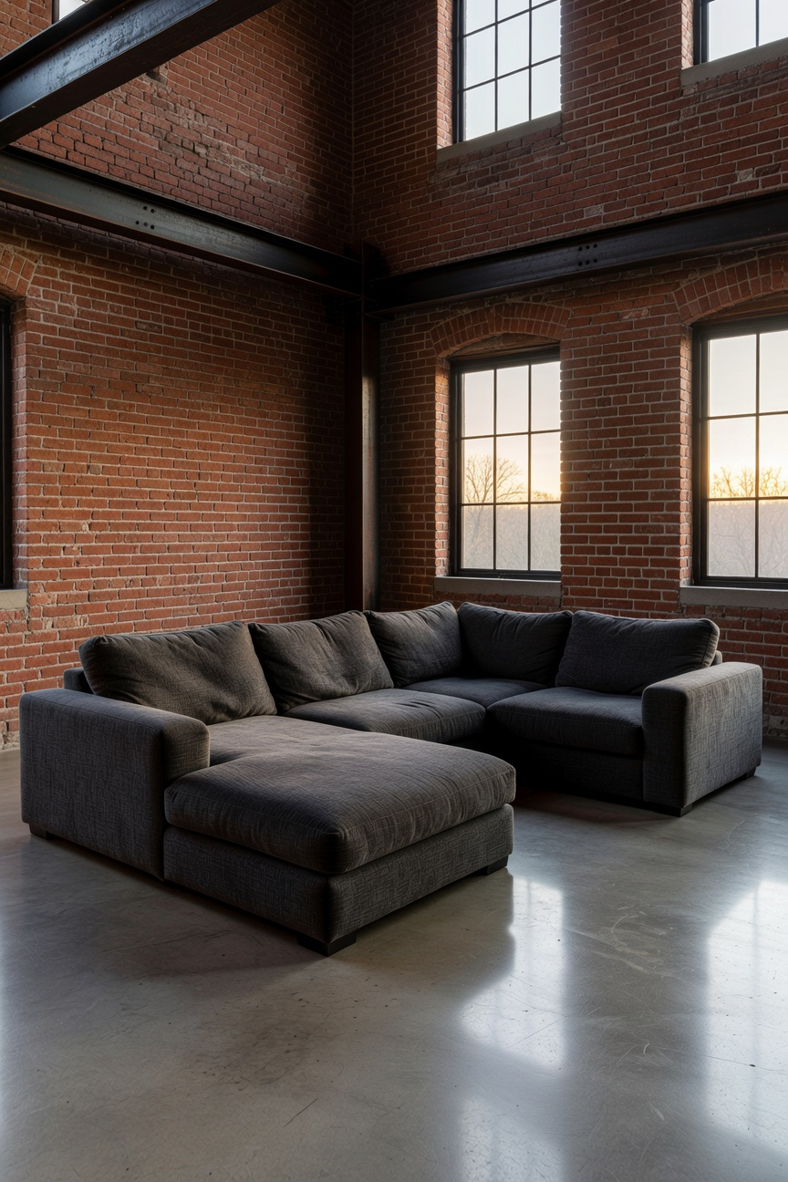
Functionally, you must treat this furniture as architecture. Therefore, a large sectional defines the room’s boundaries better than walls. It creates long, continuous lines that lead the eye across the space. Thus, the room feels expansive rather than cluttered. To execute this correctly, ensure a “36-Inch Spine” exists for clear circulation around the piece.
Furthermore, manage the visual weight carefully. Ideally, choose a low-profile silhouette to keep the vertical space open. This strategy ensures the upper room remains airy and light. Historically, this echoes the Bauhaus philosophy of “less but better.” Ultimately, this layout fosters intimacy, turning a small area into a cozy, curated conversational pit.
8. Negative Space Management: The Art of Leaving Walls Bare
Negative space is often misunderstood as emptiness. However, it actually functions as a deliberate design element known as “visual silence.” Historically, this concept aligns with the Japanese principle of *Ma*. Essentially, this philosophy treats the gap between objects as meaningful “breathing room.” Conversely, Modernist architect Le Corbusier viewed bare walls as a tool for moral cleansing. Regardless of the origin, the goal remains harmony rather than a void.
Psychologically, leaving walls bare significantly reduces cognitive load. In fact, research indicates that visual relief helps lower cortisol levels. Consequently, these empty surfaces create a “horizon” effect in small rooms. This effectively tricks the brain into perceiving more distance than actually exists. Furthermore, negative space acts as a spotlight for your key furnishings. By removing surrounding clutter, a single armchair gains immense “focal gravity.”
Practically, you must resist filling every corner to achieve this balance. Ideally, adhere to the expert 60/40 rule of design. Ensure at least 40 percent of your room remains negative space. Additionally, avoid the “perimeter trap” of pushing all furniture against the walls. Instead, float your sofa slightly away to create pockets of air. Ultimately, this approach highlights the room’s architectural “bones.” Thus, natural light and shadow become your dynamic, cost-free wallpaper.
9. Strategic Reflection: Positioning Mirrors as Architectural Windows
Strategic reflection involves treating a mirror not as an accessory, but as a structural component. Specifically, it should mimic the function of a window. Historically, architects utilized this *trompe l’oeil* technique to correct asymmetrical designs with “blind windows.” Today, we use this approach to manipulate light and physically “break” a room’s boundaries.
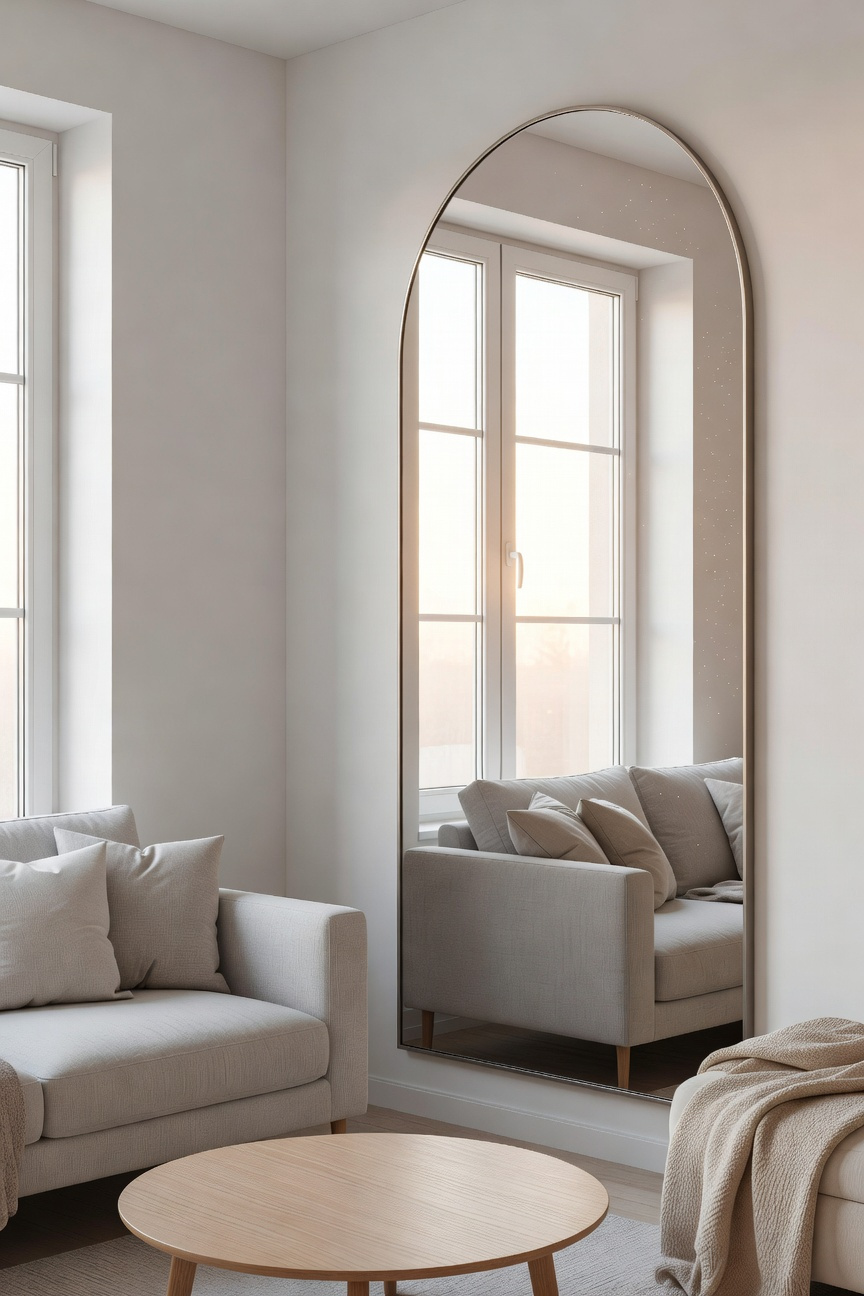
Therefore, placement is critical for success. For instance, positioning a mirror perpendicular to a real window creates a “visual continuum.” Consequently, the exterior view appears to wrap around the corner. This effectively erases the room’s rigid edges. Conversely, placing a mirror simply opposite a window may only flatten the room. To maintain the illusion of depth, mount the mirror’s center at 57 inches. This height matches standard eye level, ensuring the reflection feels like a natural vista.
Furthermore, the frame itself must appear architectural. Ideally, select industrial materials like blackened steel or wrought iron. Importantly, look for designs with muntins, the grid lines that separate panes. These details signal to the eye that the surface is an opening, not just decor. Additionally, glass quality matters significantly. In fact, professional designers insist on a minimum thickness of 1/4 inch. Thinner glass often warps the image, instantly betraying the flat reality.
Finally, consider the psychological impact. This “architectural window” provides a necessary visual breather. It connects the resident to the outside world, reducing the “tunnel effect” of small spaces. However, be mindful of what is reflected. Specifically, ensure the mirror captures light, plants, or art. Reflecting a cluttered shelf will only double the visual noise. Thus, the reflection must offer atmospheric depth to truly expand the home.
10. Raw Material Palette: Adding Depth Through Texture (Brick/Concrete) Instead of Pattern
In small living rooms, complex patterns often create unnecessary “visual noise.” Consequently, walls can feel as though they are closing in. However, prioritizing raw texture over pattern utilizes a principle called “haptic depth.” Unlike flat wallpapers, materials like brick and concrete engage the eye without demanding constant processing.
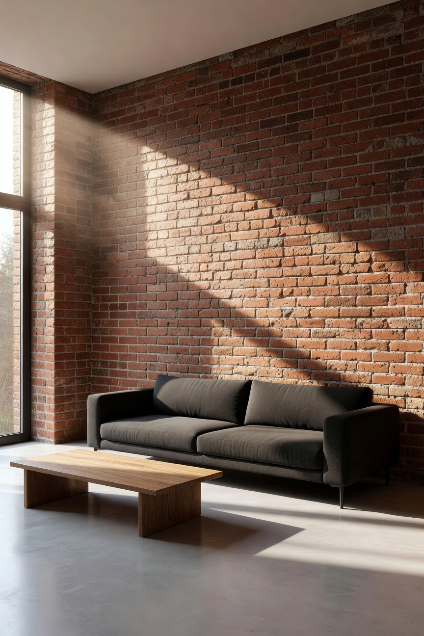
Historically, these materials were structural skeletons hidden behind plaster. Yet, the concept of “Material Honesty” changed this approach. As architect Louis Kahn famously implied, materials should display their inherent character. Therefore, exposing these surfaces allows the architecture itself to provide the room’s visual interest.
To effectively capture this depth, lighting is paramount. Specifically, “wall grazing” involves placing fixtures close to the wall. This steep angle catches every imperfection, creating a sense of infinite detail. Conversely, “wall washing” floods the surface from a distance to smooth out shadows.
Furthermore, modern applications solve space constraints. For instance, concrete microtoppings add a seamless look at only two millimeters thick. Similarly, glazed thin bricks reflect light to brighten dim corners without consuming floor space.
Finally, avoid a cold atmosphere by practicing “Warm Minimalism.” Ideally, balance raw surfaces with tactile counterpoints like chunky wool or walnut wood. Ultimately, this interplay creates a high-end sanctuary that feels curated rather than unfinished.
Phase 3: Advanced Urban Integration (Mastery)
At this level of mastery, static walls become obsolete. Instead, we embrace kinetic architecture to solve spatial limitations. Consequently, your living room acts as a highly efficient machine for living. Think of motorized, track-based cabinetry or partitions. Specifically, a media wall creates a “liquid” floor plan. It slides to reveal a sleeping niche behind it. Therefore, you reclaim the “ghost space” usually lost during the day.
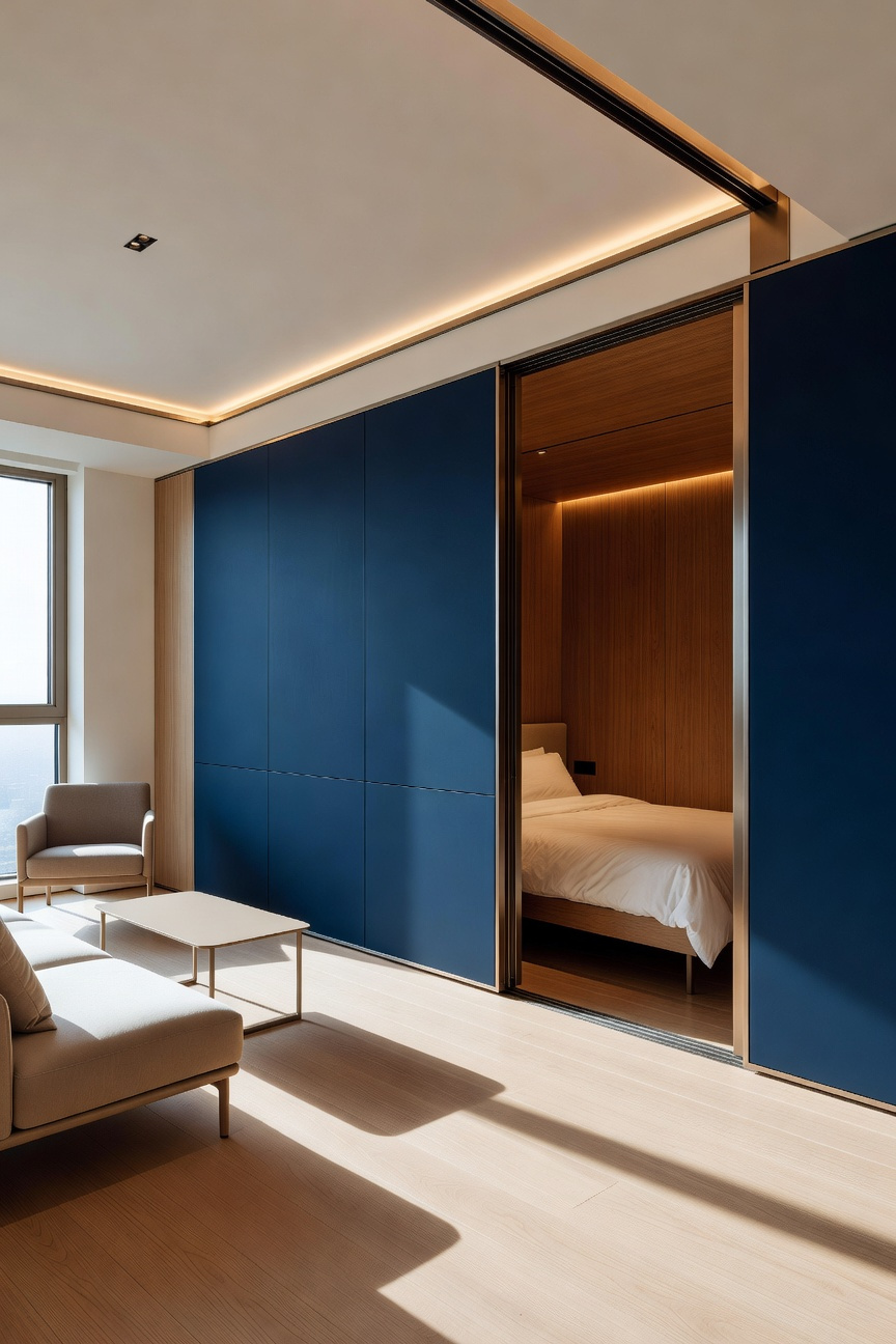
Furthermore, visual noise creates the illusion of cramping. To combat this, master designers employ the “Monolithic Strategy.” This simply means prioritizing material continuity. For instance, light oak flooring might transition seamlessly up the side of a built-in sofa. Because the eye cannot find a seam, it stops measuring square footage. Ultimately, the room becomes an atmospheric experience rather than a geometric one.
Lighting also plays a pivotal role in spatial perception. Rather than using central pendants, apply “Luminance Layering.” Specifically, wash the walls with perimeter light to utilize the “Flynn Effect.” As a result, the vertical planes feel significantly more expansive. Finally, embrace *Shakkei*, or borrowed scenery. Do not hide the urban view. Align internal glass partitions with external windows. Thus, the city skyline becomes an integral part of your room’s composition.
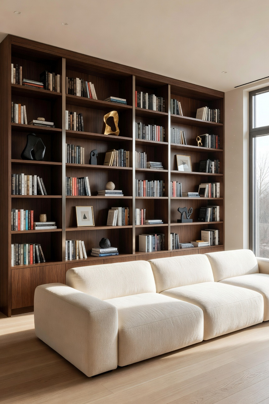
11. Custom Joinery vs. Freestanding: Integrating Storage into the Architecture
Deciding between built-ins and freestanding units fundamentally transforms a room’s perception. Specifically, this choice determines if storage acts as a separate object or an architectural extension.
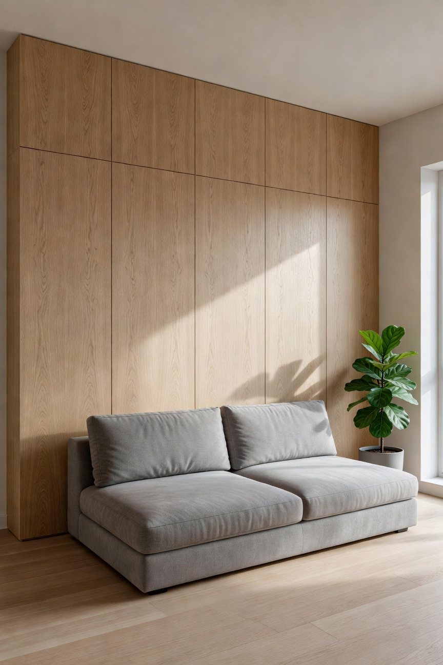
In high-end micro-living, designers often utilize the “thick wall” strategy. Here, the room’s perimeter becomes a functional, deep boundary rather than a flat surface. Consequently, carving cupboards from a single material creates a seamless “monolithic” effect. In fact, the eye slides over touch-latch doors without stuttering on handles or gaps. This level of precision is often seen in a luxury small bathroom remodel, where every inch is engineered as a “jewel box.” Therefore, visual noise drops significantly, which effectively reduces the cognitive load caused by cluttered surfaces.
However, the debate also centers on sheer volume. Notably, custom joinery increases usable storage by up to 30% compared to standard units. It effectively captures the “dead zone” often found between cabinet tops and ceilings. Conversely, freestanding furniture offers essential “visual breathing room.” Specifically, seeing the floor extend beneath a sideboard on legs makes small spaces feel airier.
Therefore, most architects recommend a strategic balance for compact living rooms. For instance, utilize custom joinery for 70% of storage needs to completely “disappear” the clutter. Then, select one “hero” freestanding piece to ground the room’s character. Ultimately, this blend secures both spatial continuity and necessary architectural efficiency.
12. The Window Treatment Hack: Ceiling-Mount Drapery Tracks for Loft Height
In small living rooms, “visual friction” often disrupts the sense of space. Standard curtain rods placed above window frames create a horizontal boundary. Unfortunately, this “dead zone” effectively lowers the perceived ceiling height. Conversely, mounting drapery tracks directly to the ceiling eliminates this visual break. As a result, the eye travels upward in a continuous sweep. Thus, even compact rooms gain a sense of vertical grandeur and loft-like volume, similar to the techniques found in our ultimate formal living room design guide.
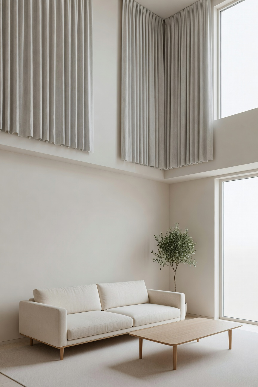
To maximize this architectural trick, designers rely on the “Ripple Fold” or S-Fold system. Unlike traditional pleats that bunch irregularly, this hardware maintains a perfect, undulating curve. Furthermore, these tracks minimize projection distance from the wall. Consequently, you can position furniture tighter against the room’s perimeter. Ideally, the track should be recessed into a ceiling channel. In fact, this “plastered-in” aesthetic dissolves the boxy feel of the room. The fabric seemingly emerges from the architecture itself, removing visual clutter.
Beyond aesthetics, this treatment serves a functional purpose in urban environments. A floor-to-ceiling fabric wall acts as an acoustic baffle. It absorbs the “flutter echoes” common in rooms with hard surfaces. Additionally, a double-track configuration offers superior light control. For instance, layering a sheer curtain under a blackout drape creates flexibility. During the day, the sheer layer diffuses sunlight. Effectively, this turns the entire wall into a soft, glowing light source. Therefore, the room feels expansive rather than enclosed.
13. Mobile Architecture: Using Industrial Carts and Nesting Elements for Fluid Layouts
In industrial design, a static room is often a dead room. We treat furniture as “plug-in” components rather than permanent fixtures. This concept creates a “kinetic interior.” Specifically, it transforms a living room from a set piece into an adaptable, event-based environment.
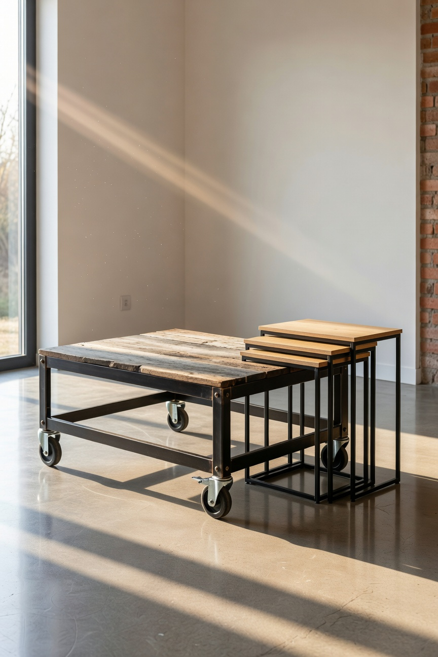
Central to this approach is the repurposed industrial cart. Ideally, these pieces utilize total locking swivel casters. Unlike cheap plastic wheels, these ball-bearing mechanisms offer a smooth, silent glide across hardwood floors. Consequently, moving a heavy media console becomes an effortless act of choreography rather than heavy lifting. Furthermore, wire or steel carts possess high “transparency.” Thus, the eye sees through them to the walls, visually expanding the room’s perceived boundaries.
Beyond mobility, nesting elements maximize volumetric efficiency. Similar to Russian Matryoshka dolls, a single footprint can hide three distinct surfaces. When nested, the room effectively “exhales,” opening up valuable floor space for movement. Conversely, when spread out, the room “inhales,” preparing for social activity or utility.
Ultimately, this flexibility offers psychological relief in small spaces. Rather than being anchored to a specific layout, the floor becomes a stage. For instance, you can pivot a rolling desk to create an instant office. Then, simply roll it away to reclaim your lounge. In effect, mobile architecture ensures your home serves you, not the other way around.
14. Acoustic Softening: Balancing Hard Industrial Surfaces with Heavy Wool Rugs
In the “industrial chic” aesthetic, the greatest challenge is often auditory rather than visual. Hard surfaces like polished concrete create a “parabolic” effect where sound waves ricochet endlessly. Consequently, a visually stunning room can feel cold and restless. To counter this, architects rely on acoustic softening through high-density textiles. Specifically, heavy wool rugs serve as the primary solution for tempering these harsh reflections.
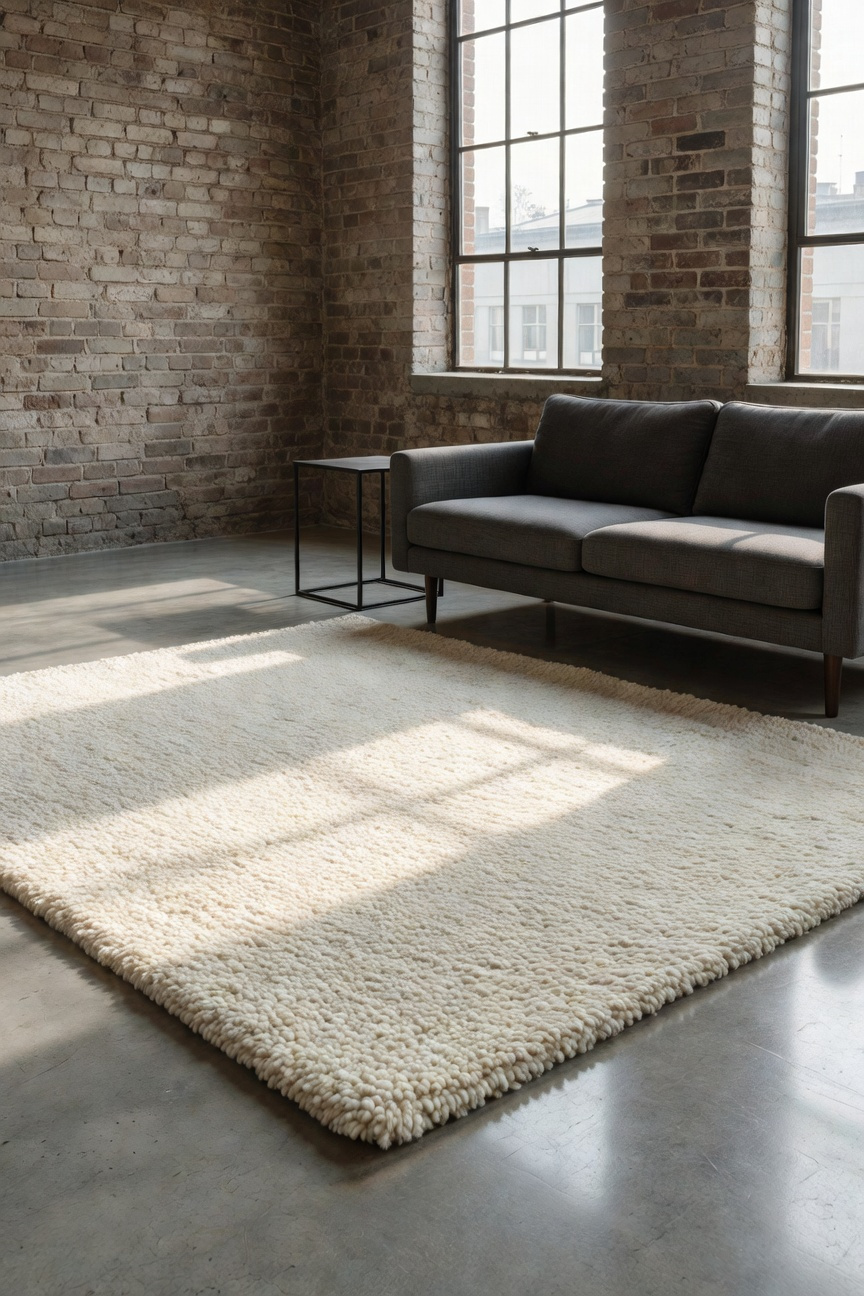
Technically, polished concrete possesses a Noise Reduction Coefficient (NRC) of nearly zero. Conversely, a dense, hand-tufted wool rug can achieve an NRC of up to 0.55. This efficiency stems from physics. Unlike smooth synthetics, wool fibers are naturally crimped. Therefore, sound waves encounter friction and dissipate as heat rather than bouncing back. Moreover, this introduces “bespoke joinery” of textures. The organic, tactile terrain of wool balances the “machine-age” rigidity of steel and glass, effectively humanizing the space.
However, proper application requires strategic “acoustic zoning.” You should not cover the entire industrial floor. Instead, aim for a “shadow margin,” leaving 8 to 12 inches of bare floor visible around the rug’s perimeter. This framing preserves the architectural integrity of the concrete while mitigating noise. Furthermore, anchor the rug by placing the front legs of your seating upon it. This creates a localized acoustic cloud. Finally, prioritize hand-tufted construction for lofts. The latex backing on these rugs acts as an additional barrier, significantly reducing impact noise between floors.
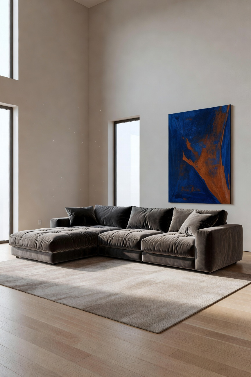
15. Statement Art: One Large Canvas Over Cluttered Gallery Walls
In the context of small living room design, choosing art is an exercise in visual architecture rather than simple decoration. Opting for one large statement canvas over a cluttered gallery wall shifts the room’s psychological impact. Conversely, a collection of small frames forces the eye to perform “cognitive scanning.” This constant movement generates “visual noise,” which often makes a confined space feel significantly tighter. Therefore, a large canvas acts as a necessary stabilizer. It provides a singular focal point, allowing the viewer’s gaze to settle and the brain to rest.
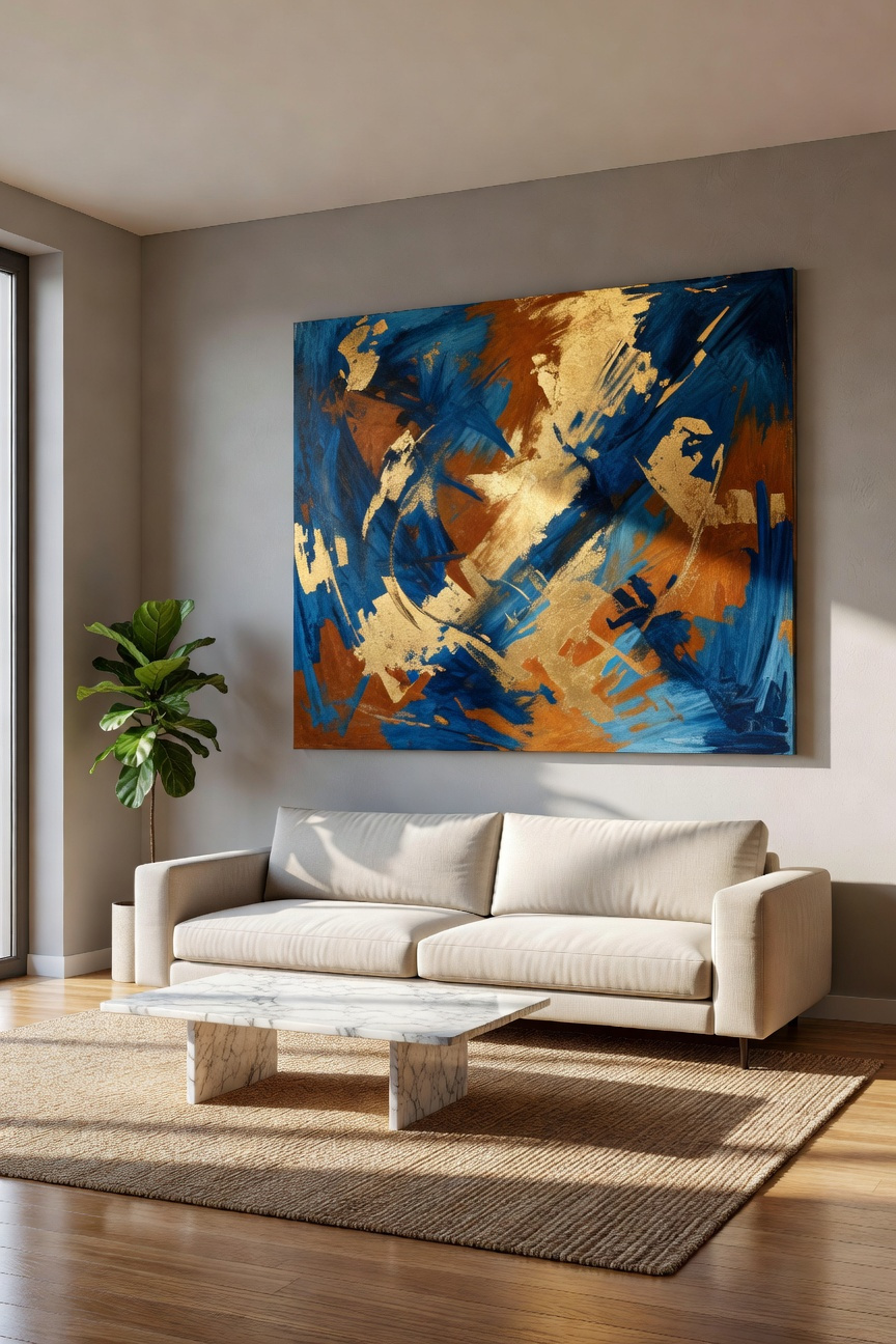
Beyond psychology, statement art functions as a powerful spatial tool. For instance, pieces featuring distinct horizon lines act as “visual portals,” tricking the brain into perceiving depth beyond the wall. Essentially, the artwork becomes a window without the structural requirements. Furthermore, a canvas offers a superior sensory experience compared to framed prints. Unlike glass-fronted gallery walls that create a “glare storm” of reflections, a textured canvas absorbs and scatters light. Consequently, this adds softness and warmth to the room, contrasting beautifully with harder industrial elements.
However, execution requires precise mathematics to ensure balance. Ideally, the artwork should occupy roughly two-thirds of the width of the furniture beneath it. This specific ratio creates a cohesive “vertical column,” unifying the art and the sofa into one grounded unit. Ultimately, shifting away from the “curated chaos” of a salon hang favors clarity. It transforms a small room from a storage space for memories into a deliberate, sophisticated environment.
Frequently Asked Questions
How can I make a small living room look expensive?
Focus on high-quality materials and architectural scale. Replace multiple small items with one “hero” piece, such as a large velvet sectional or custom floor-to-ceiling joinery. Incorporating raw textures like brick or concrete and using perimeter lighting to erase shadows can also elevate the space to a luxury level.
Is dark paint a good idea for small living rooms?
Yes, particularly deep, matte shades like industrial charcoal. Unlike bright white, which reflects light and defines boundaries, dark matte colors swallow shadows and make the corners of the room recede. This creates a “jewel box” effect that adds unexpected depth and sophistication to a compact footprint.
What is the best furniture layout for a small living room?
The most effective layout prioritizes flow and visual continuity. Utilize the “Floating Theory” by choosing furniture with tapered legs to expose more floor space. Aim for a 60/40 balance—where 60% of the floor remains visible—to prevent the room from feeling overcrowded and to maintain a fluid architectural landscape.
Conclusion: Transitioning from ‘Cramped’ to ‘Curated Urban Sanctuary’
Transitioning from “cramped” to “sanctuary” is a profound psychological shift. Therefore, it requires more than just decluttering. Instead, we must embrace the concept of *Ma*, or intentional emptiness. Consequently, the room breathes, reducing visual noise and calming the mind. Furthermore, relying on tactile materials and layered lighting replaces anxiety with “soft fascination.”
Ultimately, these small living room ideas empower you to transition from a feeling of being ‘boxed in’ to inhabiting a curated urban sanctuary. In essence, your home becomes a gallery for your life, not a storage unit. True luxury in urban living is defined by resonance rather than accumulation. Going forward, view your space through the lens of stewardship. To begin, audit your current collection with a critical, subtractive eye. Remove any object that lacks deep emotional depth or specific utility. Finally, allow the remaining emptiness to define your new, curated sanctuary.