
For decades, the standard advice for a small bathroom remodel has remained unchanged. Common belief dictates that you must “paint it white” to make a room feel larger. Yet, this dogmatic “White Box” approach frequently creates the opposite effect. High-contrast white walls highlight every boundary and sharp shadow instead of expanding the space. Consequently, the room feels fragmented, clinical, and decidedly cramped. Indeed, bright light reflects off these surfaces, exposing architectural flaws and confirming the room’s small footprint.
However, modern design science supports a bolder, moodier alternative. Dark colors, such as charcoal or navy, effectively recede from the viewer. Because the eye relaxes to focus on these shorter wavelengths, walls appear more distant. In fact, enveloping a room in monochrome dark tones blurs the lines between walls and ceilings. Thus, the eye loses track of corners, creating an illusion of infinite space. This “jewelry box” effect offers a sensory respite that stark minimalism simply cannot provide.
This guide reveals the psychological and optical advantages of abandoning the white box. We will explore how “theater painting” uses dark backdrops to make fixtures pop. Next, we discuss replacing flat pigments with rich, light-catching textures like zellige tile. Ultimately, we demonstrate how opulence and depth make even the smallest powder room feel limitless.
Philosophy: The ‘Jewel Box’ Effect – Shifting the mindset from ‘cramped utility’ to ‘concentrated luxury’.
The “Jewel Box” effect represents a sophisticated shift in interior design philosophy. Traditionally, designers attempt to make small spaces feel larger using white paint and mirrors. However, this approach often results in a sterile, utilitarian atmosphere. Conversely, the Jewel Box method embraces the room’s constraints to create an immersive, high-density sensory experience. Therefore, we stop viewing the powder room as a cramped utility closet. Instead, we treat it as a showcase of concentrated luxury, incorporating small bathroom remodeling secrets that prioritize wellness and aesthetic depth.
Historically, this concept mirrors the 18th-century “powdering closet.” These tiny, windowless rooms were status symbols adorned with exquisite silks, despite their small footprint. Similarly, modern high-concept designs draw inspiration from architectural precedents like Louis Sullivan’s “Jewel Box Banks.” They use intense ornamentation to convey preciousness.
Financially, this approach leverages the “Tiny Bathroom Paradox.” Although the cost per square foot is high, the overall footprint remains small. Therefore, materials that are cost-prohibitive in a master suite become affordable here. For instance, a rare onyx slab or hand-painted wallpaper becomes a feasible splurge in a twenty-square-foot space.
Psychologically, this strategy relies on “Room Drenching.” Rather than pushing walls away, deep colors like emerald or charcoal pull them in. As a result, the space becomes a seamless, intimate cocoon. Because users are always within arm’s reach of surfaces, tactile engagement is crucial. Therefore, we prioritize “sensory touchpoints” like unlacquered brass or pillowed marble. Ultimately, by manipulating scale with oversized patterns and dramatic lighting, the room feels significant rather than small.
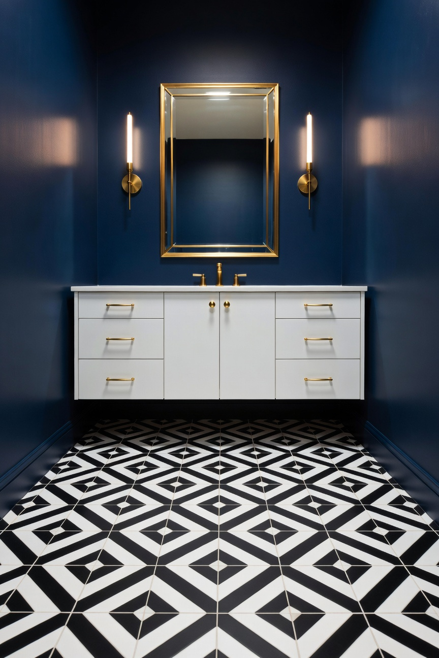
Color Theory: Deep Saturation Strategy – Using Navy, Emerald, and Charcoal to blur boundaries and recede walls.
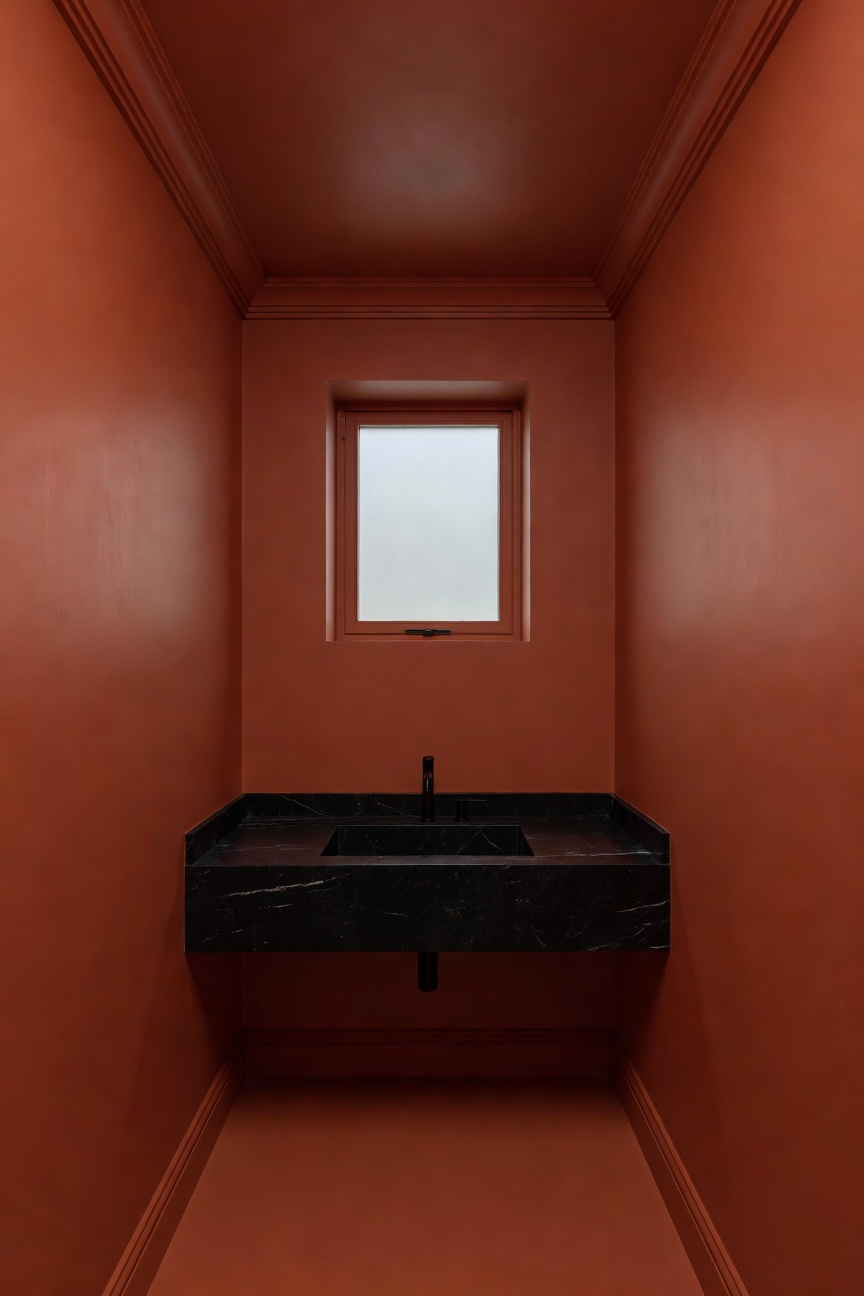
Conventionally, homeowners paint small bathrooms white to simulate space. However, the “Deep Saturation Strategy” offers a more sophisticated, opulent alternative. Specifically, this method utilizes rich tones like Navy, Emerald, and Charcoal to manipulate spatial perception. By leveraging the physics of light absorption and the principles of modern bathroom design, designers create a “Jewel Box” effect. Here, physical limitations seem to dissolve.
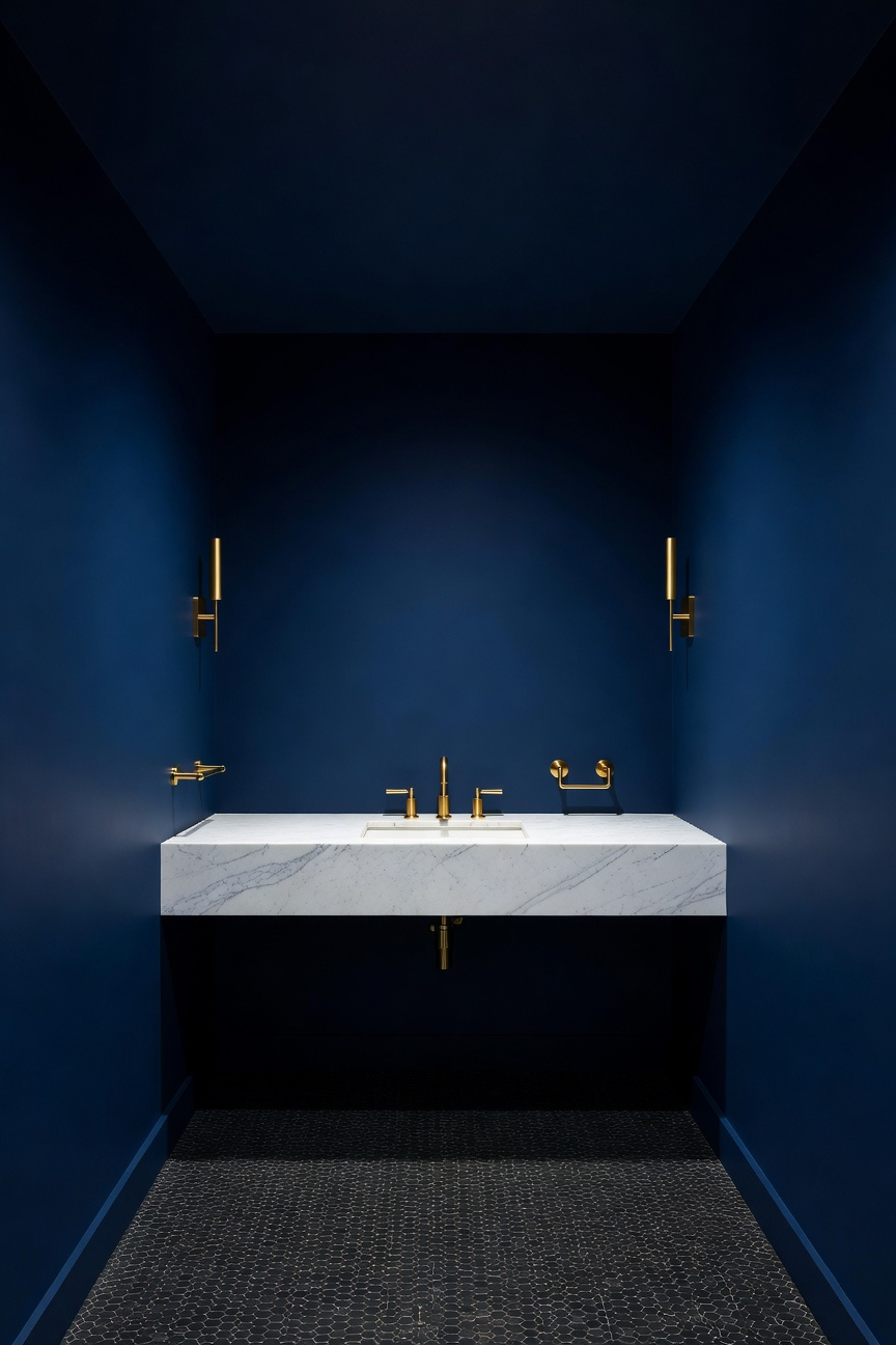
The core mechanism here is the “Vanishing Corner” illusion. In theater production, stage managers use dark backgrounds to make boundaries disappear. Similarly, painting walls and ceilings in deep, flat-finish tones blurs the “cut lines” where planes meet. Therefore, the eye cannot easily define where the room ends. Consequently, the walls feel as if they recede into an infinite distance rather than closing in. This technique, often called Color Drenching, transforms a cramped space into a boundless sensory retreat.
Technically, success requires understanding Light Reflectance Value (LRV). While light colors reflect illumination, shades with an LRV between 3 and 10 absorb it. In a windowless powder room, white paint often appears muddy or gray. Conversely, deep saturated colors embrace the inherent shadow. Thus, a low-LRV Emerald feels lush and organic, while Navy evokes the vastness of a night sky.
Finally, tactical contrast prevents the room from feeling like a cave. Specifically, the dark walls serve as a “velvet lining” for bright fixtures. For instance, pairing matte Charcoal surfaces with a high-gloss white sink creates “specular highlights.” These points of intense reflection act as visual anchors. Ultimately, this interplay ensures the space feels crisp, intentional, and luxurious.
Technique: The ‘Color Drench’ – Painting walls, trim, and ceiling the same hue to eliminate visual breaks.
Color drenching is more than a fleeting trend; it is a powerful psychological strategy for small interiors. Specifically, this technique involves painting walls, trim, and ceilings the same hue to eliminate visual breaks. By doing so, you leverage the Gestalt Principle of Continuity. This principle suggests the eye prefers smooth, uninterrupted paths. Consequently, removing high-contrast white molding effectively erases the room’s “corners.” Therefore, the brain cannot easily calculate boundaries, creating a sense of limitlessness rather than confinement.
In fact, this method reduces “visual noise” significantly. Painting everything one color acts as a sedative for the optic nerve. Additionally, it serves as excellent camouflage for awkward bulkheads or uneven ceilings. However, successful drenching requires careful attention to texture to avoid a flat appearance. Specifically, designers use “sheen alchemy” to create necessary depth.
For instance, use a matte finish on walls to absorb light and mask imperfections. Conversely, apply a satin or semi-gloss finish to the trim and doors. Thus, you create “micro-contrasts” that reveal architectural details without breaking the color theme. Ultimately, this approach transforms a utilitarian bathroom into an immersive sanctuary. Instead of feeling small, the space feels expensive, intentional, and cocoon-like.
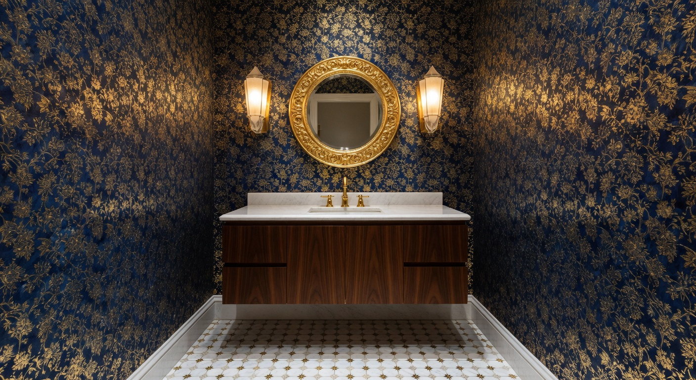
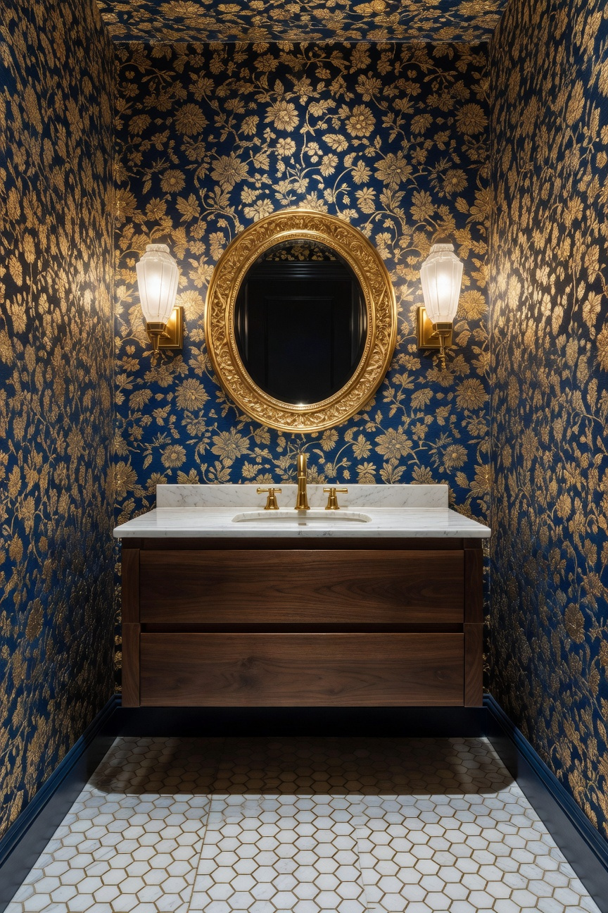
Surfaces: Statement Wallpaper Scale – Why oversized botanicals work better than timid small prints in powder rooms.
The powder room is frequently described as the home’s “jewelry box.” However, traditional advice often incorrectly suggests using small prints to match the square footage. Unfortunately, small-scale patterns create “visual noise” because the brain must track hundreds of tiny details. Consequently, the walls feel cluttered and appear to close in. Conversely, oversized botanicals utilize “spatial ease” to expand the room’s perceived dimensions. Since a single bloom might span two feet, the eye glides effortlessly across the surface.
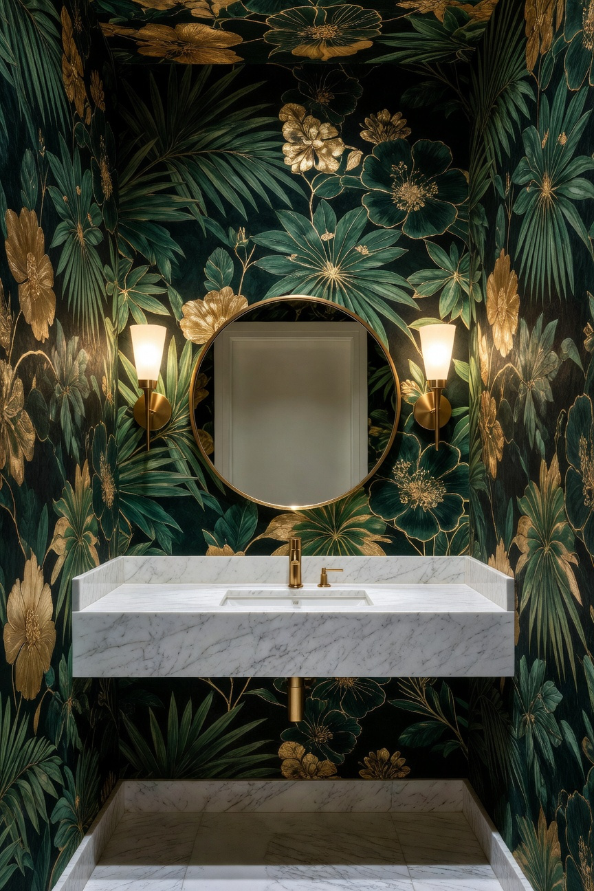
These massive designs act as a modern “scenic escape.” Historically, panoramic wallpapers were used to dissolve boundaries and create immersive landscapes. Similarly, a large-scale leaf that wraps around a corner physically blurs the room’s hard edges. Therefore, the space feels like a three-dimensional garden rather than a flat, floral-printed box. This technique creates a sense of “envelopment,” replacing perceived smallness with luxurious intensity.
Finally, bold scale acts as a necessary visual redirect. Frequently, small bathrooms suffer from visible plumbing lines or a lack of natural light. In contrast, a dominant three-foot peony forces the eye to prioritize the art over the architecture. Thus, confident scale silences the visual clutter of tight quarters. Ultimately, the most opulent spaces embrace the “more is more” philosophy by refusing to be timid.
Materiality: The Stone Slab Investment – utilizing exotic marble remnants for high-impact, low-square-footage vanity tops.
In small bathroom remodels, the vanity serves as the primary visual anchor. Therefore, it allows for a design strategy known as “concentrated luxury.” Specifically, you can treat this compact area like a jewelry box. Unlike expansive kitchen islands, vanities require minimal square footage. Consequently, you can exploit market inefficiencies by purchasing stone remnants. Often, fabricators sell these “boneyard” offcuts of exotic materials, like Calacatta Viola, for a fraction of the full slab cost. To elevate the impact, homeowners can integrate curated bathroom counter decor to complement these artisanal finishes.
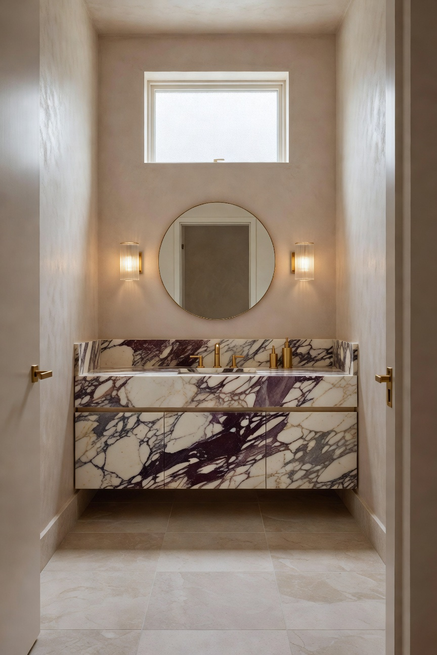
The stone’s physical finish dictates the room’s sensory atmosphere. For example, a honed finish creates a velvety, matte aesthetic often described as “quiet luxury.” Conversely, a leathered finish adds a pebbly, haptic quality that invites touch. Because vanities are experienced up close, these tactile nuances are crucial. Additionally, polished surfaces act as space expanders by reflecting light in tight quarters.
To maximize this impact, you should employ the “mitered edge” technique. Fabricators attach a wide apron to the stone’s border. As a result, a standard slab creates the illusion of a massive, monolithic block. This architectural weight grounds the design, transforming furniture into architecture. Ultimately, incorporating natural stone provides a deep biophilic connection. Thus, even a tiny powder room feels like a permanent, opulent sanctuary.
Flooring: High-Contrast Drama – Distracting the eye with bold geometric encaustic tiles or intricate mosaics.
In the context of a small bathroom, flooring becomes a strategic distraction tool. Specifically, designers utilize the “Jewel Box” effect to create neurological overload. Rather than relying on sterile, light colors, high-contrast patterns engage the brain immediately. Consequently, complex visual data stops the eye from obsessing over limited square footage. Therefore, a bold floor transforms the space from cramped to intentional. Exploring various bathroom flooring options allows for this type of tactile, grounding luxury.
Material choice plays a pivotal role in this dramatic approach. Authentic encaustic tiles offer a tactile, matte texture that feels organic underfoot. Because the pattern is inlaid rather than painted, these surfaces develop a “living patina” over time. Indeed, this sensory richness provides a grounding architectural boundary within a tight space. Conversely, standard porcelain often feels cold and clinical by comparison.
Alternatively, intricate mosaics apply the “Wrong Shoe Theory” to interior design. Just as an unexpected accessory elevates an outfit, bold floors create sophisticated tension. Surprisingly, oversized geometric patterns can actually make a small room feel wider. By forcing the pattern to “break” at the walls, the floor suggests continuity beyond visible borders.
Finally, grout serves as an active architectural element rather than just filler. Specifically, high-contrast grout emphasizes the grid, creating an energetic, vibrating effect. Additionally, this increased density provides superior slip resistance for wet areas. In fact, designers often employ the “bleed” technique to remove visual stops. Ultimately, extending the tile seamlessly up the wall effectively blurs spatial boundaries.
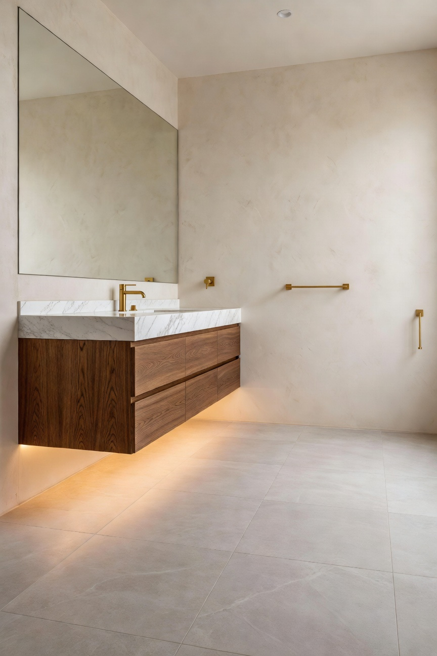
Fixtures: The Floating Vanity Illusion – Maximizing visible floor space without sacrificing opulent finishes.
Consequently, the “floating vanity illusion” serves as a sophisticated design strategy. It effectively transforms small bathrooms into expansive, high-end sanctuaries. Specifically, this concept relies on the visible floor space principle found in cognitive psychology. By elevating the cabinet 12–18 inches, the eye travels uninterrupted to the wall-floor junction. Therefore, the brain perceives the room as significantly larger than its actual footprint.
However, achieving this visual weightlessness requires structural precision. Historically, this design traces back to Modernist pioneers like Charlotte Perriand. She viewed bathrooms as functional “machines for living.” To support opulent finishes like heavy Calacatta marble, the internal wall structure needs radical modification. In fact, installers must place solid wood “blocking” between studs to anchor the cantilevered unit.
Furthermore, plumbing logistics require careful consideration. Standard rough-in lines must be tucked higher to remain hidden behind the cabinet. Alternatively, designers might expose decorative “bottle p-traps” in finishes like brushed gold. This effectively turns necessary utility into a piece of industrial jewelry.
Additionally, lighting plays a crucial role in finalizing the effect. For instance, a recessed LED strip installed underneath creates a soft light “wash” on the floor. This eliminates shadow traps and makes the vanity appear to levitate. Finally, material choices amplify this luxury. Waterfall edges on the countertop create a beautiful design tension against the open space below. Moreover, running large-format tiles beneath the vanity minimizes visual breaks. Thus, the space feels continuous, airy, and undeniably opulent.
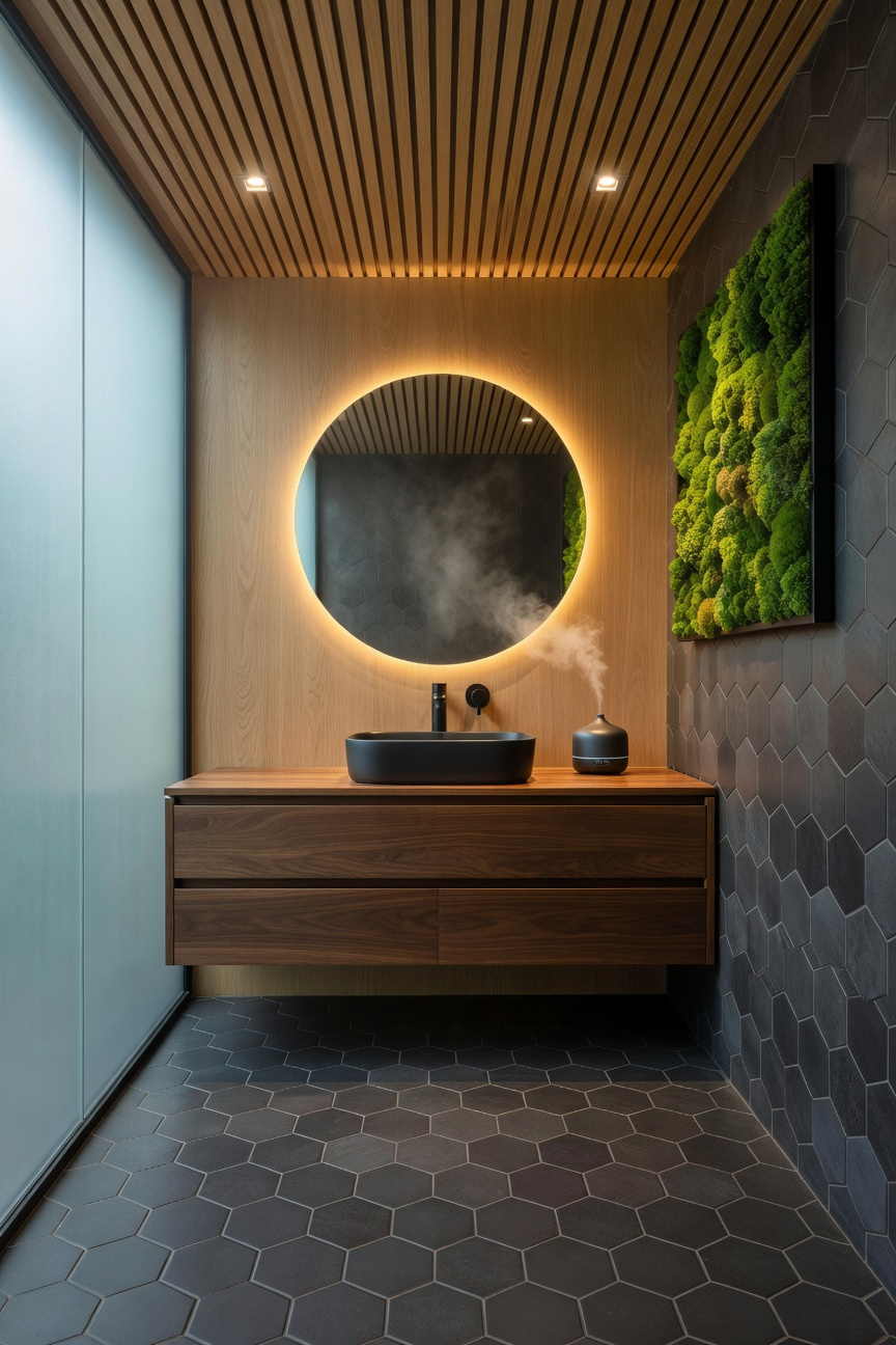
Lighting: Eye-Level Ambience – Replacing clinical overhead cans with decorative sconces and brass picture lights.
Overhead recessed lighting often makes a private sanctuary feel clinical and cold. Historically, these fixtures prioritized industrial efficiency over human connection. However, designers are now leading a “revolt against the ceiling.” Specifically, they are swapping harsh downlights for decorative sconces and opulent brass picture lights.
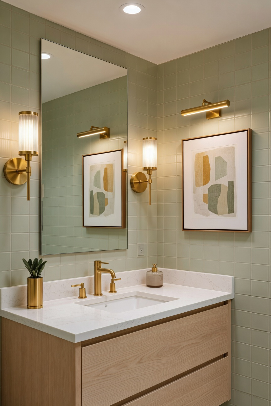
Technically, overhead lighting creates unflattering facial shadows, known as the “skull effect.” Conversely, placing sconces at eye level creates necessary “cross-illumination.” Ideally mounted 60 to 66 inches high, these fixtures fill in shadows effectively. In fact, this lighting angle acts as a real-world beauty filter. Alternatively, utilizing a brass picture light over the mirror highlights the vanity’s craftsmanship. Unlike glaring vanity bars, these fixtures direct a soft, museum-quality wash of light downward.
Furthermore, the material itself significantly contributes to the room’s ambiance. For example, unlacquered brass possesses unique “living” qualities. Over time, humidity creates a honey-toned patina, adding distinct warmth and history. Additionally, brass reflects light at a warmer spectrum, neutralizing harsh LED blues.
Finally, this placement deeply impacts psychology. Research suggests overhead glare suppresses melatonin at night. Therefore, lower light sources mimic the natural angle of the setting sun. By relying on the low-glow of a single sconce, the room becomes a restorative cocoon. Ultimately, this shift restores a traditional, candle-inspired glow to the modern home.
Statement Piece: The ‘Too Big’ Chandelier – Breaking scale rules to create a luxurious focal point.
Standard design math suggests that small rooms require modest lighting. However, the “Too Big” chandelier trend defies this logic through intentional scale disruption. Specifically, installing an oversized fixture creates a powerful sculptural anchor. Consequently, the eye focuses on this luxurious centerpiece rather than the room’s limited footprint. This visual trick effectively turns a cramped bathroom into an intimate jewelry box.
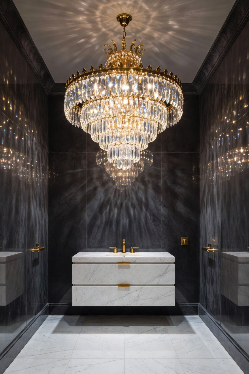
The physics of light works differently in compact spaces. A large, prism-heavy fixture creates intense light refraction closer to the walls. Therefore, these surfaces become a canvas for dancing rainbows and complex shadows. This interplay, known as chiaroscuro, adds expensive-looking texture to otherwise plain tile or paint. In fact, experts note that this “shimmering box” effect elevates the entire sensory experience.
Nevertheless, practical installation requires strategic planning to maintain functionality. Because large fixtures consume vertical space, place them strictly over vanity counters or bathtubs. Additionally, always verify structural integrity before installation. Standard junction boxes cannot support 75-pound statement pieces; thus, reinforced bracing is essential. Finally, ensure the fixture carries a proper damp rating to withstand daily humidity. By prioritizing safety alongside style, you create a space that feels both opulent and secure.
Hardware: Jewelry for the Room – Mixing unlacquered brass and polished nickel for a curated, collected look.
Treating hardware as “jewelry for the room” transforms a small bathroom from merely functional to intentionally curated. Specifically, the pairing of unlacquered brass and polished nickel bridges historic charm with modern luxury. While mixing metals often intimidates homeowners, this combination works beautifully because of a shared “warm on warm” alchemy. Unlike cool chrome, polished nickel contains copper, providing a subtle gold undertone. Consequently, it harmonizes perfectly with the deep, chocolatey-bronze patina that unlacquered brass develops in humid environments.
This duality creates a strategic lighting effect known as “liquid light.” Polished nickel acts as a mirror, bouncing illumination into dark corners to visually expand the space. Conversely, the aging brass provides a matte counterpoint. This visual layering creates necessary depth, ensuring a small footprint feels three-dimensional rather than flat.
To execute this look successfully, designers often apply a strict “70/30” rule. Primarily, assign polished nickel to 70% of the fixtures, such as faucets and showerheads. This finish withstands harsh cleaning chemicals, maintaining the sense of cleanliness essential for plumbing. In contrast, reserve unlacquered brass for the remaining 30%, specifically touchpoints like cabinet pulls and mirrors. Here, natural oils from your hands accelerate the patina, creating a “living” finish. Ultimately, this mix evokes a “collected” English Utility aesthetic, avoiding the generic look of a builder-grade kit.
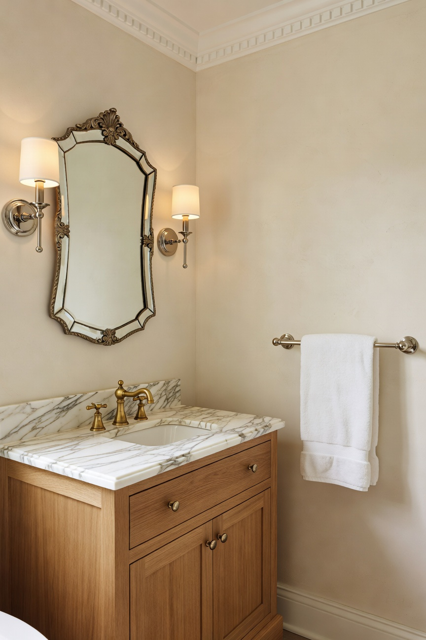
Mirrors: The Infinite Reflection – Using wall-to-wall antiqued glass to double the visual footprint.
In small bathrooms, defined boundaries make the space feel confined. Standard mirrors function like windows, yet they still establish limits. Conversely, wall-to-wall antiqued glass dissolves these architectural edges entirely. Specifically, extending the glass from floor to ceiling removes horizontal reference points. Therefore, the room’s visual footprint effectively doubles, creating a sense of limitless volume.
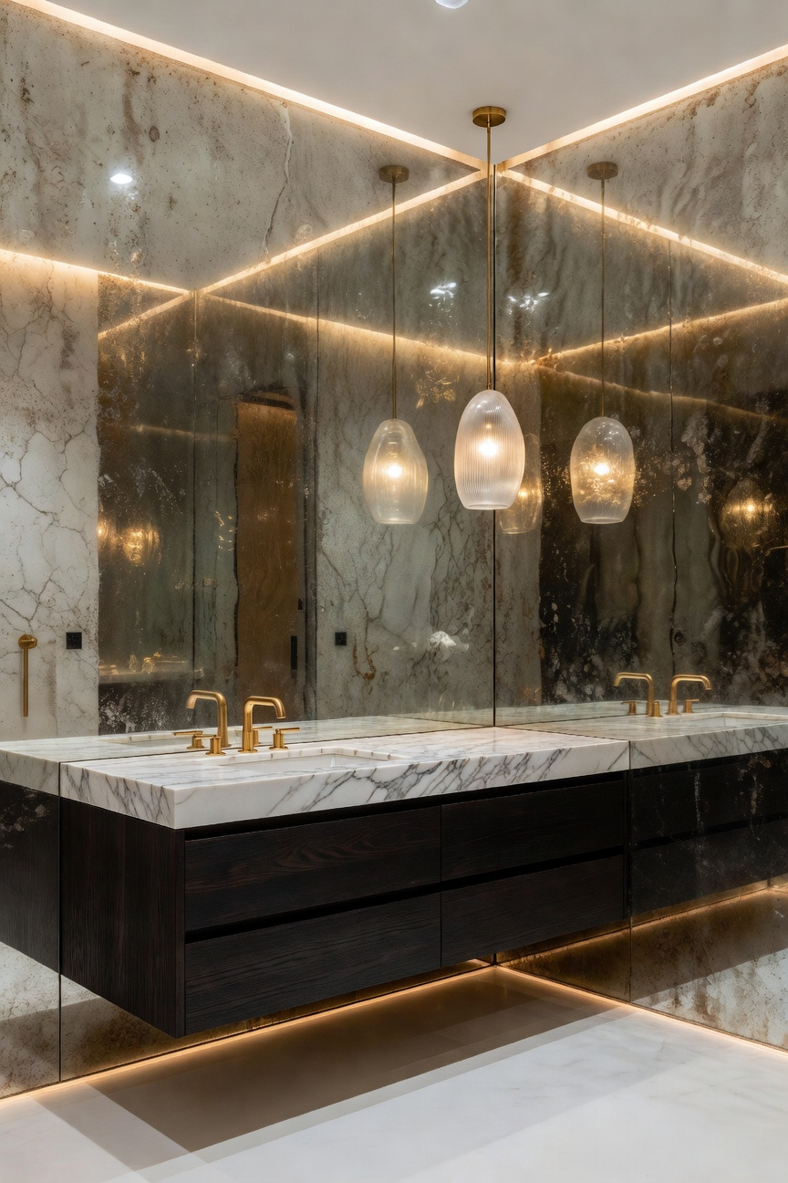
Total clarity is not always the objective in luxury design. Standard “float glass” often feels clinical or unforgiving in tight quarters. In contrast, antiqued glass provides a distinct, “misty” depth. This finish mimics historical “foxing” to create a warm glow by scattering light. Consequently, the bathroom shifts from a utility space to an opulent sanctuary. Additionally, this texture prevents the dizziness often associated with facing mirrors.
Furthermore, proper installation is critical for maintaining this “infinity” illusion. Because walls are rarely perfectly square, installers prime the surface in matte black. This dark background effectively disguises any shadow gaps between large panels. Also, professionals apply adhesive in vertical venting strips rather than blobs. This technique ensures necessary air circulation behind the glass. Ultimately, this prevents moisture-related “black rot,” preserving the mirror’s historic, soulful aesthetic for years.
Textiles: Floor-to-Ceiling Drapery – Replacing glass doors with velvet or linen curtains for softness and height.
Replacing stark glass doors with floor-to-ceiling textiles immediately introduces sophisticated volume to compact bathrooms. Conceptually, this swap trades “hard-modern” finishes for a “soft-maximalist” aesthetic. Consequently, the space feels significantly taller. By mounting tracks directly to the ceiling, vertical fabric lines draw the eye upward. This “high-hang” strategy creates a chimney effect, effectively stretching standard ceiling heights. In fact, fabric offers acoustic relief. Unlike reflective tile, heavy velvet or linen absorbs sound, creating a hushed, spa-like sanctuary.
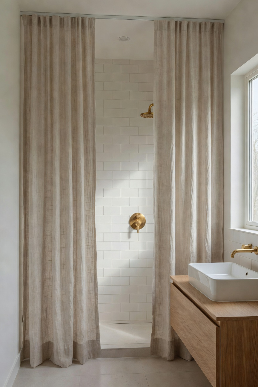
Material selection is crucial for this lavish upgrade. Specifically, modern performance velvets now feature waterproof backings, maintaining a plush, indulgent exterior. Alternatively, heavy slubbed linen evokes a breezy, Mediterranean vibe. Because linen is naturally antimicrobial, it breathes easily in humid environments. For installation, utilize a recessed ceiling track to mimic a seamless “soft wall.” Crucially, ensure the weighted hem “kisses” the floor rather than puddling to prevent moisture trapping.
Finally, consider the sensory impact. Glass is often cold and tactilely defensive. In contrast, textiles introduce “visual temperature,” making the space feel warmer immediately. Theatricality also plays a major role here. Closing a heavy curtain creates a private “cocooning” effect, transforming a daily task into a restorative ritual. Moreover, maintenance becomes effortless. Instead of fighting hard water etching on glass, simply machine wash the panels. Therefore, this design choice creates a bathroom that is both opulent and livable.
Art Curation: The Vertical Gallery Wall – Drawing the eye upward with stacked, ornate frames.
In a small bathroom remodel, floor space is a premium commodity. Consequently, the design focus must shift upward to the vertical planes. Specifically, curating a vertical gallery wall triggers the “Cathedral Effect.” Vertical lines imply strength and stability. Thus, stacking ornate frames creates an optical illusion of grandeur. In fact, placing the highest frame near the ceiling effectively “stretches” the room’s perceived height.
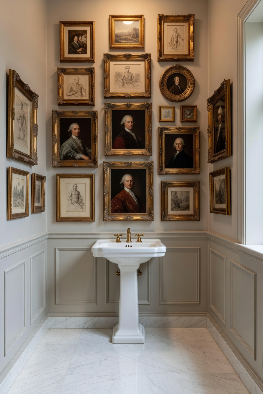
This technique recalls the 17th-century French “Salon Hang,” embracing a “more is more” philosophy. However, proper execution requires understanding visual weight. For instance, place the largest, most ornate frame at the bottom. This “anchor” prevents the arrangement from appearing top-heavy. Furthermore, adhere to the “Rule of Odds.” A trio of frames often feels most balanced psychologically. Additionally, intricate carvings require “breathing room.” Therefore, allow 4–5 inches of negative space between items to avoid visual clutter.
Material choice is also critical in humid environments. To avoid warping, designers favor Polcore or metal over traditional wood. moreover, using acrylic instead of glass prevents condensation and fogging. Finally, gilded finishes capture light from vanity sconces. This interaction creates a glowing, “jewel box” atmosphere. Ultimately, this vertical “spine” transforms a utility space into a curated sanctuary.
Architectural Detail: Adding Gravitas with Wainscoting – Installing bold beadboard or picture frame molding.
Transforming a utilitarian bathroom requires more than just new fixtures. Specifically, installing wainscoting introduces immediate architectural gravitas. Whether utilizing rhythmic beadboard or structured picture frame molding, these details create a necessary visual baseline. Consequently, they turn a plain box into a curated, historic space.
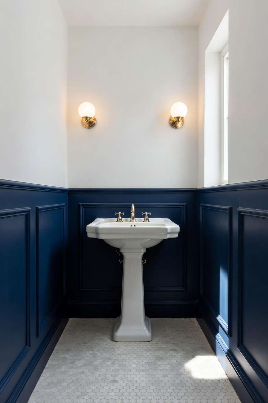
Historically, wood was removed from bathrooms during the “Sanitary Movement” due to hygiene concerns. However, modern design embraces a smart hybrid approach. For instance, using moisture-resistant cellular PVC brings back Victorian warmth without the risk of rot. Therefore, homeowners gain the aesthetic of wood with the durability of tile.
Furthermore, manipulating proportions alters the room’s psychology. Traditionally, wainscoting sits at one-third of the wall height. Yet, raising it to two-thirds creates an enveloping “jewel box” effect. In small powder rooms, this height adds undeniable drama. Additionally, the vertical lines of beadboard trick the eye, making low ceilings feel significantly higher.
Beyond structure, texture plays a crucial sensory role. Unlike cold tile, wood or composite wainscoting dampens sound. This reduces the harsh “echo-chamber” effect common in small baths. To maximize impact, consider a bold, high-gloss finish. Deep navy or forest green paint reflects light upward from the floor. Thus, the dark color feels luxurious rather than heavy. Finally, pair this detail with a pedestal sink. This allows the molding to run uninterrupted, anchoring the room effectively.
Storage: The Hidden Niche – Carving out storage between studs framed with intricate tile borders.
In small bathroom remodels, true luxury often hides within the walls. Specifically, standard construction leaves a 14.5-inch void between studs. Therefore, this dead space offers a prime opportunity for a “spatial heist.” By carving out a recessed niche, you reclaim volume without moving a single wall. Technically, this process requires precise horizontal blocking. Furthermore, a crucial 1/16-inch pitch on the sill uses gravity to prevent standing water.
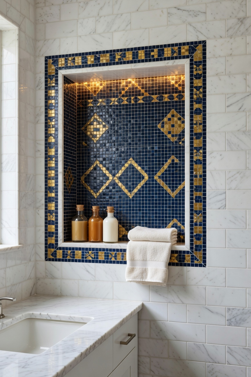
However, the difference between basic and opulent lies in the finishing details. For instance, replace standard rounded edges with a high-skill mitered edge. Here, tiles meet at a sharp 45-degree angle for a seamless look. Additionally, embrace a “more is more” philosophy by framing the niche with intricate borders. Historically, this echoes 1920s Art Deco designs that celebrated geometric patterns. Consequently, a mosaic transition band turns simple storage into recessed art.
Finally, consider the sensory impact of this negative space. In fact, recessing storage removes protruding shelves, making the room feel wider. Moreover, tucking a waterproof LED strip inside creates an ambient “light box.” Thus, the niche becomes a glowing focal point rather than just a utility shelf. Ultimately, this transforms a functional necessity into a deeply personal architectural statement.
Sensory Layering: Scentscaping and Sound – The invisible elements that define a luxury spa experience.
To transform a compact bathroom, one must address the “invisible architecture” beyond the visual aesthetic. Specifically, sensory layering stacks auditory and olfactory elements to bypass the conscious mind. In tiled spaces, hard surfaces naturally create sharp, high-frequency echoes. Consequently, luxury design prioritizes acoustic sculpting to mitigate this alertness-triggering “clatter.” For instance, integrating Brown Noise works better than standard white noise. Its deep, lower frequencies effectively soften the sound of water hitting metal. Furthermore, you can install sonic transducers behind mirrors. These devices turn surfaces into invisible speakers, eliminating visual clutter entirely.
Similarly, scent should evolve as you move through the room. High-end spas utilize “Fragrance Zoning” to create a psychological journey. At the dry vanity, introduce resinous notes like Sandalwood or Frankincense. Historically, these scents signal a transition into a private sanctuary. Conversely, the shower area requires a shift to “balsamic” profiles. Specifically, infusing steam with Hinoki cypress releases phytoncides. These wood oils are clinically proven to lower heart rates, mimicking Japanese forest bathing.
Finally, the water fixtures themselves serve as acoustic anchors. Standard faucets often aerate water, causing noisy splashing. Therefore, selecting Laminar Flow fixtures ensures a crystal-clear, silent stream. Additionally, air-injection showerheads create “plumper” droplets. This technology produces a soothing thud rather than a hiss. Ultimately, these invisible layers expand the room’s perceived boundaries.
Frequently Asked Questions
How much does a luxury small bathroom remodel cost?
A high-end remodel for a small bathroom typically ranges from $20,000 to $45,000. This higher cost per square foot accounts for premium artisanal finishes, bespoke cabinetry, and exotic stone remnants that transform the space into a concentrated luxury sanctuary.
How can I make my small bathroom feel like a luxury spa?
To create a spa-like atmosphere, focus on sensory layering. Incorporate “color drenching” to eliminate visual noise, install eye-level sconces for warm ambient lighting, and use performance textiles like floor-to-ceiling linen curtains. Adding acoustic elements like wood slats and scentscaping also elevates the experience.
What are the best colors for a small bathroom to look bigger?
While white is the traditional choice, deep saturated tones like navy, emerald, and charcoal can actually make a room feel larger. These colors absorb light and blur the corners of the room, creating an illusion of infinite depth and a sophisticated “jewel box” effect.
Conclusion: Your Home’s Most Daring Canvas – Why the smallest room deserves the biggest personality.
Ultimately, the smallest room in your home offers the greatest creative freedom. Historically, these spaces served merely as hidden utilities, but they have evolved into personal sanctuaries. In fact, a compact footprint allows you to indulge in high-end materials without breaking the budget. Consequently, you can prioritize quality over quantity, treating walls like canvases for opulent textures. Furthermore, embracing deep colors during your small bathroom remodel creates a comforting, cocoon-like effect rather than a cramped feeling. Therefore, this “jewel box” approach transforms a functional necessity into a powerful statement of identity.
Looking ahead, this daring energy should not remain contained behind a closed door. Actually, a bold powder room invites you to take greater risks throughout your entire home. Thus, living with intense color and pattern becomes a daily source of joy and dopamine. To begin, select one “hero” material, like a hand-painted tile or a dramatic wallpaper. Then, build your lighting scheme to illuminate it like a piece of fine art. Finally, allow this tiny space to tell your loudest, most authentic story.