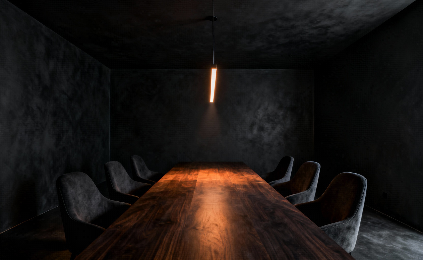

Many homeowners believe that painting black dining room walls makes a space feel small, claustrophobic, or oppressive. Consequently, they avoid dark colors, fearing a gloomy atmosphere. However, this conventional view overlooks a sophisticated design principle: the theatrical void. Actually, matte black paint functions as negative space. It absorbs ambient light completely rather than reflecting it. Therefore, the walls simply disappear, eliminating visual noise and distracting reflections.
By removing the background, the room transforms into a dedicated vessel for connection. Thus, the dining table becomes a brilliant, spotlit stage floating in velvety darkness. This high-contrast setting forces attention solely onto the guests, the food, and the warm glow of candlelight. Indeed, this “cocooning” effect prepares the mind for intimacy and safety. It encourages a natural shift from mundane chatter to profound interaction. Furthermore, the environment heightens sensory awareness, giving weight to every gesture.
This atmosphere echoes the bohemian romance of 19th-century *Chat Noir* shadow theaters. Like those historic venues, your dining room becomes a backdrop for emotional storytelling. Here, flickering candlelight casts dancing shadows, turning dinner into a private performance. This guide reveals specific techniques to master this “Theater of Shadows” aesthetic. We will explore how to balance the dramatic void with modern functionality. Finally, you will learn to craft a space designed specifically for deep conversation.
Section 1: The Canvas – Establishing the Void
Establishing the void begins with understanding how light behaves. Specifically, unlike lighter colors, matte black finishes absorb light entirely. Consequently, this mechanism minimizes the glare that typically defines a room’s corners. As a result, hard edges blur. This effectively dissolves the room’s physical boundaries, initiating a transformative black dining room remodel. Ideally, this creates a limitless atmosphere often described as the “black hole” effect.
Beyond optics, this darkness creates a distinct psychological shift. In fact, the void acts as a quiet, enveloping retreat rather than an empty cave. Therefore, the dining table transforms into a lit stage for conversation. By removing visual noise from the periphery, the room forces the eye inward. Thus, guests and cuisine are dramatically spotlighted.
Moreover, this deep canvas serves as a high-contrast anchor for precious objects. For instance, antique gold frames gain new vibrancy against the shadow. However, balance is key. You must incorporate glossy accents to reflect ambient light. Ultimately, these gleams function like distant stars. They ensure the void remains sophisticated rather than flat. For more inspiration, explore our curated list of hauntingly beautiful black dining room ideas to summon timeless drama.
1. Beyond Basic Black: Selecting undertones (blue, green, or true charcoal) to manipulate mood.
Selecting black paint requires looking beyond the simple swatch. Specifically, the subtle undertone is your most authoritative tool for manipulating mood. Consequently, the wall becomes a highly engineered atmospheric container.
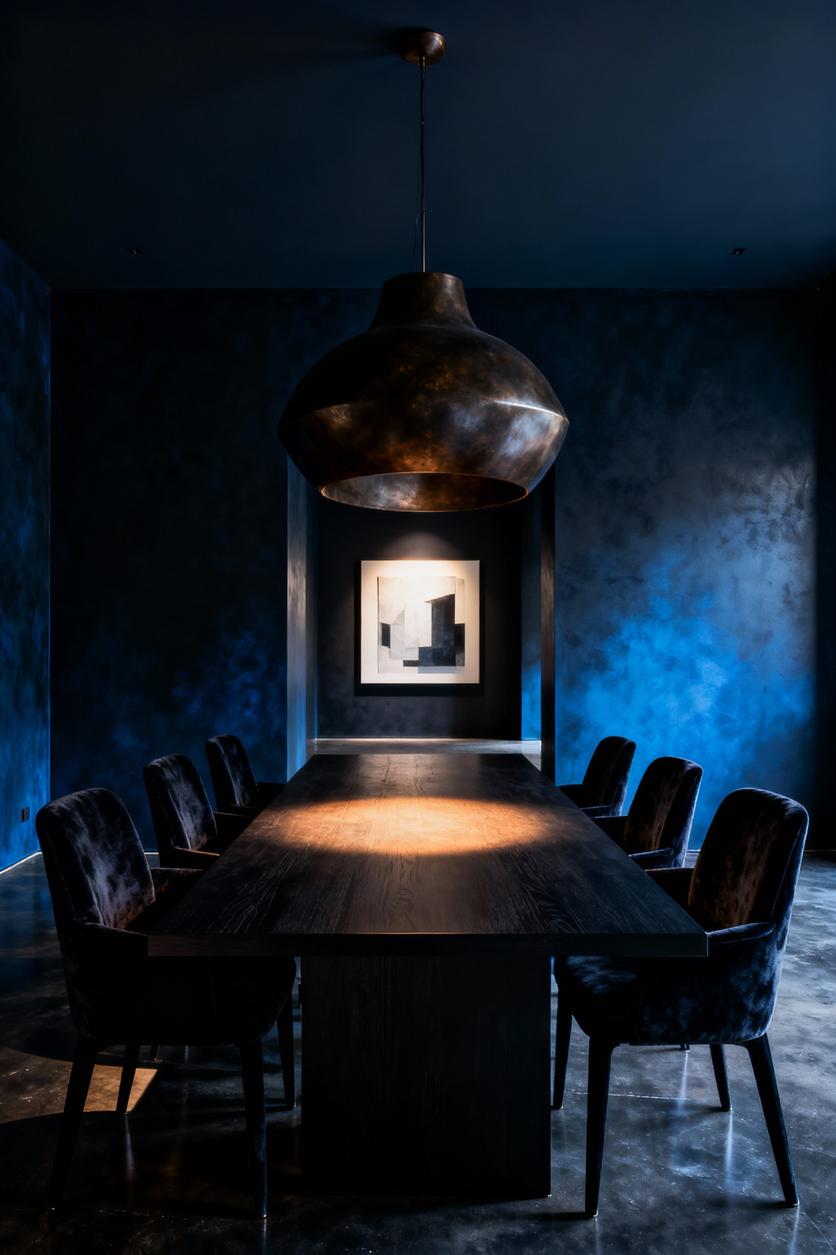
First, consider black with a deep blue undertone. Often referred to as sapphire black, this shade mimics a midnight sky. Psychologically, it cools the room to create a formal environment. Furthermore, blue acts as a subtle evolutionary appetite suppressant. Therefore, this choice is excellent for dinner parties prioritizing conversation over consumption.
Conversely, a green undertone offers a vastly different experience. Known as forest black, this hue creates an organic cocoon. It feels lush rather than cold. Additionally, the association with nature promotes a grounded sense of wellbeing. Thus, guests feel comfortable lingering longer at the table.
Finally, true charcoal acts as the ultimate foil. Because it lacks a specific chromatic pull, it creates visual stillness. Consequently, it amplifies every other element in the space. White linens appear crisper, and vibrant food presentation becomes the star. Ultimately, this is the purist’s choice for gallery-like focus.
2. The Texture of Darkness: Matte vs. Satin finishes and their impact on light absorption.
Black paint absorbs light, yet the finish dictates the outcome. However, the difference creates a distinct physical effect. Specifically, satin finishes reflect significantly more light than matte options. Consequently, this drastically alters depth perception. Matte finishes create a nearly total “void.” They scatter reflected light, resulting in a velvety appearance. Conversely, satin creates a polished surface. It allows the wall to catch light, revealing form.
This choice dictates the room’s atmosphere. For instance, matte absorbs ambient light to create a quiet cocoon. It eliminates visual noise, offering an intimate sanctuary. Therefore, candlelight glows warmly without harsh glare. In contrast, satin introduces necessary dynamism. It creates soft halos around pendants. Thus, it traces the room’s architectural contours with a subtle shimmer.
Ultimately, selecting a finish requires a practical trade-off. Matte is forgiving on older walls. Specifically, it hides imperfections like plaster flaws. Unfortunately, it is porous and difficult to clean. Alternatively, satin provides superior durability. Its higher resin content makes it wipeable. However, the sheen highlights every surface defect. Therefore, satin demands perfectly smoothed walls.
3. Limewash and Plaster: Adding old-world depth and movement to flat surfaces.
Standard matte black paint can create a singular, lifeless plane. Conversely, limewash and mineral plaster introduce essential light interaction. Specifically, the lime composition whitens the pigment slightly. Consequently, this yields a “soft black” with a chalky patina. In a dining setting, this tonal movement is transformative. Instead of absorbing all illumination, the surface refracts candlelight. Thus, the wall feels alive, mimicking aged stone. Visually, the finish resembles tactile materials like suede. Therefore, it adds intimacy without harsh reflections.
Beyond aesthetics, this choice offers historical authenticity. Historically, lime plaster was standard for Renaissance architecture. Technically, the finish creates durability through carbonation. As it absorbs carbon dioxide, the paint calcifies onto the wall. However, this depth is not inherent to the color alone. Rather, it requires artisanal application. Artisans apply multiple diluted coats using random crosshatch brushstrokes. As a result, the “handwriting” of the brush remains visible. Ultimately, this creates a three-dimensional illusion on a flat surface.
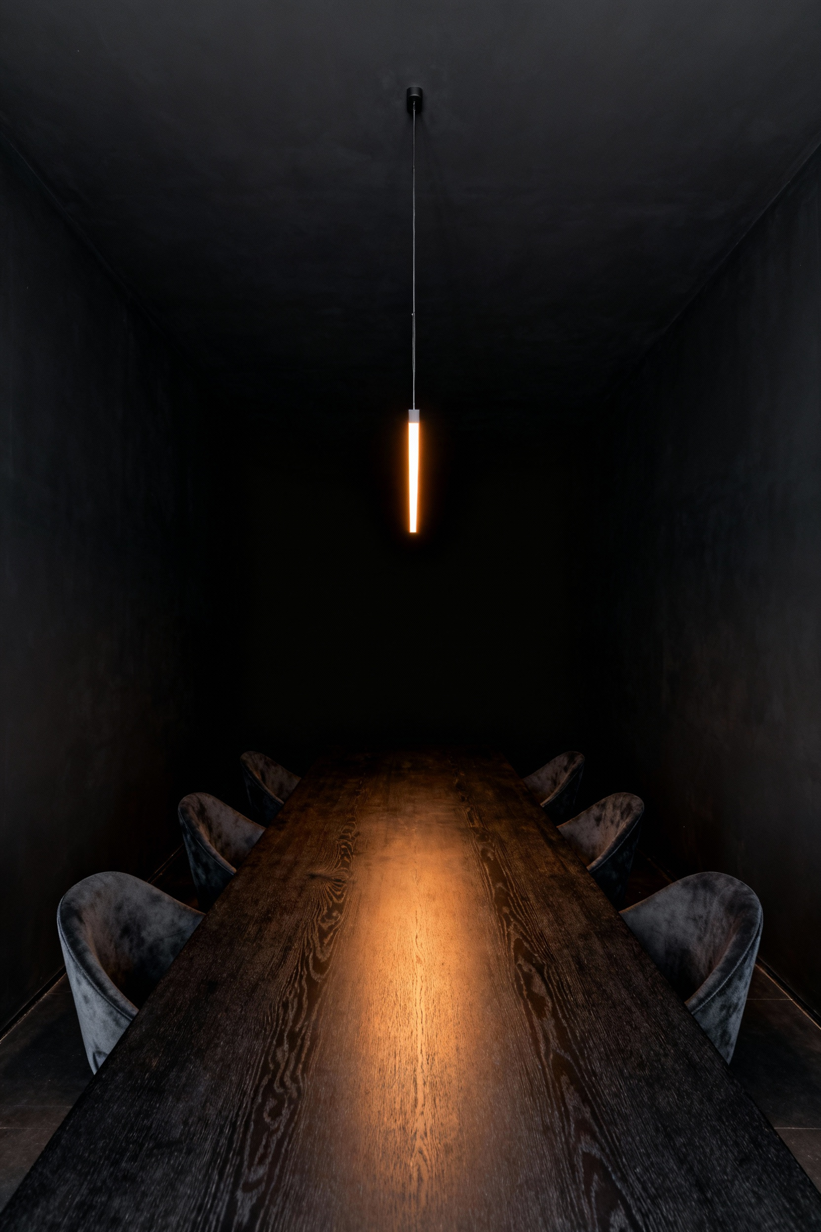
4. The Infinity Ceiling: Wrapping the color upward to dissolve spatial boundaries.
Traditionally, a white ceiling creates a hard contrast line against dark walls. This boundary grounds the viewer, defining the room’s limits. However, the “Infinity Ceiling” technique disrupts this cue. By extending black paint across the fifth wall, you dissolve the cornice line. Consequently, the space transforms from a rigid box into an atmospheric void.
In fact, this monochromatic wrapping tricks the eye. Without a stark termination point, the ceiling planes recede. Thus, the room feels unbounded, like gazing into the night sky. This optical ambiguity is perfect for dining rooms. Specifically, it creates a “cocooning” effect that feels private. Instead of bouncing light, the dark canopy absorbs it. Therefore, your lighting becomes intentional, focusing solely on the table.
Technical execution is vital here. Surprisingly, the choice of sheen determines the illusion’s success. You must utilize a matte finish for both walls and ceiling. Conversely, a gloss finish would reflect light and highlight imperfections. Ultimately, a matte surface allows the architecture to disappear into velvety darkness.
5. Architectural Definition: Using high-gloss black on trim against matte walls for subtle contrast.
Creating a sophisticated monochromatic space requires more than just picking a color. Specifically, you must master the art of sheen contrast. In this approach, the color remains pure black, yet the finish creates definition.
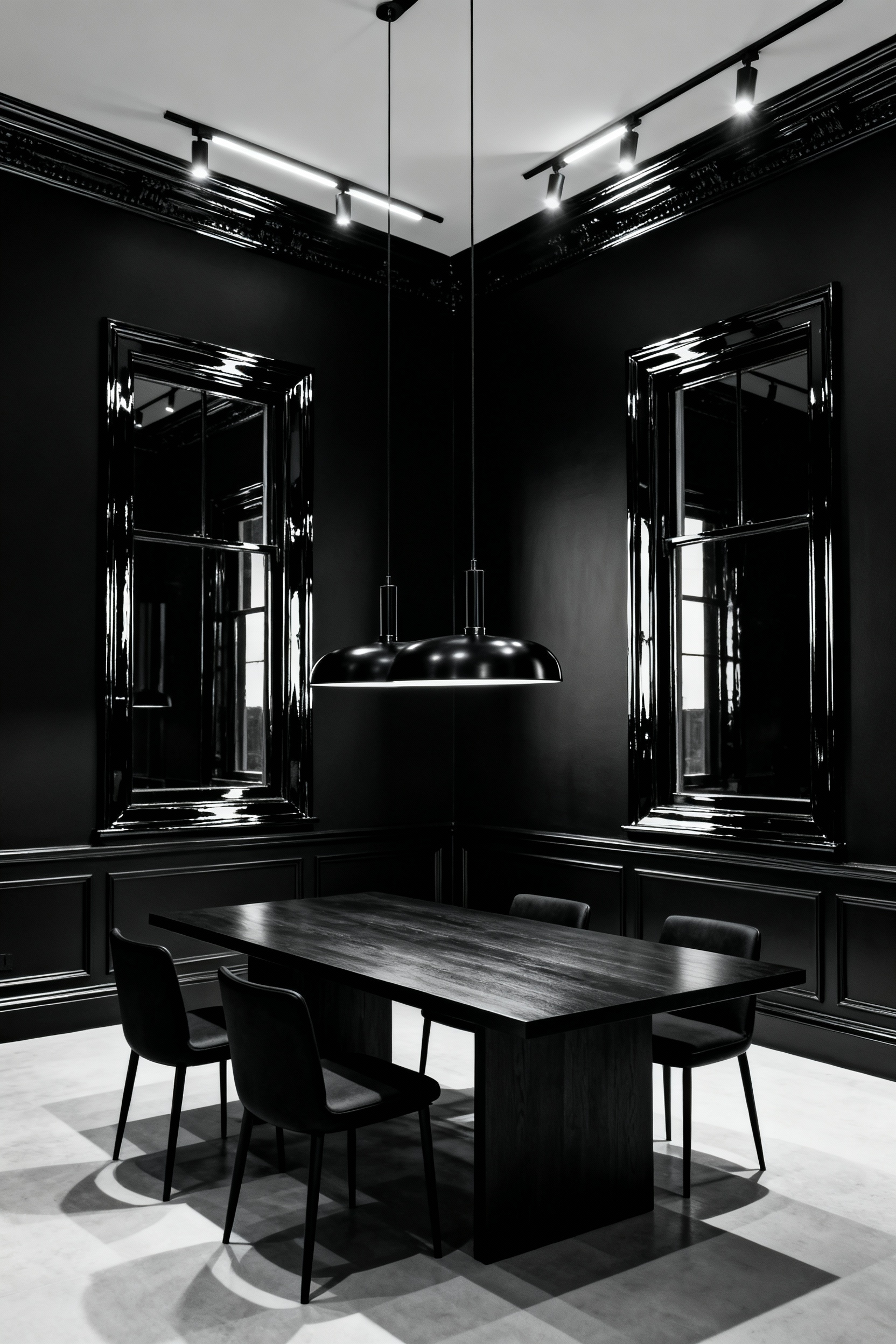
Start by treating the walls as an absorptive plane. Therefore, select a flat finish for these large surfaces. This texture diffuses light, making the black appear soft. Consequently, the room feels intimate rather than cold.
Next, create architectural punctuation with the trim. Apply a high-gloss finish to baseboards and moldings. Because of this reflectivity, these details catch light like a dark mirror. Thus, the trim visually “pops” against the background.
This technique effectively frames the space. In fact, it provides a visual backbone without needing a color break. Furthermore, this allocation of sheen serves a practical purpose. High-gloss paint is harder and contains more resin. As a result, scuff-prone areas become durable. Ultimately, this strategy relies on luminosity to create a layered experience.
Section 2: Chiaroscuro – Sculpting with Light
Deep black walls transform a standard dining room into a canvas for *chiaroscuro*. Historically, this technique defines volume through extreme contrast between light and dark. In this context, your walls become active negative space. Consequently, they absorb ambient light rather than diffusing it. Thus, the room functions as an enveloping void. This creates a stage where illuminated elements are vividly revealed.
Therefore, lighting choices must be highly intentional. Instead of washing the room in brightness, rely on low-key sources. For example, use a single pendant to act as a spotlight. This focused beam “models” the form of your dining table. Suddenly, simple glass gains dramatic weight. The resulting shadows sculpt the space.
Furthermore, the wall’s texture dictates the shadow play. Specifically, matte black surfaces absorb maximum light. This absorption prevents harsh reflections, deepening the void. Conversely, glossy finishes diffuse light, which lessens the drama. To maximize impact, pair matte walls with metallic accents. In fact, brass fixtures against deep black create a radiant pop. Ultimately, this interplay fosters profound intimacy.
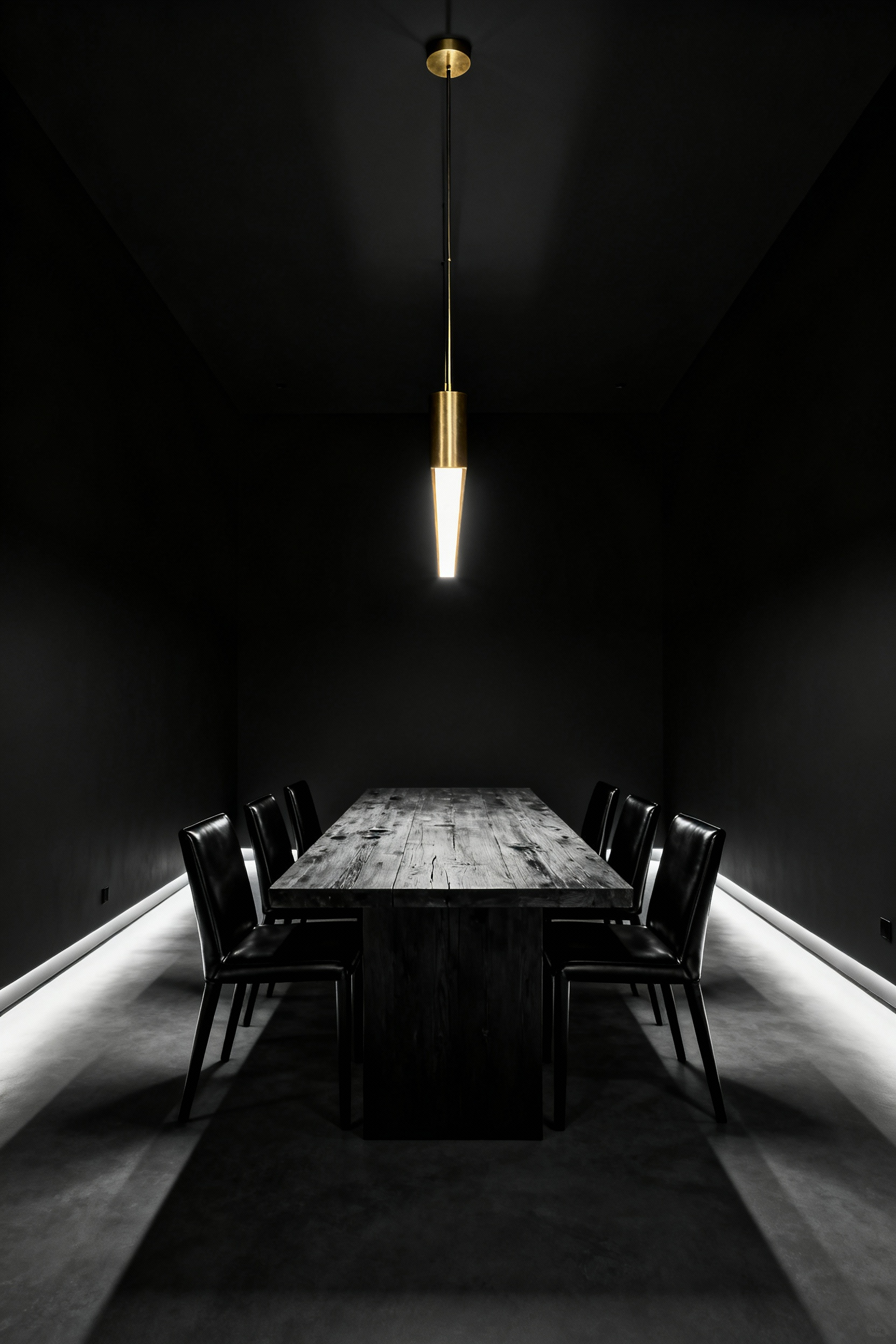
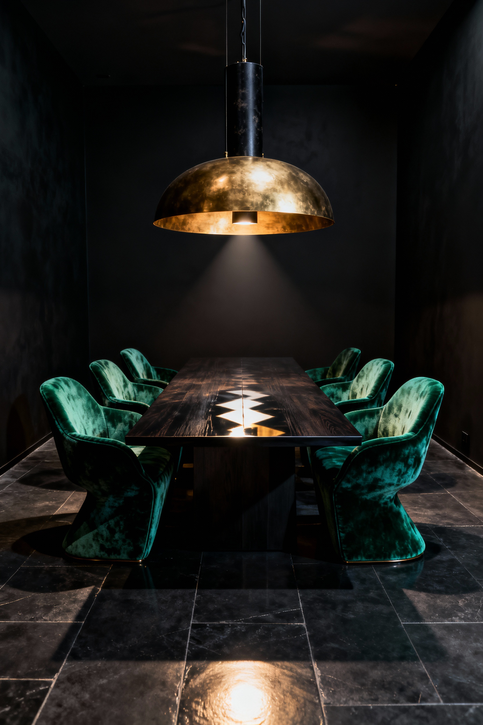
6. The Central Protagonist: Selecting a statement chandelier that commands the void.
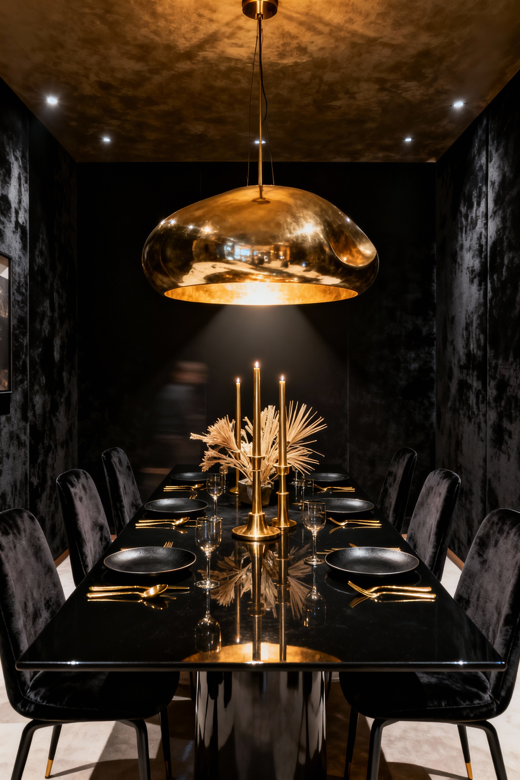
In a room defined by light-absorbing walls, lighting must do more than illuminate. Specifically, the chandelier acts as a radiant counterpoint that validates the darkness. Because black paint naturally swallows brightness, traditional shaded fixtures often fail. Therefore, your central “protagonist” must actively multiply light through refraction. Materials like crystal create a dancing sparkle, effectively turning the void into a luxurious backdrop.
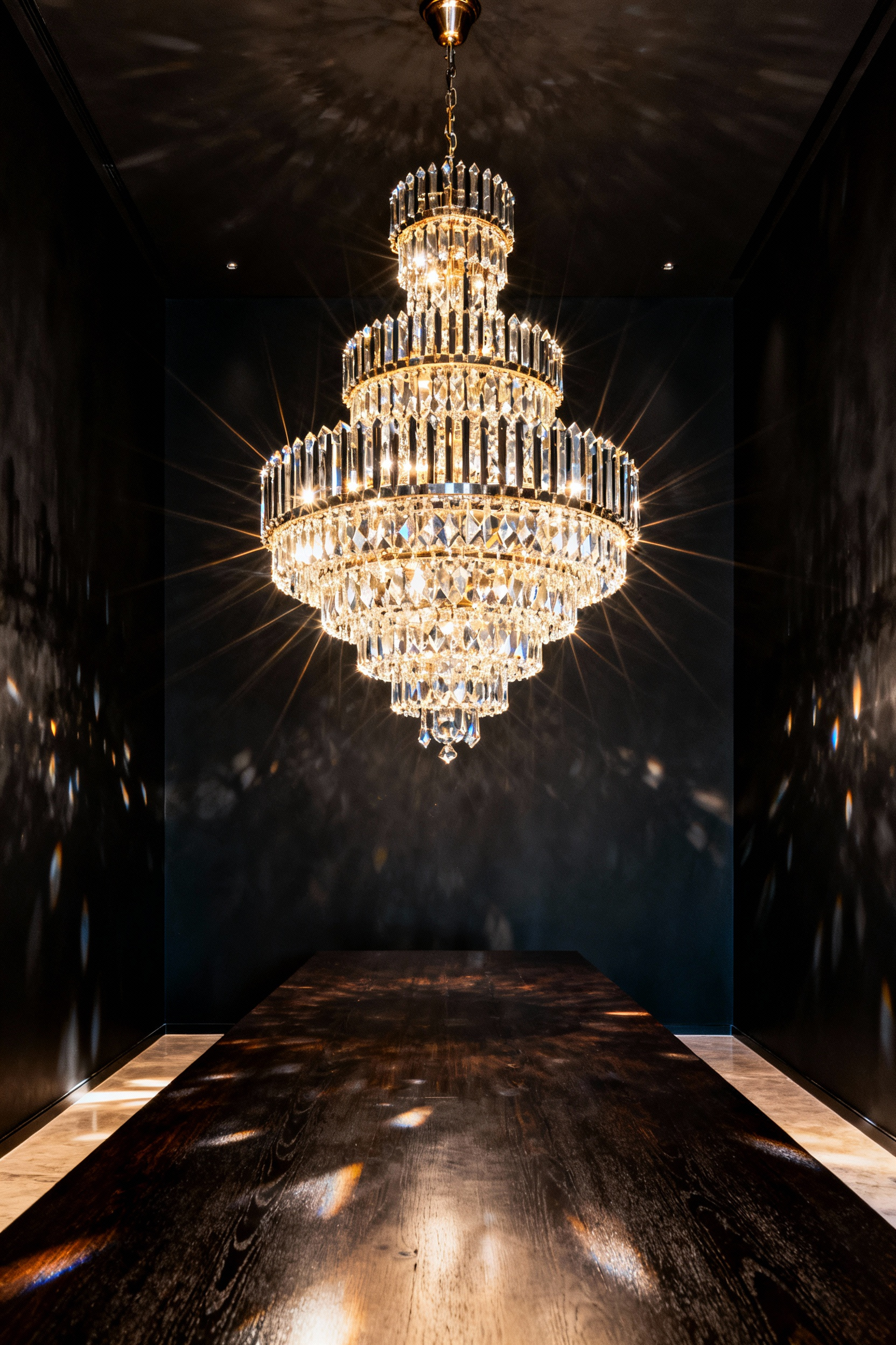
To prevent this drama from feeling cold, consider the emotional temperature. In fact, warm metallics like unlacquered brass provide a crucial anchor. This finish introduces a lyrical contrast against authoritative black paint. Historically, this mix blends opulence with approachability.
However, visual impact depends heavily on scale. Crucially, the fixture’s size should relate to the dining table rather than the room dimensions. Generally, select a diameter that is one-half to two-thirds of the table’s width. For long tables, linear lights ensure even distribution.
Conversely, a statement piece does not require glitter. A matte black chandelier with an open frame offers a sculptural presence. Ultimately, this choice leverages negative space to command attention.
7. Sconces and Shadows: Wall-mounted fixtures to create perimeter warmth.
Historically, wall sconces acted as torches against dark stone surfaces. Today, they serve a similar purpose by adding depth to black dining rooms. Indeed, a dark wall acts as a deliberate stage. Consequently, the paint finish dictates the resulting shadows. For instance, matte surfaces diffuse the glow for a soft effect. Conversely, high-gloss walls reflect illumination, creating dramatic hot spots.
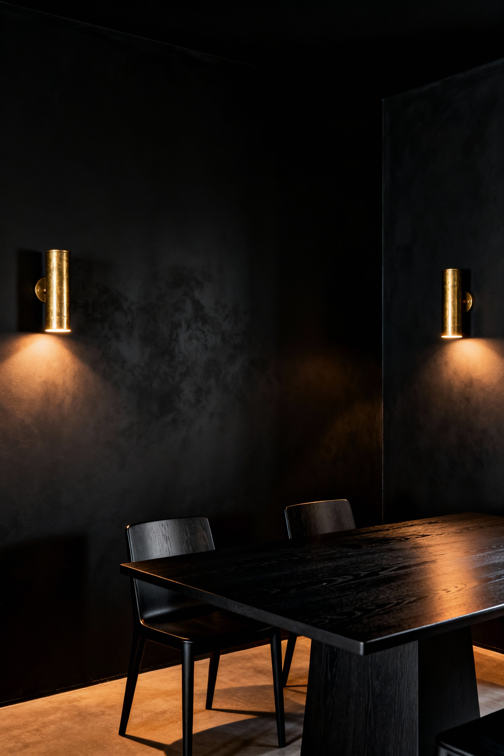
To counter potential coldness, select fixtures in brushed brass or gold. Naturally, these warm metals provide contrast against the dark palette. Furthermore, the technical specification of the bulb is critical. Specifically, choose a color temperature between 2700K and 3000K. This range mimics the relaxing hues of a sunset. Additionally, prioritize fixtures designed for an uplight wash. Thus, the light sculpts the wall, highlighting texture.
Stylistically, rely on symmetry to frame features like artwork. This placement echoes historic Georgian design, adding formal structure. Finally, utilize dimmer switches to manage ambiance. Maintaining a low output encourages intimacy. Therefore, perimeter lighting becomes a tool for connection.
8. The Art of Reflection: Positioning antique mirrors to double the candlelight.
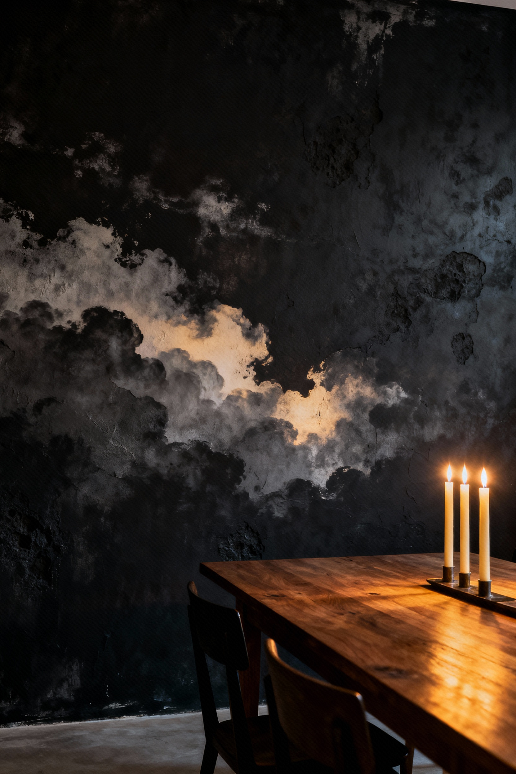
Designing with black paint is a deliberate optical strategy. Consequently, deep shades absorb almost all ambient light. This absorption prevents the room from appearing washed out. Instead, the dark canvas allows candlelight to shine with intense contrast. Specifically, flames resemble glowing embers against a velvet night sky.
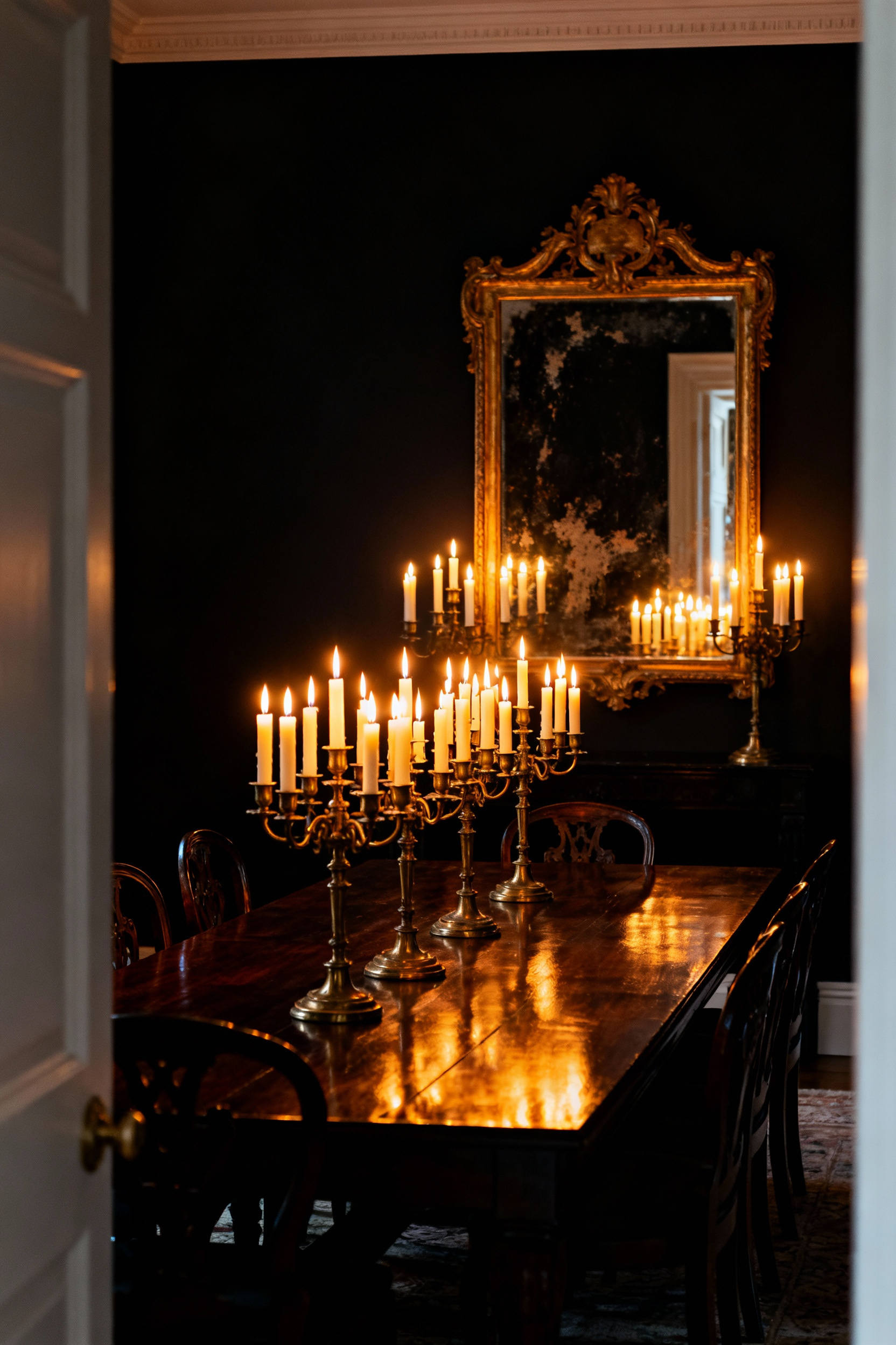
To amplify this effect, strategic placement is essential. A candle flame emits light in all directions. Unfortunately, the light facing the wall is typically lost to absorption. Therefore, positioning a mirror directly behind the flame is necessary. This placement intercepts those backward rays. Then, it redirects them forward into the room. As a result, you effectively create a second light source.
However, the quality of reflection matters. Modern glass can produce harsh glare. Conversely, antique mirrors introduce necessary softness. Their aged surfaces feature distinct foxing. These imperfections act as a diffuser for the sharp light. Historically, this technique echoes the 19th-century Girandole tradition. Ultimately, this transforms a moody room into a warm space.
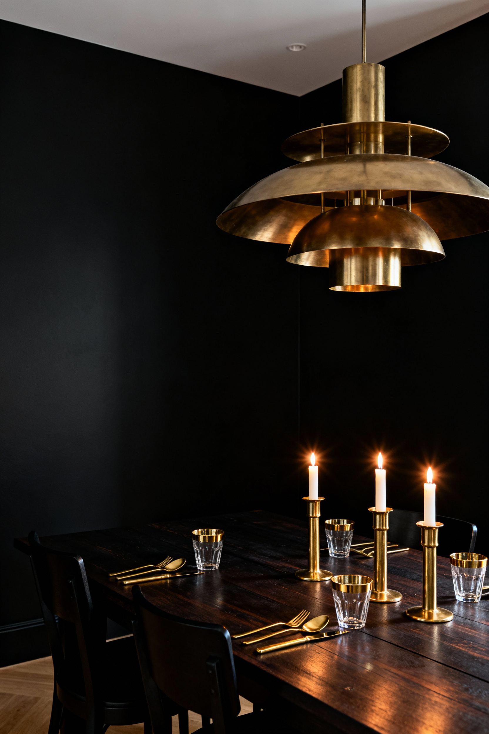
9. Living Flame: Curating candelabras and taper candles as essential lighting layers.
A black dining room serves as a dramatic visual pause. Consequently, it transforms candlelight into a theatrical spectacle. Unlike bright walls that scatter glow, deep black finishes absorb ambient light. Therefore, the perimeter disappears into shadow, focusing attention on the table’s “living flame.” This creates an intimate spotlight effect.
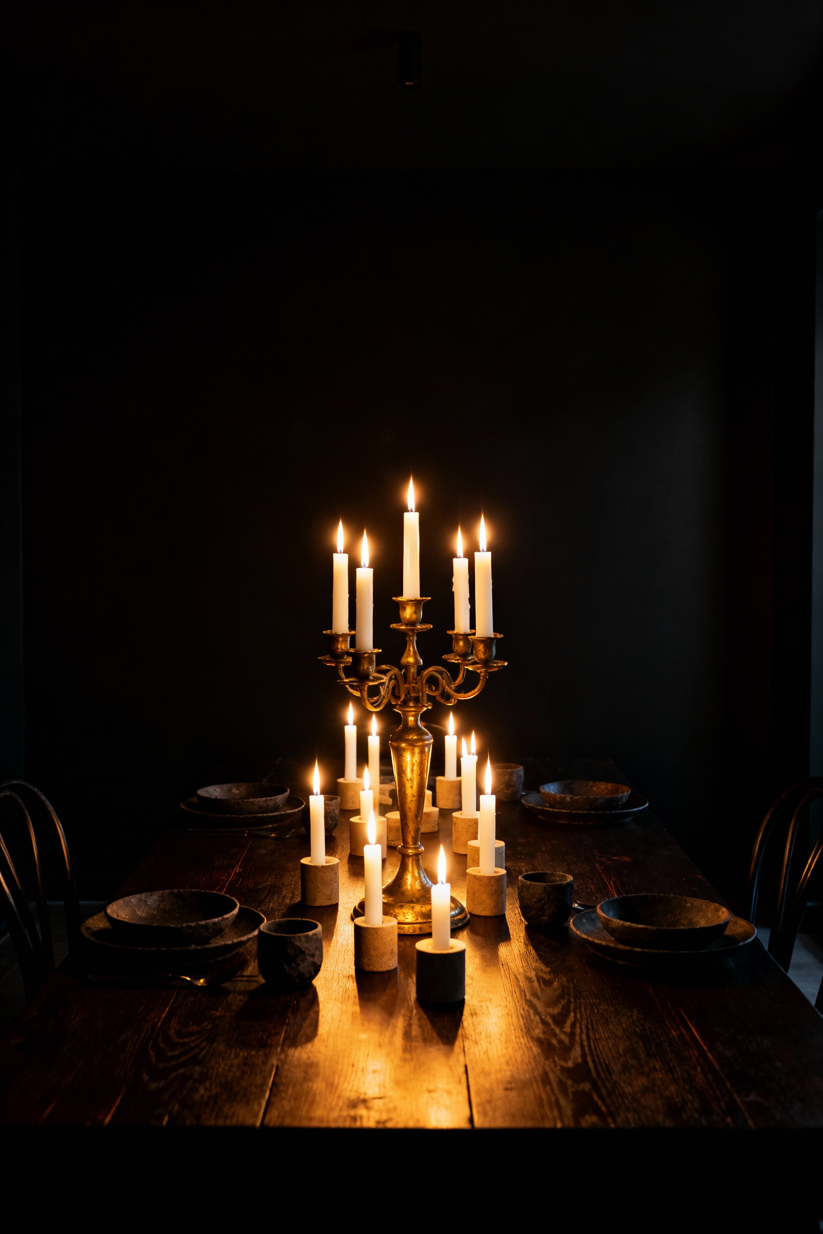
Moreover, this lighting layer acts as a sensory anchor. The warm flicker mimics primal fires, promoting relaxation. In fact, this “visual quiet” centers the mind. To maximize this, the candelabra’s material is crucial. Historically, metals like silver symbolized opulence. In a dark room, polished brass acts as a reflective host. Specifically, these surfaces bounce a fragmented glow against the matte backdrop.
However, technical nuance is required. Paraffin candles often release carbon particles that settle as soot. Thus, prioritize clean-burning soy or beeswax tapers. Additionally, trim wicks to one-quarter inch. Ultimately, these adjustments ensure your gothic romance remains sophisticated.
Section 3: The Narrative – Furnishing and Textiles
In a black dining room, the narrative shifts from color to texture. Specifically, matte black walls act as a non-reflective canvas. Consequently, they swallow light and flatten the spatial plane. To counter this, your furnishings must introduce tactile contrast. For instance, materials with a natural sheen become critical. High-quality leather or velvet catch small fragments of light. Thus, they create crisp silhouettes against the dark void. This approach achieves depth rather than overwhelming darkness.
Furthermore, the textile choice dictates mood. Velvet, for example, signals opulence. Its buttery texture encourages guests to linger. Conversely, raw linen offers austere sophistication. This organic material adds breathability to tailored walls. Therefore, layering these textures keeps the palette approachable.
Finally, these textiles serve an acoustic function. Historically, heavy drapes provided insulation. Today, they absorb sound to create a hushed atmosphere. As a result, the space feels secluded. Ultimately, the black backdrop forces a spotlight on craftsmanship.
10. Velvet and Void: Incorporating jewel-toned upholstery (emerald, oxblood) for tactile luxury.
The most dramatic dining rooms rely on the interplay of light and texture. Specifically, painting walls in matte black creates a visual void. Consequently, this “light sink” absorbs noise and blurs boundaries. Into this darkness, you must introduce a shimmering volume. Therefore, jewel-toned velvet upholstery becomes the perfect counterpoint. Unlike matte walls, velvet’s cut-pile structure reflects light differentially. As a result, emerald green chairs appear to scintillate, creating dynamic movement.
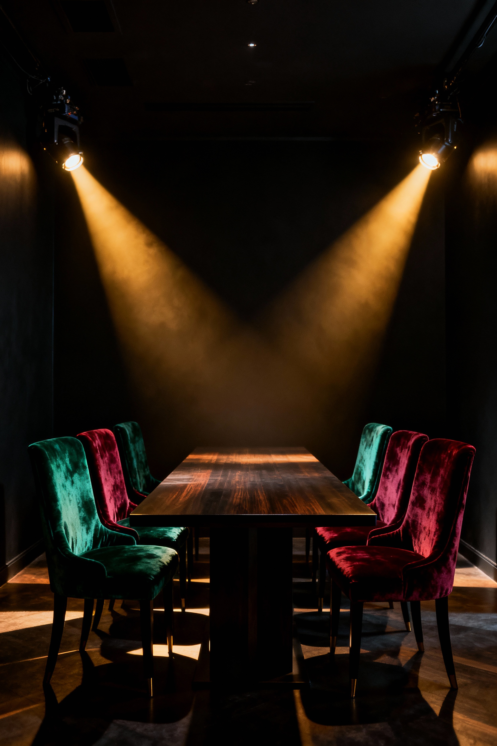
This pairing also taps into historical authority. Historically, dense-pile velvet symbolized elite status. Furthermore, saturated hues like burgundy evoke Art Deco geometry. Thus, the space feels instantly cultivated.
Beyond aesthetics, this choice serves a sensory function. Ideally, the dining room should invite touch. In contrast to hard marble, velvet offers a plush anchor. Ultimately, this “Velvet and Void” technique creates a warm embrace ideal for evening dining.
11. Warmth in the Wood: utilizing dark walnut or mahogany to ground the gothic aesthetic.
Black dining room walls create a boundless atmosphere. However, this depth can feel unmoored without a physical anchor. Consequently, utilizing dark woods like walnut or mahogany is crucial. Historically, Gothic Revival interiors relied on heavy timber to convey permanence. Similarly, a substantial wood table provides a necessary counterpoint. Specifically, the material’s visual weight stabilizes the room’s energy.
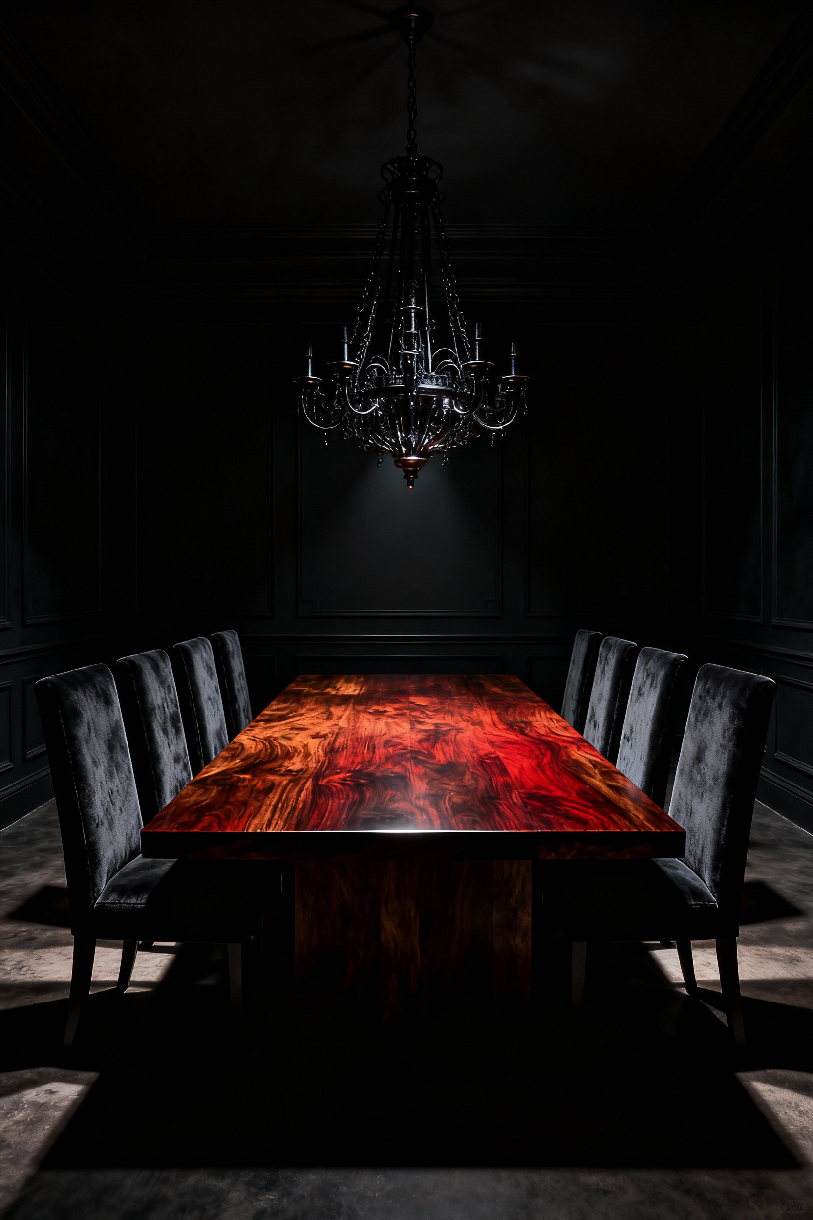
Furthermore, the wood’s natural undertones actively warm the palette. Genuine mahogany features deep, reddish-brown hues. When paired with cool black paint, these tones glow like embers. Conversely, black walnut offers earthy depth. Therefore, this organic contrast prevents the space from feeling cold.
Finally, texture prevents the design from falling flat. Matte black paint often absorbs light completely. In contrast, polished wood grain reflects a soft luster. This interplay creates a layered dimension. Additionally, the grain patterns break up monotony. Ultimately, dark wood transforms a mysterious void into an intimate cocoon.
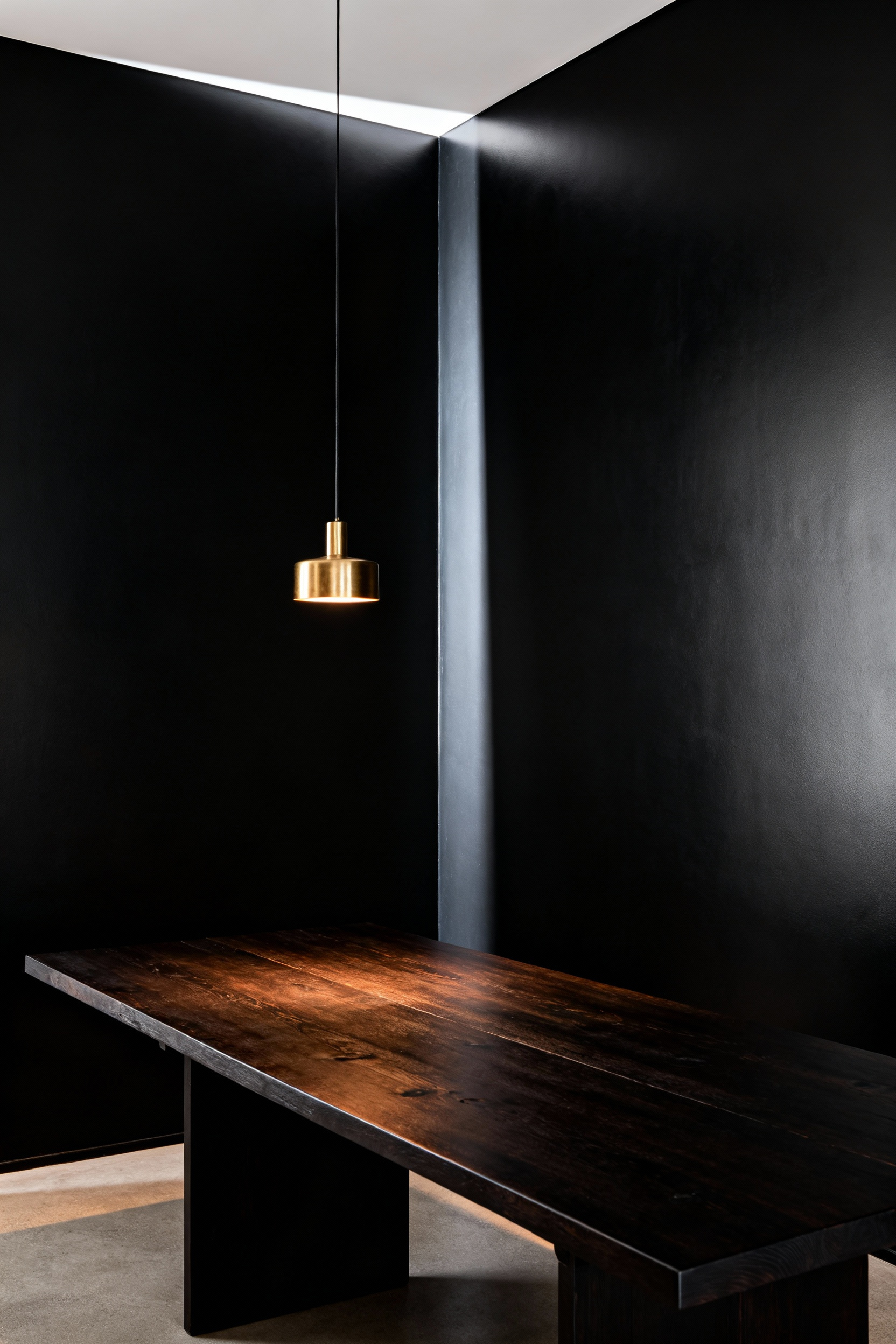
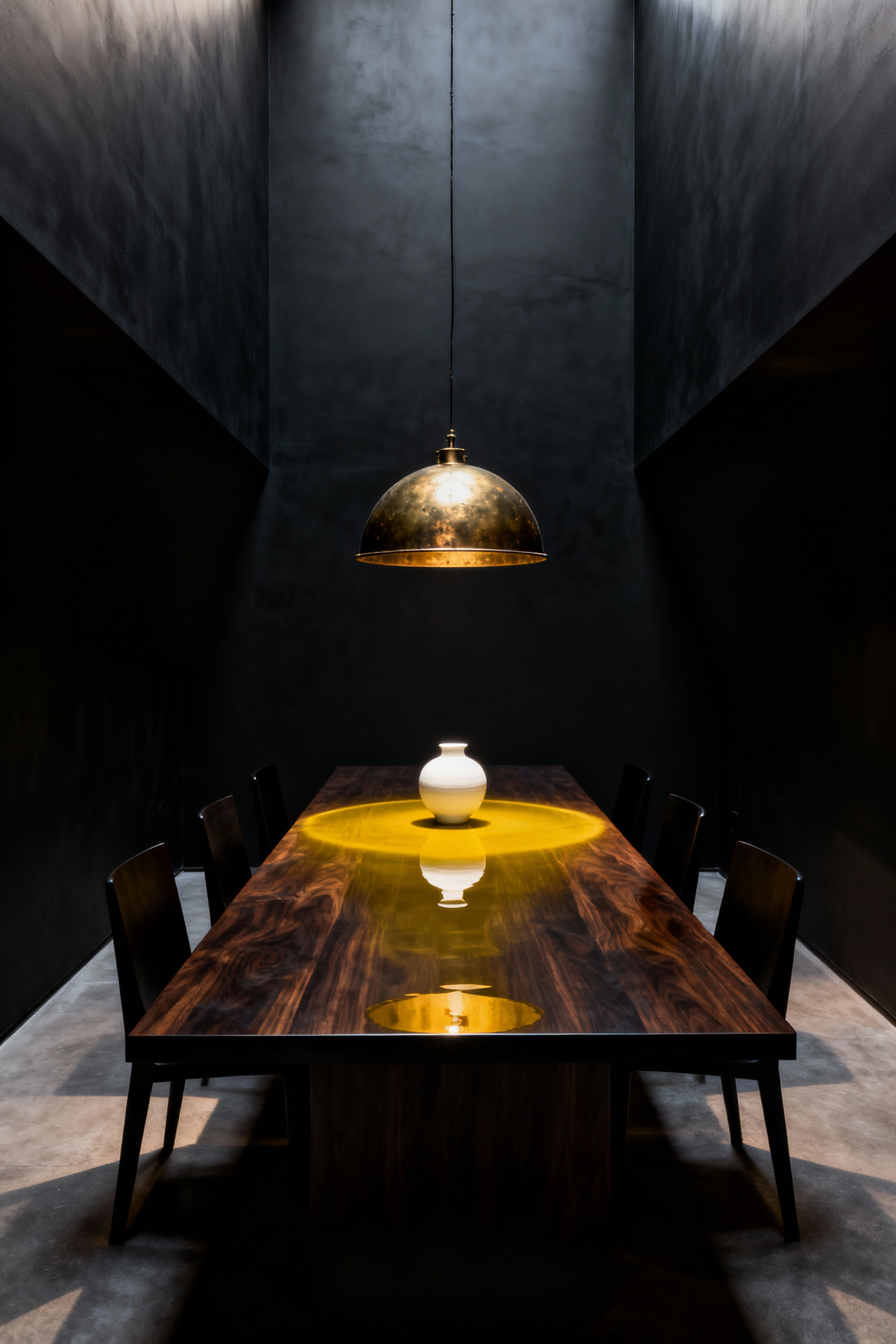
12. Metallic Punctuation: Using unlacquered brass or gold to catch the light.
Enveloping a dining room in matte black creates receding negative space. However, this depth requires balance. Specifically, metallic punctuation serves as the necessary counterpoint. Polished accents, particularly unlacquered brass, act as concentrated reflectors. Consequently, these high-contrast points refuse to recede into shadows. They capture limited light, effectively glowing from within the dark walls.
Beyond reflection, unlacquered brass creates a unique narrative. In the industry, this is known as a “living finish.” Over time, the metal reacts to the environment. Therefore, frequently handled areas remain bright, while others deepen into warm browns. Thus, the hardware records the room’s history. This natural patina introduces organic texture.
Ultimately, view these elements as functional jewelry. Mundane items like switch plates become deliberate design moments. Furthermore, the metal choice dictates mood. Polished gold delivers glamour. Conversely, unlacquered brass grounds the high drama. Through these small details, a dark space remains inviting.
13. The Modern Ghost: Integrating acrylic or glass elements to keep the visual weight balanced.
Black walls inherently possess significant visual weight. Consequently, they ground a space with intense drama. However, filling a dark room with heavy furniture can feel oppressive. Therefore, integrating transparent elements creates essential balance. Specifically, clear acrylic offers a “zero-weight” aesthetic. In fact, it allows the eye to travel through objects uninterrupted. As a result, the room maintains its moody flow. This technique creates a captivating visual paradox.
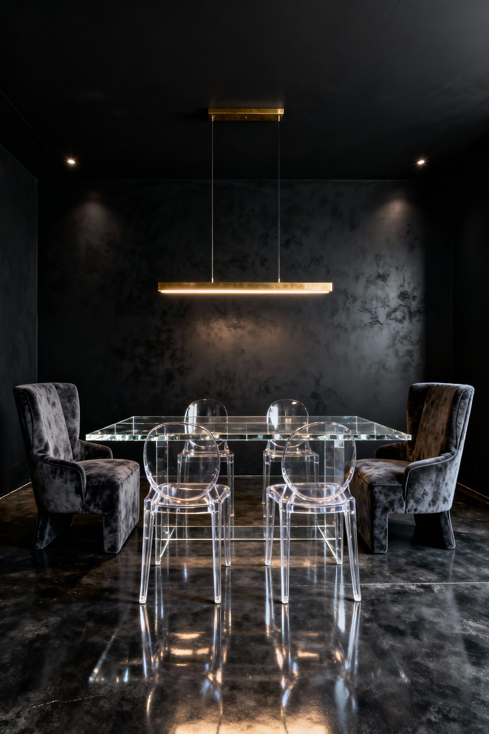
Notably, the “Ghost Chair” epitomizes this concept. It mimics Baroque elegance while using modern polycarbonate. Thus, you retain historical romance without physical bulk. Furthermore, these pieces do more than disappear. Surprisingly, they actively manipulate light. Unlike flat mirrors, curved acrylic refracts ambient light. Consequently, the edges catch the glow from chandeliers. This interaction creates jewel-like highlights. Ultimately, this pairing prevents the dining room from becoming a black hole.
Section 4: Curated Curiosities – Decor and Styling
A black dining wall acts as a powerful visual amplifier. Specifically, it subverts the traditional bright gallery concept. Because the dark color absorbs light, it demands a curated narrative. Consequently, metallic accents like warm gold become essential tools. In fact, brass hardware pops beautifully against a velvet-like void. Indeed, these reflective surfaces provide a necessary touch of glamour.
Furthermore, texture prevents the room from feeling stark. Ideally, select objects with an elemental quality. For example, cognac leather or stained wood adds necessary warmth. Additionally, living greenery provides a life-affirming counterpoint. Thus, the space feels grounded.
Moreover, these walls serve as a theatre for history. The dark backdrop naturally highlights the patina of antiques. Therefore, vintage silver gains significant gravity. In this setting, lighter art functions as a visual “window.” Finally, this approach balances drama with sophistication, adhering to the definitive mandates for exquisite luxury dining room decor.
14. The Gallery Wall: Framing vintage oil paintings or botanical prints in ornate gold.
Creating a gallery wall against black creates immediate drama. Specifically, the combination of ornate gold frames and dark paint offers powerful contrast. Black paint inherently absorbs light, creating mystery. Conversely, gold frames actively reflect light, adding necessary warmth. Therefore, this pairing balances the authority of dark walls with luxury.
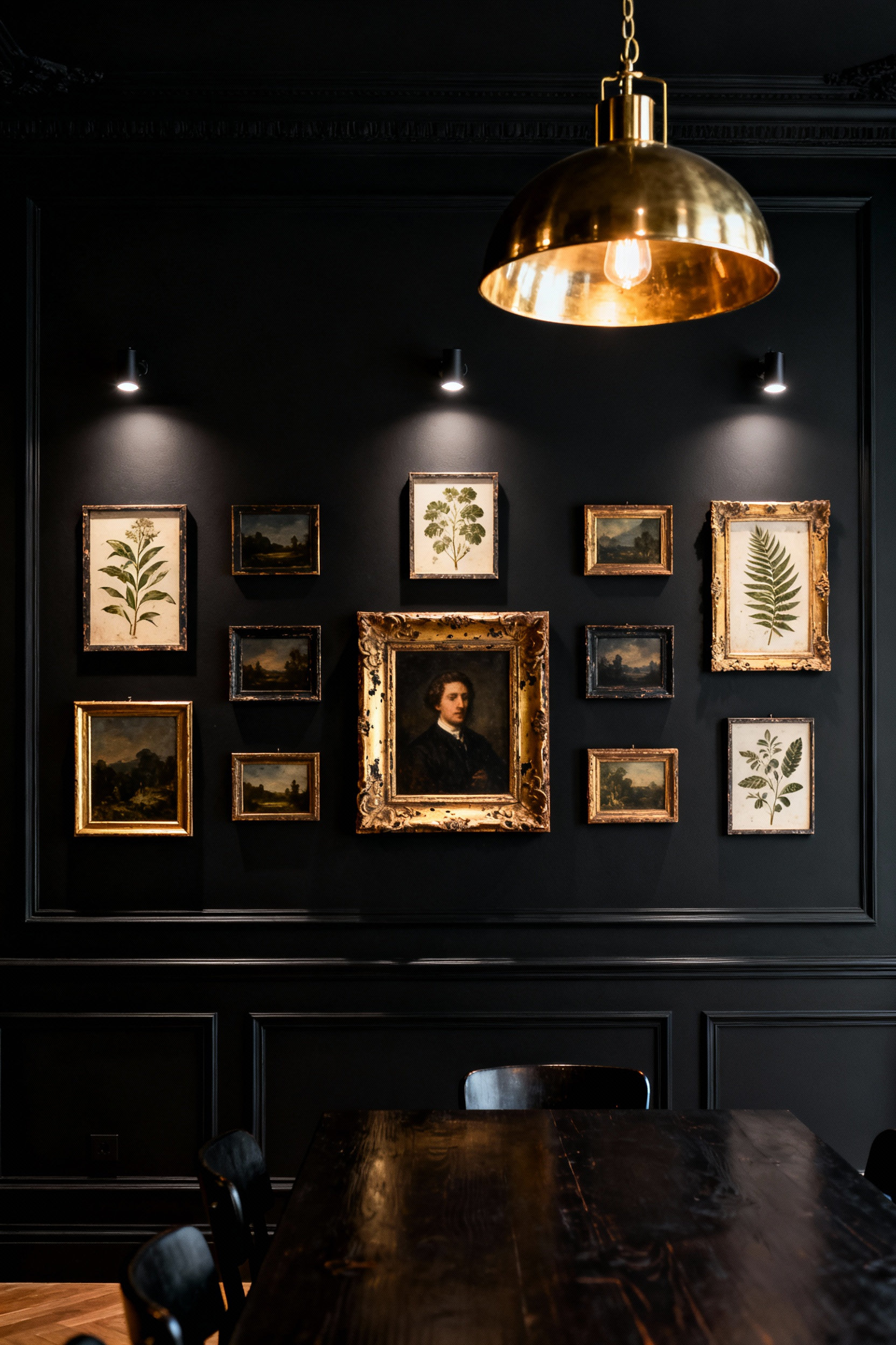
Furthermore, this design choice enhances the artwork itself. For instance, vintage oil paintings often utilize *chiaroscuro*. Consequently, a black wall acts as an extension of the painting’s background. This visual trick isolates the subject, forcing it to glow. Thus, the room feels like an intimate, curated experience.
Alternatively, framing botanical prints creates a striking atmosphere. In this context, the black wall serves as negative space. As a result, the delicate lines of the print become incredibly crisp. Moreover, the gold frame elevates these natural subjects. Ultimately, this transforms a simple wall into a sophisticated focal point.
15. Botanical Drama: Styling with dried hydrangeas, dark roses, or sculptural branches.
A black dining room wall serves as a powerful architectural canvas. Fundamentally, it functions as a low-reflectivity backdrop that transforms botanicals into art. Consequently, simple arrangements elevate into dramatic installations. For instance, utilizing sculptural branches like curly willow exploits this drama. The matte darkness amplifies the negative space between limbs. Additionally, strategic lighting casts exaggerated, dancing shadows.
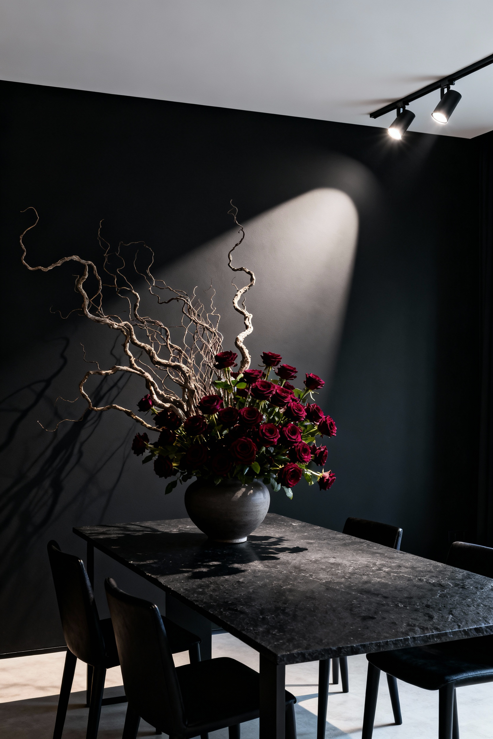
Beyond structure, texture plays a pivotal role. Specifically, dried hydrangeas provide a delicate, papery contrast. Their ruffled surfaces stand out against the flat paint. Similarly, dark burgundy roses introduce a layer of Gothic Glam. These elements evoke timeless mystery.
To ground these arrangements, select your vessel carefully. A matte black vase creates a floating effect. Alternatively, brass accents add a touch of glamour. Finally, dried botanicals offer a practical advantage. Unlike fresh bouquets, they lack strong scents that might compete with the meal. Therefore, the drama remains purely visual.
16. Literary Stacks: Incorporating antique books as functional decor and conversation starters.
Black dining room walls act as a dramatic canvas. Consequently, they maximize the visual impact of antique books. Specifically, the deep color absorbs ambient light. Therefore, the warm, metallic sheen of gold tooling pops visually. Furthermore, the velvety darkness amplifies the rich texture of aged leather.
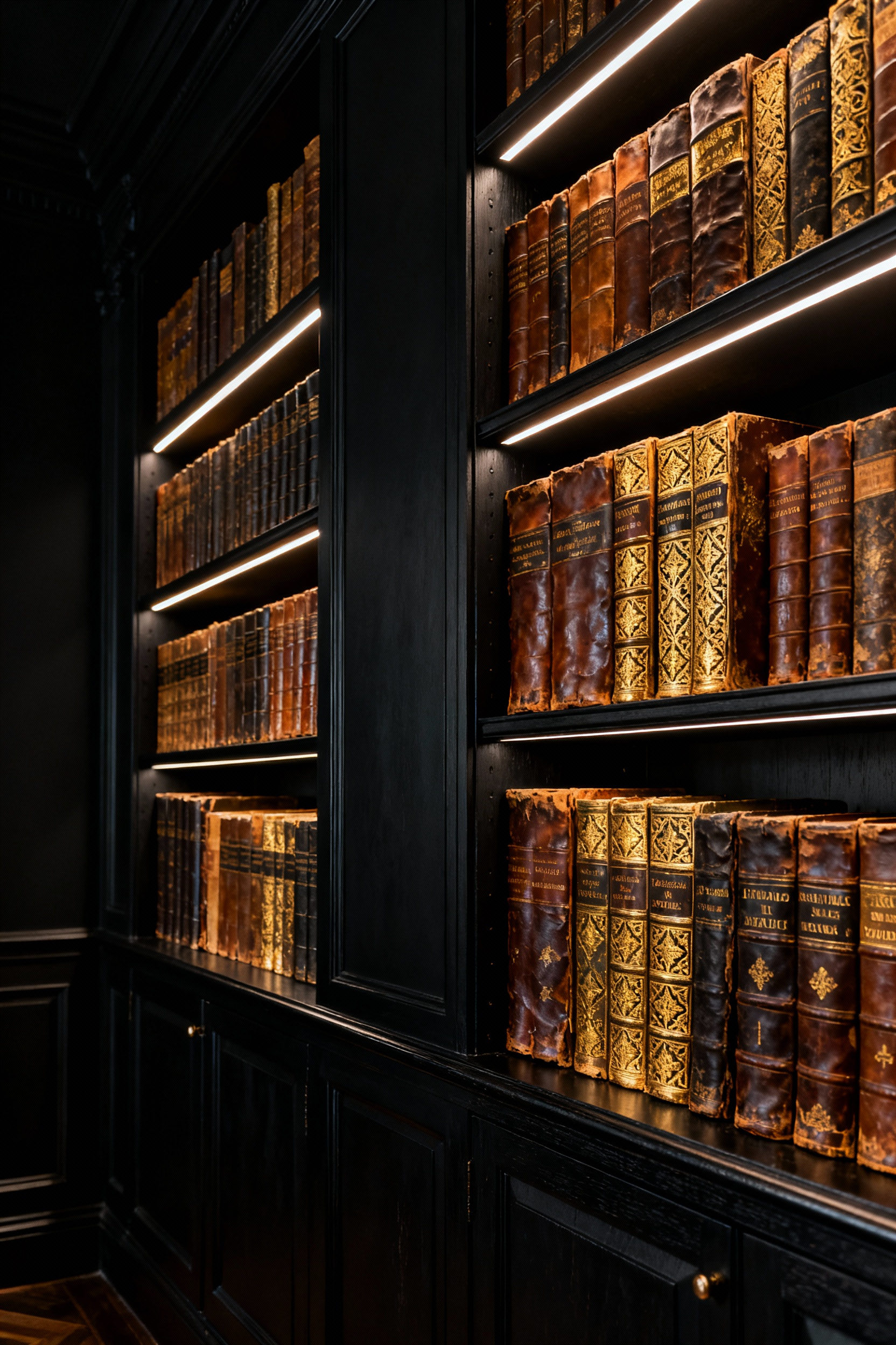
Beyond visuals, this decor choice introduces an olfactory layer. In fact, old paper releases a scent resembling vanilla. Thus, the room gains a subtle aroma that feels cozy. This sensory experience invites guests to relax.
Finally, curate these stacks to serve as conversation starters. For instance, display rare texts on gastronomy. These volumes can physically elevate a lamp on a sideboard. Simultaneously, they invite guests to discuss historical recipes. Ultimately, this approach turns storage into sophisticated curation.
17. The Tablescape: Layering dark linens, crystal, and stoneware for a tactile dining experience.
To create a tactile experience, begin with the foundation. Specifically, dark linen tablecloths serve as an intimate anchor. Unlike stiff satin, stonewashed linen introduces softness. Consequently, this choice makes a grand room feel approachable. Furthermore, the fabric absorbs sound, creating a quiet atmosphere.
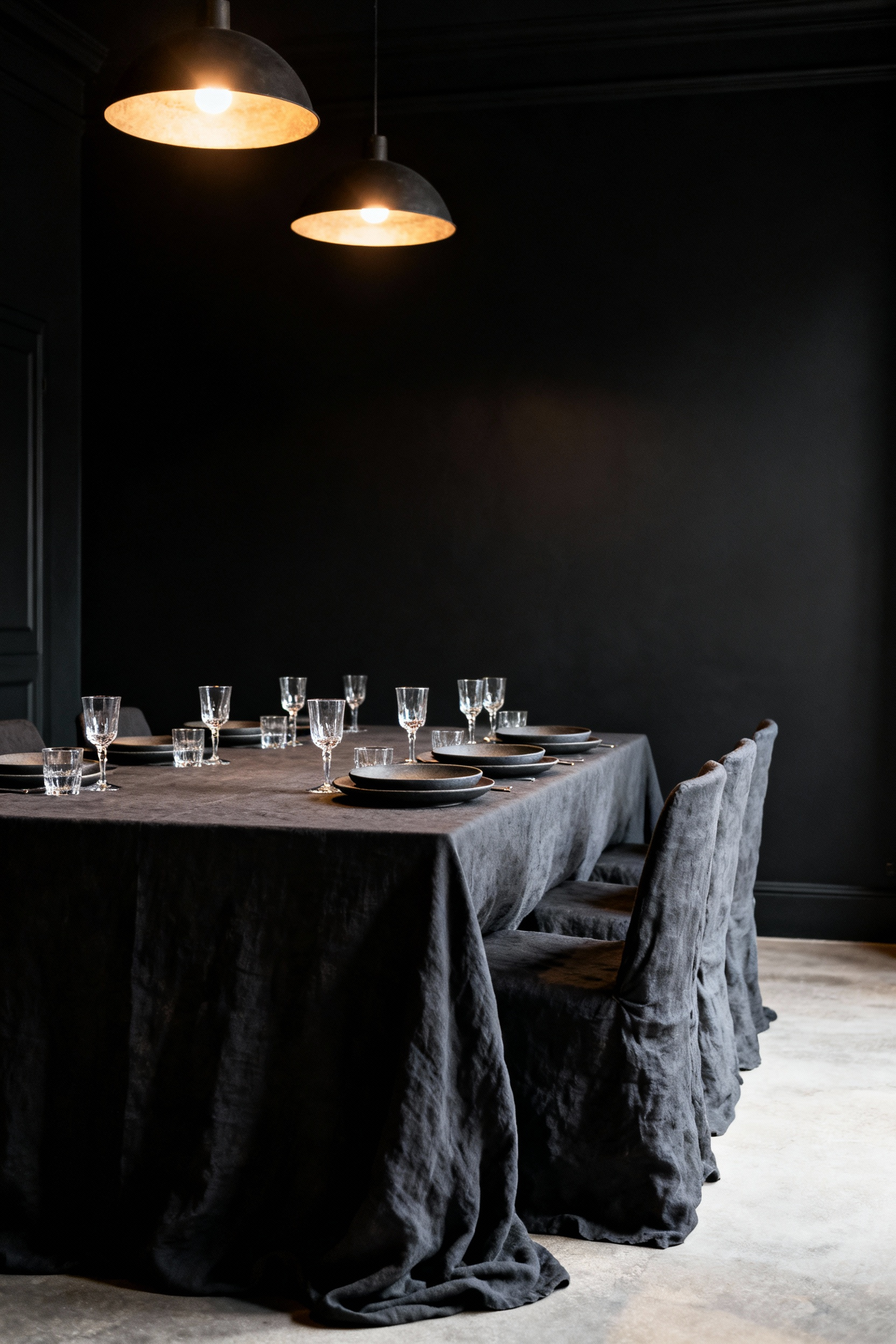
Next, focus on building dynamic contrasts. For instance, clear cut crystal acts as a vital light refractor. In dim lighting, these polished surfaces catch the glow. Therefore, they add scattered pinpoints of brilliance. Conversely, heavy stoneware plates provide necessary visual weight. These matte elements absorb light. In fact, their earthiness grounds the glamorous crystal.
Ultimately, this combination engages the sense of touch. Stoneware holds heat longer than delicate porcelain. Thus, a warm plate communicates care. Additionally, the weight encourages a slower pace to the meal. In this way, the tablescape becomes a sensory retreat.
Conclusion: Embracing the Mystery – Why a dark dining room is the ultimate backdrop for life’s most memorable stories.
Choosing black dining room walls is not merely a bold aesthetic choice; rather, it is a commitment to intimacy. By absorbing peripheral distractions, this dark envelope acts as a visual silencer. Consequently, the room’s physical boundaries vanish. Your dinner table becomes a lit stage. In this jewel box setting, everyday meals transform into deliberate, theatrical events. Therefore, the darkness does not hide you; instead, it illuminates the human connections formed within.
Looking forward, this choice ensures your home remains a sanctuary. Indeed, the erasure of visual noise creates a space where conversations take root. To embrace this mystery, begin by testing a matte charcoal swatch under candlelight. Observe how the shadows play. Finally, allow your home to become the sophisticated backdrop your life’s stories deserve.
Frequently Asked Questions
H3: Is painting a dining room black considered a poor design choice?
Absolutely not. While conventional wisdom suggests avoiding dark colors, black walls, especially matte finishes, are highly sophisticated. They function as a “theatrical void,” absorbing light and eliminating visual noise. This technique creates a sense of intimacy and infinite depth. It transforms the dining area into a secluded, luxurious cocoon perfect for conversation.
H3: What is the best way to light a dining room with black walls?
Since black absorbs ambient light, rely heavily on focused, directional lighting (*chiaroscuro*). Use statement chandeliers, especially those with crystal or polished brass, to multiply light. Additionally, employ warm perimeter light from wall sconces (2700K-3000K). Critically, use candlelight. The intense contrast between deep black and warm light creates the drama.
H3: Does painting all four dining room walls black make the space look smaller?
Counterintuitively, it can make the room feel larger. When using a dead flat matte black finish, the corners and edges dissolve because the paint absorbs light rather than reflecting it. This creates an optical illusion of depth. This is often called the “black hole” or “infinity ceiling” effect, making the room feel like an atmospheric void rather than a confined box.