Many homeowners believe that expanding a compact bathroom relies primarily on decoration. They assume that light paint and large mirrors will magically cure a cramped layout. Yet, this superficial approach often fails to address the root cause of the constraint. In reality, the success of a truly maximized small bathroom layout is governed by the “12% Rule.”
This architectural principle suggests that the initial 12% of structural planning determines 88% of your daily comfort. Because of this, fundamental decisions regarding layout and clearance must always trump surface-level finishes. For instance, building codes require specific minimum distances for fixture placement. If a toilet sits one inch too close to a wall, no amount of luxury tile can mask the physical discomfort. Therefore, architecture acts as the absolute control panel for the user experience.
While decoration handles surface aesthetics, architecture dictates volume and human circulation. This guide reveals how to prioritize these non-negotiable structural elements over ephemeral style trends. We will examine how optimizing fixed elements, like door swings and floating vanities, creates actual floor space. Ultimately, you will learn to secure a functional foundation before applying the final decorative polish.
Phase 1: Foundation – Reclaiming the Footprint
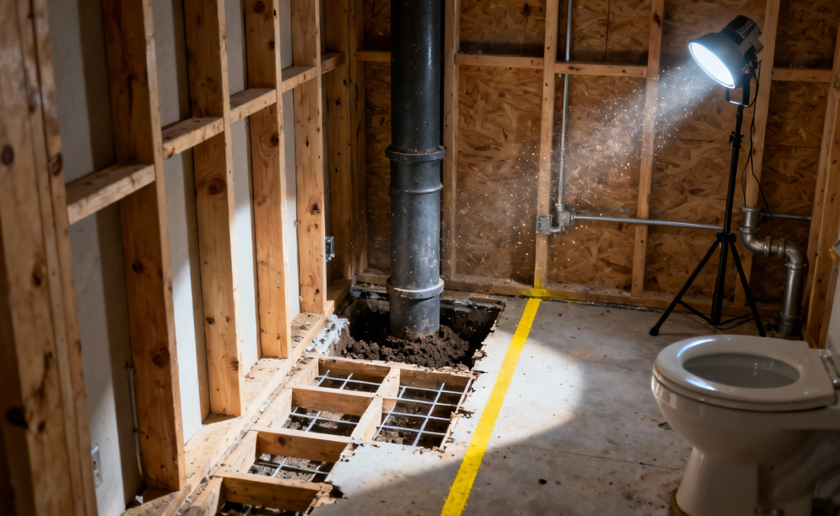
If you are embarking on a deep small bathroom remodeling project, start by acknowledging a specific historical reality. Originally, builders prioritized strict utility and plumbing efficiency over comfort. As a result, layouts followed the “line of least resistance” alongside the main soil stack. Therefore, the reclaiming process is essentially a re-engineering effort rather than a simple cosmetic update.
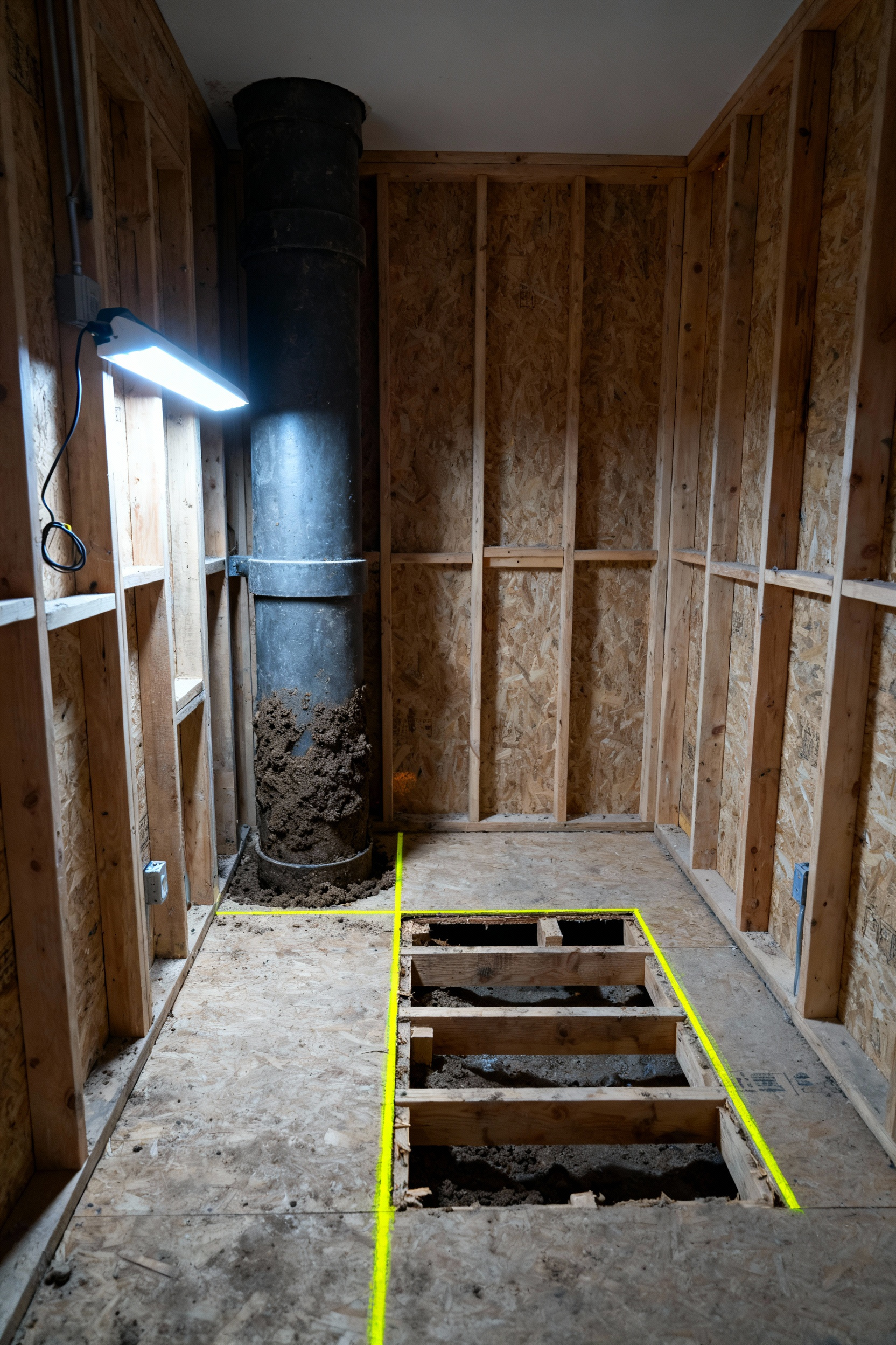
Structural constraints often dictate the true potential of the floor plan. Specifically, the toilet’s large waste line acts as the primary obstacle to open space. Moving this fixture perpendicular to floor joists often requires costly structural reframing to maintain integrity. Furthermore, the mandatory drainage slope limits how far a pipe can travel horizontally. Thus, the existing drain often remains the fixed point of the design.
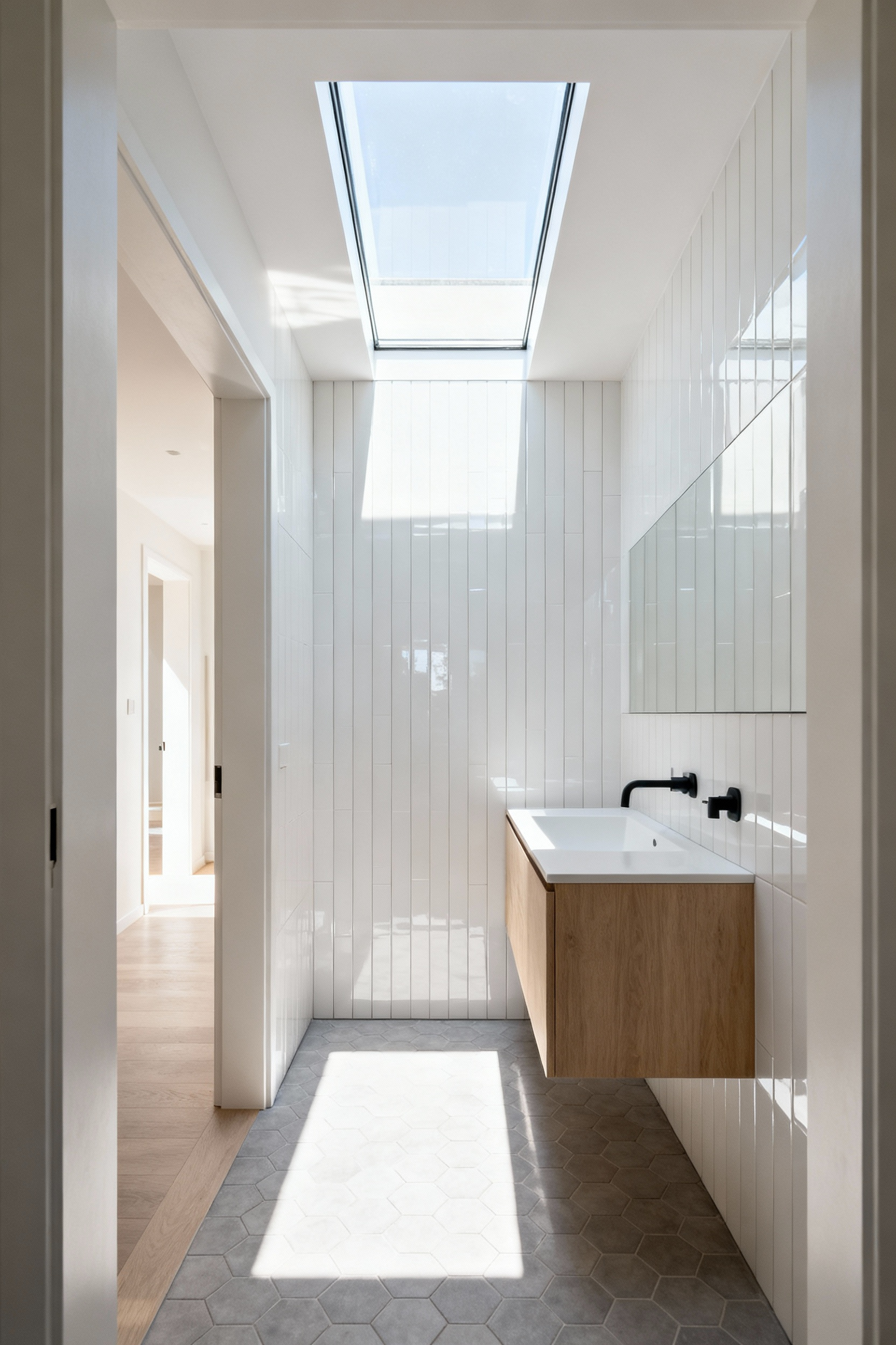
Instead, successful reclaiming focuses on volume and verticality. For instance, utilizing the wall cavity captures essential inches found between studs. Recessing storage niches here eliminates the need for protruding shelves that crowd the room. Additionally, installing wall-hung toilets or floating vanities exposes continuous flooring. This visual strategy tricks the eye into perceiving a larger, less cluttered footprint. Ultimately, these tactical shifts transform a cramped utility space into an open, breathable sanctuary.
1. The Pocket Door Imperative: Eliminating the Swing Radius
In tight industrial conversions, floor space functions as absolute currency. The traditional hinged door presents a significant geometric problem. Specifically, its swing radius consumes between 10 and 18 square feet of floor area. This creates a frustrating “dead zone” that severely limits layout options. Therefore, the pocket door becomes an architectural imperative rather than just a stylistic choice.
By collapsing the door’s function into the wall cavity, you instantly reclaim lost footage. As a result, that “dead zone” transforms into usable surface area for larger vanities or storage. Furthermore, this intervention improves the sensory experience of the room. Instead of shimmying past a swinging slab, users enjoy a fluid, unobstructed circulation path. Interestingly, this isn’t a new invention. Historically, Victorian homes used pocket doors for grand effect. Today, modern urban living demands we repurpose this mechanism for efficiency and minimalism.
Nevertheless, installing a pocket system involves nuanced trade-offs. Primarily, the wall cavity must remain completely clear of plumbing and electrical lines. This exchange of floor space for wall space often complicates retrofits in older buildings. Additionally, the hollow framing inherently offers less acoustic isolation than a solid door. Yet, for accessibility, the benefits are profound. Eliminating the arc creates a barrier-free entry, making the space usable for everyone. Ultimately, the pocket door serves as a masterclass in spatial optimization.
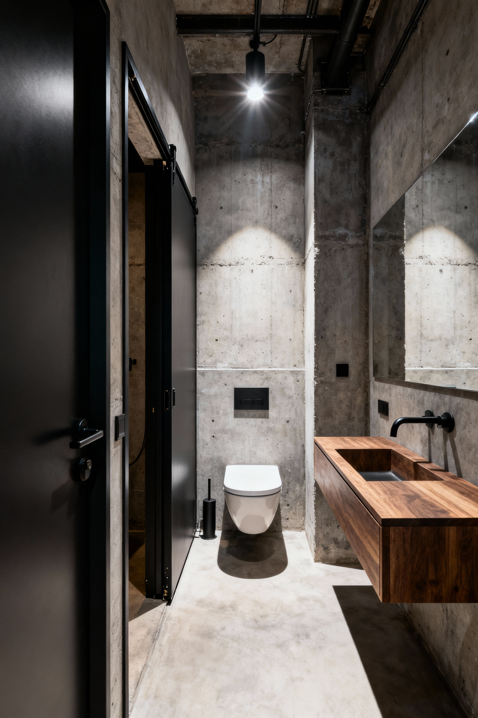
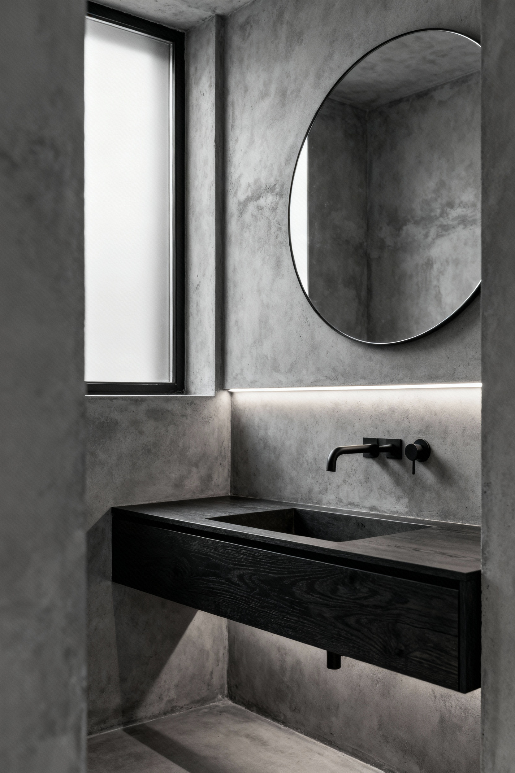
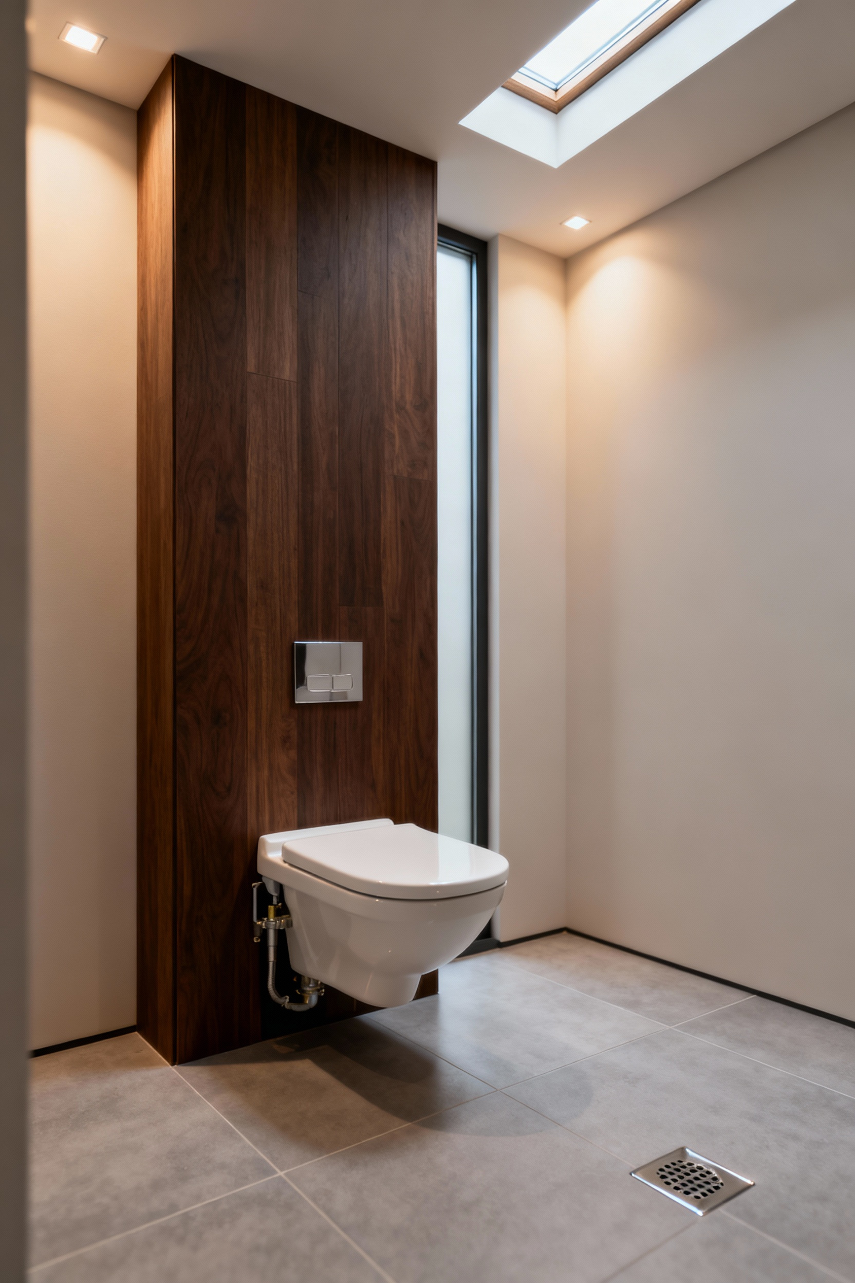
2. Wall-Mounted Toilets: Hiding the Cistern to Gain Ten Inches
In compact urban renovations, floor space is the ultimate luxury. Swapping a standard fixture for a wall-mounted toilet acts as a powerful spatial hack. Indeed, this can reclaim nearly ten inches of depth. Consequently, the bulky ceramic cistern disappears completely. Instead, it sits securely inside the wall cavity, supported by a rigid 16-gauge steel carrier frame.
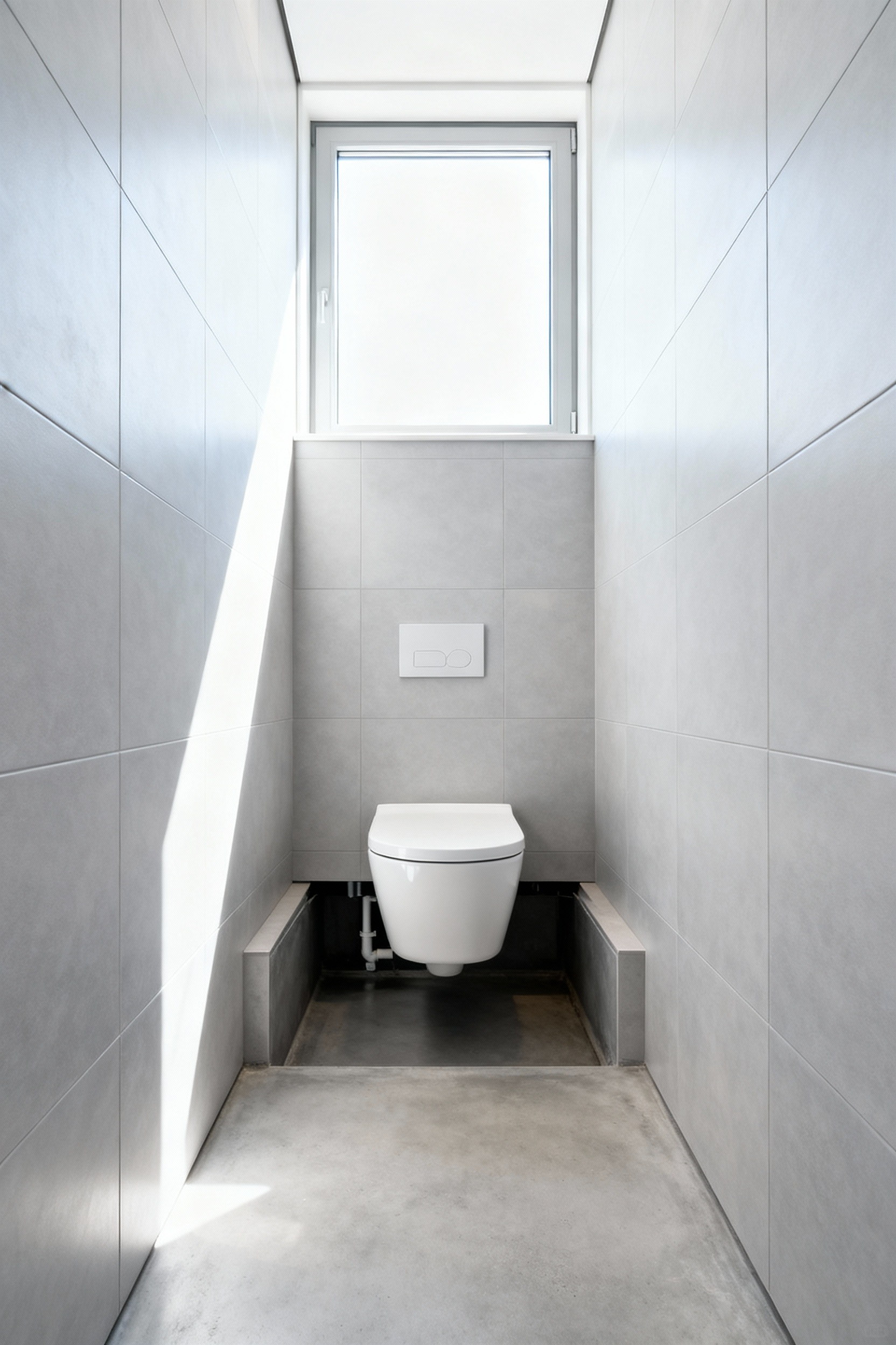
Naturally, this engineering requires some architectural foresight. You might frame the wall with deeper studs or build a shallow plumbing chase to hide the components. However, this trade-off creates a transformative visual effect. By eliminating the pedestal base, the bowl appears to float above the ground. Thus, the eye travels across the uninterrupted floor, creating a convincing illusion of a much larger room.
Furthermore, common concerns about structural stability are unfounded. These industrial-grade frames are bolted to the floor and typically rated to support nearly 900 pounds. Additionally, maintenance remains surprisingly simple. The decorative flush plate actually doubles as a concealed access panel for the internal valves. Therefore, no tile demolition is ever required for standard repairs. Finally, the wall itself acts as a significant sound barrier. The water refill noise becomes barely audible, adding a layer of acoustic sophistication to the home.
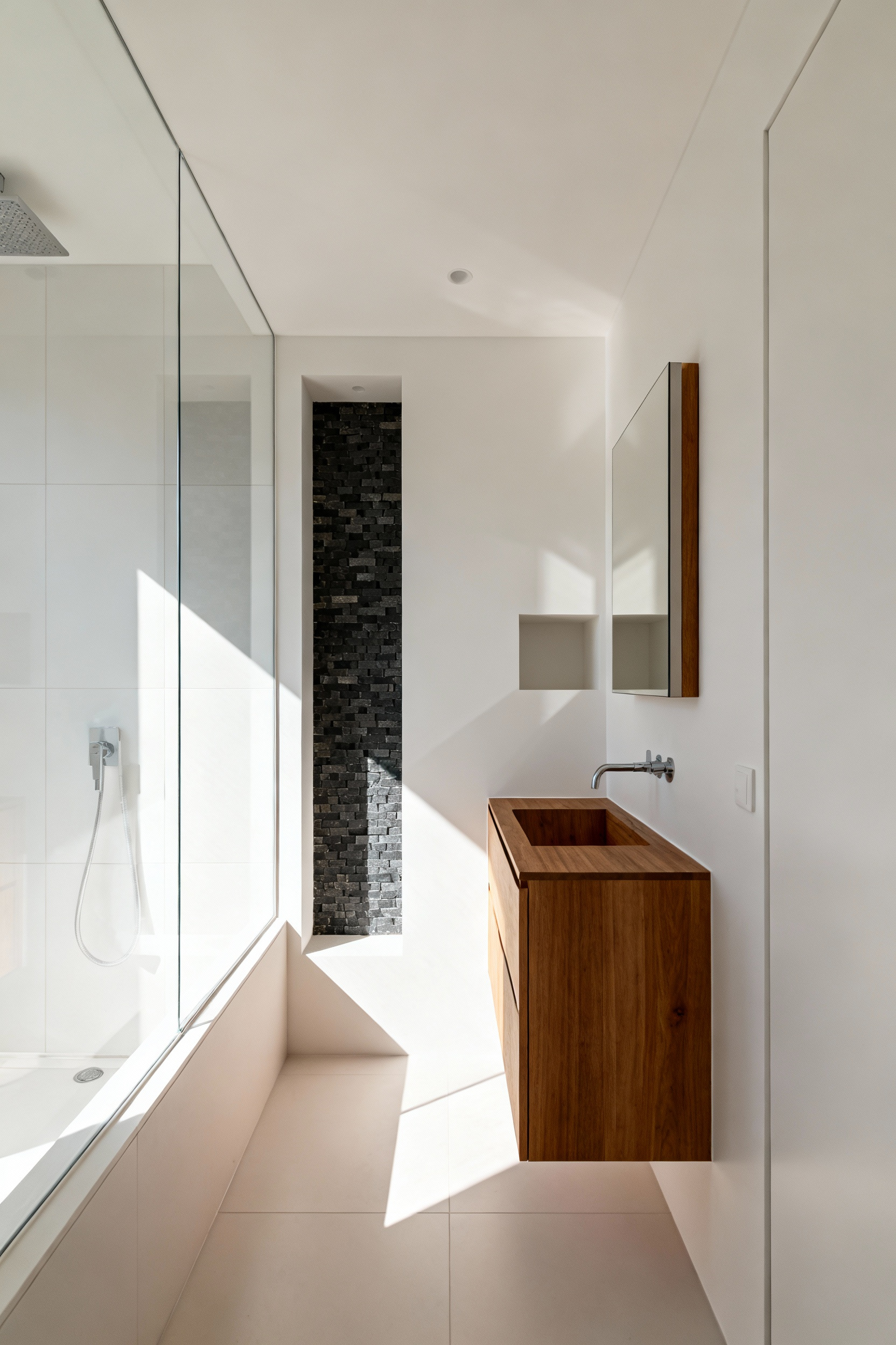
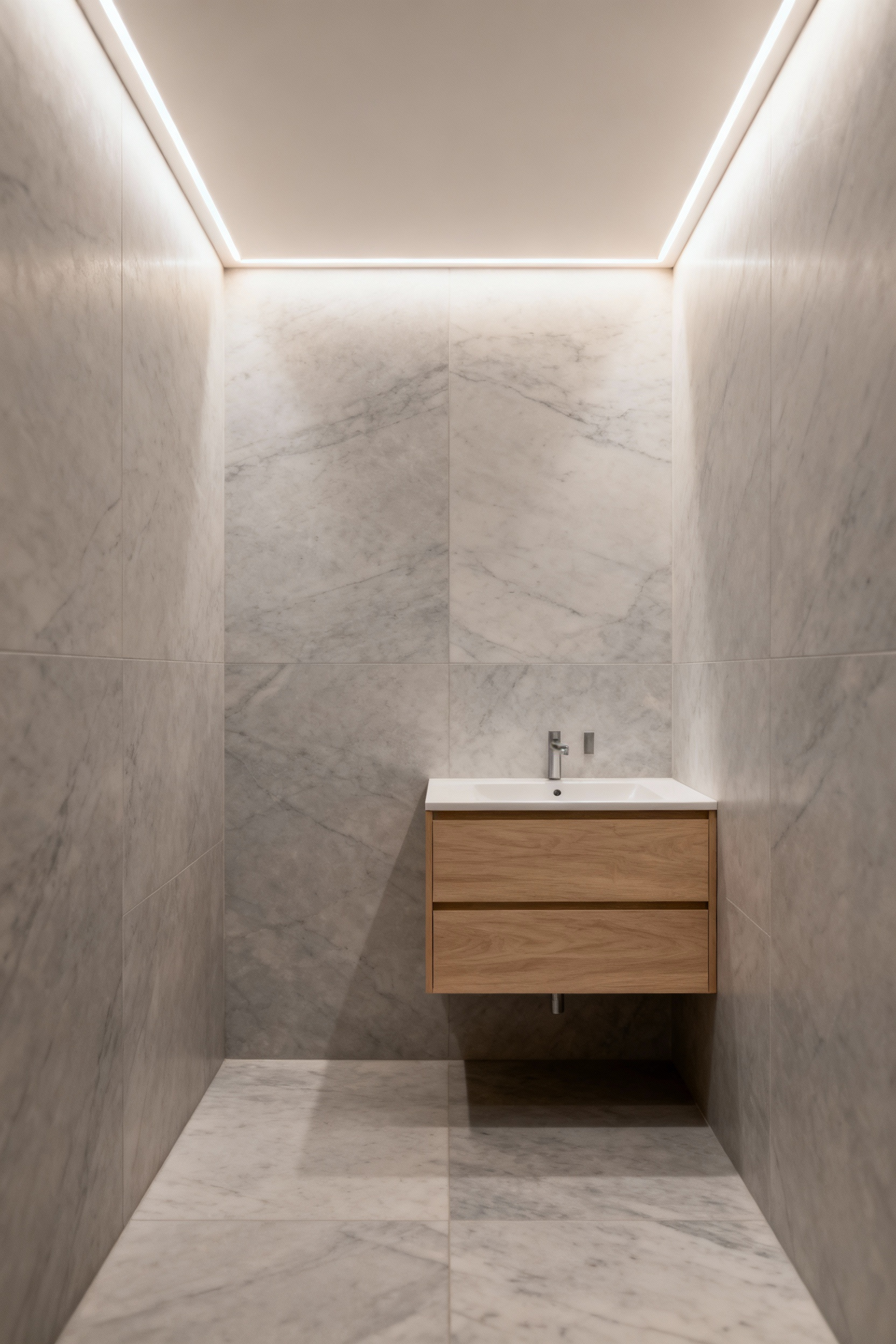
3. The Floating Vanity: Exposed Floor Space as a Visual Expander
In tight urban layouts, managing perception is as important as managing actual square footage. Traditional cabinetry often acts as a visual roadblock. It abruptly interrupts the floor plan. However, a floating vanity solves this issue by lifting the solid form off the ground. Consequently, the flooring material flows continuously from wall to wall without obstruction.
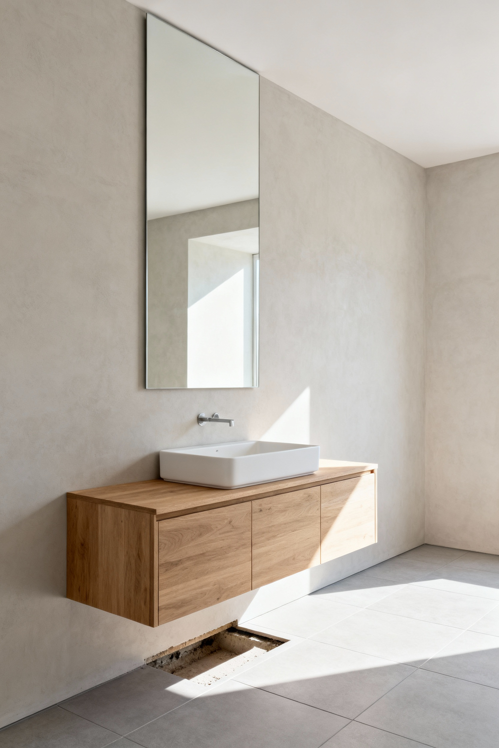
This design choice effectively leverages the Gestalt Law of Continuity. Because the eye travels uninterrupted across the floor, the brain registers the room’s full footprint. Therefore, the bathroom feels significantly larger rather than confined by heavy furniture. Furthermore, this configuration introduces a sense of sensory lightness. The open void beneath the unit allows ambient light to bounce off the floor. As a result, the space feels less cluttered and remarkably more serene.
Interestingly, this approach stems from functional commercial architecture. Originally used in upscale hotels to simplify cleaning, the wall-hung style now defines residential minimalism. By eliminating the dark, enclosed base, you effectively reduce dust accumulation while streamlining the aesthetic.
Finally, precise installation height maximizes this visual expansion. Modern “comfort height” standards usually fall between 34 and 36 inches from the finished floor. Ideally, mounting the vanity closer to the 36-inch mark exposes more vertical wall space underneath. Thus, the room appears taller and more elevated. Ultimately, this adjustment creates a sophisticated, spacious environment within even the most compact industrial footprint.
4. Corner Sinks and Angles: Leveraging the ‘Dead’ Zones
Transforming an industrial micro-space requires rethinking the “dead zone.” Specifically, the standard 90-degree corner often acts as an architectural liability. By installing a corner sink, you effectively convert this wasted area into a spatial advantage. Fundamentally, this placement alters the room’s flow. A traditional sink creates a traffic jam in the center of a small bath. Conversely, a diagonal corner unit shifts the user’s standing radius into the corner itself. Consequently, this frees up critical floor space for door swings and clearer entry paths.
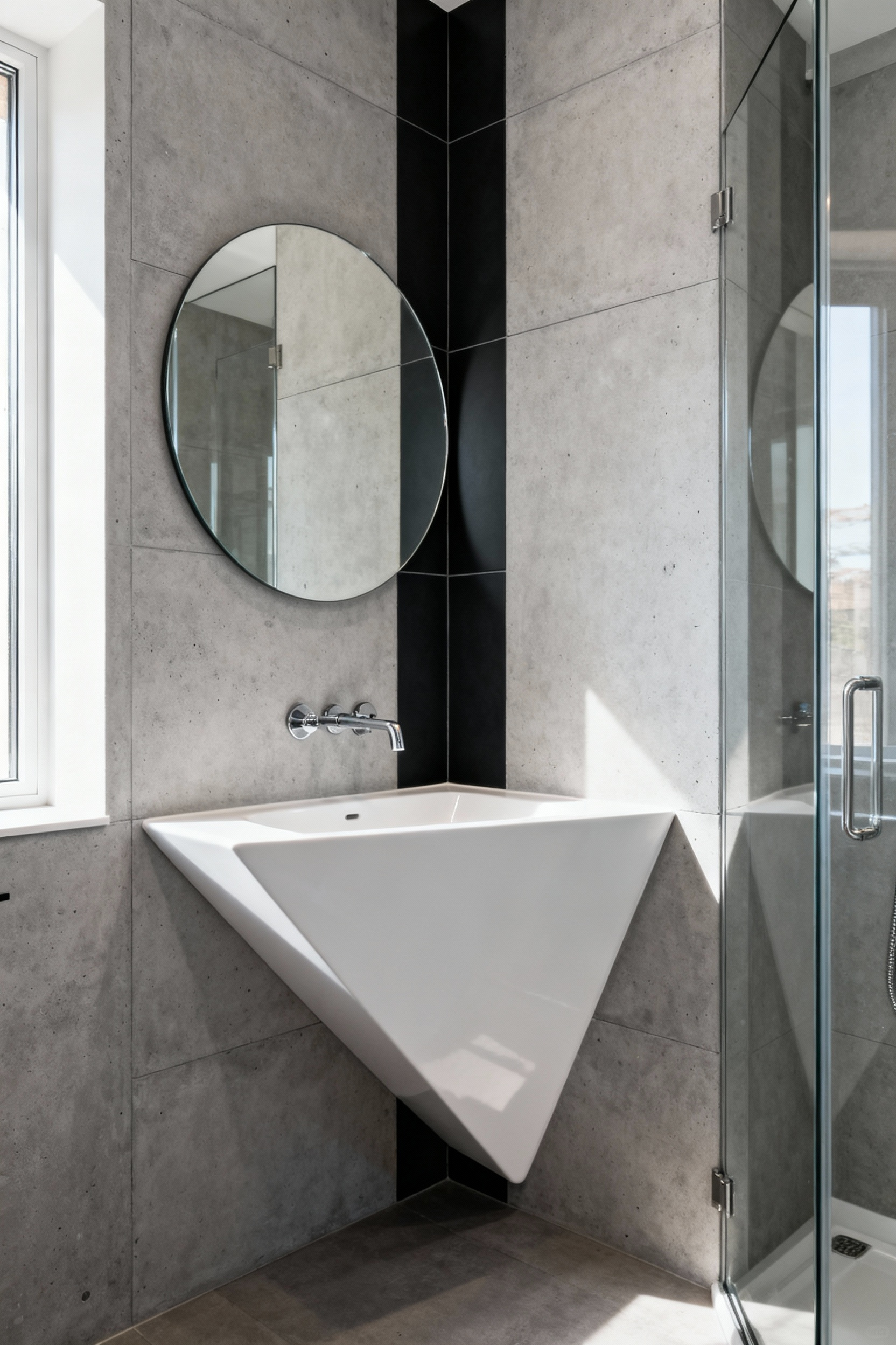
However, ergonomics must drive the design. Most designers strongly favor a diagonal cabinet front over a sharp L-shape. The diagonal setup offers more natural depth. Therefore, the user does not feel “boxed in” while standing there. Nevertheless, functionality has limits. Ultra-compact models are typically best suited strictly for hand-washing. Their shallow basins often cause splashing during deeper grooming tasks. Thus, they function best in guest powder rooms.
Technically, successful installation demands precision. You must maintain at least six inches of clearance from adjacent walls. This gap ensures sufficient elbow room during use. Furthermore, plumbing in these tight angles requires foresight. Often, we utilize flexible braided stainless steel lines to navigate the 45-degree convergence. Additionally, recessed wall plumbing can further maximize the usable footprint. Ultimately, these calculated engineering choices turn a cramped closet into a functional, airy amenity.
5. The Wet Room Conversion: Removing the Curb to Unify the Floor Plate
The primary advantage of a wet room is its power to deceive the eye. In traditional layouts, a shower curb effectively slices the room into distinct segments. This segmentation emphasizes a limited footprint. However, a curbless design creates a unified floor plate. Specifically, running a single large-format tile from the entrance directly into the shower creates an unbroken sightline. Therefore, the mind perceives the area as one expansive space rather than cramped zones.
Yet, achieving this seamless look requires technical precision. The floor appears flat, but it is actually a carefully engineered illusion. To manage drainage, we must recess the subfloor. In timber-framed lofts, this often involves removing floorboards and installing structural supports like noggins. Furthermore, the floor requires a subtle “fall,” usually a 1.5% gradient. This slope directs water toward a linear drain without disturbing the aesthetic. Crucially, “tanking” protects the structure. This comprehensive waterproofing process seals the entire room against moisture migration.
Ultimately, this conversion represents a high-value investment. Because of the intensive labor, costs run 20% to 50% higher than standard baths. Nevertheless, the return on investment is significant. The level-entry floor offers universal accessibility, supporting aging-in-place strategies. Additionally, floating vanities enhance the open feel by exposing the floor beneath. Finally, installing underfloor heating is highly recommended. Radiant heat accelerates evaporation, ensuring the unified floor plate dries rapidly after use.
Phase 2: Development – Vertical Volume and Structure
Real development begins by shifting focus from the horizontal floor plan to the vertical wall plane. Specifically, this involves a process of structural subtraction. Instead of adding bulky storage furniture, we reclaim the empty cavity between wall studs. Consequently, medicine cabinets and shower niches tuck neatly inside the framework. Therefore, these elements effectively disappear from the walking path, saving crucial inches in a tight room.
Furthermore, we must re-engineer the wall to support floating fixtures. By utilizing steel in-wall carrier systems, toilets and vanities lift off the ground completely. As a result, the flooring material runs uninterrupted beneath them. Ideally, this visual continuity fools the eye into perceiving a much larger footprint. Technically, this requires a thicker chase wall, but the optical payoff is substantial.
Simultaneously, the design should apply the concept of volumetric compression. Storage units must become taller and slimmer, extending purposefully to the ceiling line. In fact, this maximizes capacity without encroaching on movement zones. Finally, aesthetic choices like vertical tile patterns and floor-to-ceiling mirrors draw the gaze upward. Ultimately, these optical tricks create a sense of loft and airiness within a restricted box.
6. Recessed Niches: Utilizing Stud Bays for Flush Storage
In small bathrooms, every cubic inch matters. The wall cavity offers a hidden opportunity for expansion. Specifically, utilizing the stud bay translates wasted air into functional storage. Typically, residential framing utilizes 2×4 lumber. Therefore, this creates a usable internal depth of approximately 3.5 inches. Surprisingly, this dimension is perfect for holding standard shampoo bottles and toiletries.
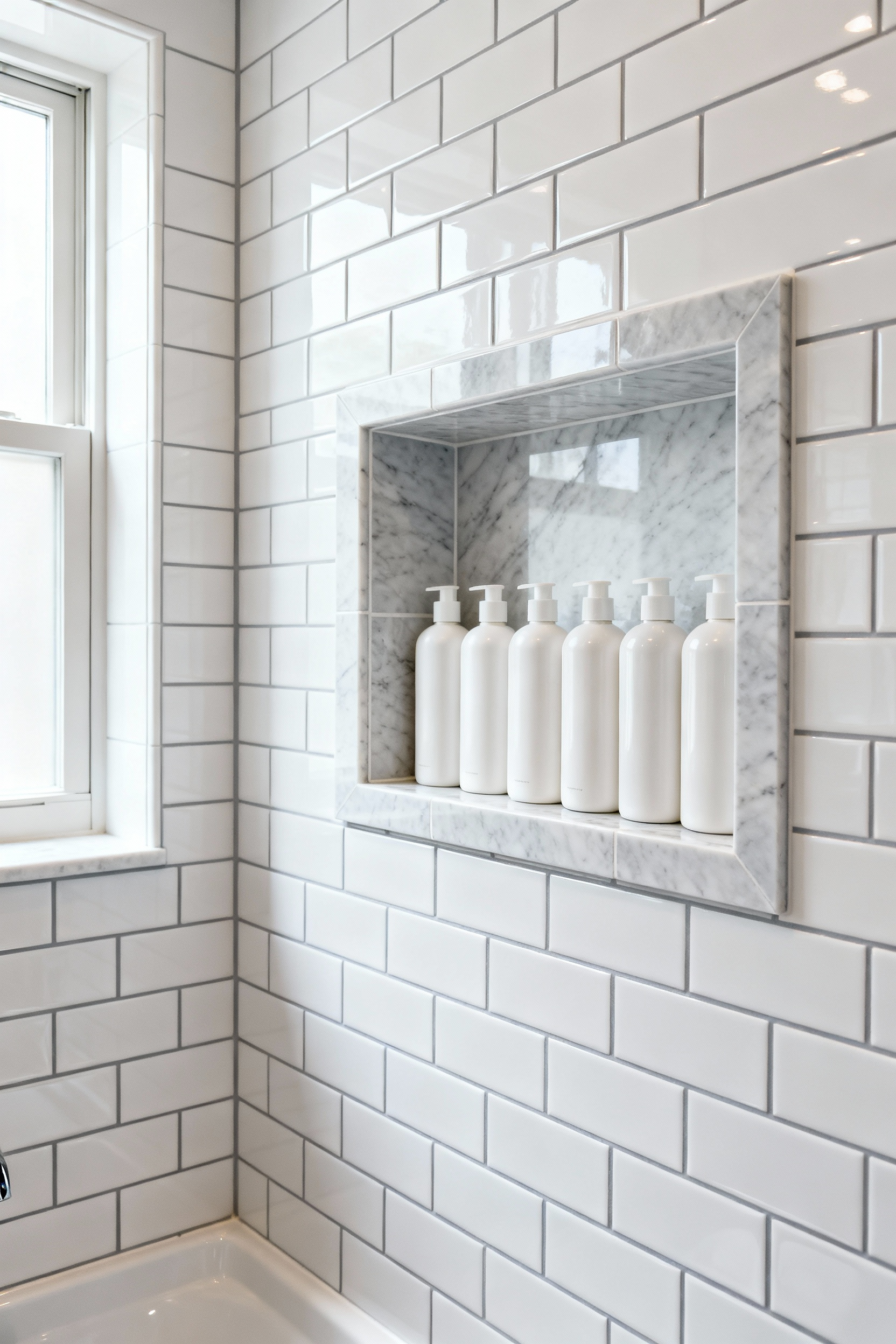
By recessing shelves into the wall, you eliminate protruding hardware. As a result, you preserve valuable elbow room within the shower or vanity area. Furthermore, this “flush” design creates a sleek, minimalist aesthetic. Beyond utility, these niches act as sophisticated architectural features. Historically, niches were used to display statues or art. Similarly, you can use contrasting tile or stone to create visual depth. Thus, a boring flat wall transforms into a compelling focal point.
However, installation requires strategic foresight. Often, plumbing lines or electrical wires run through these wall cavities. Consequently, rerouting them can increase renovation costs. Alternatively, a “super-tall” vertical niche offers a smart structural workaround. This design fits vertically between existing studs. Therefore, it maximizes storage without requiring complex structural headers. Finally, moisture management is critical. Specifically, installers must ensure meticulous waterproofing and sloped sills. Ultimately, this prevents water from collecting inside the wall structure.
7. Floor-to-Ceiling Tiling: Drawing the Eye Upward
In small bathrooms, horizontal lines often visually compress the space. Typically, tiling stops halfway up the wall, creating a distinct horizon line. Yet, extending tile from the floor to the ceiling eliminates this visual break completely. Consequently, the eye is forced to scan the entire vertical plane without interruption. This seamless flow creates a powerful illusion of volume. Even a compact powder room can feel significantly taller and more expansive.
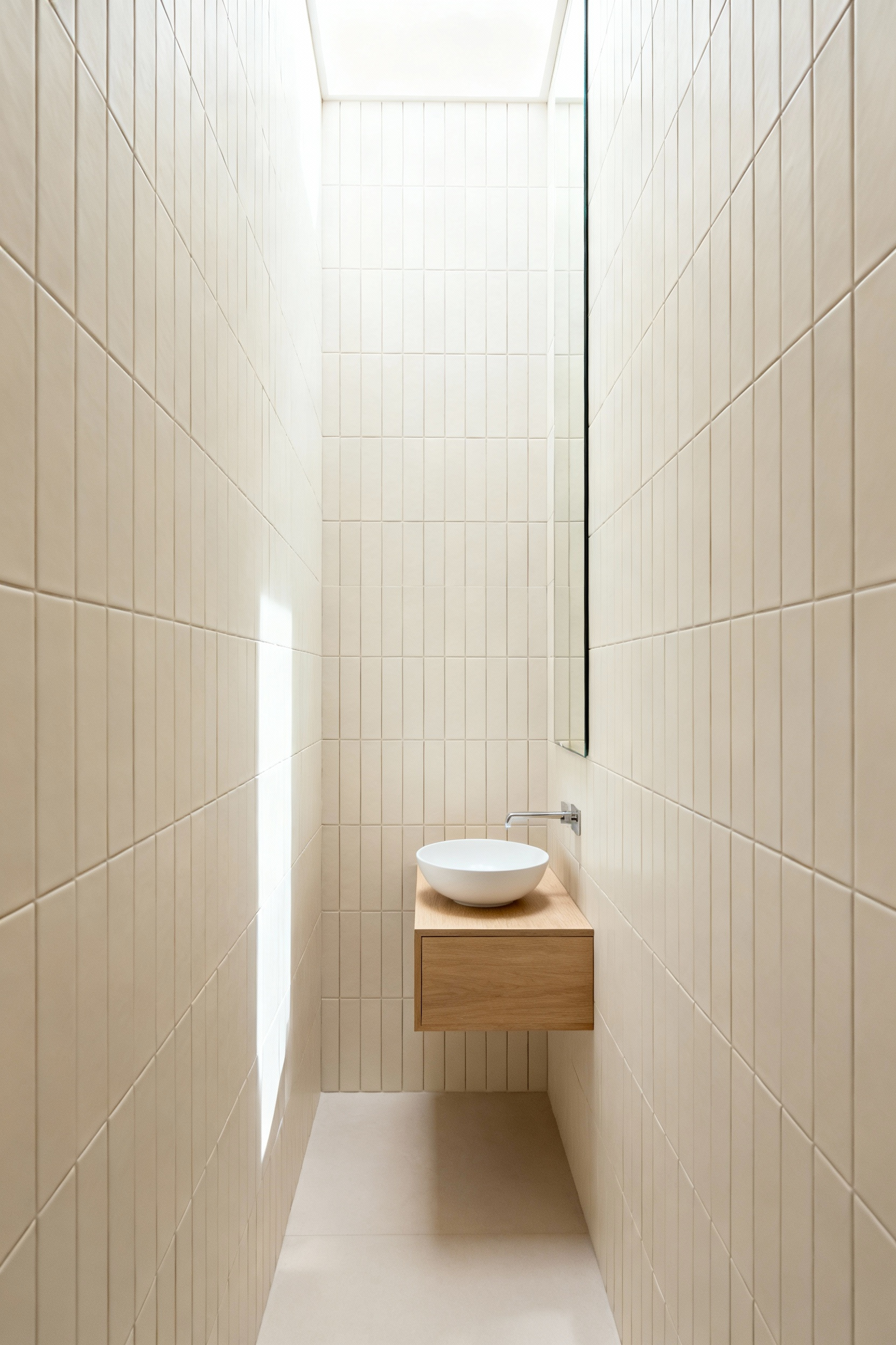
Furthermore, the specific layout of the tiles amplifies this verticality. For instance, arranging rectangular tiles in a vertical stack explicitly draws the gaze upward. Ideally, you should prioritize large-format tiles for these full-height applications. Because larger tiles require fewer grout lines, they minimize visual clutter. As a result, the wall reads as a single, monolithic surface rather than a busy grid. This architectural approach brings a sophisticated, “luxe” aesthetic to industrial conversions.
Beyond geometry, the finish of the tile affects spatial perception. Specifically, choosing glossy or high-shine finishes enhances the sense of openness. Therefore, the walls act as subtle reflectors, bouncing light deeper into the room. Additionally, this design choice offers practical, long-term benefits. In fact, floor-to-ceiling coverage creates a superior waterproof envelope, much like a European-style wet room. Although the initial investment is higher due to labor and materials, the durability is unmatched. Ultimately, this strategy successfully merges high-impact design with necessary structural protection.
8. The Vertical Radiator: Industrial Efficiency in Narrow Spaces
In the context of industrial renovation, horizontal wall space is often a scarce commodity. Therefore, the vertical radiator serves as a vital engineering solution rather than just a design trend. Fundamentally, heat output is determined by total surface area. A tall, narrow profile maintains high thermal efficiency without dominating the room’s width.
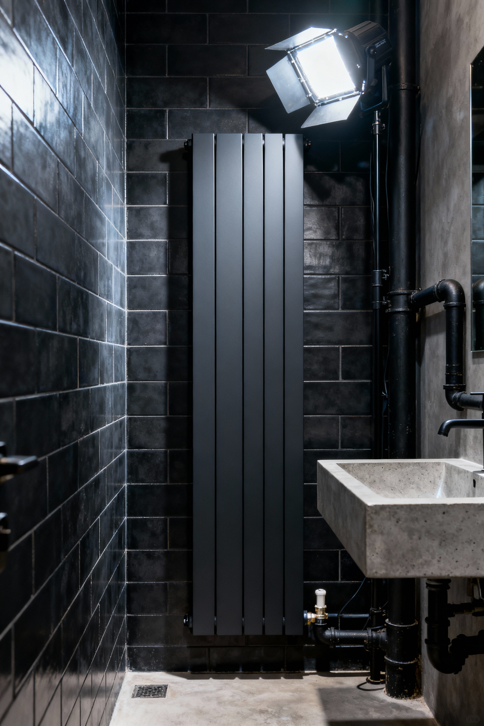
Instead of a wide unit consuming valuable lower wall space, a vertical model extends upward. Thus, you achieve the necessary BTU output while occupying only a fraction of the floor footprint. This approach is effectively an exercise in wall-space economics. Lifting the heat source frees up the lower wall for vanities, toilets, or essential movement.
Furthermore, this slim form fits seamlessly into awkward, narrow gaps often found in converted lofts. Historically, this vertical orientation traces back to space-saving Victorian column radiators used in public buildings. Today, sleek matte black or anthracite finishes honor that industrial heritage while visually expanding the room’s height.
Functionally, vertical channels generate a strong plume of rising heat through convection. As a result, the bathroom air warms rapidly. Additionally, this orientation places high-intensity heat exactly where it is needed for drying towels. Ultimately, the vertical radiator transforms a simple utility object into a sophisticated architectural feature.
9. Transoms and Borrowed Light: Expanding Boundaries Without Demolition
Historically, operable transoms were vital for cooling Victorian row houses. In modern renovations, these architectural features serve a distinct visual purpose. Specifically, they act as strategic portals for “borrowed light” in windowless areas. Capturing ambient brightness from an adjacent hallway creates a powerful illusion. In fact, this influx of high-level light draws the eye upward. Thus, the room gains a sense of “volumetric expansion” without expanding the actual footprint.
Moreover, maintaining privacy is essential in a bathroom setting. Therefore, architects often specify acid-etched or industrial ribbed glass for these openings. Significantly, these textured surfaces diffuse light softly rather than blocking it. Simultaneously, they obscure interior visibility to vague shadows. As a result, you eliminate the “cave-like” feeling of a small bath.
Furthermore, this approach respects the architectural budget. In contrast, removing walls to gain space is notoriously expensive. Typically, structural demolition involves rerouting complex plumbing and electrical systems. Conversely, installing a header and transom above a door is a surgical, low-impact intervention. Ultimately, you achieve the sophistication of daylight without the chaos of heavy construction.
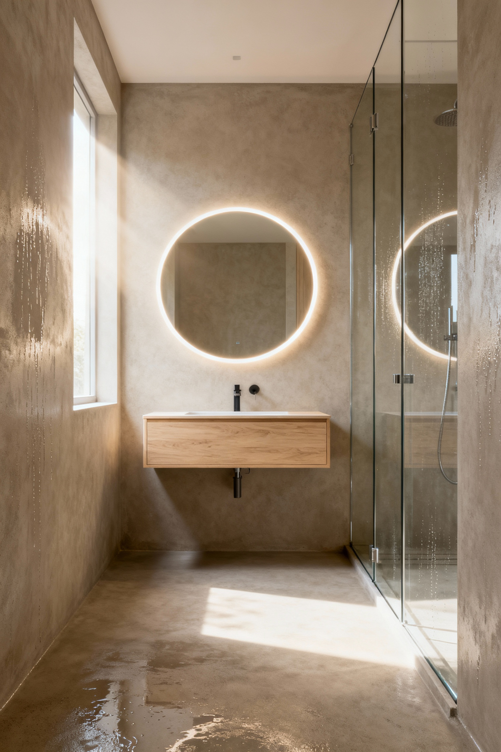
10. Mirror Architecture: Strategic Placement for ‘Infinity’ Depth
Creating “infinity” depth requires more than simply hanging a standard vanity glass. Historically, architects like Sir John Soane used mirrors to elongate vistas and manipulate perception. Placing mirrors on opposing surfaces creates a complex, multi-layered effect known as the “infinity game.” This technique dissolves physical boundaries. Consequently, a small, utilitarian bathroom transforms into a meditative space for contemplation.
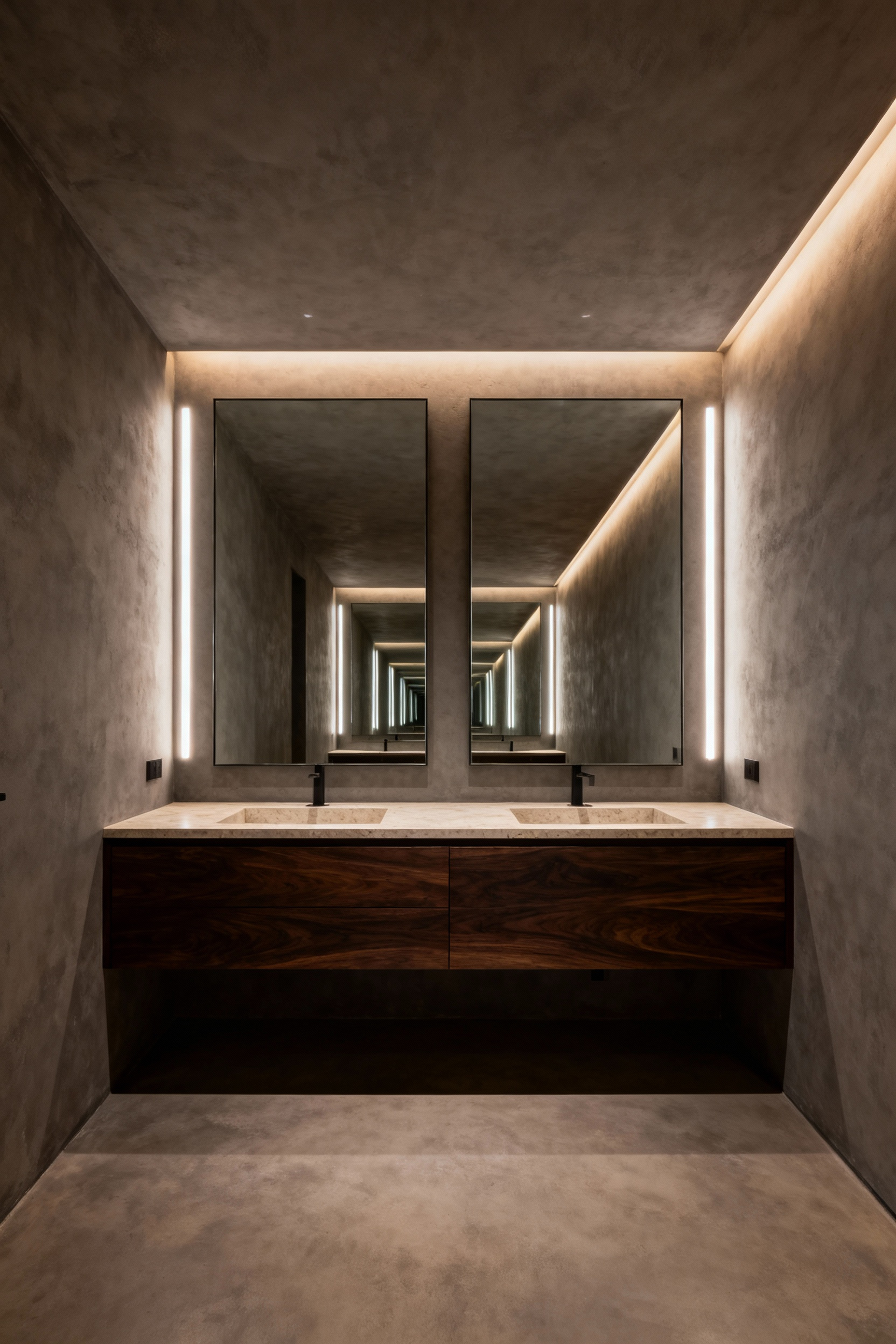
However, successful execution depends entirely on the reflected image. A mirror acts strictly as an amplifier. Therefore, it must face something visually compelling, like a piece of art or a textured wall. Conversely, positioning a mirror opposite a cluttered shelf or trash bin is disastrous. This merely multiplies visual noise. Ultimately, such placement disrupts the room’s harmony.
Furthermore, the physical shape of the glass dictates the dimensional illusion. For instance, a frameless, wall-to-wall rectangular mirror blurs lateral boundaries. This makes narrow industrial spaces feel significantly wider. Alternatively, floor-to-ceiling panels draw the eye upward. As a result, low ceilings appear much higher, adding vertical grandeur.
Finally, consider the choreography of light. Positioning a large mirror opposite a window creates the most powerful impact. Effectively, this captures natural light and redistributes it deep into the room. Additionally, it brings outdoor views into the reflection. Thus, the static interior feels dynamic and alive.
Phase 3: Advanced Application – Materiality and Illusion
True architectural expansion relies on more than just light paint colors. Instead, we utilize specific materials as psychological tools to drastically alter perception. Specifically, the primary goal is creating a monolithic, seamless surface that feels limitless. Consequently, avoiding visual breaks like heavy grout lines is essential. Therefore, use large-format stone or sintered tiles on both walls and floors. This reduction in visual noise allows the viewer’s eye to travel uninterrupted. Furthermore, extending the same material vertically creates a cohesive “wraparound” effect. Similarly, distinct barriers must be removed; frameless glass enclosures allow the eye to register the room’s full depth.
Next, consider mirrors as architectural extensions rather than mere accessories. In fact, they should be calculated to visually double the space. Ideally, a floor-to-ceiling mirror effectively creates an illusory second half to the bathroom. Additionally, backlighting these reflective surfaces eliminates dark corners that often make spaces feel confined.
Finally, an advanced layout must prioritize the illusion of a clear floorplate. For instance, wall-hung vanities and toilets appear to defy gravity. By exposing the floor underneath, you trick the eye into registering more total square footage. Moreover, recessed storage keeps wall planes flat and uncluttered. Ultimately, integrating high-end, tactile textures creates a sense of calm luxury, distracting the user from the room’s actual limited footprint.
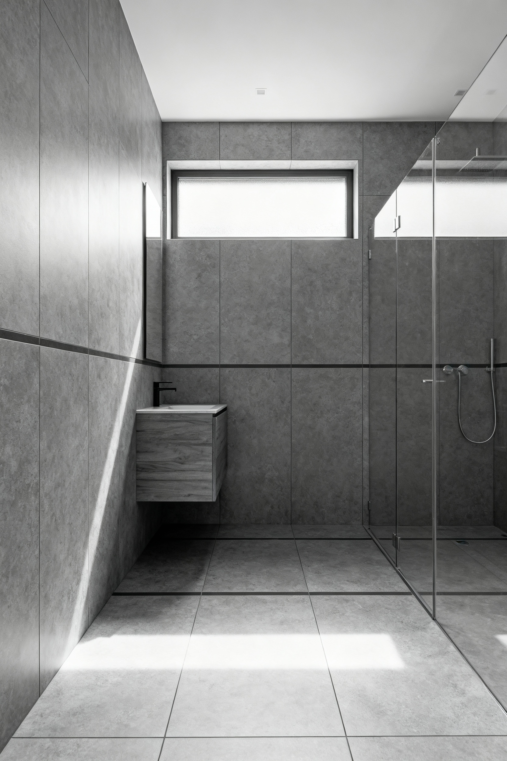
11. Seamless Surfaces: Why Microcement Beats Small Tiles (The Grout Line Trap)
In a compact bathroom, small tiles often create a phenomenon known as “visual fracturing.” High-density grids force the human eye to process every single grout line. This repetitive pattern creates visual clutter, actively making a small space feel claustrophobic. However, microcement offers a sophisticated solution to this spatial problem. By eliminating seams entirely, it creates an uninterrupted, monolithic surface. Therefore, the eye travels smoothly across floors and walls, effectively tricking the brain into perceiving a larger, more cohesive room.
Furthermore, traditional grout presents a significant hygiene challenge in wet environments. Because standard cementitious grout is inherently porous, it acts like a microscopic sponge. As a result, these channels absorb moisture and soap scum, creating a breeding ground for mold. In contrast, microcement becomes fully waterproof when sealed with a high-quality polyurethane. Thus, it eliminates the “porous hygiene trap” entirely. Maintenance simplifies significantly, requiring only a gentle wipe-down rather than aggressive scrubbing.
Finally, this material elevates the room’s atmosphere through unique tactile qualities. Unlike the rigid, cold feel of ceramic tile, microcement features a hand-troweled finish. Moreover, its application is flexible enough to coat curved walls and integrated vanities without joints. Ultimately, this capability allows for sculpted, seamless designs that appear carved from a single block, bringing a quiet, industrial luxury to the home.
12. The Monochromatic Envelope: Blurring Corners with Industrial Greys
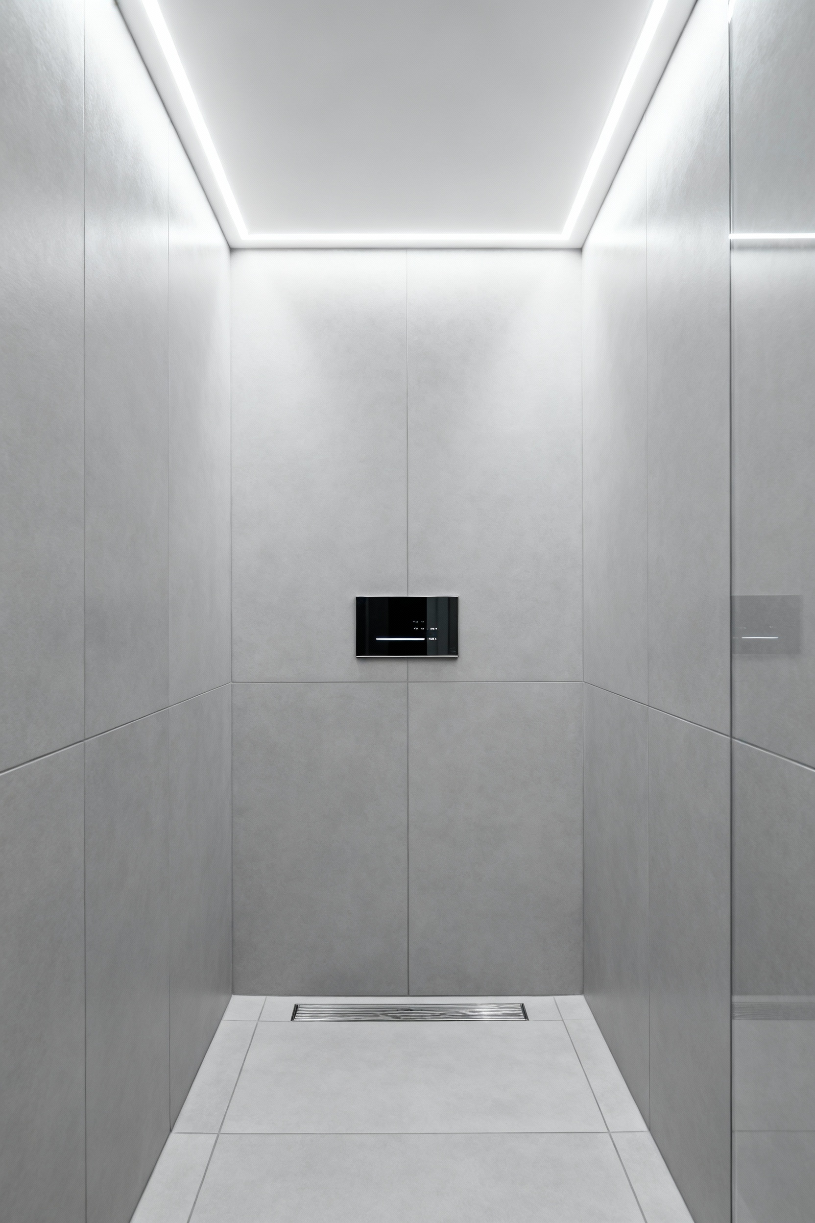
Creating a sense of infinite space in a small bathroom requires tricking the eye. Specifically, you must dissolve the hard boundaries where walls meet floors. This architectural strategy is often called the “Monochromatic Envelope.” Essentially, it involves wrapping the room in a continuous, seamless shade of industrial grey.
In typical layouts, grout lines and contrasting trim act as visual checkpoints. These grids force the eye to register the room’s limited dimensions. To counter this, we utilize seamless materials like microcement. This polymer-modified coating creates a joint-free surface across floors, walls, and even ceilings. As a result, the eye travels freely across the envelope without interruption.
Selecting the right hue is equally critical for this sophisticated effect. Historically, shades like charcoal and concrete grey directly reference the utilitarian Modernist movement. These tones champion the structural honesty of factories and warehouses. Psychologically, darker greys create a cocooning effect, while lighter concrete tones amplify airiness.
However, a single color creates a risk of appearing flat. Therefore, you must layer different sheens to introduce necessary depth. For instance, pair matte, hand-troweled walls with a polished stone vanity. This textural contrast catches light subtly without breaking the color continuity. Finally, introduce aged brass or bronze fixtures to prevent sterility. Ultimately, these warm metal accents balance the cool industrial base with a touch of luxury.
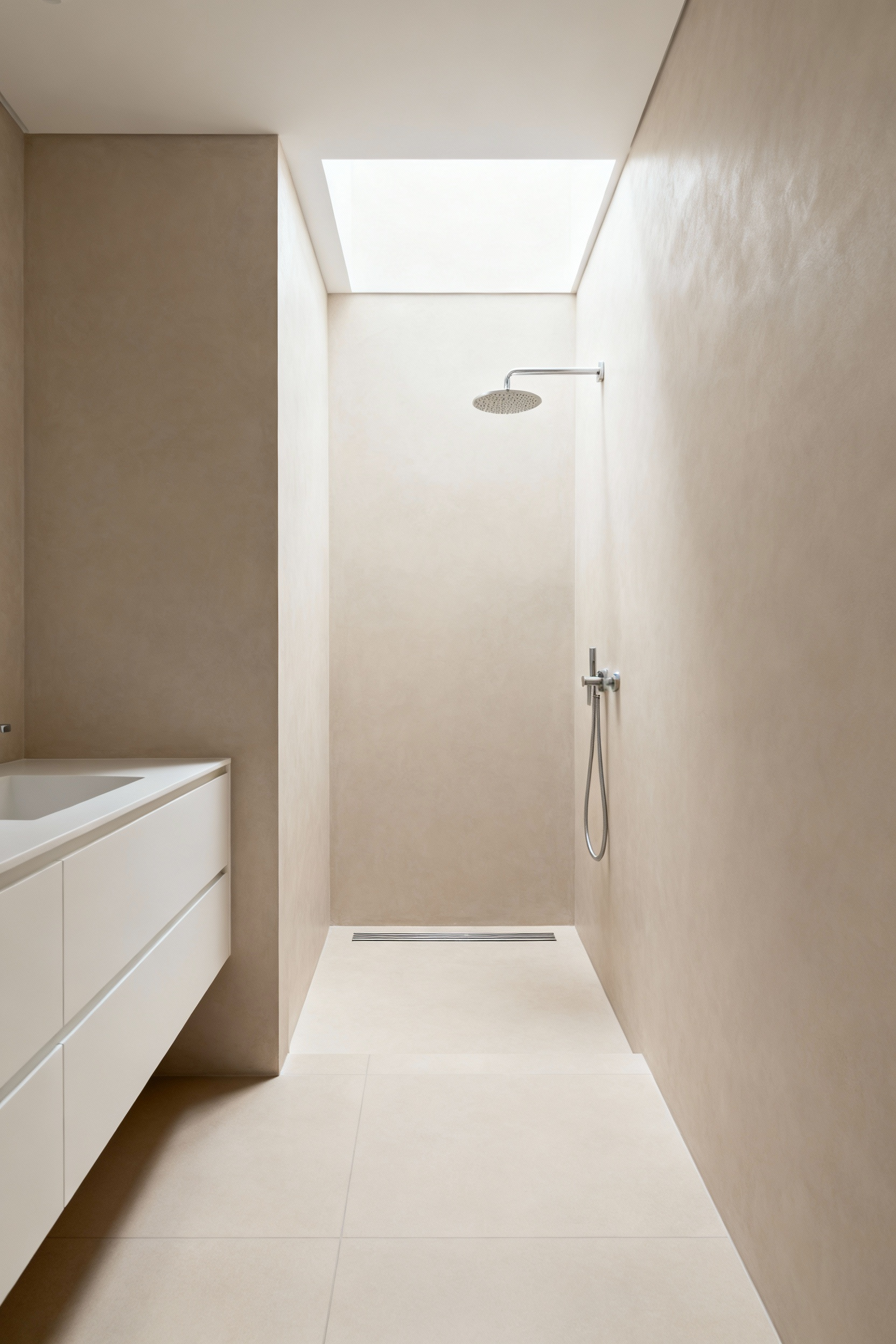
13. Linear Drains: The Gradient Advantage for Layout Flexibility
Traditional center drains demand a complex, multi-directional slope. This creates an inverted funnel shape that complicates tile work. In contrast, the linear drain utilizes a uni-directional slope. Thus, the shower floor needs only a gentle pitch along one smooth plane. Specifically, this uniformity allows for large-format tiles to run continuously from the main room. Therefore, the bathroom floor appears unbroken, effectively expanding the perceived space within small footprints.
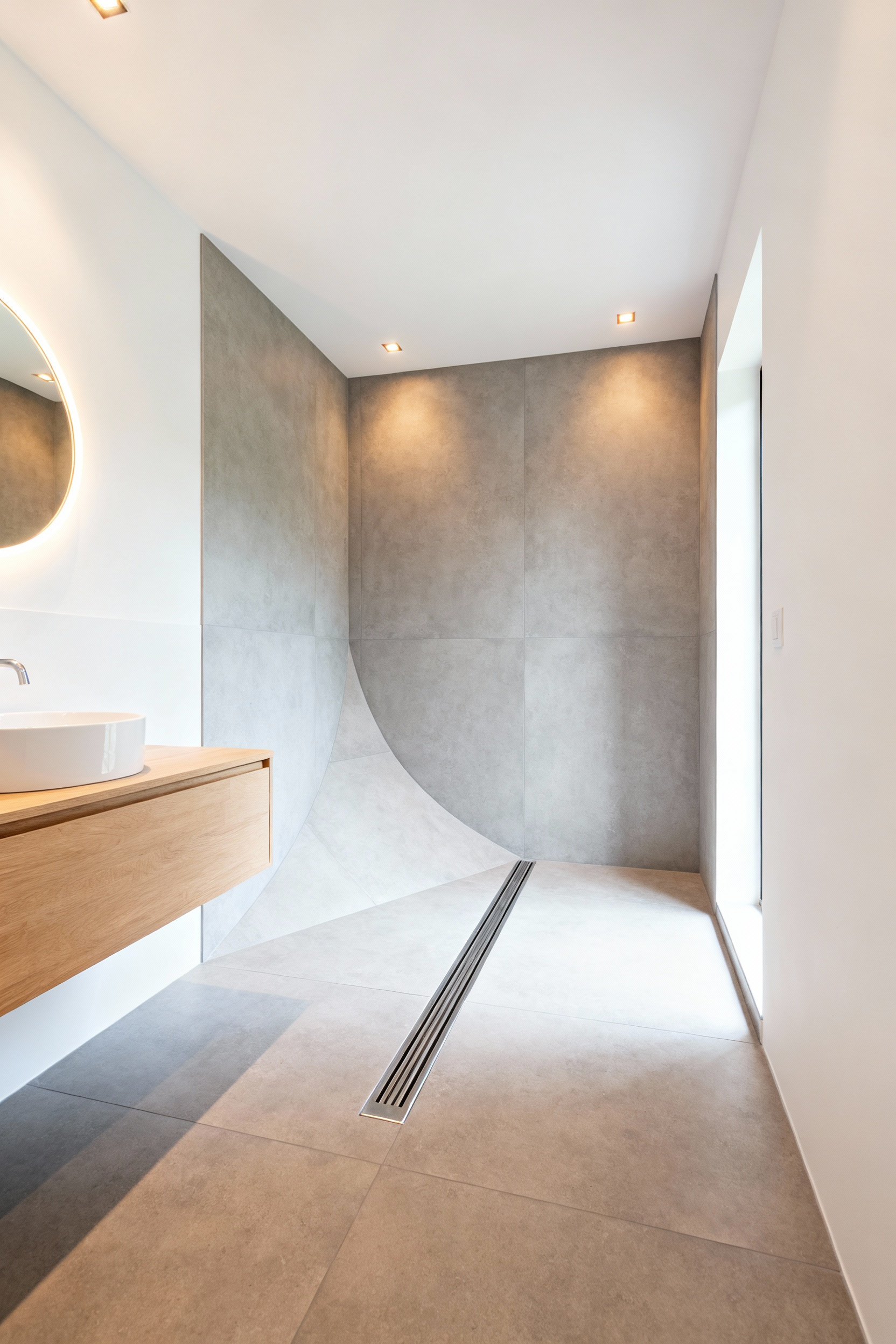
Furthermore, this gradient system is the architectural key to a modern, curbless design. By eliminating the physical barrier, you treat the entire bathroom as one cohesive wet room. Unlike center drains, linear models can sit discreetly against a far wall. As a result, users stand on a mostly level surface rather than an uneven slope. This maximizes the actual usable floor space. Ultimately, this consistent grade improves safety and accessibility. It transforms the shower into a barrier-free environment suitable for multi-generational living.
14. Frameless Glass Barriers: The Invisible Partition
In compact industrial renovations, visual continuity is paramount. Specifically, removing bulky metal frames allows the eye to travel uninterrupted across the room. Consequently, this creates a profound psychological illusion of expanded space. Experts confirm that clear sightlines effectively trick the brain into perceiving a larger area. Therefore, the room feels cohesive rather than compartmentalized. Additionally, natural light flows freely across the enclosure, eliminating dark, cave-like corners common with shower curtains. For further guidance on modern architectural principles, explore these essential principles of modern bathroom design.
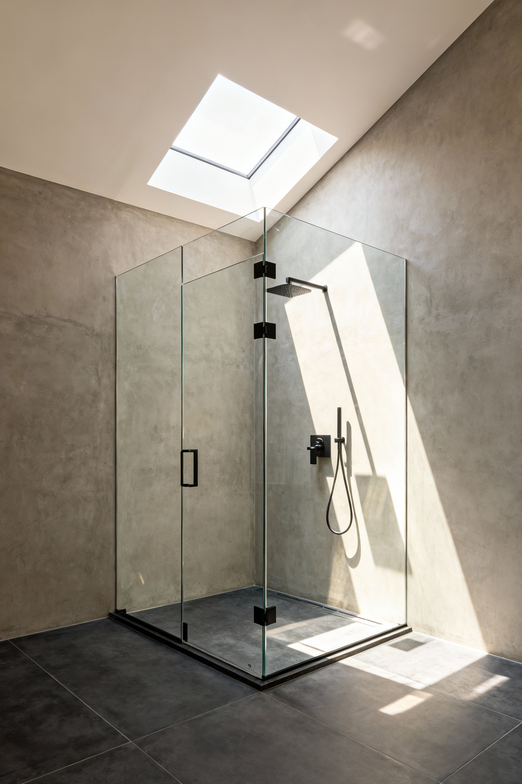
However, achieving true invisibility requires selecting the right material. Standard clear glass often contains iron oxide, which produces a subtle green tint along the edges. To combat this, architects frequently specify low-iron glass. Technically, this “optically clear” upgrade reduces iron content and increases light transmittance by approximately 5-6%. As a result, tile colors remain true, and the barrier effectively disappears.
Nevertheless, this minimalism demands structural compensation. Since there is no supporting metal frame, the glass itself must be substantial. Typically, this means utilizing 3/8-inch or 1/2-inch tempered safety glass for stability. Furthermore, installation requires absolute precision. Without a forgiving metal channel, the floor slope must be exact to prevent leaks. Ultimately, while the investment is higher, the result is a sophisticated, open atmosphere that honors the architecture.
15. Cantilevered Shelving: Raw Materials with Zero Visual Weight
In compact bathrooms, reducing visual clutter is essential for maximizing spatial perception. Consequently, cantilevered shelving offers a sophisticated solution by introducing “zero visual weight” to the room. However, true transparency relies heavily on specific material choices. Standard “float” glass contains iron oxide, which imparts a distinct green tint along the edges.
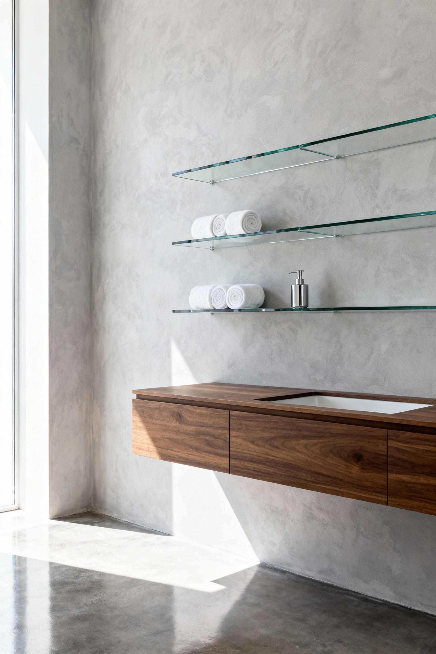
In contrast, low-iron glass creates a pristine, crystalline appearance. This “optically clear” material allows approximately 91% visible light transmittance, ensuring the shelf visually recedes. While acrylic offers a lightweight alternative, it lacks necessary durability for wet environments. Unfortunately, acrylic is soft and prone to micro-scratches from abrasive cleaning cloths. Over time, these scratches create a hazy finish that adds unwanted visual density. Therefore, tempered low-iron glass remains the superior option for maintaining clarity and hygiene.
Finally, the installation mechanics must reinforce this floating illusion. Ideally, utilize blind shelf supports anchored directly into the wall studs before tiling. This method eliminates visible brackets, leaving only the clean horizontal plane. Alternatively, an integrated recessed ledge can achieve a similar effect. By continuing the wall material into a niche, you create a calm composition without protruding elements. Ultimately, these strategies prioritize architectural integrity, keeping the focus on open space rather than hardware.
Phase 4: Mastery Integration – Technical Refinement
True mastery of a small bathroom begins behind the drywall. We must optimize the structural envelope to reclaim volumetric space. Specifically, this involves the strategic deployment of in-wall plumbing systems. For instance, wall-hung fixtures are not merely aesthetic choices; they are technical refinements. By concealing the tank mechanism within a thickened wall chase, we push volume into the cavity. As a result, we free up precious floor area. Furthermore, exposing the flooring beneath the vanity creates “visual bleed.” Thus, the room perceives continuous space.
Moreover, reclaiming this space allows us to address the “Code-to-Comfort Calculus.” Building codes often set low minimums for safety. However, a master layout integrates stringent regulations with human factors. We often sacrifice fixture size to gain clear floor space. For example, choosing a compact toilet to gain nine extra inches of clearance prioritizes unhindered movement over bulk. Ultimately, this trade-off defines the room’s functionality.
Finally, technical refinement requires “perceptual engineering” through layered illumination. In small spaces, light acts as a structural element. Specifically, we utilize ambient, task, and accent lighting to push back visual boundaries. Ideally, toe-kick LEDs beneath a floating vanity create a ribbon of light along the floor. Consequently, this optical trick reinforces the visual bleed effect. If windows are absent, a tubular skylight can channel natural light from the roof. In short, these invisible choices transform a cramped utility space into a sophisticated sanctuary.
16. Architectural Lighting: Recessed Coves to Eliminate Ceiling Clutter
In confined spaces, visual clutter stresses us out. Therefore, eliminating bulky ceiling fixtures is a critical design move. Instead of a distracting object, lighting should become a seamless atmospheric effect. Recessed cove lighting hides the source, leaving only a soft glow. Consequently, the room feels organized, spacious, and calming. This shift allows the brain to downshift, reducing anxiety in personal spaces.
Architecturally, this technique works by dematerializing the ceiling structure. Fundamentally, the indirect light washes the room’s perimeter. This blurs the harsh line where walls meet the ceiling. As a result, the overhead plane appears to float, expanding the perceived volume upward. To maximize this optical illusion, utilize a reflective matte paint finish on the ceiling. This ensures the light bounces without creating harsh glare.
Furthermore, modern LED technology makes this look achievable without losing height. Slim LED tape strips fit into minimal recesses, preserving valuable vertical space. However, this ambient glow often requires functional support. Therefore, pair coves with small, strategic recessed downlights for specific grooming tasks. Ultimately, this layered approach honors the industrial spirit by keeping the ceiling distinctively clean.
17. Smart Water Integration: Digital Valves for Minimalist Trim
In compact renovations, preserving wall depth is often critical. Traditionally, mechanical shower valves consume valuable space within the wall cavity. However, smart digital valves offer a sophisticated architectural solution. Specifically, they decouple the user interface from the mechanical plumbing engine.
Consequently, the bulky mixing unit operates remotely. Ideally, you can house this component in an accessible closet or service panel. Therefore, the shower wall requires only shallow wiring runs. This structural freedom allows for thinner wall assemblies or deeper inset niches.
Visually, this shift eliminates cluttered metal projections. Instead of chunky knobs, a sleek digital panel lies flush against the stone or tile. Thus, the small shower area feels significantly more expansive. Furthermore, the tactile experience evolves from mechanical turning to precise, electronic tapping.
In fact, users can select an exact temperature, ensuring a consistent, spa-like experience. Beyond aesthetics, this technology enhances water stewardship. For instance, programmable presets allow for monitoring flow rates and setting safety limits. Ultimately, digital integration merges industrial efficiency with a clean, minimalist design language.
The Efficiency Paradox: Why Constraint Breeds Sophistication
The tightest constraints often produce the most refined designs. Limited square footage demands a discipline that vast rooms rarely require. By stripping away the non-essential, you reveal the true potential of architectural elements. Functional innovations evolve into sleek, minimalist statements. Moreover, a smaller footprint allows you to prioritize superior, tactile materials over sheer quantity. True sophistication is not defined by volume, but by absolute intentionality.
Looking ahead, this approach offers a sustainable blueprint for sophisticated urban living. Specifically, it shifts your focus from mindless accumulation to careful curation. Ideally, your home becomes a sanctuary where every texture serves a distinct purpose. Thus, the bathroom transforms from a utility space into a personal retreat. To begin, audit your current floor plan for visual interruptions and unnecessary clutter. Finally, select one premium finish, like textured stone, to anchor your new, efficient small bathroom layout sanctuary.
Frequently Asked Questions
What is the most space-efficient layout for a standard 5×8 bathroom?
The most efficient layout is typically a straight-line configuration (galley style). Place the vanity, toilet, and tub/shower along one wall. This minimizes complex plumbing and leaves the maximum open floor space. However, for visual expansion, utilize a wall-hung vanity and a pocket door to reclaim floor area lost to door swing and cabinet bulk.
How can I fit a shower, toilet, and vanity into a micro-bathroom footprint (under 30 sq. ft.)?
For extremely small footprints, the wet room concept is essential. Remove the shower curb and use a linear drain to unify the floor plate. This allows the shower area to overlap with the toilet clearance zone when not in use. Use a corner sink or an ultra-compact console sink rather than a traditional vanity to maintain minimum circulation space.
Should I prioritize a pocket door installation in my compact renovation?
Absolutely. A traditional hinged door consumes between 10 to 18 square feet of usable floor area through its swing radius. Implementing a pocket door instantly frees up this “dead zone.” This allows you to place critical fixtures, like the vanity or towel storage, closer to the entry wall without violating necessary clearance codes.
“`json { “@context”: “https://schema.org”, “@graph”: [ { “@type”: “Article”, “@id”: “https://pennyshome.com/small-bathroom-layout/”, “headline”: “The Definitive Guide to Maximizing Your Small Bathroom Layout: Architecture Over Decoration”, “image”: “http://pennyshome.com/wp-content/uploads/2026/02/small-bathroom-reengineering-footprint.jpeg”, “datePublished”: “2026-02-03”, “dateModified”: “2026-02-03”, “author”: { “@type”: “Person”, “name”: “Marcus Thompson” }, “publisher”: { “@type”: “Organization”, “name”: “pennyshome”, “url”: “https://pennyshome.com”, “logo”: { “@type”: “ImageObject”, “url”: “http://pennyshome.com/wp-content/uploads/2025/10/Pennyshomelogo.webp” } }, “description”: “Learn how discerning homeowners optimize their small bathroom layout. Master architectural tricks like floating vanities, monochromatic envelopes, and pocket doors for a luxury sanctuary. Focus on structural integrity and spatial efficiency over surface-level decoration.” }, { “@type”: “FAQPage”, “mainEntity”: [ { “@type”: “Question”, “name”: “What is the most space-efficient layout for a standard 5×8 bathroom?”, “acceptedAnswer”: { “@type”: “Answer”, “text”: “The most efficient layout is typically a straight-line configuration (galley style), placing the vanity, toilet, and tub/shower along one wall. This minimizes complex plumbing and leaves the maximum open floor space. However, for visual expansion, utilize a wall-hung vanity and a pocket door to reclaim floor area lost to door swing and cabinet bulk.” } }, { “@type”: “Question”, “name”: “How can I fit a shower, toilet, and vanity into a micro-bathroom footprint (under 30 sq. ft.)?”, “acceptedAnswer”: { “@type”: “Answer”, “text”: “For extremely small footprints, the wet room concept is essential. Remove the shower curb and use a linear drain to unify the floor plate, allowing the shower area to overlap with the toilet clearance zone when not in use. Use a corner sink or an ultra-compact console sink rather than a traditional vanity to maintain minimum circulation space.” } }, { “@type”: “Question”, “name”: “Should I prioritize a pocket door installation in my compact renovation?”, “acceptedAnswer”: { “@type”: “Answer”, “text”: “Absolutely. A traditional hinged door consumes between 10 to 18 square feet of usable floor area through its swing radius. Implementing a pocket door instantly frees up this \”dead zone,\” allowing you to place critical fixtures, like the vanity or towel storage, closer to the entry wall without violating necessary clearance codes.” } } ] } ] } “`