
Soft greens have symbolized hygiene and tranquility since the sanitary movement of the 1920s. Initially, bathrooms relied on stark white surfaces to prove their cleanliness. However, this often felt too clinical for a residential setting. Therefore, designers introduced pale mint and seafoam greens as softer alternatives.
Today, the focus has shifted from mere sanitation to personal wellness. Specifically, trends now favor less saturated, sophisticated hues like sage. Creating a truly exceptional Sage Green Bathroom transforms the space into a calming retreat. In fact, it offers an organic connection to nature.
Modern organic luxury relies on this earthy palette to anchor biophilic design. For instance, sage pairs beautifully with natural wood vanities and warm brass hardware. Next, matte finishes are replacing polished chrome to enhance the tactile experience. This guide reveals how to master this timeless aesthetic in your home. We will explore material pairings that elevate sage from vintage to vogue. Ultimately, you will learn to balance history with contemporary comfort.
The Dual Principle: Why today’s most sophisticated sage bathrooms must balance historical weight with contemporary wellness needs.
Sage green transcends fleeting trends. It bridges two distinct worlds: ancient medicinal belief and modern science. Historically, the color derives from the herb *Salvia*, whose Latin root means “to heal.” Consequently, it has long symbolized tranquility and wisdom. However, modern research now validates this ancient intuition.
Data regarding chromotherapy confirms the benefits. Specifically, muted greens actively lower blood pressure and reduce muscle tension. Thus, a sage bathroom functions as a deliberate sanctuary. It becomes a space for daily renewal rather than mere utility.
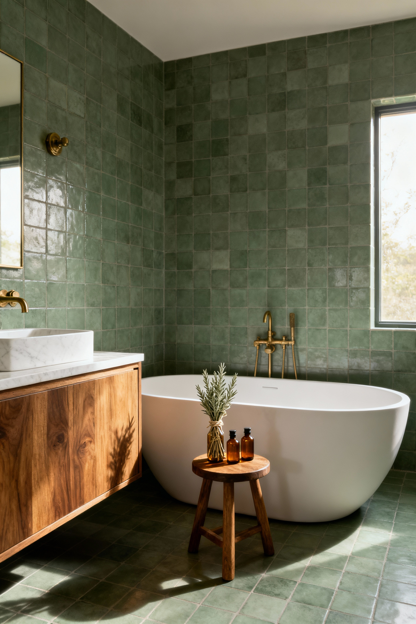
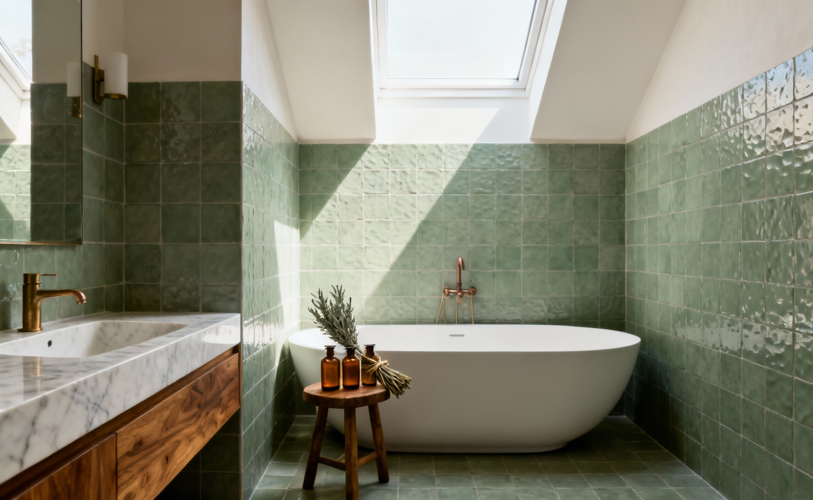
To achieve this balance, the design must create a material dialogue between eras. Indeed, sage pairs beautifully with the warmth of vintage unlacquered brass. This combination mimics the timeless glamour of a Victorian bathhouse. Conversely, the color softens the sharp lines of modern white Carrara marble.
Texture plays a vital role here. Hand-crafted Zellige tiles capture light dynamically. They offer an organic, water-like depth unlike flat paint. Ultimately, this anchors the space in nature.
Finally, the dual principle demands that high-performance technology remains discreet. We desire modern comforts, but the aesthetic must remain serene. Therefore, advanced steam systems are often concealed behind traditional cross-handles. Similarly, radiant heated floors provide sensory grounding without adding visual clutter. By hiding these features, the room preserves the illusion of a restorative retreat.
1. The Psychology of Sage: Understanding why this hue anchors us to nature and history simultaneously.
Sage green serves as a powerful anchor to the natural world. Specifically, this hue functions as a “Nature Neutral” within interior spaces. Our eyes are uniquely attuned to green. This likely stems from our evolutionary history outdoors. Consequently, this connection elicits immediate feelings of safety.
In particular, sage green’s muted quality is essential for mental well-being. It blends vibrant green with the stability of gray. Indeed, this mix actively alleviates anxiety. Utilizing this tone transforms a standard bathroom into a restorative refuge. It simulates the quiet atmosphere of a forest floor.
However, the appeal extends beyond simple aesthetics. Historically, the word “sage” describes a person possessing profound wisdom. Thus, the color conveys a sense of maturity rather than fleeting trendiness.
Finally, this hue echoes a sacred heritage. Indigenous Nations have long revered the sage plant for its cleansing properties. Symbolically, it represents the Earth element. Ultimately, choosing sage green grounds a home in both wellness and enduring design.
2. Principle of Contrast: Why unlacquered brass is the historical soulmate of sage green cabinetry.
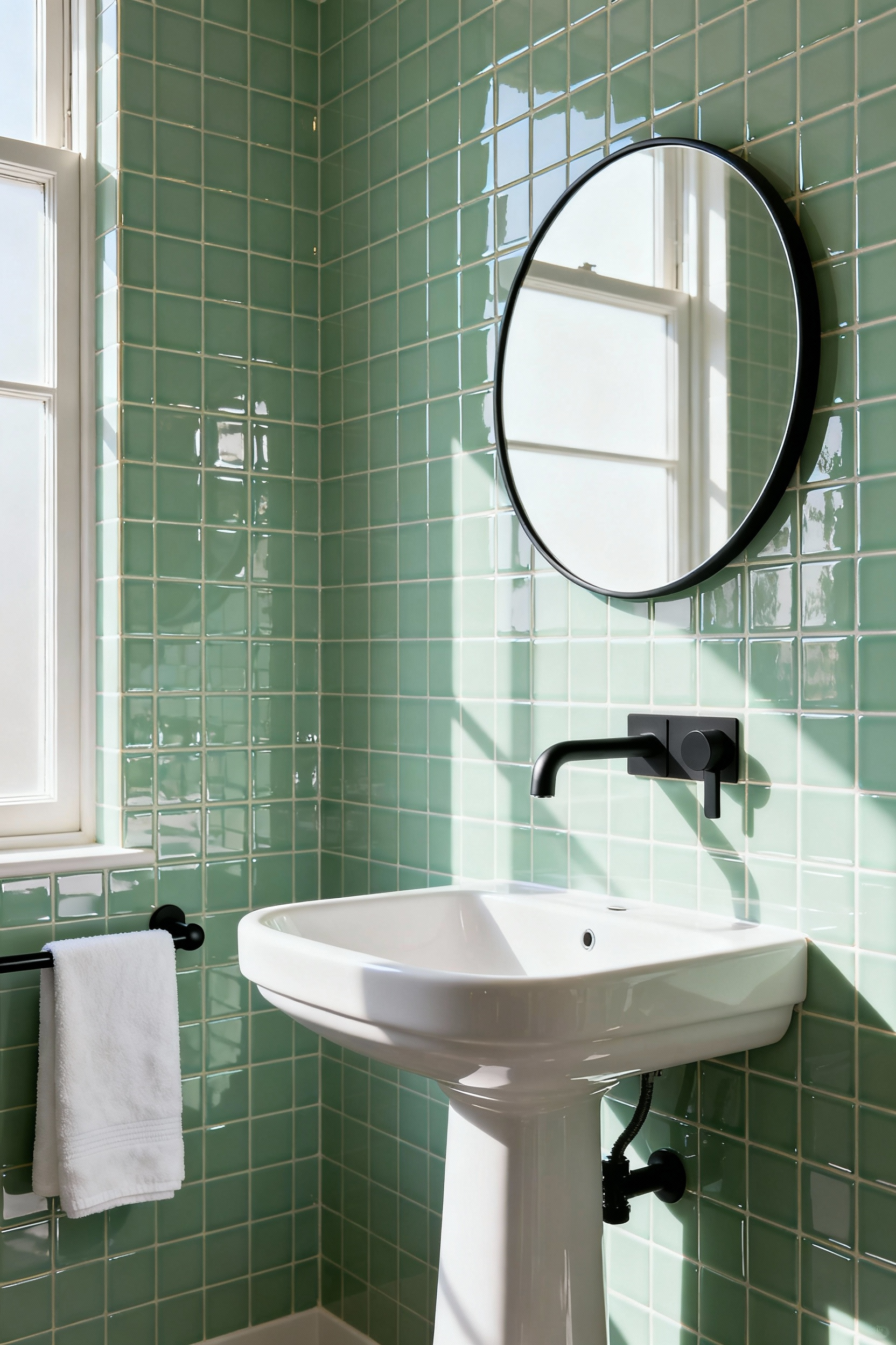
The synergy between unlacquered brass and sage green lies in contrast. Primarily, this relies on color temperature. Sage green acts as a cool, earthy anchor. It evokes the natural world. Conversely, unlacquered brass provides a warm counterpoint. This alloy offers a rich, golden hue. Consequently, the tension between cool paint and warm metal creates a balanced atmosphere.
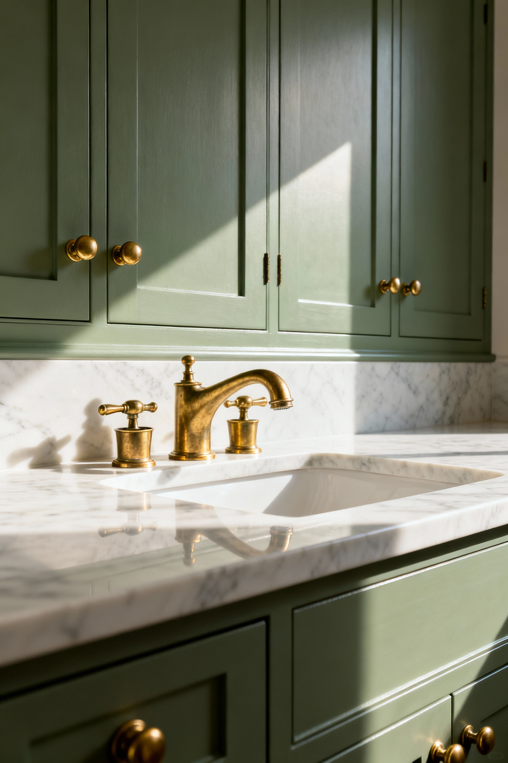
Furthermore, surface dynamics add architectural depth. Unlacquered brass functions as a “living finish.” It lacks a synthetic protective coating. As a result, the metal reacts to oxygen and touch over time. This oxidation creates a patina, evolving from gold to bronze.
In contrast, the sage cabinetry remains a static backdrop. Therefore, the changing metal prevents the space from feeling flat.
Finally, this pairing resonates with historical authenticity. It captures an “old-world” charm found in classic restorations. The hardware becomes a narrative element. Meanwhile, the muted green suggests a heritage-inspired palette. Thus, these materials function as soulmates.
3. Upcycling Feature: Transforming a mid-century dresser into a bespoke sage vanity.
Transforming a vintage dresser into a vanity marries mid-century form with modern tranquility. Specifically, the clean silhouettes of mid-century design provide an ideal canvas. Applying a dusty sage green, like Benjamin Moore’s Saybrook Sage, creates a sophisticated contrast. Ideally, keep the drawer fronts exposed to showcase the walnut veneer. However, this choice requires protection. Therefore, apply a specialized sealant like Marine Varnish to the top surface. This creates a water-resistant shell.
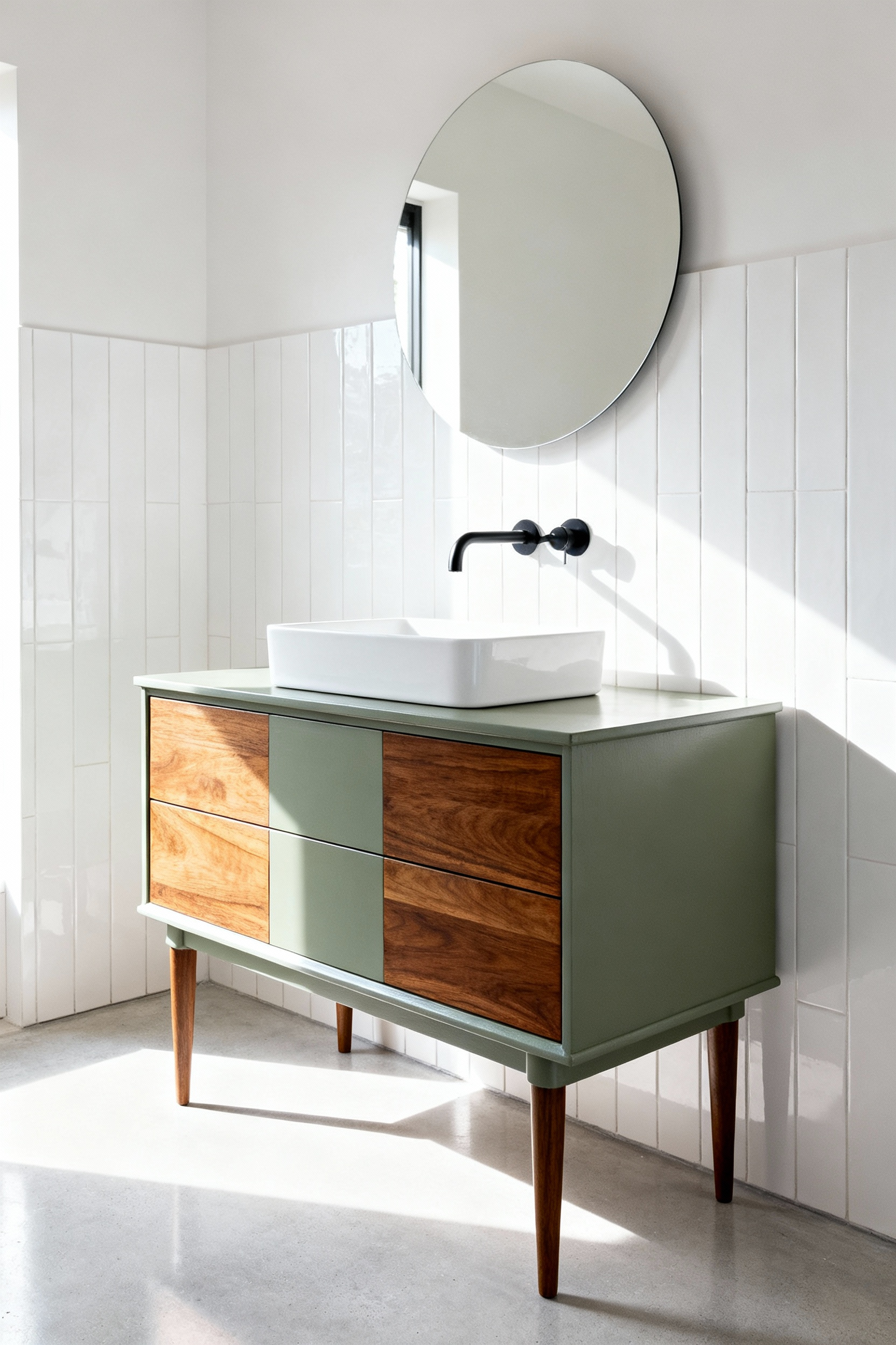
Furthermore, the transformation requires structural modifications. You must carefully cut a “U” shape into the internal drawer boxes. This accommodates the sink’s P-trap. Thus, the vanity retains functional storage while concealing plumbing.
Additionally, consider height. Vintage dressers are often lower than standard vanities. Indeed, installing a vessel sink adds necessary vertical clearance. Finally, complete the look with metallic hardware. Brass accents provide a glamorous counterpoint to the earthy sage.
4. Texture over Pigment: Using vertical beadboard wainscoting to add architectural interest without overwhelming the eye.
Creating visual interest in a small bathroom does not always require bold color. Instead, rely on architectural texture. Vertical beadboard wainscoting offers a sophisticated alternative to high-pigment walls. Specifically, this utilizes light and shadow rather than hue. The subtle ridges of the paneling catch the light naturally. Consequently, they cast delicate shadows within the grooves. This creates a dynamic surface that feels alive.
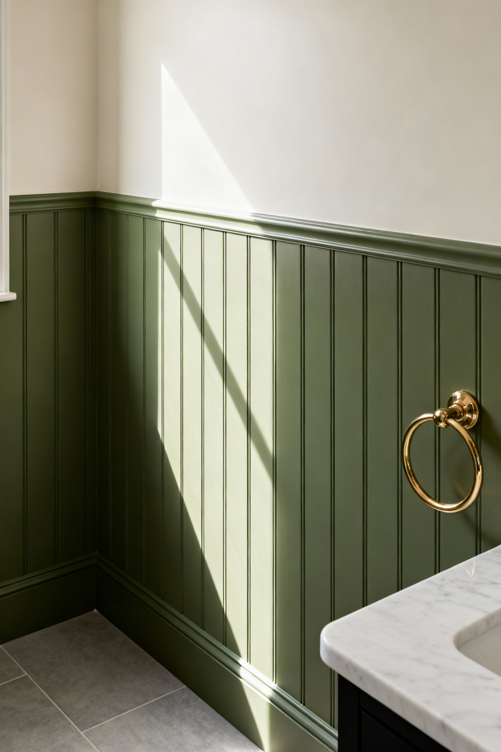
Furthermore, vertical lines serve a spatial function. Traditional wainscoting can visually cut a room in half. However, vertical orientation draws the eye upward. This prevents the room from feeling enclosed.
In this context, the beadboard acts as a tactile anchor for the sage paint. The crisp texture grounds the space. Therefore, the muted green feels airy rather than flat.
Finally, this choice is practical. Historically, wainscoting protected plaster from scuffs. Today, it provides durability while adding character. Thus, the texture is beautiful because it is functional.
5. Tile Theory: The resurgence of the 4×4 square zellige tile in varying herbal shades.
Modern design is pivoting away from mass-produced uniformity. Instead, we see a distinct return to texture as luxury. Specifically, the resurgence of 4×4 Zellige tile illustrates this shift. Authentic Zellige is handcrafted from Moroccan clay. Consequently, each piece features unique surface irregularities. In fact, pits and chips are not defects. They are essential character traits.
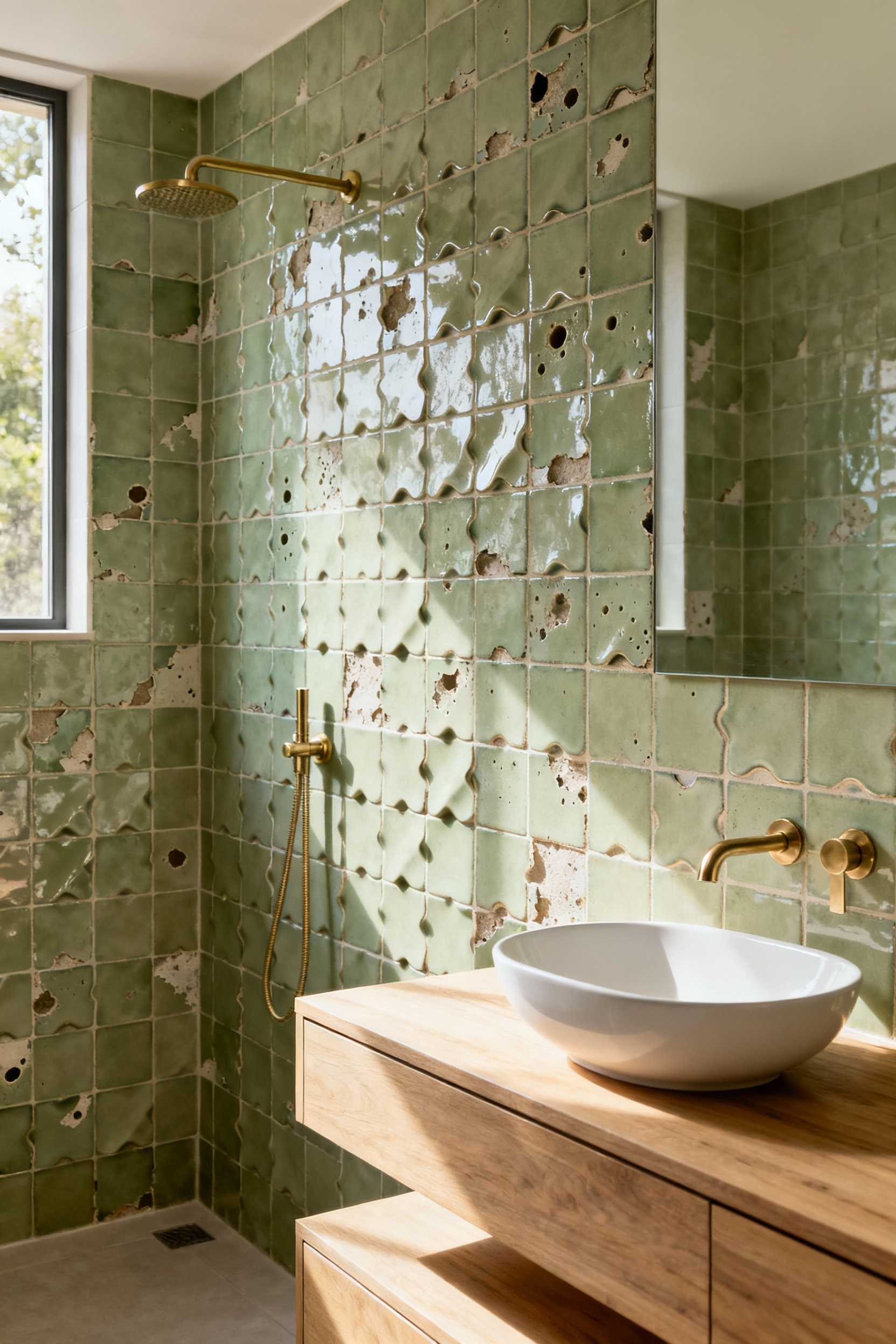
Furthermore, the firing process creates stunning color diversity. Tiles closer to the fire develop different hues. Therefore, a wall of “sage green” becomes a fluid surface. Colors range from pale moss to deep olive. Naturally, this palette establishes a spa-like atmosphere. The glossy glaze catches light like water.
Structurally, the 4×4 square subverts the ubiquitous subway tile. It offers a balanced foundation. To preserve the aesthetic, professionals minimize joint widths. Ultimately, this tight spacing ensures the focus remains on the clay texture.
6. The ‘New’ Neutral: Treating sage as a foundational neutral rather than a bold accent color.
Sage green has replaced “millennial gray” as the preferred backdrop. Specifically, this hue functions as a foundational neutral. This versatility stems from its composition. In fact, sage is a grayish-green with chalk-like undertones. Consequently, the gray pigment dampens the green. It prevents it from feeling overwhelming. It offers light-reflecting qualities while adding depth. Therefore, it serves as a sophisticated canvas compared to beige.
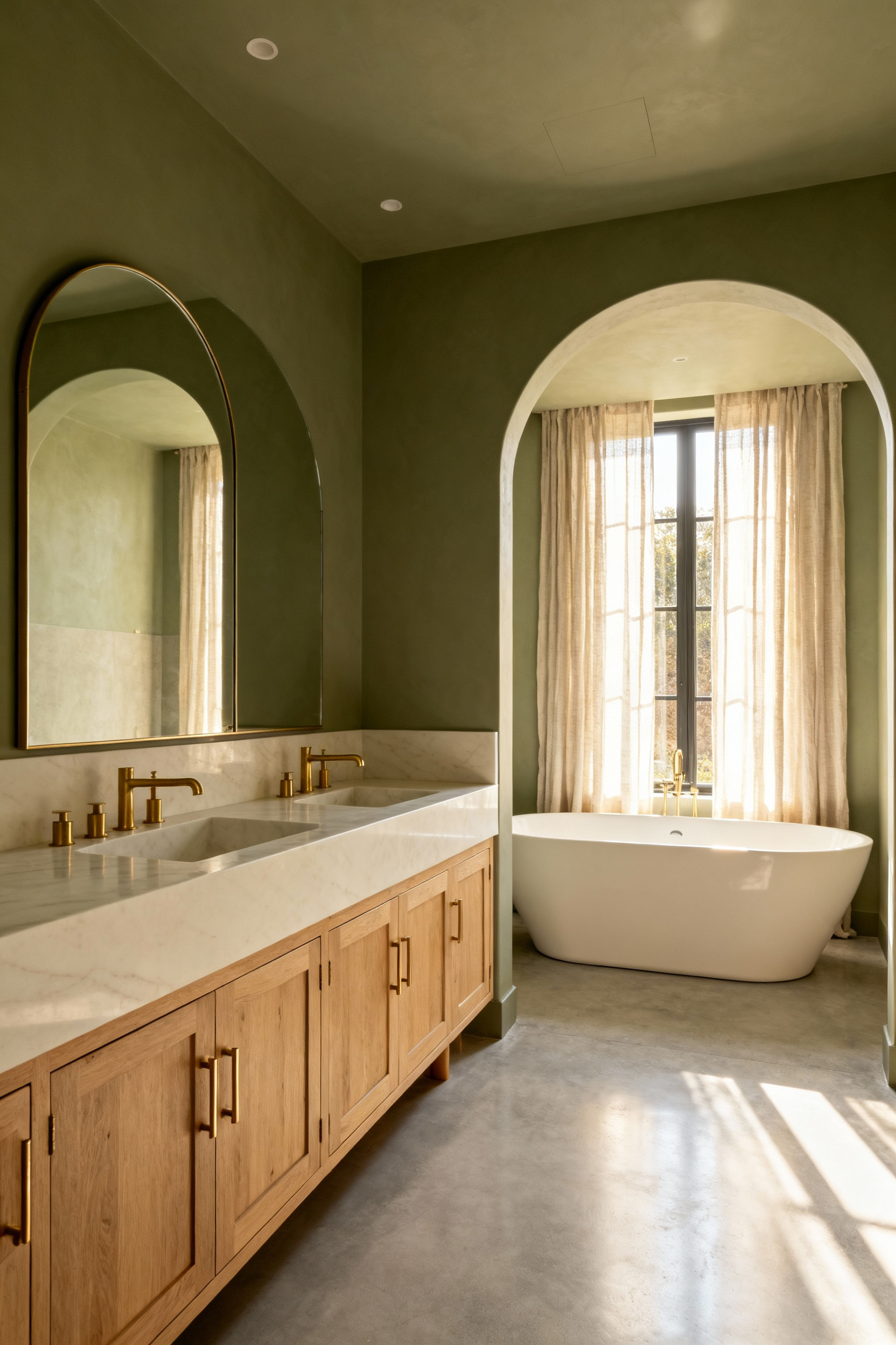
Beyond aesthetics, this aligns with wellness-focused interiors. Bathrooms are transitioning into restorative sanctuaries. Sage green supports this by evoking calm. Moreover, Feng Shui associates this color with balance. Thus, it creates a serene atmosphere.
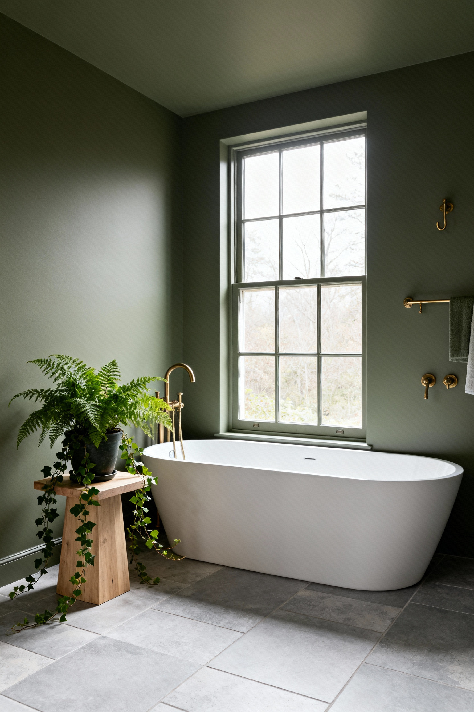
To embrace this look, treat sage as the dominant base. Historically, green was an accent. Now, homeowners flip this ratio. They utilize “color-drenching” techniques. Walls, trim, and ceilings share the same shade. As a result, the color becomes texture. Finally, its chameleon-like quality anchors both warm brass and cool marble accents.
7. Historical Context: Restoring the clawfoot tub with a coat of ‘Dried Thyme’ exterior paint.
The clawfoot tub stands as a heavy icon of the Victorian era. Historically, these fixtures relied on white enamel to symbolize progress. However, customization was rare during the 19th century. Today, restoring the exterior with ‘Dried Thyme’ shifts the tub’s role. It moves from a functional basin to a decorative anchor. Specifically, this muted sage provides visual weight that matches the iron.
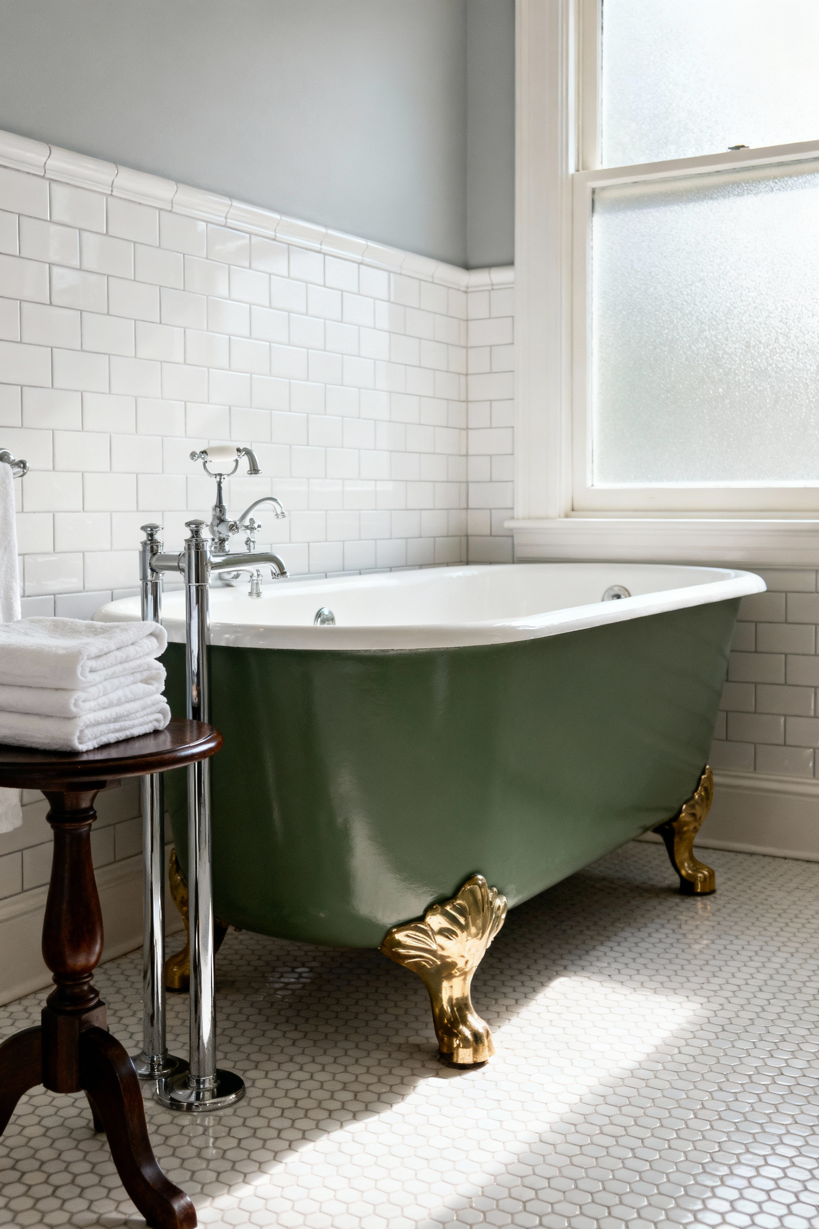
Furthermore, this choice offers a correction to history. Victorian green pigments often contained arsenic. In contrast, ‘Dried Thyme’ offers an organic connection without danger. Consequently, the restoration prioritizes wellness alongside aesthetics.
Functionally, the paint formula is critical. We specifically selected exterior-grade paint. Bathrooms generate unique microclimates. Therefore, the finish must resist humidity. Moreover, this durable enamel creates a non-porous seal. As a result, it protects the antique metal for future generations.
8. Sustainable Softening: Integrating vintage Turkish runners to warm up cool tiled floors.
Bathrooms often feel sterile due to hard surfaces. In sage green spaces, this coolness is amplified. Therefore, integrating a vintage Turkish runner serves as a critical design anchor. Specifically, deep reds and rusts contrast with muted sage. Historically, these hues derive from natural pigments like Madder Root. Consequently, they introduce vibrancy without overwhelming the palette. Additionally, the rug’s aged patina softens these colors.
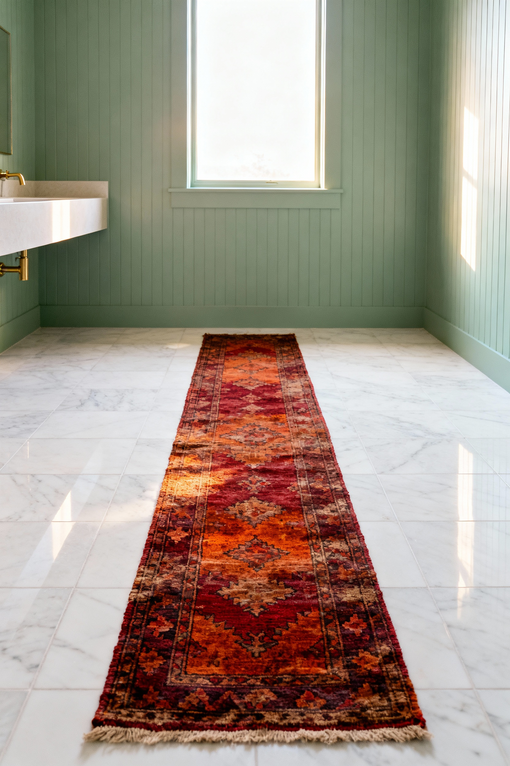
Functionally, the runner provides a sensory intervention. Stepping onto hand-knotted wool creates immediate warmth. Indeed, wool offers a durable counterpoint to cold tile. Furthermore, vintage wool is resilient. Its lanolin content makes it stain-resistant. Ideally, look for low-pile options like Oushaks.
Finally, this approach champions sustainability. Selecting a vintage piece supports design circularity. Conversely, modern synthetic mats have short life cycles. Thus, a vintage runner becomes an investment. Ultimately, you introduce a one-of-a-kind artifact into your home. Each knot tells a story.
9. Lighting the Mood: Why milk glass globes and schoolhouse fixtures amplify the retro-sage aesthetic.
The retro-sage aesthetic relies on unpretentious timelessness. Specifically, schoolhouse fixtures provide the perfect anchor. Originally, these utilitarian pieces flourished in public buildings. Consequently, they bring functional simplicity to a residential space. Furthermore, their symmetrical geometry offers a nod to Art Deco. This structured shape contrasts cleanly with the organic softness of sage paint.
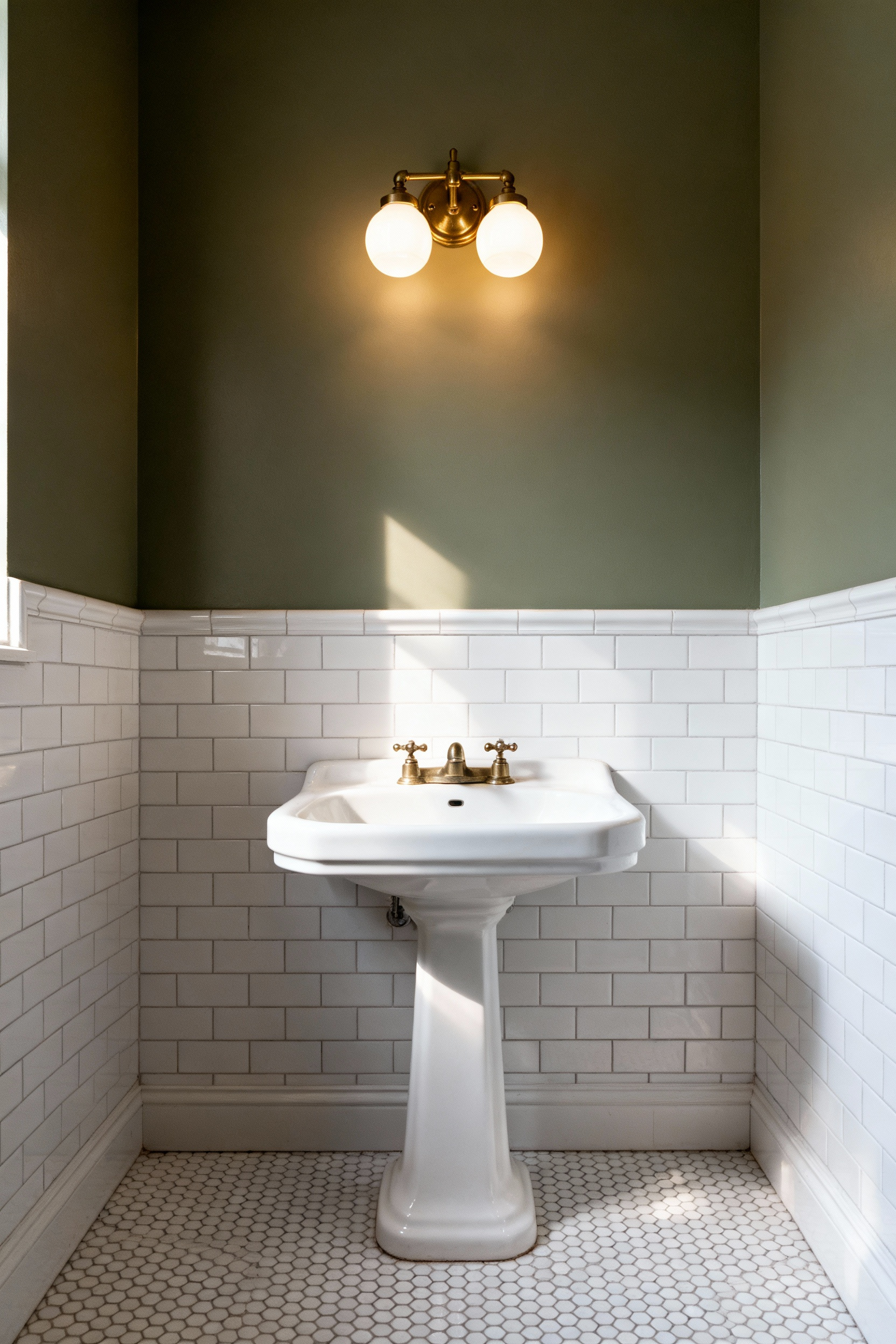
However, the magic lies in illumination. In fact, milk glass is essential for flattering earthy colors. Sage green is photosensitive. Harsh lighting can wash it out. Conversely, the opaque nature of milk glass diffuses light gently. Therefore, it creates a soft glow that minimizes shadows. This warm diffusion preserves the wall color’s deep undertones.
Finally, the material choices create a visual dialogue. Notably, the creamy white glass serves as a bright foil against muted walls. Simultaneously, the glossy surface introduces a tactile sheen. Additionally, pairing these globes with antique brass adds warmth. Ultimately, this combination solidifies the vintage authenticity.
10. Biophilic Integration: The art of styling eucalyptus and hanging ferns in high-humidity green spaces.
Integrating eucalyptus and ferns deepens a room’s sensory experience. In fact, this taps into biophilic principles. specifically, hanging a fresh eucalyptus bouquet from your showerhead transforms the atmosphere. Consequently, the rising steam acts as a diffuser. This heat activates 1,8-cineole, a compound known to clear airways. Thus, a daily shower becomes a therapeutic ritual.
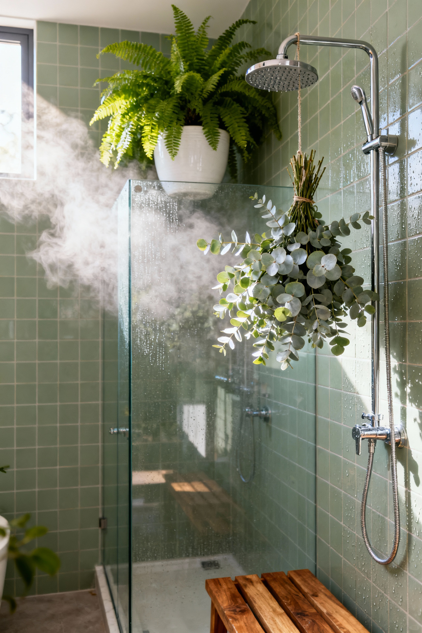
Visually, styling these botanicals requires an eye for texture. For example, Silver Dollar Eucalyptus offers a muted, dusty finish. This silvery-blue tone complements a mid-century sage palette. Conversely, hanging ferns introduce visual complexity. Lush varieties like Boston Ferns provide deep, intricate fronds. Ideally, position these darker greens near the silvery eucalyptus. Therefore, you establish a dynamic tapestry.
Finally, consider the vessels. Unglazed terracotta planters ground the cool sage tones. Alternatively, vintage-style macrame hangers enhance vertical space. Ultimately, this curation honors design history while meeting wellness needs.
11. Mixing Eras: Pairing 1950s pastel ceramics with modern matte black or oil-rubbed bronze.
The 1950s pastel aesthetic was defined by post-war optimism. Naturally, these bathrooms feature high-gloss surfaces and cheerful colors. However, updating a sage green space often requires grounding this brightness. Therefore, introducing matte black hardware offers a powerful solution.
Specifically, matte black creates a modern rebellion against the original style. These dark neutrals sharpen the rounded edges of vintage ceramics. Consequently, the graphic lines pull the aesthetic into the present. Furthermore, the textural contrast is striking. The velvety metal sits boldly against the slick glaze. This adds necessary visual depth.
Alternatively, oil-rubbed bronze provides a warmer contrast. In fact, its rich chocolate undertones harmonize with green pastels. Ideally, this finish creates a “tonal echo” with the vintage tile. Thus, the hardware suggests a heritage quality. Ultimately, this strategy prevents the room from feeling dated.
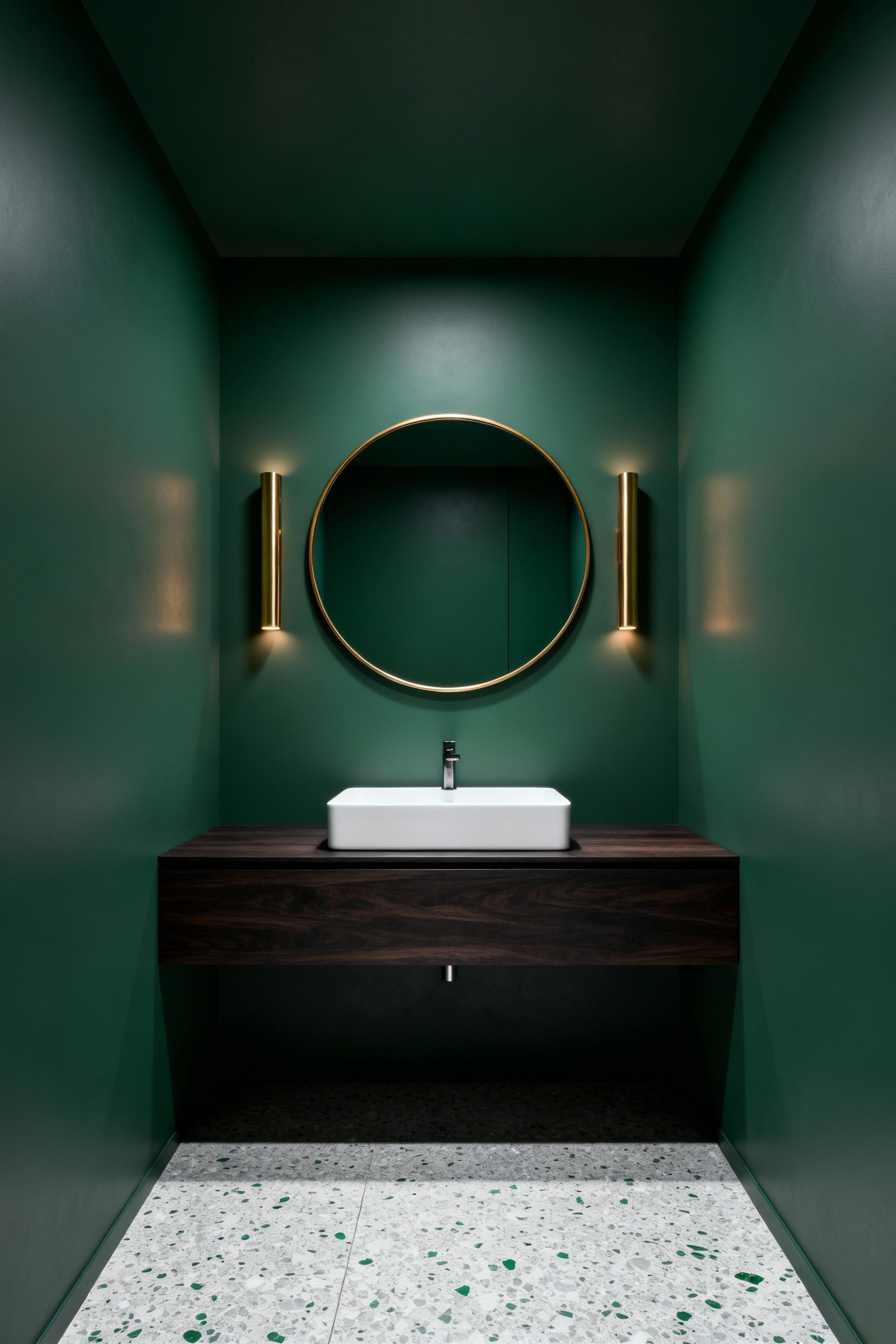
12. The Vanity Mirror: Scouring thrift stores for gold-gilded frames that pop against earthy walls.
Sage green acts as a restorative backdrop within a bathroom sanctuary. Consequently, this organic neutrality requires a dramatic element. Specifically, a thrifted, gold-gilded mirror provides the perfect visual tension. The warm metallic sheen pops against the low-chroma paint. Thus, the design balances opulence with calm.
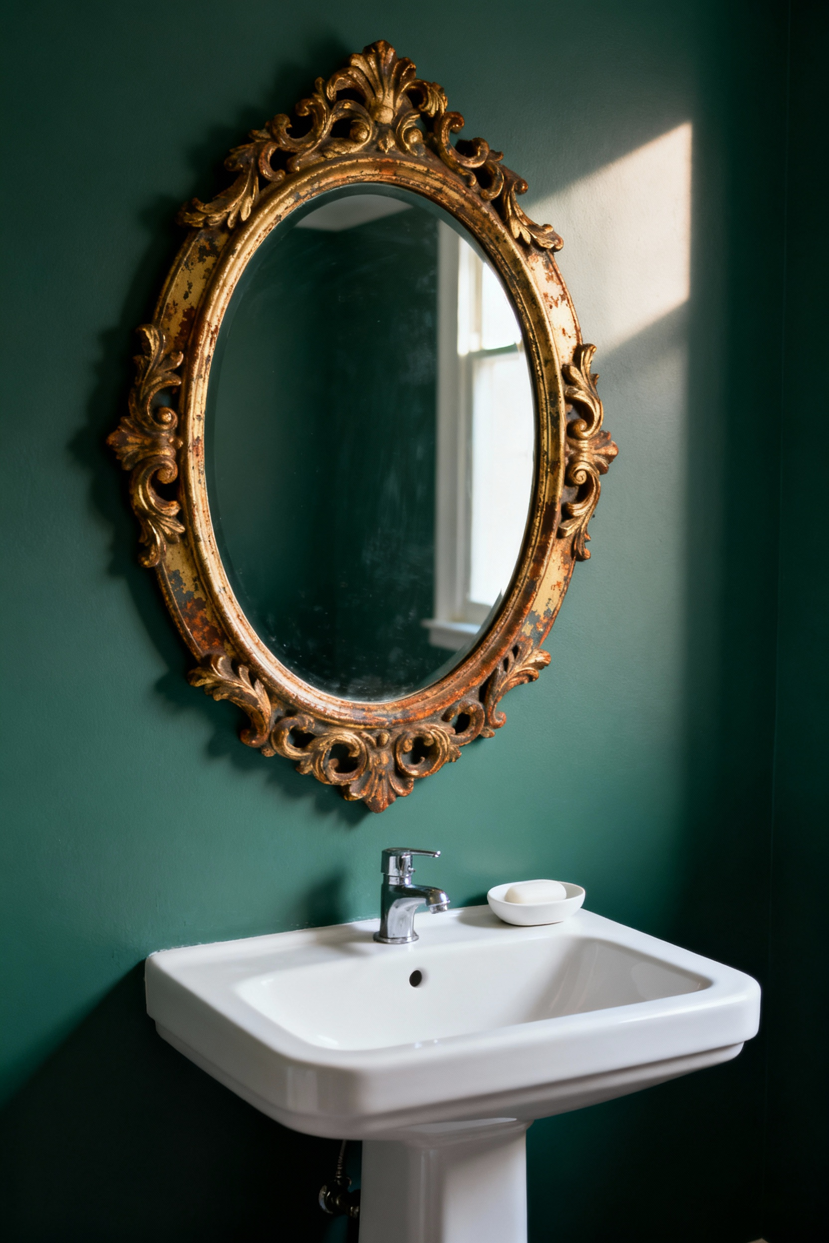
However, the allure lies in history. Therefore, avoid resin and search for genuine patina. For instance, antique frames often reveal a red clay underlayer known as bole. Furthermore, intricate gesso carvings offer a tactile counterpoint to smooth walls. Even distinct oxidation on the glass adds narrative depth.
Ultimately, this selection transforms a standard vanity. Yet, placing giltwood in a bathroom requires care. Because high humidity can warp wood, ensure the space is well-ventilated. In short, this pairing creates a sophisticated atmosphere.
13. Wallpaper Whimsy: Introducing William Morris-inspired botanical prints for a ‘garden room’ feel.
Historically, William Morris designed patterns to reject industrialization. Specifically, he sought to bring organic integrity into interiors. Therefore, introducing these prints into a bathroom creates a private ‘garden room.’ Ideally, patterns like ‘Willow Bough’ transform walls into living arbors. Consequently, the space feels like a secluded indoor grotto.
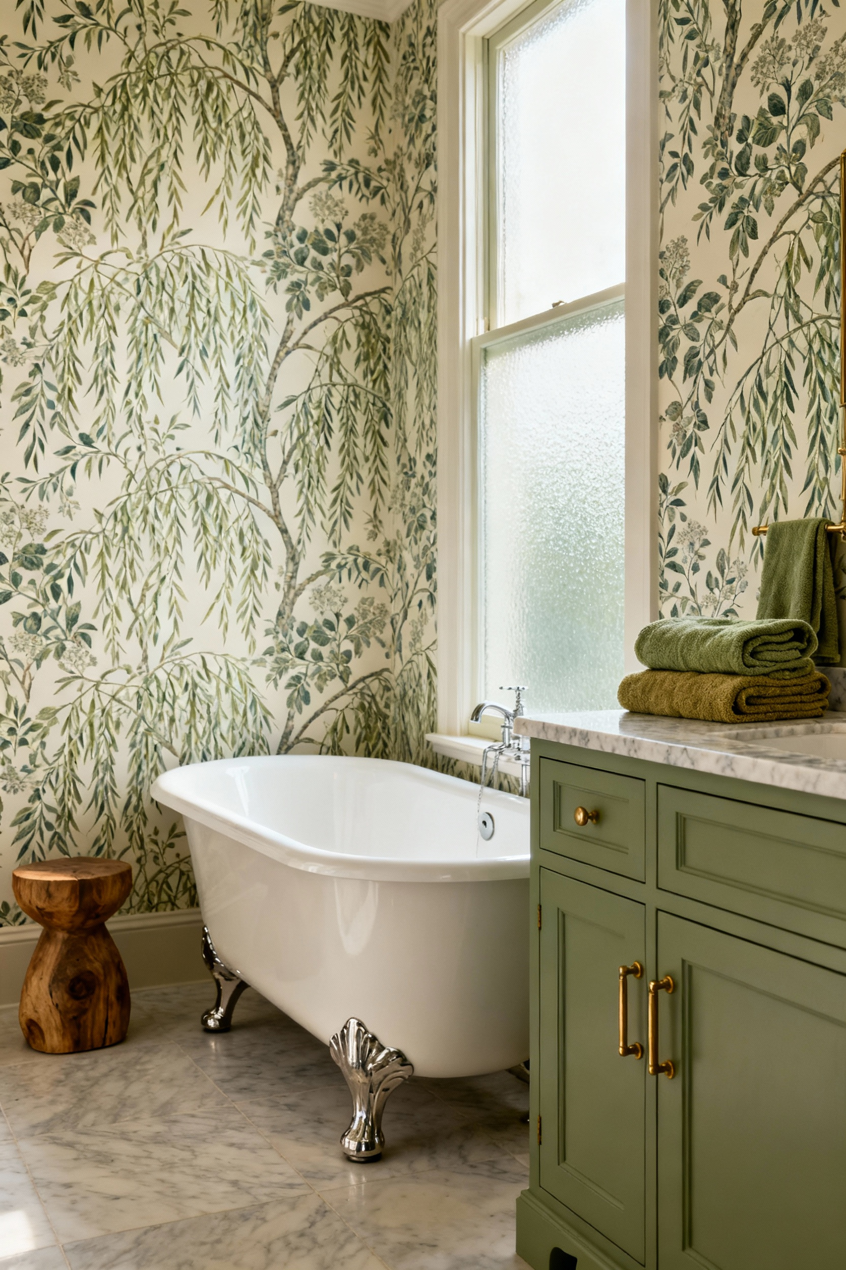
However, intricate designs require balance. Sage green acts as the tranquil anchor for complex foliage. Unlike garish colors, sage honors Morris’s preference for native botany. In fact, this backdrop elevates the design to historic sophistication. It quiets the visual noise.
Practically, original paper cannot withstand humidity. Fortunately, modern science offers durable alternatives. For instance, washable vinyl wallpapers perfectly mimic heritage prints. Alternatively, explore our full collection of Luxury Bathroom Wallpaper Ideas. Ultimately, these adaptations preserve the Arts and Crafts spirit.
14. Linen Logic: Choosing sustainable, waffle-weave organic cottons in terracotta or oatmeal.
Selecting the right textile involves understanding efficiency. Specifically, the waffle weave offers superior functionality. Often called a “honeycomb weave,” this design maximizes surface area. Consequently, raised pockets actively trap moisture. Unlike heavy terry cloth, the structure promotes air circulation. Therefore, these towels dry quickly, inhibiting mildew.
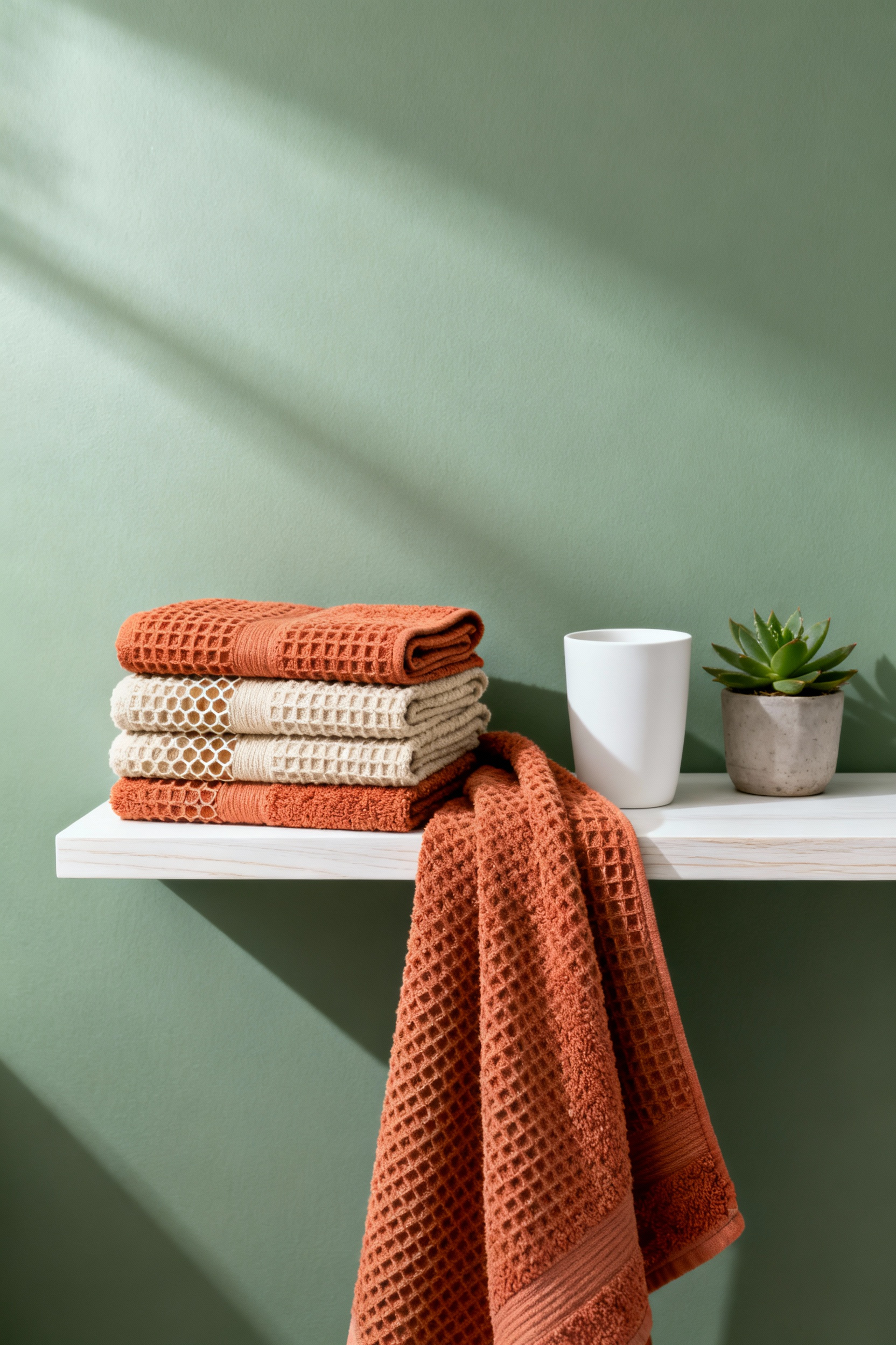
Beyond structure, material choice impacts sustainability. Ideally, select organic cotton in an “oatmeal” shade. This hue represents the unbleached fiber. As a result, it eliminates the need for dyeing. However, if you crave color, terracotta offers a sustainable alternative. Achieving this tone often involves low-impact dyes.
Finally, this creates visual harmony. “Terracotta” translates to “baked earth.” Thus, pairing this warm tone with cool sage evokes balance. Specifically, rust accents warm the herbal tiles. Conversely, oatmeal tones act as a buffer. Ultimately, this transforms the bath into an authentic retreat.
15. Storage with Story: Repurposing antique apothecary cabinets for towel storage.
An antique apothecary cabinet offers more than storage; it introduces narrative. Originally designed to house ingredients, these pieces feature robust hardwoods. Consequently, repurposing them creates a sophisticated juxtaposition. Specifically, shallow drawers now perfectly accommodate rolled linens. This shift transforms organization into serenity.
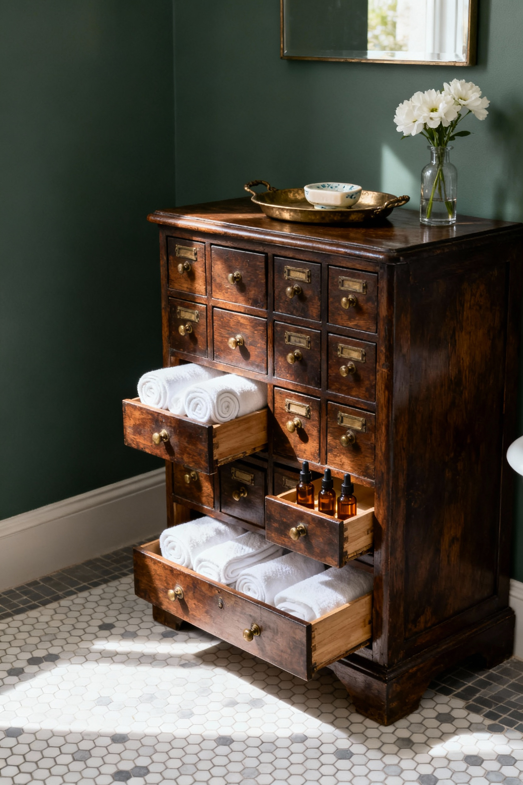
Aesthetically, the cabinet acts as an anchor. The deep patina of the wood contrasts with the sage palette. The dark timber absorbs light, providing a mature counterpoint. Thus, the room feels grounded.
However, vintage furniture faces environmental challenges. Humidity can wreak havoc on antique joinery. Therefore, preservation is a priority.
To mitigate this, apply a moisture barrier. Avoid simple wax finishes. Instead, coat the exterior with marine varnish. Alternatively, high-grade hard wax oil provides water repellency. Ultimately, this ensures your piece survives the humidity.
16. The Sustainable Floor: Cork and reclaimed wood options that ground the airy green palette.
To balance a sage green palette, the floor must act as an anchor. Therefore, sustainable materials like cork offer the perfect solution. Specifically, cork transforms a bathroom into a warm restorative retreat. Because it is harvested without felling trees, it is carbon-negative. Consequently, its structure provides thermal insulation. This softness counters hard tile.
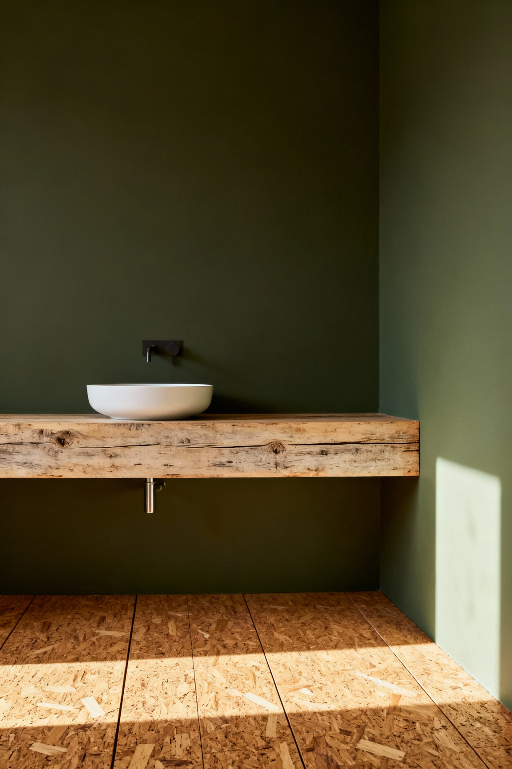
However, moisture requires careful selection. For bathrooms, choose solid tiles sealed with a high-quality finish.
Alternatively, reclaimed wood introduces the patina of history. In fact, imperfections create a cozy aesthetic. Furthermore, old-growth timber is stable. Ideally, look for moisture-resistant species like Reclaimed Teak. Ultimately, these textures provide tension against the newness of sage paint.
17. The Fifth Wall: When and how to carry sage paint up to the ceiling for a cocooning effect.
Ignoring the ceiling often leaves a stark white surface. This contrast emphasizes boundaries, creating visual noise. By carrying sage green paint up to this “fifth wall,” you eliminate the horizon line. Consequently, the space feels immersive. This technique creates a serene “cocooning” effect.
Specifically, this approach suits “jewel-box” spaces like powder rooms. Visually, the sage tone pulls the ceiling inward. Therefore, the room becomes intimate.
To execute this, employ “color drenching.” Simply apply the same shade to walls, trim, and ceiling. Thus, the architectural planes dissolve. For the finish, select a flat sheen. This softens the atmosphere. Ultimately, wrapping the room in sage transforms it into a restorative retreat.
Conclusion: Curating a space that honors the past while nurturing your present well-being.
Ultimately, choosing a sage green palette is an intentional act of restoration. Because the Latin root *salvia* means “to heal,” this hue transforms daily routines into mindful rituals. Its gray undertones create a bridge between eras, grounding accents perfectly. Crafting your ideal Sage Green Bathroom means embracing this biophilic connection. You are crafting a personal sanctuary that balances ancient wisdom with modern serenity.
Looking forward, this timeless neutrality ensures your design remains relevant. Therefore, your home evolves gracefully. It rejects fleeting trends for sustainable longevity. To begin, layer warm textures like teak against a sage backdrop. Specifically, audit your fixtures to see where history can be reintroduced. Finally, let your bathroom become a genuine retreat that honors heritage.
- **
Frequently Asked Questions
What colors complement a sage green bathroom for a luxury look?
For a high-end look, sage green pairs best with warm neutrals and sophisticated metallics. Consider accent colors such as creamy off-whites, terracotta, or deep charcoal gray. For hardware, unlacquered brass, brushed gold, or antique bronze offers rich warmth. This beautifully contrasts with the cool, earthy green tones.
Is sage green a good choice for a small bathroom or powder room?
Yes, sage green is an excellent choice for a small space. Its muted, grayish undertones prevent it from feeling overwhelming. Furthermore, using techniques like “color drenching”—painting the walls and ceiling the same shade—can create an immersive envelope. This makes the small space feel intentionally cozy rather than cramped.
Should hardware (faucets/pulls) be warm or cool in a sage green bathroom?
Generally, warm hardware complements the cool base of sage green. Warm metals like unlacquered brass or brushed gold create necessary visual tension. This elevates the look from simple to luxurious. However, if the room features cool-toned marble, polished chrome can be used. Just ensure warm accents, like wood, are introduced elsewhere to maintain balance.